Quote:
Originally Posted by Mittwoch

I like the outcome of your last signature, the one which apparently stars G-Dragon, I wouldn't know, I'm not really into K-pop  ).
I must admit that's one good blending and the colors are really matching, getting rid of that side bar was a good decision xD. I would play a bit more with the lightning to get a better depth, but that only for slight improvements ^^. The text looks a tad odd since it's not blended at all, but the font is pretty good. All in all, great work, keep it up 
Oh, and now I remembered, I really liked your Altair one :> |
Haha thanks
I actually didn't do much to my Altair sig so...

But yeah I agree that the sig looked pretty good overall

Thank you for your C&C +rep
Quote:
Originally Posted by The Chaos
I like this version much better and G-dragon smile gonna kill me someday XD
|
Really? You don't like Taeyang?

Quote:
Originally Posted by SweetPrincess
I agree  He has the most Beautiful Smile
♥♥♥G-Dragon♥♥♥ |
Gonna have to disagree with you there Himey-chan

Quote:
Originally Posted by Hooves
Well you got a point there Just not used to his various looks  |
Yeah, me neither. Don't worry you're not the only one.
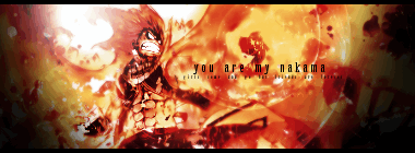
Did another Natsu sig. Compared to my first signature ever, this is much much better. I was gonna do something else today, but I really liked the stock so I chose use it
I used clipping masks(which are a more complicated in gimp), displacement maps, fractals and some other stuff
Now I gotta go make an avatar
Version 1
Version 2
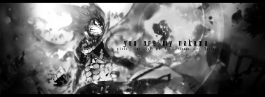
Which one looks better?
Edit: I just realized I posted at 22:22
Alright here's the avatar *shamelessly finds a stock and resizes/crops it*
Maybe I should stop being lazy and be more like Hooves
Gonna have to say goodbye to my awesome avatar

