Quote:
Originally Posted by Star-Wing

Rennir, that FMA starter pic is EPIC!!!!!!!!!!!!!!
*ahem* Sorry, I just love FMA/B and I totally loved that...never thought blue would blend with Edward.
(Yup, I am here...left the thread to load for a few hours while I was away xP And no it didn't take few hours, I was just AWOL  )
Has it really been only a couple of months for you?! I was thinking at least half a year or so....so many amazing sigs!
Spoiler for my musings....:
I usually find it hard to find interesting avies, but I loved 6 of yours (Edwards, second Mustang, Ichigo, blonde-girl (main character of Claymore, I think), Lelouch, and the last one).
 Kinda empty, but it looks awesome. Nice colors and blending <3
 Reflection is kinda weird and the blending.
  Over brightened (might be my monitor so np I guess  ) yet totally adorable sig <33 And the text is cool too.
 Can't see who it is but I want to do the same bg!! Blended so well!
 Stock? Great lightning *.* And scan lines? I actually want to try that too, but I don't know how to do that -_-
 Text seems out of place but other then that 10/10!
Weeeeeeeee~ You did Alphonse sigs! So love those two~
Ooooh, your first request is awesome! Great style; I am tempted to steal  But for the Arbitres request, the borders seems too thick ^^; I still think you don't do requests
So, all that was what my 2-months-old-inexperienced-self feels, so please, I hope you take no offense. I might be wrong about a lot of stuff, but I am still learning ^^;
Loved your gallery anyways, loads of beautiful and stunning sigs. I really hope you update frequently!
Cookies, when the monster allows me ^^; |
Well, it's been 4-6 months now. It was 1-2 months when I created the thread
. Your criticisms are valid
. I'm never going to regard criticism against me invalid, even if it isn't constructive
. Those were some of my early sigs. I leave them there so it's like a visual map of my progress as time goes on, though my progress has been coming to a halt recently
.
These are in order:
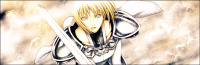
Lol, there's no blending in that xD I just pasted in the render and that was it
.
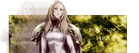
Me messing with Miria's "phantom" ability. I still used abstract brushes/colorize for bgs back when I made that.
I kinda agree. Fractal's too visible as well. I loved the text style in this one
Render needs to be bigger, but the bg was a lot of c4ds/fractals?(I really don't know what to call them
) set on dodge/screen. Notice the borders
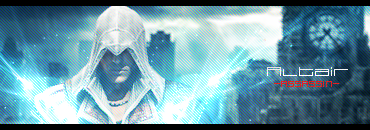
The bg was a stock from Timeshift. Render is actually Ezio, but I didn't like that name so I used Altair instead
. There should be a built in option for scan lines in PS. You can also make your own though

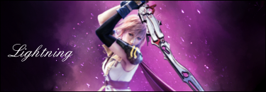
I actually have a better idea for text now. The sig was supposed to be simple, so I used simple text as well.
I would go back and re-work most of these sigs, but I'm too lazy so I'm just going to continue making new ones
. Plus, like I said earlier, it's a good visual of my development
.
I don't take offense
. In fact, I wish more people should come and critique my sigs. I might even start offering cookies for it xD. Coughaladjrcough.