2012-04-30, 16:41
|
Link #621 |
|
books-eater youkai
Join Date: Dec 2007
Location: Betweem wisdom and insanity
|
@ ranran, Merilyn Mensola, PreSage, Ak3mi, Sobonok glad than you liked it.
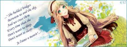
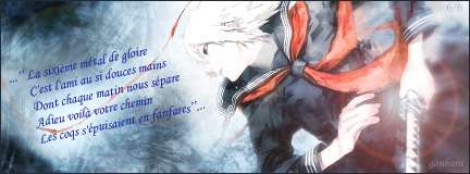
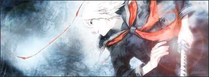
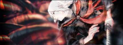
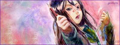
@ GenjiChan Danbooru and Safebooru. One thing thought, the ''girls'' for my current serie ( the one than I use) all share the oekaki_musume tag ( http://danbooru.donmai.us/wiki/show?title=oekaki_musume ) @ rikikai, of course, a '' arc-en-ciel joyeux'' ( a happy rainbow) has to be colorfull... Time for the weekly update: Another new set of signatures and avatar:   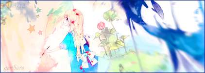  And for the freebies, it's the same way as last week: 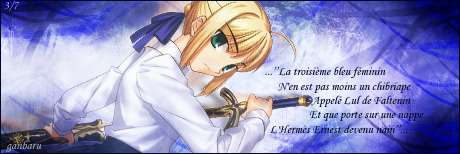 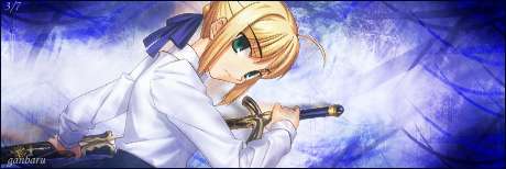 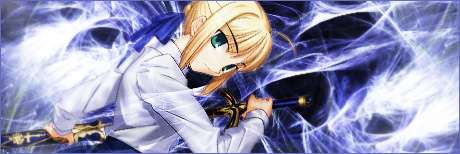  ( for this one, given the quote, it had to be either Saber, Ryougi Shiki, a trap or a reverse trap  ) )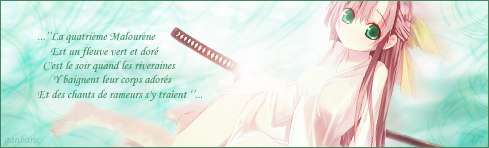 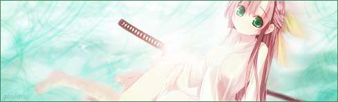 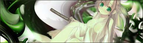 
__________________
|

|

|
|
2012-04-30, 21:02
|
Link #622 |
|
Kaiba
Join Date: Jul 2010
Location: David Tennant's bedroom in the TARDIS
|
The series is quite adorable, I love the pastel colors and the little girl. The Saber freebies are MADE of awesome. My favorites are with the quote and the one with the different BG; the other one looks a bit empty on the side. The flow is really nice, and the background too. You're improving a LOT!
__________________
|
|
|
|
|
2012-04-30, 22:52
|
Link #623 |
|
~Official Slacker~
 Author AuthorJoin Date: Aug 2010
Location: Xanadu
Age: 29
|
I must say that I'm really starting to enjoy more and more of your work ganbaru. I might even grab one of the freebies in the future
The Saber signature really has a nice feel of effects to it.
__________________
|
|
|
|
|
2012-05-01, 20:07
|
Link #626 |
|
books-eater youkai
Join Date: Dec 2007
Location: Betweem wisdom and insanity
|
To be honest, I can't take much credit for my current set, as there's less photoshop work on it than usual. In fact it will be tha case of the whole serie, as it's more about addaptating pictures into signatures than making signatures out of some materials
__________________
|
|
|
|
|
2012-05-02, 00:51
|
Link #627 | |
|
Koomi-kun~
Graphic DesignerJoin Date: Oct 2011
Location: In the distortion of space and time..
|
Quote:

__________________
|
|
|
|
|
|
2012-05-04, 12:47
|
Link #628 | |
|
Megane girl fan
Join Date: May 2011
Location: Diagonally parked in a parallel universe.
Age: 55
|
Quote:
Endless "No nickname today" Soul
__________________
|
|
|
|
|
|
2012-05-07, 20:33
|
Link #630 | |
|
Kaiba
Join Date: Jul 2010
Location: David Tennant's bedroom in the TARDIS
|
Quote:
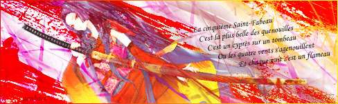
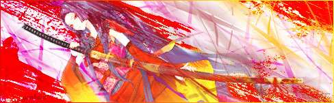
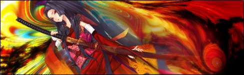
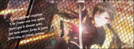
The first set of freebies I don't really like the top two, but the smudgey swirly one is very cool. The second set, reminds me of Les Miserables for some reason, particularly the first two, and those two also look the best.
__________________
|
|
|
|
|
|
2012-05-08, 01:01
|
Link #631 | |
|
Koomi-kun~
Graphic DesignerJoin Date: Oct 2011
Location: In the distortion of space and time..
|
Quote:
__________________
|
|
|
|
|
|
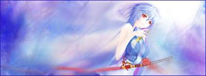
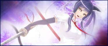
2012-05-14, 16:36
|
Link #635 |
|
Koomi-kun~
Graphic DesignerJoin Date: Oct 2011
Location: In the distortion of space and time..
|
Another great set again! Good colour textures with your current signature! I love the First and the Third set of the freebie signatures! My type, with a "kick-ass" girl with strong looks! Not to forget to mention the long hair! Very good!
__________________
|
|
|
|
|
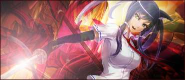
2012-05-14, 21:48
|
Link #637 | |
|
Quietly Lurking
Graphic DesignerJoin Date: Mar 2010
Location: Beneath the prodigious sky...
|
Quote:
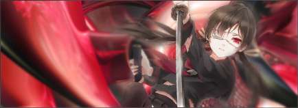
Try setting that outer glow to screen or linear dodge so it doesn't look as solid. Then burn the render a lot to match up with the dark bg, add parts of the dark things in front of her if you want then blur parts of the bg for depth, making it seem like she's enclosed by the coils. That's what I had in mind when I saw it anyways
__________________
|
|
|
|
|
|
2012-05-14, 23:12
|
Link #638 | ||
|
Klutz
Join Date: Jun 2007
Location: California
Age: 32
|
*randomly pops-up to comment on your signatures*
Quote:
 Quote:
__________________
|
||
|
|
|
|
2012-05-15, 04:38
|
Link #639 | |
|
I am a Boxer
Join Date: Apr 2011
Location: Where hot girls are fighting!
|
Quote:
Hoooooo.....these sign..are awesome..this time..is really difficult to choose one..because are all good!! Nice work ganbaru you're an artist...  wow! wow!
__________________
|
|
|
|
|
|
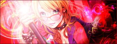
2012-05-21, 15:37
|
Link #640 |
|
books-eater youkai
Join Date: Dec 2007
Location: Betweem wisdom and insanity
|
Time for the usual weekly update.
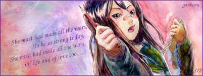
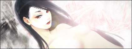
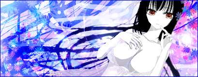
A new set of signatures and avatar:   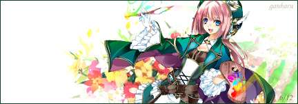  Some usual freebies: 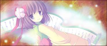  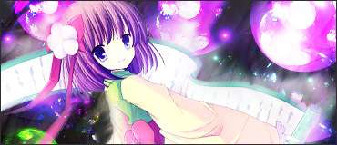 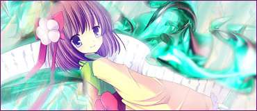 And another kind of freebies, because I had the material, the time ... and there's ( at least one) individual than want some ''sexiness''... Spoiler for nudity for the first, small clothing for the second:
I know, the first one is lamer than the second...
__________________
|
|
|
|
 |
| Tags |
| ganbaru |
|
|