 2007-12-08, 19:11
|
Link #1 |
|
~La-la Land~
 Graphic Designer Graphic DesignerJoin Date: Jul 2007
Location: Seattle
Age: 37
|
Marina's Gallery
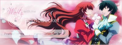
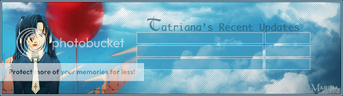
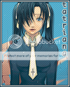
 Welcome to my gallery! I've been doing sigs for several months now, since about....December of 2007. Since then, I've branched out to trying out avatars, banners, and extractions (vectoring may happen some day...). Take your time browsing through my creations and thank you for visiting! I like doing requests, so please feel free to hit me up with some nice quality images and I'll see what I can do! Also, if anyone wants to use any of my sigs/avatars, please ask permission first.  If you're looking for the Box Avatars, please click here.       last.fm last.fmNOTE: Ripping is BAD! May you be cursed with head lice if you so much as attempt to claim what is not yours as your own! ______________________________________________ Spoiler for Signatures:
Spoiler for Banners:
Spoiler for Collaborations:
Spoiler for Avatars:
Spoiler for Renders:
* indicates it as a request Unless indicated, all renders used are done by other artists. Thank you for letting me use them!
__________________
Last edited by Marina; 2010-11-23 at 02:57. |

|

|
|
2007-12-08, 20:29
|
Link #2 |
|
noLife
ArtistJoin Date: Jul 2007
Age: 35
|
Not bad for a beginner
 I'm liking the dango one :P A thing I noticed is that some of the renders you've used are a bit too sharp and kinda well, don't blend together with the background very well. But otherwise yesh, not bad for a beginner
|
|
|
|
|
2007-12-09, 19:22
|
Link #5 | |||
|
~La-la Land~
Graphic DesignerJoin Date: Jul 2007
Location: Seattle
Age: 37
|
Quote:
Quote:
Quote:
__________________
|
|||
|
|
|
|
2007-12-12, 10:28
|
Link #6 |
|
Hail pork!
Graphic DesignerJoin Date: May 2007
Location: Silicon Valley
|
Hey there Marina, it's been a while... so lets see what you have up:
 I see you're starting to use more filters... and in this sig it appears to be bevel and emboss for the bg. Not a bad touch although your render is a bit sharp. When you're constraining renders, try changing your setting to bicubic smoother so you won't get the sharpness quality that you have now. Colors and lighting look appropriate for the presentation you have there. If it weren't for the overly sharp render, I would say this would be your best one out of the lot. Good job.  Interesting bg you have on this sig. It's quite lively for its mysterious color which is a plus. Text style looks complimentary so I'll give you a plus on that. 3px border looks great to line up the canvas. Renders are a bit sharp as well but not too much. I would change the color of the guy's shirt to compliment the rest of the presentation. Take the blur tool @ 30% and feather on the outline of the renders so they can blend in a bit more. It's a nice compilation Marina... good job, I really liked the bg on this one.  I won't speak too much on this one but what's nice is that the whole presentation is very soft which goes well while she's licking her ice cream. Colors are complimentary to the mint chip that she's working on so that's a great addition to the presentation. Your name text a is a bit small but what's cool is that it does match up with your vector brushing. Hmmm, I wonder what's going on with your renders... this one is also sharp. I need to know what you're doing because it's consistant so far with the renders I've seen in your work. Back to the siggy... your border has the perfect complimentary color which is outstanding and render coloring is a plus.  Sharpness on the render is still too much and this time, the contrast is a bit high. Might want to tone that down a bit. Text could probably a bit more thicker than what you have there just because it's almost the same size as your vector brushing. I like the render, it's kawaii but just with those fixes and your presentation should be fine.  LoL, I like this one, it's simple and it's cool. All I would recommend on this one is to change out the text color to a more complimenting color. That wasn't too bad was it?  I enjoyed looking at the bg. Looks like just her face with some render coloring applied which looks nice. You can't go wrong with that style of coloring. Text looks nice with the glow which compliments the outter glow of your render. I would recommend a better blending method and careful with making your render sharp looking. Either than that, it's a fine piece of work.  It's a filmography for this render lol... well all I can say is that the border closes this canvas off perfectly fine. I can't say too much about the rest of your work on this sig but it's simple.  I believe this is one of your oldest sigs and might have been a request but all I would recommend on this one is applying a drop shadow to your main render and easing off the drop shadows on your sub renders and text. It's hard for me to fully critique because I'm at work right now lol... but for starters, this should be good for now. You've come a long way from when you started Marina. Keep practicing and taking up request. You'll improve more when you're taking up request. Not only will you be honing out your skills but broadening your horizons by applying new techniques on requests. Of course if you need help on anything, let me know what's up.
__________________
|
|
|
|
|
2007-12-12, 22:49
|
Link #7 |
|
Falling for Ginsama ^3^
Graphic DesignerJoin Date: Feb 2007
Location: Airantou
 |
Marina>> cool, u have been steadily getting better at sig making ^__^
from what I c Iike that sig request u did with that game pic. ^^b good job with it. although redundant in critique I will just reemphasize what Wing said, that sig is a nice piece or work, all u need to do is not get the render so sharp. other then that I love what U have done with that sig. =D (^__^)--O *gives cookie* XD
__________________
|
|
|
|
|
2007-12-13, 00:34
|
Link #9 | |||
|
~La-la Land~
Graphic DesignerJoin Date: Jul 2007
Location: Seattle
Age: 37
|
Quote:
Anyways, I know, my sharp renders...I don't know how to get rid of them! I will take your advice up on getting them to not be so sharp since it's something very consistent in all my signatures and I am a huge fan of smoothness...wish I could just transplant the image in my mind on the screen!Quote:
It's funny, but I don't even play that game and it's one of my favorites just because it was fun to make and the artwork is so cute! (off topic: checked out your thread and I really like your sigs as well!) Quote:

__________________
|
|||
|
|
|
|
2007-12-13, 09:25
|
Link #10 |
|
The endless sky
Graphic DesignerJoin Date: Jun 2007
Location: Oosutoraria
Age: 34
|
Oooh. Wow.
I'm seeing some very lovely works here, Marina. ^^ You have good contrasting skills with renders and the bg. You nailed some of the texts, too! The only real problem is those sharp renders, but that can be easily fixed. I pretty much like all your bg on the sigs, they are really something.You have some sort of 'Soft' type of sigs going on here. I like, I like! Keep it up, and I hope you get rid of the sharpness thing going on. xD Everyone loves cookies. Yeahh~? *Gives cookie* |
|
|
|
|
2007-12-14, 04:14
|
Link #13 | |||
|
~La-la Land~
Graphic DesignerJoin Date: Jul 2007
Location: Seattle
Age: 37
|
Quote:
I really do love the whole "soft" look though, just wish I could make it work out better. Quote:
Quote:
Something about simplicity always gets to me...oh, and cute of course. Just need to change the text color on the Clannad one...
__________________
|
|||
|
|
|
|
2007-12-17, 11:45
|
Link #14 |
|
hiatus almost permanent
Join Date: Apr 2007
|
Literary wanderlust? I am actually going to hope you'd write something because your user title intrigued me to check out your gallery =) Writers are hard to come by here. ^^"
Your sigs are generally not bad, ;D but work on the rendering and contrast xD cheers! |
|
|
|
|
2007-12-20, 17:38
|
Link #15 | |
|
~La-la Land~
Graphic DesignerJoin Date: Jul 2007
Location: Seattle
Age: 37
|
Quote:
New request sig, made it a funky size to fit the piano in alright: 
__________________
|
|
|
|
|
|
2007-12-21, 00:32
|
Link #17 | |
|
Hail pork!
Graphic DesignerJoin Date: May 2007
Location: Silicon Valley
|
Quote:
All in all, it's a very simple and clean presentation which is great. I'm a big fan of music, musical instruments and piano pieces. I used to play competitively in classical music so I have a great respect for the piano. Just a side note, I'm listening to some great piano pieces from Kanon. If you haven't watched that anime, then it's a must see. It's actually Kanon 2006. The album is an all piano album from the anime and it's fantastic. Keep up the great work Marina. You're doing a terrific job and I'm glad to see you excel in photoshop. You've started with baby steps, passed the crawling stage and now walking with your head up high. Again, keep up the terrific job and I look forward to seeing more of your work. Your job is to excel past my work. Happy holidays! .wz619
__________________
|
|
|
|
|
|
2007-12-21, 03:59
|
Link #19 | ||
|
hiatus almost permanent
Join Date: Apr 2007
|
Quote:
Quote:
But with regards to the sig I think the piano should be larger. Large enough to see the keys- because the sig looks a bit fat, when it should be more elegant (read: smaller width, greater length). That's just my amateurish opinion, though. =x |
||
|
|
|
|
2007-12-21, 08:12
|
Link #20 | ||||
|
~La-la Land~
Graphic DesignerJoin Date: Jul 2007
Location: Seattle
Age: 37
|
Quote:
Quote:
 I softened up the bevel/emboss and I moved my name down and over, but the title...AUGHHHH! I sortof cheated w/ it and went the lazy way w/o properly extracting its render and so every time I try to blend it in better, you notice a definite rectangle around the whole evil thing  I'm about to toss my hands up in bafflement! What do you find to be the easiest way to extract renders? I went through the as tutorials, like the whole quick mask and pen thingy, but I started out with the good ol' eraser. I'm about to toss my hands up in bafflement! What do you find to be the easiest way to extract renders? I went through the as tutorials, like the whole quick mask and pen thingy, but I started out with the good ol' eraser.As to music: Spoiler for off-topic!:
Oh, and as a note, I was so horrified when I read the first two sentences of your comment, I immediately looked up at the sig to see what disaster I had created and then felt much more relieved after reading the rest of your comment How scary the effect of the words from my signature sempai Wing!Quote:
 Quote:
Spoiler for Off-topic once again:
Oh! And just for fun for one of my favorite movies of all time, a crop!:  (Will be unable to create sigs for the 3 weeks of xmas break, but I'll still browse and comment) |
||||
|
|
|
 |
| Tags |
| avatars, banners, signatures |
|
|


 *
*


 *
* *
* *
* *
* *
*
 *
*
 *
*
 *
* *
*


 *
*
 *
* *
*

 * V2
* V2
 *
*
 *
* *
* *
* *
* *
* *
* *
* *
*
 *
*

 *
*


 *
*


 *
* *
*


 *
* *
* *
* *
* *
*

 *
*


 *
* *
*
 *
*


 *
*


 *
* *
* *
* *
* *
* *
* *
*


 *
*


 *
* 


 *
* 
 *
* 


 *
*  *
* 


 *
* 


 Moderator