2007-11-15, 10:05
|
Link #63 |
|
Fallen Angel
 Graphic Designer Graphic DesignerJoin Date: Jul 2007
Location: why ask ??
Age: 38
  |
thx all of you for the comments,since the 2nd one was the favorite... i'm enhancing a bit the sigs...
here we are with the new one....  btw, Kasumi and konstargirl if you think the quality is bad i don't think so... coz my source image is quite have a good quality... to tell you the truth i'm mainly using blur filter here...most of them are Gausian blur, about 30 layers maybe.. since i want to have a soft render, the render was quite sharp and not good enough to give a soft,calm, and serene feeling into it... so maybe we couldn't expect a sharp quality there... here are the link if you want to compare : Image thx for the CnC guys, i'll give each of u a cookie for thx^^
__________________
|

|

|
|
2007-11-16, 06:38
|
Link #65 |
|
(ノಠ益ಠ)ノ彡┻━┻
 Moderator ModeratorJoin Date: Mar 2006
|
The source is good but the second version looks a bit grainy. Do you use soft light at all? It does help to smooth it out a bit.
Here's an example - hope you don't mind me using this to demonstrate:  This uses three layers. I duplicated the first one twice, blurred the duplicates with Gaussian set to 1.8 , used the blending setting to put both duplicates in soft light, and set one to 70 percent opacity and the other to about 50 percent. Used color balance on the original layer to bring out the blue, blurred it with Gaussian set to .2, and then saved it. The overall effect gives you a smoother, softer picture but you still preserve some of the sharpness and detail without the grainy look. Other than that I think your sig is wonderful, the background and text are great and the feathers are an excellent touch. 
__________________
|
|
|
|
|
2007-11-16, 11:43
|
Link #67 |
|
Retired
Graphic DesignerJoin Date: Mar 2007
Location: Princeton University
|
I see you're going for Klash's style on this
 (especially the text and you're name tag) (especially the text and you're name tag)Outcome looks great. Only thing i would say is the render is a little too dark, but that is minor. Some more blending may be used, but that is meh also. Anyways, good job overall.
__________________
|
|
|
|
|
2007-11-19, 08:24
|
Link #70 |
|
Fallen Angel
Graphic DesignerJoin Date: Jul 2007
Location: why ask ??
Age: 38
|
well icy already answered it ^^ 10 points for u
 new sigs, i have spare time since i'm having a holiday ^^ [in monday ??] well actually yes... it's Noumi from Little Busters! since i'm just playing the game recently, taken from the CG inside. The picture was quite interesting for me^^... just experimenting with some brush and filter here, not to satisfied with the result but also not to dissapointed, i guess it's so so -_- 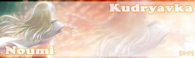
__________________
|
|
|
|
|
2007-12-04, 00:30
|
Link #72 |
|
Fallen Angel
Graphic DesignerJoin Date: Jul 2007
Location: why ask ??
Age: 38
|
Christmas is drawing near..^^ have anybody prepare their x-mas sigs ^^ ? if not yet, then do now haha...
   here we go with my newly x-mas sigs, combining some art with animation... the girl who got lucky get inside was Mai... well as you already know, she is one of the girl from Kanon series ... pretty extraordinary if you may think, since i never made any animation sigs.. well this time is an exception for x-mas. Again using blue as a main colors, since i'm love blue a lot... maybe this is the reason i have an aquarius as my zodiacalso a few avatar^^ okay, almost forgot... let's go to the point, i'm also have made some x-mas sigs for a gift to a few person in this forums. i'm giving to them in reason of respect, also they have helping me a lot in this year... giving CnC, etc. and those person was : - Dkz - Sephi - Icy - Daniel_E - Aoie Emesai - Bigdave i'm giving it those presents at 20... 5 days before x-mas, i'm mainly finished with most of it. just a bit finishing touch and voila !! thx for all of your help guys^^ note: done editing and revision !!
__________________
Last edited by Runa; 2007-12-04 at 01:13. |
|
|
|
|
2007-12-04, 00:45
|
Link #73 |
|
I LOVE FLAN_CHAN
Graphic DesignerJoin Date: Oct 2007
Location: Flan-chan
Age: 21
|
Spoiler for Save room:
Omg Mai~! Heaven bows to the lightening, My idea- just say no to the blue text which just don't fit in and animated text.. Give it a 1 pt stroke all around and then a top and bottom 2-3 pt stroke black but leave the hand sticking out of the borders. and remove some of the circle around the head. and maybe add in some soft brush. Then I am ready to take the signature home. Sorry to kill your first animated signature, just hate flashy texts(Make 2 version probably would be best). Overlay borders just don't work very well. ~If you don't know what I am saying, I don't blame you.
__________________
Last edited by Izayoi; 2007-12-04 at 02:14. |
|
|
|
|
2007-12-04, 01:23
|
Link #74 |
|
Fallen Angel
Graphic DesignerJoin Date: Jul 2007
Location: why ask ??
Age: 38
|
thx for the feedback.. already change it above, but i can't change those animated text.. well since i'm quite loving it^^ don't blame you if u don't quite like it, well different people different taste isn't it ?
 but thx again for the CnC... a bit early but, merry x-mas to you but thx again for the CnC... a bit early but, merry x-mas to you
__________________
|
|
|
|
|
2007-12-04, 02:14
|
Link #75 | |
|
I LOVE FLAN_CHAN
Graphic DesignerJoin Date: Oct 2007
Location: Flan-chan
Age: 21
|
Quote:
__________________
Last edited by Izayoi; 2007-12-04 at 08:59. |
|
|
|
|
|
2007-12-05, 07:01
|
Link #77 |
|
The endless sky
Graphic DesignerJoin Date: Jun 2007
Location: Oosutoraria
Age: 34
|
Ooh, wow. I love your Mai sig. ^^
Some animation is always nice. The boarder looked a bit weird with a bit behind Mai, but after awhile it looks fine. xDHmm, maybe softening the clouds? Or possibly blurring. Personally, I don't like the colour of the "Merry Christmas" banner-ish thing. But, it's just really IMO. I'd say, it's pretty good. The render is awesome, and it just looks good all around. I had a bit of trouble trying to pick up the mistakes. It's just too good, with all that animation. (Believe me, im a sucker for animated sigs. xD) Oh, btw, I love those avvies, to kawaii and very creative. ^^ The current one your using is just too cool!  EDIT: Some CnC won't hurt on this sig: Hmm, yeah, it's a so-so outcome. Maybe just something a bit stronger, like another choice of boarder. Also, maybe change the size? It's all I can say, really. The outcome suits the render, so maybe leaving it is the best. Btw I like your name tag thing. ^^ Till next time!  XD Last edited by KasumiGirl; 2007-12-05 at 07:13. |
|
|
|
|
2007-12-05, 08:08
|
Link #78 | ||
|
Thinking outside the box
Graphic DesignerJoin Date: May 2007
Location: The Netherlands
Age: 37
|
The Mai sig is bright ^.^ Some of the details are lost due to the brightness. And some white spots at her hair at top middle of the sig..
Quote:
I started already but with only 2 failures as result. These 3 weeks are gone be uhu... hard Quote:
Likes saber. weakness for animated sig. Taken note of
__________________
|
||
|
|
|
|
2007-12-05, 16:24
|
Link #79 | |
|
AniMexican!
Join Date: Dec 2005
Location: Monterrey N.L. Mexico
|
Quote:
Like Sephi said, I am also quite happy that you decided to make a sig for me. Looking forward to it!
__________________
|
|
|
|
|
|
2007-12-05, 18:49
|
Link #80 |
|
Fallen Angel
Graphic DesignerJoin Date: Jul 2007
Location: why ask ??
Age: 38
|
@Sephi
haha... you do got a point there, this 3 weeks will be a hell for me @Daniel well, we don't have any daniel who have a godlike skills of tracing are we ^^, sorry for a wrong typing haha @Kasumi well... who doesn't love Mai in here ... at least i know what type of girls AS member like hehe...
__________________
|
|
|
|
 |
|
|