2012-10-25, 09:13
|
Link #20221 | |
|
books-eater youkai
Join Date: Dec 2007
Location: Betweem wisdom and insanity
|
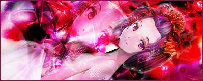
mystogan 8,3/10 appropriate for the season
GenjiChan 8,5/10 Isn't the text a bit too invasive ? Quote:

__________________
|
|

|

|
|
2012-10-26, 05:00
|
Link #20223 |
|
Sayaka★Magica
Join Date: Sep 2010
Location: Under the piercing blue sky
|
GenjiChan - 8.3/10 I don't know if that's your intention, but I thought the big text was too distracting.
ganbaru - 8.5/10 I like that "polarity" between light and dark. Also, it works as a set with your avatar. Krytonis - 8.7/10 SAO's OTP, nice. Love the glow effects. I know how to make glowing text, but I wonder how you guys make those nice glowing particles.
__________________
|
|
|
|
|
2012-11-01, 12:16
|
Link #20231 |
|
D-Don't stare, baka...
Join Date: Sep 2012
Location: Tristinian Academy of Magic
|
ninryu. I really like your Rikka signature. 9/10.
Since there aren't any good x-mas theme signatures with me, I've decided to make this one. And don't get me wrong or anything! It's just that Saito's clothes are so warm.
__________________
Last edited by Tsundere Louise; 2012-11-02 at 02:02. |
|
|
|
|
2012-11-01, 15:32
|
Link #20234 |
|
Onani Master
Join Date: Jan 2009
Location: The girl's bathroom
Age: 34
 |
Krytonis: Rafales, huh? They'll never see us coming... 9/10 ML fans unite!
Tsundere Louise: It's not like I'm staring or anything but 8.5/10 ganbaru: Lovely effects as per usual mate. 9/10
__________________
|
|
|
|
|
2012-11-01, 20:37
|
Link #20235 |
|
Barrel!
 Graphic Designer Graphic DesignerJoin Date: Jul 2011
Location: still under a rock
Age: 34
|
grylsyjaeger: Can't remember if I rated this one before. 8.7/10
ganbaru: Like this one, the amount of different colors and the effect to go with it. 9.2/10 Krytonis: Nice Muv luv signature. Like the color in the background to go with the TSF. 8.8/10 Tsundere Louise: Nice pose of Louise. 8.6/10
__________________
|
|
|
|
|
2012-11-01, 21:14
|
Link #20236 |
|
Constellation
Graphic DesignerJoin Date: Jan 2008
Location: Pearl of the Orient Seas
Age: 31
|
Kaihan 9/10 A little more sharpening should do the trick
ganbaru 7/10 not really fond of the text, if it were textless I'd rate it a little higher. It's a bit oversharpened too, and it's a bit too bright as well. I love the colors though Krystonis 8/10 I'm not really fond of mechas, but your signature looks nice nonetheless Tsundere Louise 7/10
__________________
|
|
|
|
|
2012-11-02, 21:42
|
Link #20240 |
|
Storm Vanguard
Graphic DesignerJoin Date: Mar 2008
Location: Type-00
|
Tsundere Louise - 8/10. Good scan. The border's color doesn't really blend well with the rest of the sig. Try adding some effects.
ganbaru - 8.8/10. Colorful and has good composition. Kaihan - 9.5/10. Damn, I like the dark theme of the sig. The combination of red and black in the background is just splendid. Frailty - 8/10. Cute. I'll finish the game someday. Midnight2352 - 8/10. Brings back memories. |
|
|
|
 |
| Tags |
| rate, signature |
|
|