2014-09-18, 14:41
|
Link #401 |
|
Senior Member
Join Date: Nov 2012
|
The nose is just too much, it doesn't even fit, why are the lines for it so much bigger than for the rest of the head ? It looks like someone added it to make a joke. Wors way better with one like Alchemist's. I would be personnally way more satisfied if they could change that.
Otherwise, a comparison between casual clothes Mion Matsuri and Kizuna, since the second one is fully ready. 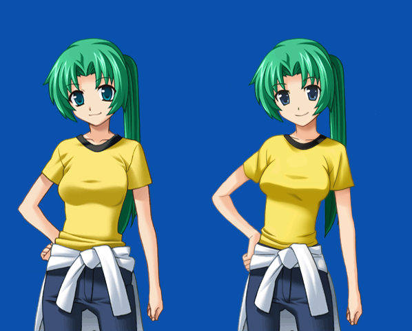
|

|

|
|
2014-09-18, 14:45
|
Link #402 |
|
Senior Member
Join Date: Nov 2012
|
"Can't wait to see Keiichi, Satoshi, and Mamoru."
You know Kei/Satoshi doesn't appear before the 5th arc and Akasaka doesn't appear before the 7th one right ? Looking at the speed they're making the first arc, I wouldn't expect to see them before one year or two. |
|
|
|
|
2014-09-18, 16:19
|
Link #405 |
|
Senior Member
Join Date: Nov 2012
|
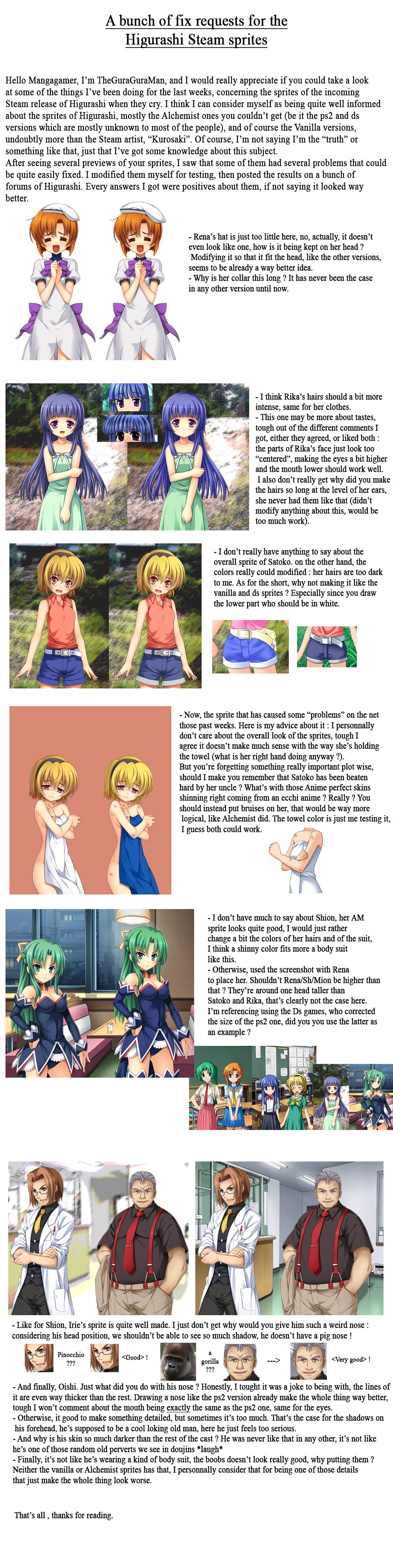
There are no point in making him darker. More sinister ? He's not like that at all in any other version, here he just feels too "serious", the usual oishi is more a cool headed old guy. And giving him such a tight suit to show his booobs doesn't really look good either, he's not wearing a body suit.
With those corrections, I think he's okay on the other hand : 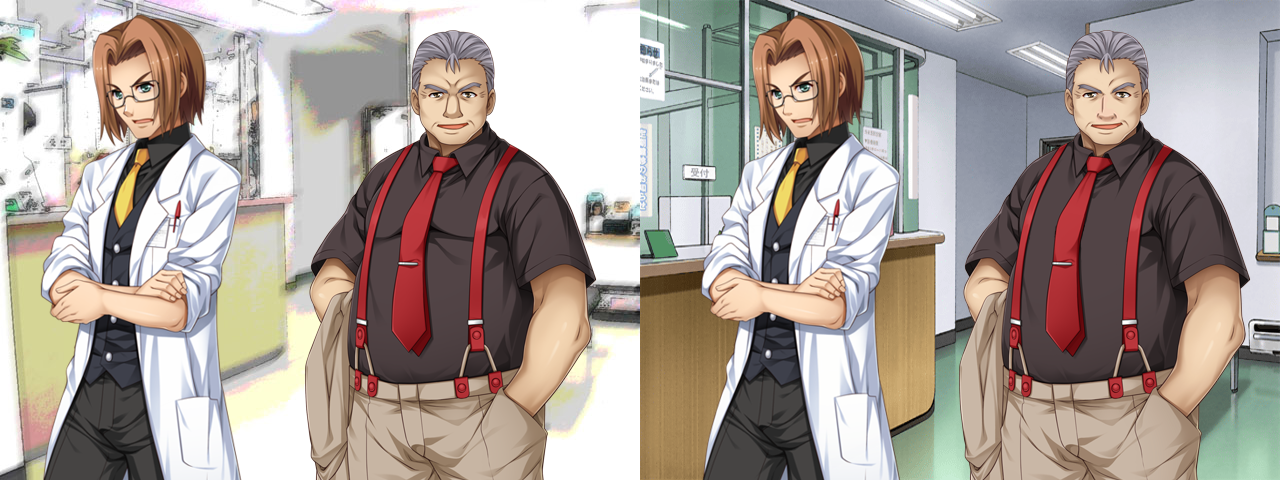
|
|
|
|
|
2014-09-18, 19:05
|
Link #408 |
|
Senior Member
Join Date: Sep 2014
Location: Finland
Age: 28
 |
I wonder if they'll release a sprite preview that we won't have something to complain about. lol
I guess the Mion one was pretty good, aside from the hair length difference between her and Shion. Let's hope that they listen to their community. I laughed at the Ooishi and gorilla comparison.  Anyway, the sprites aren't *that* bad, they could just use a few improvements, otherwise the artist really did a great job at it. |
|
|
|
|
2014-09-18, 19:06
|
Link #409 |
|
Strange New World
 Graphic Designer Graphic DesignerJoin Date: Jun 2009
Location: Canada eh.
|
I think the intro sounds a bit arrogant and overall tone might sound a bit too harsh throughout.
But sending them some changes would be welcomed but I should not be the only one put off a little with reading...maybe it is just me.
__________________
|
|
|
|
|
2014-09-18, 21:41
|
Link #410 |
|
Senior Member
Join Date: Jul 2008
Location: Massachusetts, USA
Age: 36
|
I think the new sprites in general, Oishi included, are great. It makes perfect sense that Oishi should have moobs; he has a huge beer gut. And he should be built strong, too. Remember when he stood like a mountain against that smart-aleck police guy, and flipped him, in EP8?
I think all the new MG sprites are a level above the PS2/Kizuna sprites. They're much more dynamic, and less flat (though I still prefer the original Ryukishi graphics overall). |
|
|
|
|
2014-09-18, 22:52
|
Link #411 | |
|
Senior Member
Join Date: Sep 2014
Location: Finland
Age: 28
|
Quote:
I guess the whole nose thing is just the artist's style. I find it hard to believe that drawing a nose could be that difficult for it to be a lack of skill. We can judge it if we want to, but I don't think you could really compare that to something like a bug or balance issue in a game, hence it's probably not considered as important. I guess the majority are still bothered by the new sprites, and it's a good thing to inform about it, in any case. The artist might end up agreeing and doing something about it. But even if they didn't change them, it wouldn't keep bothering me too much. I'd just get used to it. |
|
|
|
|
|
2014-09-19, 02:44
|
Link #412 | |
|
Senior Member
Join Date: Nov 2012
|
Quote:
- more characters sprites - All the backgrounds remade - CGs Overall, the style is just different. But making it more detailed DOESN'T make it directly better at all. When looking at Alchemist sprites, I'm satisfied, but it seems like the Steam sprites always has got stupid problems. Besides the fact the artist straight copy some elements of the ps2/ds sprites, so artisitically he doesn't have much originality, and still manage to fail important characters like Mion and Rika who are garbage. And Mangagamer just posted Tomitake : 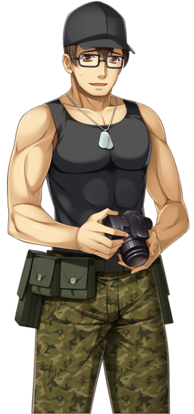 Finally a guy who has got no problem on the face, tough the artist clearly straight copied the face of the Alchemist version and changed its perspective... But wait, what the hell with those muscles, is Tomitake supposed to be a fishman 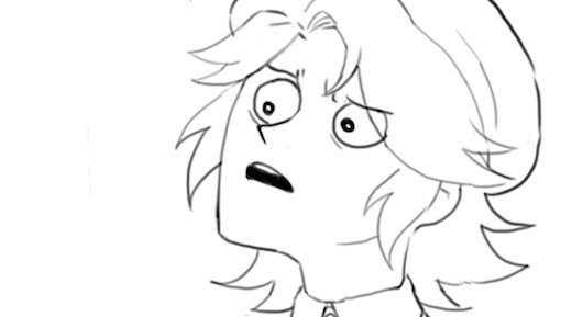 ? ?
|
|
|
|
|
|
2014-09-19, 04:26
|
Link #413 | ||
|
Senior Member

Join Date: Jan 2006
Location: The Netherlands
|
Quote:
Quote:
That is a bit strange. One detail which isn't very important, but would be nice to have for Tomitake's sprites is his beer belly. Takano comments on it in the visual novel. It is also visible in the ordinal sprites, but seems to be missing in the PS2 sprites. 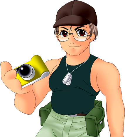
Last edited by chaos_alfa; 2014-09-19 at 04:41. |
||
|
|
|
|
2014-09-19, 06:51
|
Link #415 | |||
|
Senior Member
Join Date: Nov 2012
|
Quote:
You don't seems to understand that it's an ANATOMY problem to being with, those muscles doesn't even make any sense and the lines make them look horrible, he feels like a fish damnit. Quote:
Oh, true, forgot that. And just in case, The Shion we see at the beginning of Watanagashi WAS Mion (Shion first appeared at the dessert day), so it doesn't even make sense anyway. Quote:
So, which version do you prefer ? from left to right, Alchemist, Mangagamer, Mangagamer with some colors changes, and Mangagamer with some colors changes and the arm muscles removed, and finally same as before without the abdominals, like the Vanilla version. 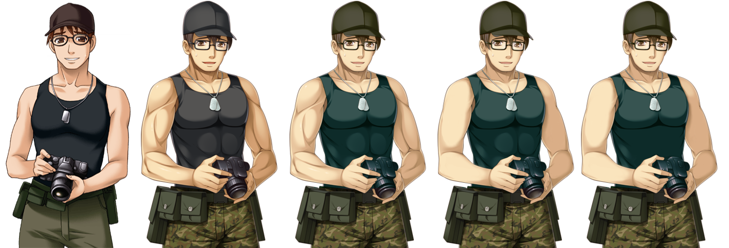
Last edited by TheGuraGuraMan; 2014-09-19 at 07:05. |
|||
|
|
|
|
2014-09-19, 06:52
|
Link #416 | ||
|
貴方が私のマスターか?
Join Date: Jul 2014
Location: Georgia, Tbilisi
|
Quote:
Quote:
|
||
|
|
|
|
2014-09-19, 07:30
|
Link #418 | |
|
貴方が私のマスターか?
Join Date: Jul 2014
Location: Georgia, Tbilisi
|
Quote:
|
|
|
|
|
|
2014-09-19, 07:34
|
Link #419 | ||
|
Senior Member
Join Date: Jan 2006
Location: The Netherlands
|
Quote:
Quote:
 It is interesting to see where the sprites differ from each other, what it means and how they can be improved if found necessary. |
||
|
|
|
|
2014-09-19, 07:45
|
Link #420 | |
|
Senior Member
Join Date: Nov 2012
|
Quote:
Agree, tough I was more asking which version of Mangagamer you prefered. Actually, the fat arms could fit the fact that he's getting a bit fat, which seemed to be the case in the vanilla. But indeed, removing the muscles make it obvious the arms were made a bit too big. And Considering that Alchemist actually did gave him good abdominals :  Oh, and btw, had the idea to make some images looking like the cards in the limited edition of Matsuri, what do you think ? Spoiler for Minigaroshi:
Those ones is in french, but could make ones in english too, also have an english logo. If you've got a proposition of character along with a line, wouldn't mind making it. Last edited by TheGuraGuraMan; 2014-09-19 at 08:34. |
|
|
|
|
 |
|
|