2007-03-08, 18:36
|
Link #2681 |
|
~ You're dead ^__^* ~
 Graphic Designer Graphic DesignerJoin Date: Apr 2006
Location: uk, England
Age: 34
 |
KiNA! ~ version 2 i see?
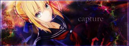
 i think i liked your other one better tbh...the animated words really did make it look stunning ~ i like it now but the problem is that the "fire" section doesnt seem to fit with the overall sig >.< maybe its cause both of the stocks are to close to each other ~ 8/10 i think i liked your other one better tbh...the animated words really did make it look stunning ~ i like it now but the problem is that the "fire" section doesnt seem to fit with the overall sig >.< maybe its cause both of the stocks are to close to each other ~ 8/10Aoie Emesai ~ cute ^__^ it needs a boarder tho ~ also the girl on the right doesnt seem to be part of the pic :/ 8/10
__________________
|

|

|
|
2007-03-08, 21:07
|
Link #2682 |
|
"Show it to me"
Join Date: Dec 2005
Location: In solitude, where we are least alone
|
KiNa: I like the fiery BG. Somehow it matches her. 8/10
Aoi_Emesai: Quite adorable. 8/10 Deathkillz: Another Ikkitousen sig? Well, I see that you didn't use your trademark font style hm? BG is okay. Pic is rather bad on the quality side. Your current font style doesn't seem to match it IMO. 7/10
__________________
|
|
|
|
|
2007-03-09, 00:41
|
Link #2683 |
|
of Porsche
Join Date: Jul 2006
Location: Pasadena, California
Age: 39
  |
Everybody's got new sigs. :P
Cyz 8.8 Your sig reminds me of tetris lol. But jokes aside, it's a fine piece of work. Layout is good, placement is good, and I won't comment on what the girls are doing there. = P I think the choice of text is appropriate: not really sticking out but that's the general atmosphere you wanted to convey, eh? Perhaps that's the thing with it; it's all white and orange. It's visually pleasing to look at, but it's not really striking me with shock and awe or something (short of the yuri lol). To be honest, this signature has no flaws. My personal tastes just ask for more contrasting colors like blue or green to go against the peach-white layout of this forum. Deathkillz: 8.2 I've no idea what Ikkitousen is but it must be full of girls who go to the gym a lot. O_o Well you've got the abstract background going on again. I particularly like how you got the star place on the woman's forehead on the left. But the bloated image is of lower quality and a little distracting (those lines around her neck and chin just aren't smooth). I think it might be better to mask all those abstract lines going in front of the girl on the right since parts of her face and body have streaks of white that don't work well imo. Nice to see you change your trademark font but upon closer inspection, you should stick to it now. lol Kinda like me. = P Klashikari: 9.1 Hmmm I'm pretty sure I rated yours a long time ago since it hasn't changed. I like how incorperated so much Japanese in there and the mix of color is a nice touch. If you still have your .psd file, you should try some other JP fonts that are a bit more artsy, kind of like cursive for English. There are other background effects that you have that go well because it doesn't really stand out that much. As a whole, the image is kind of dull, but appropriately so. Aoie_Emesai: 7.6 It lacks a lot of color. >_> Framing is okay, but was that chibi-witch on the right added in? It doesn't seem to fit with the lady in the red hat. :x It might work with darker lines or something. A full border isn't really necessary per sae, but at least some line going through the top and bottom (like mine) would help imo. Seems like the left side would blend into the forum white easily. ChibiDusk: 7.0 The white sillouette is something I haven't seen in a while on a signature. But I think it doesn't help to have the left side have so much white too. Not enough contrast. Well, actually no that's not the problem. I think it's the fact that the background looks like cloud covers with the colors inverted of sorts. It's a particular filter that takes like 5 seconds to do. I dunno. I'm sure you put a lot more effort into the signature than I think you did. But I think it just needs more contrast, less white and grey. You already have a pure-white sillouette dominating a portion of the canvas, y'know? ---------------------------------------------------- Well this is a much better do of pairing my favorite Kanon characters compared to my previous one. And I think I know why. Recall my previous signature:  See the problem? Too much content, too many effects, and my name placed in the center certainly didn't help establish a proper balance (the katakana leaning to the right brings the viewers' eyes to the right...rightfully so since she's the brighter object). Furthermore, there's too much spacing between the two. Doesn't really hint the kind of affection I was going for. Below, the two are put much closer and it blends well since the two arethat close together in the real scene. No need to photoshop their placements together. I went for the minimalistic approach and worked more on creating mystisism through filters rather than effects. Instead of orange blending to blue, it's blue blending to green. I'm deeply satisfied with this one and I think I'll keep this for a while. I can happily call this 10/10 work. I hope the masses will too. =] EDIT: Try and find the major edit here! (Hint: go frame by frame of this episode and pay attention to the eyes) Last edited by Zaris; 2007-03-09 at 00:45. Reason: Extra Game lol |
|
|
|
|
2007-03-09, 01:22
|
Link #2684 | |
|
♪♫ Maya Iincho ♩♬
ArtistJoin Date: May 2004
Location: Unnecessary
Age: 37
|
Quote:
Zaris - oh, very nice. Quite touching too. 9/10 I left the chibi girl on the bottom right there cause without her, no one would even recognize that the girl in the middle is Marisa in a slightly smaller miko outfit. (which we can't see)
__________________
Last edited by Aoie_Emesai; 2007-03-09 at 01:45. |
|
|
|
|
|
2007-03-09, 09:57
|
Link #2685 |
|
"Show it to me"
Join Date: Dec 2005
Location: In solitude, where we are least alone
|
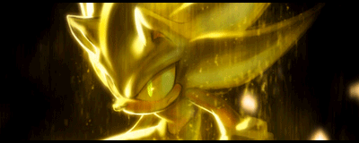
KiNa: Change of sig again? And I see it's another Ikkitousen sig with a different girl. I like the BG designs and the pic is nice too. Is it me or does it look blurry? 8/10
__________________
|
|
|
|
|
2007-03-09, 16:22
|
Link #2686 |
|
~ You're dead ^__^* ~
Graphic DesignerJoin Date: Apr 2006
Location: uk, England
Age: 34
|
cyz ~ otoboku!
 is that the scene that was never shown is that the scene that was never shown ") cute and the BG looks great ~ 9/10 cute and the BG looks great ~ 9/10zaris ~ lol it looks kinda big O.o that aside i really like that scene ^__^ but tbh i thought that your previous one had more "skill" put into it  8/10 8/10~ seen as my stock failed last time...lets try again ^__^ edit: and i think i will stick to my signature font...it feels empty without something i can recognize
__________________
Last edited by Deathkillz; 2007-03-09 at 16:32. |
|
|
|
|
2007-03-09, 16:38
|
Link #2687 |
|
♪~ Daydreaming ~♪
Graphic Designer Administrator AdministratorJoin Date: Dec 2005
Location: Italy
|
Deathkillz: I like that one. Has a good lighting and I like the background (let alone the subject ^^) . 8,5/10
Cyz: The bg is a bit plain but on the whole the sign is rather impactful. 8/10 Aoie_Emesai: Cute. A soft border (soft like the hair color of the main character) would have been a good plus. I'd set a bit of opacity on the chibi on the right, because as it is now, it's sharper than the main subject, hence a bit distracting. 7,5/10 Zaris: I basically like your signs, but I really am not keen of those two black lines you put on the top and on the bottom. Probably they're meant to give a widescreen feeling, but they just don't suit. Ah, little tip: next time, please don't put the signature up straight after you've seen the raw. Let a day pass so that the subs are out. This way, it's kinda (too much) spoilerish ^^ 7/10
__________________
|
|
|
|
|
2007-03-10, 14:03
|
Link #2688 |
|
"Show it to me"
Join Date: Dec 2005
Location: In solitude, where we are least alone
|
@ Deathkillz: I don't know. I just found this pic of Mizuho and Takako kissing and it was nice. I think it was a CG pic.
Deathkillz: I think this was much better than your last one. Now, the BG matches to the mood IMO. 8/10
__________________
|
|
|
|
|
2007-03-10, 18:31
|
Link #2689 |
|
Sexy Tornado
ArtistJoin Date: Dec 2005
Location: The European Bunion
Age: 45
|
kaito-kid - Nice work, though the subject isn't particularly to my liking
 8.5/10 8.5/10Cyz - Takako <3 Mizuho is awesome too of course 8.5/10Not sure about my new one. It took a while to get it looking good, but I'm still unsure whether I like it as it is or whether I should try something different with it. The character is Presea from Tales of Symphonia. She's been my favourite for a long while so I thought it was about time I gave her some sig love. |
|
|
|
|
2007-03-11, 10:18
|
Link #2692 |
|
Kira_Naruto, the ecchi
Graphic DesignerJoin Date: Dec 2005
Location: http://www.exciting-tits.com/
|
@ Klash .. Messy sig again.. but that just you
..Somehow the mid edit:Mai feels a bit alienated O_o @ DK .. white lines are messy =/ @ Zaris .. hmm.. you seems to like calm simple style .. Altho, I dont really feel the sig aura .. erm .. whatever >.< @ KK .. hmm.. cant really say I like them tho ... @ Rad .. too simple for your level .. the emptyness is too noticeable @ Suhaki .. A crop job =/ @ KiNA .. hmmm, its kinda overbaked >.< Dont bother if I'm not rating requested sig >.> V @ Klash .. well.. I dont watch Kanon.. so meh, shits happens .. And you are dont watch BL like I dont watch Kanon.. so yeah __________________  Last edited by KiNA; 2007-03-11 at 11:29. |
|
|
|
|
2007-03-11, 10:47
|
Link #2693 | |
|
阿賀野型3番艦、矢矧 Lv180
Graphic Designer Moderator ModeratorJoin Date: Mar 2006
Location: Belgium, Brussels
Age: 37
|
Quote:
)messy? quite probably some "new things" i tried to do on the center, but meh... 4 months and half of loyal service, it was the time to change the rena sig for something "fresh", heh ~~
__________________
|
|
|
|
|
|
2007-03-11, 18:51
|
Link #2695 |
|
A Ninny Moose
Join Date: Dec 2006
Location: Loitering around
Age: 31
|
@ Ascaloth: LOL! perfect wording
@Kira : That sig is teh ownage man, nicely done grunge feeling @Klashikari : Calming colors, smooth, nice ^.^ @LunarCat : Who doesn't love the simple style of going no-sig
|
|
|
|
|
2007-03-12, 19:08
|
Link #2698 |
|
Lateral G's
Join Date: Nov 2003
Location: In a Green Coffee Cup
|
Klashikari: Pretty busy siggy you got their. Blends nicely though.
Zaris: Like both of those up there nice quality, but I cant escape the fact that I feel like I'm looking at a normal tv that's playing something in widescreen format. btw... my sig is like... 2 years old.... probably should make a new one... and an avatar.... whered it go!! |
|
|
|
 |
| Tags |
| rate, signature |
|
|


 9/10
9/10