2007-07-22, 13:21
|
Link #61 |
|
Senior Member
 Graphic Designer Graphic DesignerJoin Date: May 2007
 |
I 'm loving the kimi ga nozomu,
Being a bit girly like i am (no i'm not gay) i actually watched all of that anime. plus i like the artwork ^^ thats my excuse anyway i'm also digging the Seto no Hanayome avvy's great work as usual ^^ [i should make some stuff >.<] |

|

|
|
2007-07-22, 15:34
|
Link #62 |
|
~ You're dead ^__^* ~
Graphic DesignerJoin Date: Apr 2006
Location: uk, England
Age: 34
|
id say your chrono crusade one is just too bright x_x it seems to be missing some colours and even if you tend to create a "light emitting from her pendant/body" effect i think it would look better if the sides of the siggy are a darker shade of blue :3
__________________
|
|
|
|
|
2007-07-22, 16:27
|
Link #63 |
|
Thinking outside the box
Graphic DesignerJoin Date: May 2007
Location: The Netherlands
Age: 37
|
Mmm Kimi Ga Nozomu Eien (Ugh... what a hard name... And i thought utawarerumono was hard
 ) Never came over as a girly anime to me. Even though i didn't liked the anime very much. I love the op/ed and insert song. And the ending is actually good! One of the few better endings i saw so far. ) Never came over as a girly anime to me. Even though i didn't liked the anime very much. I love the op/ed and insert song. And the ending is actually good! One of the few better endings i saw so far.And meh... am i the only one thinking Rumbling hearts sounds lame compare to the original translation? I think The eternity you desire sounds much better and much more fitting for the anime. 3 versions with darker bg. Though the details the bg is made of become visible. 1.  2.  3.  Think the second one is a bit to dark. The third blue seems a bit to much. But mmm in the end i'm awful with deciding when there are so many versions of it already. And these are the moments i risk losing hair. I really can't decide with these things. But it was nice to learn making a sig like this. Just that i sort of lost control over it... It has 4-5 color balances. And 2 gradient maps. And 2 photo filters  So if someone can help me decide which version to call the final one. I would appreciate it. And hopefully the next version should i try this style again will turn out a bit better.
__________________
|
|
|
|
|
2007-07-22, 17:30
|
Link #65 |
|
~ You're dead ^__^* ~
Graphic DesignerJoin Date: Apr 2006
Location: uk, England
Age: 34
|
despite what you say i actually like the 2nd version most ^.^ the colour gradiant is just right in between your very first version and you recent 3rd version ~ she doesnt seem as "white washed" before wich is a good sigh of contrast and depth
 good job :3
__________________
|
|
|
|
|
2007-07-22, 22:28
|
Link #66 | |
|
"Show it to me"
Join Date: Dec 2005
Location: In solitude, where we are least alone
|
Quote:
__________________
|
|
|
|
|
|
2007-07-23, 05:22
|
Link #67 |
|
Thinking outside the box
Graphic DesignerJoin Date: May 2007
Location: The Netherlands
Age: 37
|
Than the second one it is
I been staring at it for to long to make a proper choice myself.I had a feeling someone would say the text is hard to read . I actually thought of increasing the size. But i cba rasterizing the layer again. And tbh... despite the fact that you can't really read the text. I'm fairly satisfied with the look of it and how it blends with the rest of the background  And meh.. if only i was this good at making scenery backgrounds. I could perhaps create the sky like bg + some ugliness. But the city would be quite hard. And meh... No point taking the long hard way if it turns uglier than the easy way  Thanks for comment guys 
__________________
|
|
|
|
|
2007-07-25, 07:00
|
Link #68 |
|
Thinking outside the box
Graphic DesignerJoin Date: May 2007
Location: The Netherlands
Age: 37
|
Thought of not making a sig for awhile.. But didn't had to work the last two days. So had loads of time...
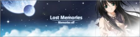
2 sigies to update. 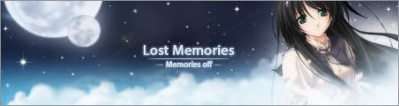 Saw a wallpaper of memories off. The girl looked so cute... Decided to make a signature of. alternate version. Different moon. And different blending with the light source near the girl. Spoiler:
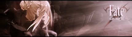
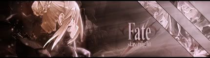 FSN. Was trying some of the GFX style. Not to bad outcome imo. Fitting avatars for the sigies   frameless version Spoiler:
I was thinking. Hell.. that first sig would even make a nice banner!  Talking about shameless Criticism and comments are appreciate it.
__________________
Last edited by Sephi; 2007-07-25 at 07:25. Reason: added banner v2 |
|
|
|
|
2007-07-25, 08:43
|
Link #69 |
|
~ You're dead ^__^* ~
Graphic DesignerJoin Date: Apr 2006
Location: uk, England
Age: 34
|
i duno about crits as i think the banner looks beautiful
 the mood is perfect and your blending technique is great! would cookie ya but i need to spread first *good job* the mood is perfect and your blending technique is great! would cookie ya but i need to spread first *good job*
__________________
|
|
|
|
|
2007-07-25, 08:55
|
Link #70 | |
|
hiatus almost permanent
Join Date: Apr 2007
|
Quote:
Very nice blending, just that the clouds to the right of the girl seem fluffy of a different texture from the other parts that's all =). But I think it's really great xD |
|
|
|
|
|
2007-07-25, 12:53
|
Link #71 |
|
Thinking outside the box
Graphic DesignerJoin Date: May 2007
Location: The Netherlands
Age: 37
|
Thanks for comment guys. I'm quite found of the night one myself to. So found of it that i wish the night one was the main theme.
@innominate. Was a bit hard to get that part done. But here is v3  Problem is as you can see in the sig. The render stops there. So the rest is just smudged out. And i'm sort of covering the lacking parts with white magic glow/cloud. I did made it more cloud like to fit the banner theme more. Also made a V3 of the sig in the gradient of the night banner. 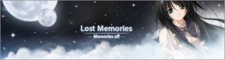 Also my Dawn banner  Just the render that is a bit Mmmm... Gone try find a better render that is cute and looking at the sky. Dusk one coming tomorrow. But i don't have to work again tomorrow. So i got plenty of time
__________________
|
|
|
|
|
2007-07-25, 13:59
|
Link #72 |
|
Retired
Graphic DesignerJoin Date: Mar 2007
Location: Princeton University
|
Really nice ones Sephi-san =3 I like the night one a lot, kinda inspired me to do my own night one
Well iono, 2 days for all the extensions is kinda hard for me, but your nice banners are really inspiring me to do them lol anyways GJ =3
__________________
|
|
|
|
|
2007-07-26, 12:12
|
Link #73 | |
|
Thinking outside the box
Graphic DesignerJoin Date: May 2007
Location: The Netherlands
Age: 37
|
Quote:
Banners Daytime gradient Air banner for the daytime gradient in the Sky banner contest   Aria Banner for the daytime gradient in the sky banner contest  Sola banner for the for the daytime gradient in the sky banner contest  Iriya no Sora banner for the daytime gradient in the sky banner contest  Extension banners Belldandy banner for the dawn gradient in the sky banner contest.   Aria Banner for the daytime gradient in the sky banner contest Card Captor Sakura banner for the dusk gradient in the sky banner contest   Memories off banner for the night gradient in the sky banner contest   Made the render on the Sakura and Belldandy banner larger. Changed the font of my Aria banner... It's almost silly how often i use the same font... But it can't be helped. I couldn't find a more suitable font for the Aria one. And the font fits Sakura and Belldandy perfectly imo Good luck to anyone who is participating in the banner contest
__________________
Last edited by Sephi; 2007-08-13 at 08:50. |
|
|
|
|
|
2007-07-26, 18:26
|
Link #75 |
|
Hail pork!
Graphic DesignerJoin Date: May 2007
Location: Silicon Valley
|
I was bored today and jacked an old render from you. Hope you don't mind but I also put your name on it to give you credit:
Here is a raw psd before I apply my gradient maps and advanced blending options:  This is the outcome after applied alterations: 
__________________
|
|
|
|
|
2007-07-27, 10:21
|
Link #76 |
|
Thinking outside the box
Graphic DesignerJoin Date: May 2007
Location: The Netherlands
Age: 37
|
I need some help here. I was thinking of scrapping either my Sola or Iriya banner. And i would like to hear someone opinion if i should replace sola or iriya banner for this air banner i cooked up today...
Air banner  Iriya no Sora banner for the daytime gradient in the sky banner contest Sola banner for the for the daytime gradient in the sky banner contest So any opinions are welcome.
__________________
|
|
|
|
|
2007-07-27, 11:14
|
Link #77 |
|
阿賀野型3番艦、矢矧 Lv180
Graphic Designer Moderator ModeratorJoin Date: Mar 2006
Location: Belgium, Brussels
Age: 37
|
I don't really like the air banner for several reasons :
1) the contrast between the left and right is a bit unbalanced. (the left brightness is searing, while the right brightness is dull) 2) the edges are kinda too obvious, much like how it was on the Sola and Iriya before 3) The font doesn't strike me really well..." 4) the position of Yukito and Misuzu is rather awkward : instead of being spectator of the sky (if they were on the center), i felt like they are kinda (out from nowhere), an impression of place holder, since AS is taking the right part. i will be frank and blunt : the Iriya and Sola strike me much sky and homogeneous feelings than the air, altogether. Also, something to nitpick with iriya : the right side isn't totally blended well (well these purp remnants of clouds are really weird). i believe you should mimic some cloud aspect of the right part. as for Sola, the font is still a bit bland, and the Birds really look... well not really part of the banner (either the blending of their sole presence)
__________________
|
|
|
|
|
2007-07-27, 15:14
|
Link #78 |
|
Thinking outside the box
Graphic DesignerJoin Date: May 2007
Location: The Netherlands
Age: 37
|
Thanks for your input Klashikari. Since no one i bugged could decide which to swap out. I decided to swap the Iriya out.
As for the update on the Air banner Previous version Final version turned out like this  Hopefully fixed the contras difference by lowering flare opacity. Changed render to... Hopefully more fitting than the previous one. Also changed the font. Though i think it's a either hate it or love it font ^^ But meh ... i like it As for the edges. I hope i fixed that to.. I don't want to lose to much of the edges by the blend..
__________________
|
|
|
|
|
2007-07-27, 15:29
|
Link #80 |
|
~ You're dead ^__^* ~
Graphic DesignerJoin Date: Apr 2006
Location: uk, England
Age: 34
|
oh really? thats a shame...i love the iriya banner and imo the matsuri one would be your weakest of the three >_<
imo the colours for your sky banner is pretty dull ~ you need to brighten it up a little or tweek with the contrast but as far as it's composition ~ it is fine
__________________
|
|
|
|
 |
|
|


 It honestly looked good in the gray background of photoshop!!! But on this white one the color seems dull