 2006-08-04, 15:44
|
Link #41 | |
|
Junior Member

Join Date: Jul 2006
Location: Sweden/Ljusdal
Age: 36
 |
Quote:
 And I most say that i really like Kairin she is so cute 
|
|

|

|
|
2006-08-08, 18:55
|
Link #42 |
|
Kairin-chan's #1 Fan
 Artist ArtistJoin Date: Jul 2003
Location: Canada
|
Well it's that time of the month again! Wallpaper time! YAY!!! Now Jojo can stop nagging me to finish it. lol
As promised, I said I would draw Kairin in a bikini, and after many grueling hours of work I finally finished. I have to say that I wish I had a widescreen monitor right about now. It just looks much better not having to crop off so much of the background. But I digress... So without furthur a due, I present bikini Kairin - the 128th wonder of the world!   Yes I know it's not a thumbnail (don't hurt me NightWish) I just wanted people to get a good first look at it. Btw, the kanji at the top right says "Umi no Yakusoku" which means "Promise of the Sea" which is what I have come to call this wallpaper. Once again, I hope you guys enjoy it. I worked hard on it for you guys. Here are the links for the zip files: http://www.azuremidnight.com/Wallpap...Widescreen.zip http://www.azuremidnight.com/Wallpap...chStandard.zip So as usual, I'll take a short break, then do some more Kairin art. No wallpapers for a bit since I want to just do some sketching. My next wallpaper will probably be chibi Kairin so watch out for that.  Btw, since I don't have a widescreen monitor, could the people who do please give me any feedback. Like if something gets cut off or what-not. I don't think it will since the resolutions are fine but, like I said, I can't check. Infact I got a new LCD monitor which replaced my old CRT (broke), and now 1280x1024 is my max res. Ah well! As always, any comments/questions/critiques are always welcome! EDIT: Fixed the preview pic. Okay the new Zips are now online. Thanks to Wao for pointing out my spelling mistake. So if you downloaded the old version, you can now get the correct version.
__________________
Last edited by Kiva128; 2006-08-09 at 08:57. |
|
|
|
|
2006-08-09, 05:21
|
Link #43 |
|
OK.
Join Date: Nov 2003
Location: The Fields of High Attus
Age: 34
|
Sorry for being absolutely and terribly anal, but "yakusoku" is written like this:
約束 You forgot the right side of the bolded character (that is "yaku") which looks like "勺". In order to not make this a spam post here's a lousy 10 minute sketch complete with useless, idiotic wapanese writing around it! Spoiler:
I guess I'll colour it... and then get back to work >:[
__________________
|
|
|
|
|
2006-08-09, 06:48
|
Link #44 |
|
sleepyhead
AuthorJoin Date: Dec 2005
Location: event horizon
|
@ Kiva128
Thanks for removing those awful and annoying dotsP.S. In the future... could you draw a Karin with a little more hair showing (but still nice and relaxing positions like the your latest masterpiece) and without the two pony tails... those things like the dots just look stressful (actually the dots looked painful  )... well that’s just my opinion... )... well that’s just my opinion...
__________________
|
|
|
|
|
2006-08-09, 08:03
|
Link #45 | ||
|
Kairin-chan's #1 Fan
ArtistJoin Date: Jul 2003
Location: Canada
|
Quote:
Quote:
As for the hair, I like the pony tail thingies. Without them, what would seperate her from any other anime elf character? That doesn't mean I won't try new hairstyles of course but I'm not sure why you find them 'stressful' Eruruu from Utawarerumono has only on and has a giant metal ring in it. Now that would be stressful. So if you don't like the dots and pony tails, you can watch for the pics where I don't have them. Other than that what can I say? I can't make everyone happy. Some like the dots, some don't. Some like the hair some don't, some like the ears, etc. I wish I could make a design that everyone likes, but there's no such thing. So I'll do the best I can.
__________________
Last edited by Kiva128; 2006-08-09 at 09:08. |
||
|
|
|
|
2006-08-09, 10:43
|
Link #46 |
|
OK.
Join Date: Nov 2003
Location: The Fields of High Attus
Age: 34
|
Oh that's okay really....
I think if people don't like the design very much they could try editing them out themselves or drawing their own one if they really wanted to... I dunno. It depends on people's attitude towards the mascot... is it the context (i.e. the typical kind of expressions and demeanour the mascot has in pictures) or small specific features (the exact face shape, the exact dress or decoration) that define the mascot? I coloured the pic I did earlier but it totally doesn't fit into the image of Kairin. I just felt itchy... so here we go:  . .
__________________
|
|
|
|
|
2006-08-09, 11:10
|
Link #47 | ||||
|
sleepyhead
AuthorJoin Date: Dec 2005
Location: event horizon
|
Quote:
Won't change no matter what ehh... that's the spirit Quote:
What other anime elf character !?... I thought the fact that you made an elf was pretty unique and original Quote:
Eruruu's little ring thingy is cute... and I think that its more part of her outfit then her character...Well that's just my n00by criticism... feel free to ignore some of the stupid things I say... I sometimes just get carried away... your work is excellent BTWQuote:
So that means your not just going to use the same Karin design over and over and over
__________________
|
||||
|
|
|
|
2006-08-09, 11:17
|
Link #48 | ||
|
Kairin-chan's #1 Fan
ArtistJoin Date: Jul 2003
Location: Canada
|
Quote:
Where's the fun in drawing the same thing over and over again? Next time I'll draw the ponytails without the beads in them. I actually wanted to do that with the swimsuit picture but I changed my mind.  Glad we got the dot thing cleared up. Quote:
And she doesn't have her elf ears. 
__________________
|
||
|
|
|
|
2006-08-09, 13:10
|
Link #51 | |
|
Asuki-tan Kairin ↓
Join Date: Feb 2004
Location: Fürth (GER)
Age: 43
|
Quote:
, since I want to promote her in my avatar. She's just too unknown in the forums.
__________________
|
|
|
|
|
|
2006-08-09, 23:20
|
Link #52 | |
|
OK.
Join Date: Nov 2003
Location: The Fields of High Attus
Age: 34
|
Quote:
I originally just drew whatever, realised I drew her forehead rather large, and therefore drew her originally looking angry at having a large forehead... then that sort of disappeared...Here's something I was scribbling on a paper while watching NHK ni Youkoso 5... and decided to give it a slapdash colouring since it's fun (and I'm slacking off again too!). As you can see, I switch around a lot of styles... and the drawings all look slanted cos there is a fair gap between the chair and the table so what looks normal to me while drawing, is actually slanted.black and white  edit: oh yes, thanks for the compliments lavielove Don't stab yourself to death though, it's too much of a waste...
__________________
|
|
|
|
|
|
2006-08-10, 07:15
|
Link #53 |
|
Kairin-chan's #1 Fan
ArtistJoin Date: Jul 2003
Location: Canada
|
I like your latest one a lot wao. Kairin has a cute hairstyle there.
You know what that particular drawing style reminds me of? If you've ever played Breath of Fire III or IV, it looks pretty close to the style of the official art. And Kairin for some reason reminds me of Nina and that blue haired person reminds me of Ryu. Which is cool since I love the Breath of Fire series (BoF2 FTW!). I see you're not hesitating to experiment so good job with that.
__________________
Last edited by Kiva128; 2006-08-10 at 07:41. |
|
|
|
|
2006-08-10, 08:16
|
Link #54 |
|
OK.
Join Date: Nov 2003
Location: The Fields of High Attus
Age: 34
|
I took a look at this Breath of Fire series you mention and you're right - I really like the look of the Breath of Fire III illustrations. They really fit in with the kind of style I seem to be veering a little more to recently. I'd like to draw like that someday.... It's not like I experiment though, I just can't decide on a style, seriously (there are some which I don't do if I don't want to though, like shoujo manga styles)
But her hairstyle here is a very obvious (subconscious?) ripoff of Silvia's hairstyle from Sousei no Aquarion .P.S. I coloured one of the other guys whose head pokes into there and made it my avatar... I kind of like how this doodling turned out - usually I don't work well with that pen, too....
__________________
|
|
|
|
|
2006-08-16, 13:30
|
Link #56 |
|
Kairin-chan's #1 Fan
ArtistJoin Date: Jul 2003
Location: Canada
|
Hi folks. Just dropping in with a quick sketch of Kairin. I wanted to try some new things (angles and such). I know there are lots of mistakes in it (hence the fact it's a sketch
)Anyways, here she is:  I may re-do this one so that it looks like high quality like my wallpapers, but I don't think I will for some reason.  We'll see. Anyways, until next time!
__________________
|
|
|
|
|
2006-08-17, 00:48
|
Link #57 |
|
Weapon of Mass Discussion
FansubberJoin Date: Feb 2003
Location: New York, USA
|
Strangely I love it. The angle is very striking and I love the pattern of her clothing. Most interesting of all is the expression on her face. This is a very serious, forward looking Kairin focused on the horizon. I love her like this. Even the very roughness of the artstyle adds to the impresison that she makes.
I'm hoping that you finish this drawing someday. But don't polish her too much.
__________________
|
|
|
|
|
2006-09-12, 08:19
|
Link #58 |
|
Kairin-chan's #1 Fan
ArtistJoin Date: Jul 2003
Location: Canada
|
Nothing new here (yet).
But I just saw the new Halloween banner contest and I was thinking. If people wanted to use the Kairin beach picture, there's a flower in her hair which isn't very Halloween-ish. So I removed it and made the picture easier to edit with an all white background. 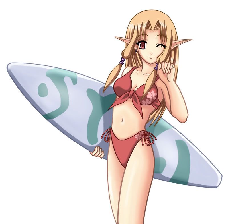 Hope that helps!
__________________
|
|
|
|
|
2006-09-12, 15:35
|
Link #59 |
|
¤ simply h0t baby ;D
Join Date: Sep 2006
Location: Germany
|
hm i m new in this forum and i did browse this thread.. maybe i overread it but:
with which program do u color :O i really like the beach picture - especially because u used colored lineart. it makes the picture have a nice warm touch. (maybe for a halloween pic u can post one with dark outlines :< would fit better i guess) cant wait for an xmas angel pic tbh edit: omg the smiley i used looked angry .__." wanted just a normal smiley |
|
|
|
|
2006-09-12, 15:53
|
Link #60 | |
|
Kairin-chan's #1 Fan
ArtistJoin Date: Jul 2003
Location: Canada
|
Quote:
I used Photoshop to draw and colour all the pictures I did in this thread. No pencils or paper involved. I'm glad you like my work. Keep an eye out since the next one coming should be...good.
__________________
|
|
|
|
|
 |
| Tags |
| kairin, wiki candidate |
| Thread Tools | |
|
|


 ... besides... those ears would make any character special
  ... now I want to give you another green cookie


