2008-11-19, 04:16
|
Link #441 | ||
|
~La-la Land~
 Graphic Designer Graphic DesignerJoin Date: Jul 2007
Location: Seattle
Age: 37
|
Quote:
Quote:
 thanks so much Malin, that means a lot coming from you. You seem to like soft and pretty sigs, and it shows in the ones you make! thanks so much Malin, that means a lot coming from you. You seem to like soft and pretty sigs, and it shows in the ones you make!Anyways....updates: Spoiler for sig requests:
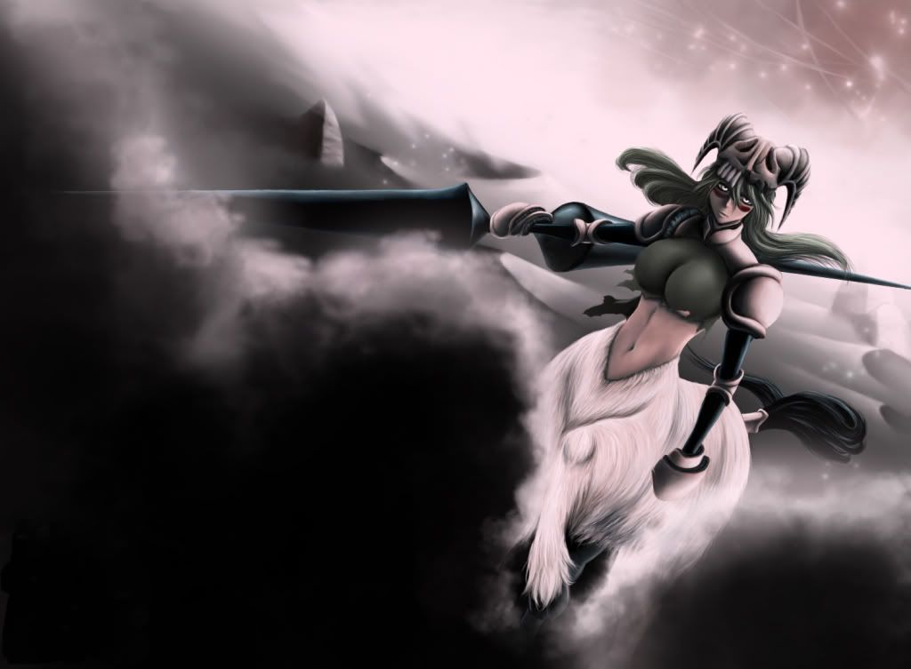
Banner for International Saimoe League 2009:  Source image by Kagaya, my new favorite graphic artist >.< AND need to make my final decision soon for the nov sotm comp:  I really like this render, but I had a hard time incorporating things with it. So it's sortof a call between this recent one, or my first attempt Spoiler for sig1 for comparison:
Whew *deep breath* As usual, CnC would be wonderful~
__________________
Last edited by Marina; 2008-11-22 at 04:28. |
||

|

|
|
2008-11-19, 07:04
|
Link #443 | |
|
ǾΝΈ ΡЇΈÇΈ is the Best !!

Join Date: Apr 2007
Location: away from you
Age: 35
|
Quote:
 Second ..I Like The new Version Better than The old one ..
__________________
|
|
|
|
|
|
2008-11-19, 12:19
|
Link #444 |
|
Thinking outside the box
Graphic DesignerJoin Date: May 2007
Location: The Netherlands
Age: 37
|
[-------meh meh part------------][===Very nice part!===]
 [----------meh meh part---------------][=Very nice part!=] WOAH! 1337 ascii ! I don't know what is going on at the left, nor do i know what it is, except for the dog/wolf like face in the middle which took me awhile to spot. But the upper right part of the sig looks awesome.
__________________
|
|
|
|
|
2008-11-21, 01:21
|
Link #448 |
|
~La-la Land~
Graphic DesignerJoin Date: Jul 2007
Location: Seattle
Age: 37
|
First off, let me thank everyone who helped me choose which sig to use for sotm, I'm always so bad at judging which of my own sigs I should submit >.<
I'm glad most of you liked the sig I did for Haku-chan as well, to be honest it was a REALLY hard sig to work on because the source image was already so beautiful. I had no idea what to do with it because I was afraid of ruining what was already there. @Sephi It's the two wolves sortof "cuddling" their heads together, and that entire left side is his ruff, but I get how the image confusing if you don't know what the character looks like. Anyways, here's a little MAL siggie I whipped up this afternoon:      And some request siggies:   evil AS restraints makes transparencies look so sad! evil AS restraints makes transparencies look so sad!   And a couple more banners I'm working on for ISML, as before, source image by Kagaya:  
__________________
Last edited by Marina; 2008-11-22 at 04:23. |
|
|
|
|
2008-11-23, 05:10
|
Link #452 | |
|
The Interstellar Medium
AuthorJoin Date: May 2008
Location: [SWE]
Age: 34
|
Quote:
Awesome work.
__________________
|
|
|
|
|
|
2008-11-23, 09:12
|
Link #453 |
|
Executioner
Join Date: Oct 2008
Location: Philippines
|
Hi there... Mr/Ms.Marina.. Can i request if you don't mind making me a signature?
In a size of 350x150 with a boarder line and putting also some text "I will always love you forever" and also my name "Kazuhara" if it's ok.. Spoiler:
I will wait for your reply patiently.. Thanks in advance 
__________________
|
|
|
|
|
2008-11-24, 03:02
|
Link #455 |
|
~La-la Land~
Graphic DesignerJoin Date: Jul 2007
Location: Seattle
Age: 37
|
Thanks for the comments everyone ^_^
@Cyz, I'm glad you like the sig, I was honestly having such a brain fart over it! @Daniel&Chaos - I love that MAL sig I made for quinset, I may have to shrink it down and use an edited version of it here sometime! The Kotomi one made me laugh too since it's HER..and the name of the person I made it for is 'Serenity'....  @RyviusRan - Thank you for the comment, I also love Monster, it's such a great show! I agree that it's a bit hard to find good works of it anywhere @AtomicoX, that means a lot coming from you >.< I <3 Kagaya's works and I had a lot of hair-ripping moments trying to figure out fonts to complement the banners just right. @kazuhara - PMd reply So down below in the spoiler was a little project of mine I've been working on for a few days... and I'm taking a break and calling it done for now! I know it's not perfect, but I think I'll take a step back and look at it again sometime next year  Spoiler:
Cute toradora headphone render:  and a new logo 
__________________
Last edited by Marina; 2008-11-24 at 06:20. Reason: added render |
|
|
|
|
2008-11-24, 03:47
|
Link #456 |
|
The Interstellar Medium
AuthorJoin Date: May 2008
Location: [SWE]
Age: 34
|
I think you did it again with the exception that it might be a bit crowded with the fonts between the categories. They kinda mash together in some places.
On the other hand, very nice idea providing links AND in the way you have done it. I didn't know it was links or even multiple pics until I actually clicked on them. As a summary, I sense some of the same techniques you used for the banners, namely the fonts and colors. My opinion is the same for this one as for the banners, except the crowding problem.
__________________
|
|
|
|
|
2008-11-24, 06:53
|
Link #458 |
|
Thinking outside the box
Graphic DesignerJoin Date: May 2007
Location: The Netherlands
Age: 37
|
Aria !!! So many pictures of Aria i don't have yet
I like the soft/calm aria like feeling of it. The favorite anime is a bit to crowded and lacking a structure. But other than that. I think it's a nice idea. Nicely done with the linking to You could turn it in to a website template.*goes to some imageboards now*
__________________
|
|
|
|
|
2008-11-24, 13:00
|
Link #459 | |
|
Banned
Join Date: Jun 2008
Location: Currently stalking, Evil Rick, Larthak, Malin, Kholdstare, lv23, as always Endrance.anafewothrs
|
Quote:
Because there aren't that many renders that haven't been used. I will take these Spoiler for savin space:
I don't want specifics I leave it up to you. Thank you! Last edited by Utsukushii Hono'o; 2008-11-24 at 13:23. |
|
|
|
|
|
2008-11-24, 13:25
|
Link #460 | |
|
Paparazzi
Join Date: Mar 2008
Age: 41
|
Quote:
 This one is going to be hard to top. Source for the Aria chibis? Pretty please! |
|
|
|
|
 |
| Tags |
| avatars, banners, signatures |
|
|


 Why couldn't I have been a Bitch?!


")


 You're keeping yourself busy I see :eyebrows: