2009-03-04, 02:12
|
Link #41 | |
|
sleepyhead
 Author AuthorJoin Date: Dec 2005
Location: event horizon
|
Quote:
__________________
|
|

|
|
2009-03-04, 05:17
|
Link #45 | |
|
sleepyhead
AuthorJoin Date: Dec 2005
Location: event horizon
|
Quote:
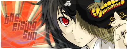
I'll sumirise the current "tengu" text font/style/position as one word: fail I like her expression and the feeling of wind; even though I do not recognize the character the association with a tengu is not bad. The sticks and the text is disorientating and confusing. Maybe try something more accessible and intuitive in its place?
__________________
|
|
|
|
|
2009-03-04, 06:18
|
Link #46 |
|
(ノಠ益ಠ)ノ彡┻━┻
 Moderator ModeratorJoin Date: Mar 2006
|
The tengu text is kinda cheesy I'll admit.
 It's something I'll probably mess with in the next version, thank you for finding the kanji for it. The character is not one I recognize either, but I liked the stock (I can provide the original if anyone cares to see it) and the expression seemed good for drawing a focus. It's something I'll probably mess with in the next version, thank you for finding the kanji for it. The character is not one I recognize either, but I liked the stock (I can provide the original if anyone cares to see it) and the expression seemed good for drawing a focus.I'm not sure what you mean about sticks. Is the text/font just too intrusive? I was worried that no text or very hard to see text might unbalance the signature because the viewers eyes might be drawn to the right side too much. @KiNA - I actually had an idea for a fourth signature. An animuted one. ^^ This is a fun theme. 
__________________
|
|
|
|
2009-03-04, 06:24
|
Link #47 | |
|
is not amused
Graphic DesignerJoin Date: Jul 2007
Location: Naval Base
|
Quote:
 I saw the stock image provided while hunting for some pics that I could use for my first draft.
__________________
|
|
|
|
|
2009-03-04, 07:20
|
Link #49 | |
|
sleepyhead
AuthorJoin Date: Dec 2005
Location: event horizon
|
The recent anime adaptation has just 1 (one) episode. There exists a older poor incarnation as well.
Quote:
__________________
|
|
|
|
|
2009-03-04, 11:42
|
Link #52 | |
|
Black Dragon
Graphic DesignerJoin Date: Dec 2007
Location: In the Netherrealm, thinking who to betray next...
|
Quote:
__________________
|
|
|
|
|
2009-03-04, 11:55
|
Link #54 |
|
Senior Member
Join Date: Nov 2006
Location: Virginia, USA
Age: 62
|
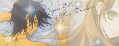
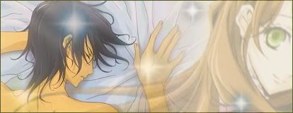
My second attempt. Two versions, one with text and one without as Evil Rick suggested trying.
Spoiler for screen space:
Opinions? Recommendations? Preferences? Does the concept of Lydia as a dream figure come across without the text's explanation?
__________________
|
|
|
|
2009-03-04, 12:34
|
Link #56 | |
|
Reisen FTW!
Graphic DesignerJoin Date: Aug 2006
Location: Chicago,IL, USA!!!!
Age: 31
 |
Quote:
__________________
|
|
|
|
|
2009-03-04, 12:47
|
Link #58 | |
|
Kira_Naruto, the ecchi
Graphic DesignerJoin Date: Dec 2005
Location: http://www.exciting-tits.com/
|
Quote:
 You'll have to sharpen the overall sig, it look too washout. Playing with level also should help.
__________________
|
|
|
|
|
2009-03-04, 15:28
|
Link #60 | |
|
Ha ha ha ha ha...
Graphic DesignerJoin Date: Apr 2006
Location: Right behind you.
Age: 35
|
Quote:
As usual, I have an idea for a signature but I don't know if I actually feel like making it. I can't compete with the vets like KiNA and Solace anyway. Their signatures ALWAYS pwn mine.
__________________
|
|
|
|
 |
| Tags |
| contest, sotm |
|
|


 , is it from a doujin or something?