 2008-04-19, 22:48
|
Link #6361 |
|
Klutz
Join Date: Jun 2007
Location: California
Age: 32
|
Xellos-7/10 Made me laugh, but the quality brought it down a bit.
Hakkun-8/10 I like the color scheme, but I'm not too fond of those kinds of borders Marina-Posted sig-8.5/10 The only thing is that the top corner is awfully bright. >.< Regular sig-9/10 The colors are wonderful <3
__________________
|

|

|
|
2008-04-20, 01:18
|
Link #6364 |
|
ISML Technical Staff
 Graphic Designer Graphic DesignerJoin Date: Dec 2006
Location: Phoenix, AZ
Age: 35
  |
Hakkun: 8.5/10, because I like those characters and the way they're portrayed.
Hakuryu: 8.5/10, Nice borders, and cute picture. Chaos: 8/10, Hm, not really into the dark composition of the sig, but I really like the text. Cut-Tongue: 7/10, It's probably something I'm not getting, but it looks simplistic even though it could have been a difficult original sketch. @mine: This is my super-bad-quality entry for March SoTM.
__________________
|
|
|
|
|
2008-04-20, 03:31
|
Link #6365 |
|
~ You're dead ^__^* ~
Graphic DesignerJoin Date: Apr 2006
Location: uk, England
Age: 34
|
Xellos-_^ ~ no need to twist the meaning behind that this time
") Marina ~ The first one is nice, but perhaps you can lower the opacity of the area behind the text a bit more. But overall I like the clean theme of the siggy  8.5/10 KholdStare ~ Lol...did you aim for fake transparency? XD Yea, the quality is quite bad. But the theme is nice even if the BG does look a bit odd with the girl. 7/10
__________________
|
|
|
|
|
2008-04-20, 16:30
|
Link #6367 |
|
Black Dragon
Graphic DesignerJoin Date: Dec 2007
Location: In the Netherrealm, thinking who to betray next...
|
KholdStare: Good, what anime? 8/10
Deathkillz: Rozen Maiden. Right? 8/10 Endrance: Wait, is that the image you take to the sig request? I don't remember that it was meded there, but well, looks a bit plane 6/10 Hey, I just made this sig but is to heavy to be used in AS T3T Can you rate it anyway? 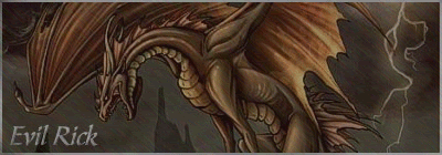
__________________
|
|
|
|
|
2008-04-20, 17:37
|
Link #6368 |
|
ISML Technical Staff
Graphic DesignerJoin Date: Dec 2006
Location: Phoenix, AZ
Age: 35
|
Deathkillz: 9/10, No border? Still wins.
Endrance: 8/10, I'm probably missing out on some deep message here.  Evil Rick: 8/10, Pretty good animation, but the flashes could be slower, and the text could be better.  @Evil Rick: That was actually from a game, Yggdra Union.
__________________
|
|
|
|
|
2008-04-20, 20:31
|
Link #6369 |
|
♥Sebastian's new wife♥
ArtistJoin Date: Aug 2006
Location: USA
Age: 31
 |
kholdstare: 8/10
Evil Rick: Current siggy, 6/10 Flash could've been slower. New one: Though it exceeds AS rules, it is good. Better than the current sig. 7.5/10 deathie: 8/10 because the colors and blur are very pretty :P. Everyone else: An average of 8/10 as usual.
__________________
|
|
|
|
|
2008-04-20, 20:40
|
Link #6370 |
|
Black Dragon
Graphic DesignerJoin Date: Dec 2007
Location: In the Netherrealm, thinking who to betray next...
|
The Chaos: Don't want to make her anger
9/10Xellos-^: No, although it sounds strange, it don't calls my attention 5/10 Marina: Cute! ^.^ 8/10 Hakkun: Also cute! O3O 7.5/10 Hakuryu: What does the text says? 8/10 Cut-Tongue: Sorry, it don't look good, you better change it 5/10 KholdStare: I like Rozen Maiden 9/10 mimi girl: Simple but cute 7/10 @KholdStare: 
__________________
|
|
|
|
|
2008-04-20, 20:58
|
Link #6371 |
|
~La-la Land~
Graphic DesignerJoin Date: Jul 2007
Location: Seattle
Age: 37
|
Evil Rick - 8.5/10 Just needs a border ^_^ Much better than your past ones, I actually like your current sig and the text isn't distracting. Good animation too.
mimi_girl - 7.5/10 Unique style, I likes Endrance - 7/10 not bad, text positioning and font just a little lacking. The outer glow on the text especially is sortof cheesy, you can do better! (like the image itself though) dkz - 9.5/10 Love it
__________________
|
|
|
|
|
2008-04-21, 04:32
|
Link #6375 |
|
Ka-na-me...^^
Join Date: Jan 2007
Location: Holland
Age: 33
|
Kasumigirl and ice climbers: already rated before
Aoie: The girl looks nice but the starry effects is a bit to much, the text is also blurry, but nice sig 7/10 Marina: Bit to many colours...bit still nice 7/10 Evil rick: 1. dragon: Looks nice, animation is better and good pic 9/10 2. knight: Much better then ur last sig, nice animation 8/10 mimi girl: The girl is a bit to purple(i know the render), i think to much gradiant map...6/10 Kholdstare: Bit bad quality yes but i like this char so 8/10 |
|
|
|
|
2008-04-21, 08:20
|
Link #6377 |
|
~Rock ☆~
Graphic DesignerJoin Date: Apr 2007
Location: In The Farplane
|
Evil Rick-I love the rain and how the flashes actually look like lightning-10/10
as for your actual one i like the light on the blade-8/10 Kholdstare-Beautiful!-8/10 Aoie_Emesai-I like the shimmer affect it gives it a nice feel 9.5/10 Marina-Very pretty-8/10 Ice Climbers-What else can i say-10/10 The Chaos-Ahh! Soul Eater sig...love it-10/10
__________________
Last edited by Endrance; 2008-04-21 at 16:01. |
|
|
|
|
2008-04-21, 10:26
|
Link #6378 |
|
Constellation
Graphic DesignerJoin Date: Jan 2008
Location: Pearl of the Orient Seas
Age: 31
|
Endrance... nice sig... cool effect ^_^ 9/10
The Chaos.... Maka looks really cool in your sig ^^ 9/10 Aoie_Emesai.... the light, shimmering effect really fits the pic 10/10 Shinbou... hmmm Vampire Knight sig... looks neat especially the text 7.5/10 Evil Rick... you have a very cool new sig! but I don't know who's that =3 8/10
__________________
|
|
|
|
|
2008-04-21, 18:38
|
Link #6379 |
|
Black Dragon
Graphic DesignerJoin Date: Dec 2007
Location: In the Netherrealm, thinking who to betray next...
|
Marina: Cute very cute 8/10
Aoie Emesai: Nice but who is she? 8/10 Shinbou: Not bad but with a border it should be much better 7.5/10 Endrance: Lain? 7/10 samuraidude: A bit plane but I like it 7.5/10 Hey, I made another sig but it also is too heavy to be used here T_T Can you rate it anyway? 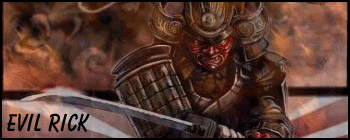
__________________
|
|
|
|
 |
| Tags |
| rate, signature |
|
|


