 2006-01-30, 16:27
|
Link #241 |
|
Sugar has side effects
Join Date: Dec 2005
Location: Anywhere Khamsin goes
Age: 30
 |
Cyz: It's saber all saber sigs now 8/10
Kira_Naruto: Nice rider sig love the colour purple ^^ 9/10 ForeverGoNe: It's nice I love the colours you picked out 8.5/10 Streetor: Hmm black and glowing green sort of look werid 7/10 Manaras: Once again a Saber sig 8/10 uchiha rave: Very Gothic 7/10 |

|

|
|
2006-01-30, 19:16
|
Link #242 |
|
The Hawqman
Join Date: Dec 2005
Location: Ottawa Ontario
Age: 33
|
Wintersummer thats a nice looking sig, the font is kind of too small, and you could have done more with your backround 8/10
Streetor your sig is unique, but it has nothing that i can say "wow" about i know you can make much better sigs then that 6.5/10 Manaras the backround is good and everything, but the stock does not go with that black backround 7.5/10 Well this is a sig i made like 2 months ago, but never really got the chance to post it. 
|
|
|
|
|
2006-01-30, 19:40
|
Link #243 |
|
The Lone Gamer
Join Date: Oct 2004
Location: A changed place
Age: 35
  |
Mr.Hawq - Nice but A bit to crowded perhaps you should take advantage of the 500 X 160 pix limit. 7/10 Oh yeah the Hellsing sig looks good but I somehow find your sigs all a bit to croded like I said take advantage of the limit
Winter&Summer - Low quality and a little hic up on the top left border plus it is really small. 5/10 Meh my si is a quick slap dash one that I just made quickly by using refuse out of a Berserk Wallpaper I am working on. |
|
|
|
|
2006-02-01, 07:45
|
Link #244 |
|
Kira_Naruto, the ecchi
 Graphic Designer Graphic DesignerJoin Date: Dec 2005
Location: http://www.exciting-tits.com/
|
@ streetor.. hmm.. simple but interesting ... 70%
@ winter-san .. a bit low Q source.. and the BG is plain .. 64% @ Hawq .. WB.. Current sig.. too dark and crowded.. Your name stamp out made it look inappropriate. 50% . The one in your post is too bright instead... and still look a bit havoc (or crowded) I guess thats your trademark ^-^ . Honestly, you've done better in the past .. 60% @ mxg .. I learnt to appreciate junk item more after watching Rozen Maiden.. In fact, Im think I fall in love with one particular junk  .. Yours, was quite nice bar the facts that the BG picture was quite blurry.. and the 2 horizontal lines cuts out some heads 0_0.. A 68% .. Yours, was quite nice bar the facts that the BG picture was quite blurry.. and the 2 horizontal lines cuts out some heads 0_0.. A 68%@ KiNa .. A new siggy  ... Turn out differently from what I intended tho... ... Turn out differently from what I intended tho...  Both image are a pain to extract out >.< Both image are a pain to extract out >.<
__________________
|
|
|
|
|
2006-02-01, 12:43
|
Link #245 |
|
"Show it to me"
Join Date: Dec 2005
Location: In solitude, where we are least alone
|
winter&summer: im guessing those are from ccs? anyway, they are cute 8/10
mxg: the black and white color really suits the mood of the sig but it's plain 7/10 kira naruto: another rider sig? anyway, as always, the cut-out style is very nice 10/10
__________________
|
|
|
|
|
2006-02-02, 23:53
|
Link #248 |
|
Inflammation
Join Date: Sep 2004
Location: Cardboard Box
Age: 40
|
@Sakura - It looks nice. Not bad at all, I like the shape of the sig.. It's unique 8/10
@Hawq - That's some really nice blendin you have there. I like the style in which you did the players, it's really effective (I forget the name of the style offhand). It's pretty solid. 9/10 @Winter - I've seen better stuff from you. It doesn't stick together at all but I like your idea of using the disney themed text. 6.5/10 |
|
|
|
|
2006-02-03, 03:55
|
Link #249 |
|
Kira_Naruto, the ecchi
Graphic DesignerJoin Date: Dec 2005
Location: http://www.exciting-tits.com/
|
@ Hawq .. Still messy :/ .. the top and lower corder kinda cool ... overall 72%
@ Sakura-chan[/b] .. Cool shape...  .. thats about it that I can say .. .. [b]84%/b] .. thats about it that I can say .. .. [b]84%/b]@ FG .. your brush BG always fascinated me... but not very fond with blending main image too much... and I cant see your invisible border >.> .. Still 88% for the BG.. @ KiNa .. @ hawq.. we definitely have different definition of coolness in sig making ,_, .
__________________
|
|
|
|
|
2006-02-03, 04:43
|
Link #250 |
|
♪~ Daydreaming ~♪
Graphic Designer Administrator AdministratorJoin Date: Dec 2005
Location: Italy
|
KiNa: uhm.. although technically well realized (especially for the image extractions), your signature looks just like before the previous ones. Always a naughty Rider. I don't know, I guess it doesn't suit my tastes. Also, that monochrome used... hmm .. I sincerely expect more from you... imho you've done much better signs for other peoples 7/10
ForeverGone: yet another masterpiece of a background, nothing less from you! I've to agree that the blending main image isn't the very best. Still, another sign I could say it was done by you watching it from 1 mile away. My preferred is still the one with Tohru (was that her?), but anyway 8,75/10 Winter&Summer: Nice idea but very poor source. The background would have been better if offering a bit more. The Disney font is a plus and another plus is that I'm a CCS fan. 6/10 Mr.Hawq: Albeit not being a particular fan of basketball, I think you obtained a good mixture of colours and subjects. Maybe it is a bit too wide. I'm realizing a sign is usually better when not trespassing the 320/350 lenght limit. 8/10 Sakura-Chan: very good work on the bordering. As said by the others, "unique" is the adjective fitting it better. 7,5/10 Cyz: Superb realization, I may add that I don't particularly like Saber's closeup (either the one on the left, either the transparent on the center). She's .. a bit unkawaii, I like her more detailed. Nothing to say about the rest, the right image is good, bg and blending are excellent. 8,5/10
__________________
|
|
|
|
|
2006-02-03, 12:06
|
Link #251 |
|
"Show it to me"
Join Date: Dec 2005
Location: In solitude, where we are least alone
|
Mr. Hawq: i like the designs and the colors matches up perfectly. funny, it reminds me of shoes advertisements
 9/10 9/10Sakura-chan: the shape of your sig is nice. I like the colors too (I always have a fascination with blue) 8/10 -> sig changed again (yeah i know...again) my new sig was made by KiNa (thanx KiNa!!!!)
__________________
|
|
|
|
|
2006-02-03, 16:44
|
Link #252 | |
|
The Hawqman
Join Date: Dec 2005
Location: Ottawa Ontario
Age: 33
|
@cyz great looking sig, the opacity of the image blends well with the backround, i just dont like those small little white shiny dots there, and the text is kind of hard to read. 8.5/10
@sakura i like your sig, i love the way you did your border, and the sig it self looks quite nice so 8.75/10 Quote:
|
|
|
|
|
|
2006-02-03, 18:31
|
Link #253 |
|
LOVELY☆COMPLEX
Join Date: Dec 2005
Location: Ontario, Canada
|
k i took your advice and added a border...its was kinda thick though b/c the 1 px black border didnt show up...
 so i did 2. it didnt looks so good anymore so im sticking to my no border...or does anyone want to help me add a border to mine? so i did 2. it didnt looks so good anymore so im sticking to my no border...or does anyone want to help me add a border to mine?Streetor: i like it! i like the text written under it too haha. its simple but i cant really make out who the characters are. 8/10 Winter&Summer: i like the colours but the left image looks like a floating head. maybe a bigger font size would make it better, and the border is cut off on the left. just fixx it up abit and it will look much better! 7/10 Mr.Hawq: i like the red one a lot. i really like the colours and your current one is nice too i like the border but your name doesnt really stand out. red one:8.5/10 current one:8/10 mxg: i like the text colour and the design but the two black strips are kinda thick imo. it covers part of some of the ppls heads but overall good! 8/10 KiNa: I like the images and the font of your name. the back ground is cool too and the design is awesome. i would give you 10/10 again but purple is really really not my colour sorry 9.5/10cyz: i like the border and colour but its abit hard to read the name saber in the corner. 8/10 Sakura-chan: i love that sig. i love the shape, the colour, the image, everything! *thumbs up* 10/10 ForeverGoNe: i love this sig too! the colour blends in with the imae so well. for this case it doesnt seem so bad for it to blend so much. the back ground is awesome and the test is cool. *thumbs up for the second time* 10/10 heres another sig i made out of my spare time. can you give me comments? anything i should fix? 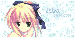
|
|
|
|
|
2006-02-03, 22:23
|
Link #254 | |
|
Kira_Naruto, the ecchi
Graphic DesignerJoin Date: Dec 2005
Location: http://www.exciting-tits.com/
|
Quote:
I never get excellent grade whenever Muir Woods gave out ratings.. and for me, his sig never appeals to me as well.. so its really up to personal preferences...@ KiLa .. The BG is too bright >.< and the text dissolved in it .. thus making it a bit unreadable :/... Is that brushing? Dont try to do overbrushing .. leave a little blank here and there to give a bit of depth.. if you want to cover the whole sig.. alternate a different color.. sparringly >.> Border is nice ... One that I always used is a white 2px then black 1 px border. Sakura could be made to be more visually attractive.. Duplicate it.. then run Gausian blur filter (low radius--0.8 to 1.2) then set the top layer to softlight . Overall 73%btw, the Saber text in cyz's sig was carved in by deleting thetext portion from border layer before applying the bevel blending ... >.>
__________________
|
|
|
|
|
|
2006-02-04, 02:02
|
Link #255 |
|
A complex "maybe"
Join Date: Jul 2003
Age: 33
|
This signature/ava combo was really hard to make, mostly because it's really hard to find decent quality pictures for this show online. ;_; Both of them are really simple because they were intended that way... Go watch Nobuta wo Produce?
torrencee >> it's pretty and shiny! The double color border is a nice touch, and the cutting out of the picture is nice. 9.5/10
|
|
|
|
|
2006-02-04, 12:34
|
Link #257 |
|
Kira_Naruto, the ecchi
Graphic DesignerJoin Date: Dec 2005
Location: http://www.exciting-tits.com/
|
@ Sakura-chan ... Why do I feel like Naruto?
 wow... another crazy shape ... Throw that and all it was is a crop.. still cool tho .. 80% wow... another crazy shape ... Throw that and all it was is a crop.. still cool tho .. 80%@ KiLa.. Nice and clean... not much too bash  .. so 93% ^-^ .. so 93% ^-^ @ KiNa .. ... feels like doing it... so yea.. a new sig .. and gosh o.O its animated too
__________________
|
|
|
|
|
2006-02-04, 13:06
|
Link #258 |
|
"Show it to me"
Join Date: Dec 2005
Location: In solitude, where we are least alone
|
torencee: kawaii! cute ilya sig indeed 10/10. oh! that saber sig is really cool and cute too. i'll give it a 10/10 as well.
sakura-chan: hmm, who are they? anyway, the shape is cool but that's about it i can think of 8.5/10 kira naruto: rider's pics are pretty. also, i like that shiny glasses animation thingy. 9/10
__________________
|
|
|
|
|
2006-02-04, 13:39
|
Link #259 |
|
The Hawqman
Join Date: Dec 2005
Location: Ottawa Ontario
Age: 33
|
Kira naruto, very nice sig, i love the quote, the animation is great, and once again the cutting is nice except a little screwed up on the left side hair. and shoulder 8.8/10
sakura very nice shape, and the cropping looks good, you could have probably filtered it or something, and played around with it, but 8/10 btw people, if i do ever make a sig, and post it on this thread plz dont criticize me on the text style, because i only use the default text, and also that i make the sigs at school when i get the time in my communication tech class, so at our school are computers dont let us install downloaded fonts. |
|
|
|
 |
| Tags |
| rate, signature |
|
|


