2012-02-09, 02:08
|
Link #582 |
|
Koomi-kun~
 Graphic Designer Graphic DesignerJoin Date: Oct 2011
Location: In the distortion of space and time..
|
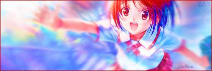
The new weekly set has a very sweet taste~!
The freebies 1 and 3 are very cute and sends out an aroma that makes your body calm down. The freebie 2 has an interesting taste which adds a unique looks and has an amazing background!!
__________________
|

|

|
|
2012-02-14, 16:34
|
Link #583 |
|
books-eater youkai
Join Date: Dec 2007
Location: Betweem wisdom and insanity
|
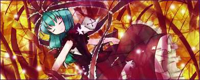
Time for a weekly update.
A new set of signatures and avatar:     And some freebies, still modifiable:    With the end of thi9s serie comming, I started to gather material for my next one, it will probably be different than what I do use usualy and the text... let's just say than I won't use the first degree of reading . It wouldn't be the kind of stuff I would want on my signatures and it wouldn't be the kind of signatures for a forum as here anyway. C&C are always welcome.
__________________
|
|
|
|
|
2012-02-14, 23:31
|
Link #585 |
|
Senior Member
ArtistJoin Date: Mar 2009
Location: Normandy SR-2
Age: 29
|
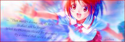
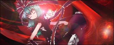
It's great to see you using more C4Ds. I like the white one as well - the only thing I'd suggest for that is to establish the focus a bit better, as I always say
 Try not to cover the entire bg in effects; try blurring, sharpening, dodging and burning to give sigs a sense of depth. Sometimes a simple dark or light area brushed on with the airbrush and then reduced in opacity does the trick fine. Try not to cover the entire bg in effects; try blurring, sharpening, dodging and burning to give sigs a sense of depth. Sometimes a simple dark or light area brushed on with the airbrush and then reduced in opacity does the trick fine. Another thing is that overlapping C4Ds over the render can help it blend. Something like these (grabbing a sig from my own thread and Renn-kun's thread): Softer approach, I guess you could say (using C4D brushes) - this was usually my way:  Solid C4Ds but it's very awesomely blended with the overlaps with the render - I think this is way harder to achieve personally, I haven't really tried it properly:  As for your current set, I think it's quite interesting. I'm just not sure how I like how you blurred the girl's outline, usually making a render transparent in any part doesn't really work (like the girl's left side). The big white space in the middle of the sig is a bit distracting as well, but at the same time it does lead your eye nicely to the render... okay, I should stop rambling now, I'm thinking this is an art class seminar or something Keep it up ganbaru! 
__________________
|
|
|
|
|
2012-02-17, 20:47
|
Link #586 |
|
Kaiba
Join Date: Jul 2010
Location: David Tennant's bedroom in the TARDIS
|
I looove the colors and the sky in particular. The stars (?) are so majestic! Also I actually like the transparency, gives the girl an ethereal feel to her. fits with the theme of the sig.
Great work as always sempai
__________________
|
|
|
|
|
2012-02-28, 15:01
|
Link #591 |
|
Koomi-kun~
Graphic DesignerJoin Date: Oct 2011
Location: In the distortion of space and time..
|
Oh My God.
This is truly amazing senpai! I love the colour blending and the textures in your current signature! It really makes you feel like you are watching the girl in real life in person! The freebies are very cute! I really like the third version!
__________________
|
|
|
|
|
2012-03-04, 01:04
|
Link #592 | |
|
Strangely dependable...
Join Date: Nov 2006
Location: some random place out there...
|
Quote:

__________________
|
|
|
|
|
|
2012-03-06, 06:29
|
Link #593 |
|
books-eater youkai
Join Date: Dec 2007
Location: Betweem wisdom and insanity
|
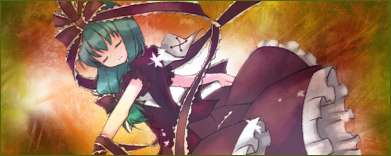
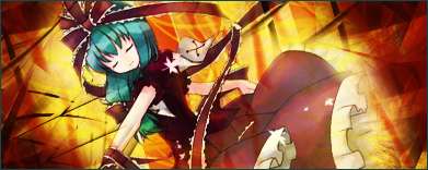
Time for a new weekly update:
The last set of singature and avatar of this serie:     The whole serie: Spoiler for ''Nuit du Walpurgis classique'' by Paul Verlaine / Girls and flowers.:
And some freebies, related to the serie:           C&C are always appreciated. Next week, ''The Conqueror Worm'' By Edgar Allan Poe...
__________________
|
|
|
|
|
2012-03-14, 01:04
|
Link #595 |
|
Kaiba
Join Date: Jul 2010
Location: David Tennant's bedroom in the TARDIS
|
Unfortunately I don't like the series at all...
The first one is too blurred with the focus too sharpened, I can't really tell what's going on. Perhaps if you dind't blur her so much it would be better. For the second one, personally it's just not to my taste, plus again too blurry for me especially over her face. (Blur=blur or smudge, don't know which) The freebie is a good idea but there's simply way too much going on in the first two. I think I like the second if you take the big C4d flower thing out? plus the reds don't really complement each other so maybe if you made the bg the same red as in the dress or in the first freebie. The third just looks like tentacle hentai waiting to happen the c4d just doesn't fit. the fourth has promise, if you smudge/blur her less and more just lightly around the edges and do the same thing with the bg i suggested with the second one as far as color. i would also recommend a softer bg since she is cute but the background looks so intricate and almost dangerous. I am very fond of the last series though and I likehow you are experimenting with new techniques.
__________________
|
|
|
|
|
2012-03-14, 15:53
|
Link #596 | |
|
books-eater youkai
Join Date: Dec 2007
Location: Betweem wisdom and insanity
|
To be honest, there's not much to see in the first signature beside a small baby holded by his/her mother. As the second, I did much blur and smudge the ''mother'', what I wanted to keep as the focus was the child. Of course, as a stand alone it would be logical to focus on both but in the context of this serie, the child is the subject.
Quote:
...
__________________
|
|
|
|
|
|
2012-03-28, 01:50
|
Link #599 |
|
Kaiba
Join Date: Jul 2010
Location: David Tennant's bedroom in the TARDIS
|
I like the style of this series so far
The freebies are well done too. As for this set of freebies I like the bottom right on best, but I would suggest scooting the c4d over to the right some so the big part in the corner doesn't seem like the focal point (I think it draws a little too much attention right now). I like the top right as well. I think it's great that you're trying out new styles, using c4d and fractals, and also new poses and angles. There's also more depth, I see especially in the first of this week's set. The angle and blurring/effects help. Well done Sempai.
__________________
|
|
|
|
 |
| Tags |
| ganbaru |
|
|


 :|::|
:|::|