2007-05-30, 19:04
|
Link #1 |
|
Aspiring but lazy
Join Date: Dec 2005
Location: The Internet
|
Cel Workshop (Take 2)
Here I am with a brand new thread. Though I don't have much new fanart or original art that are worthy of posting, I do have some traces that have recently been taking up most of my free time.
Traces - Not my own art: Pre-June 2007 Here's the things that started it all. With the influx of fanart after TH10 came out, there were some that were appealing but were left as sketches. Seeing as I wanted to give 1-stroke freehand inking a shot, I went and did them. Resized to 200% and done with a tablet using freehand strokes and about a million undos. Spoiler for TH10 traces:
Fresh from TH10 linearts with excessive momentum and a lack of targets, I surveyed my drives for more B&W waiting to be inked. Just then, I recalled the treasure trove that is the Lucky Star mangas. I recall I used to felt so bad I couldn't make use of them as source material for avatars and signatures. Back then, sources were pretty scarce. Same deal, resized to 200%, OC4 with a tablet. This time, I've colored them though.  Spoiler for Lucky Star traces. Now with color!:
So my brother got the tablet, buu. I was still itching for more though. I went ahead and cracked open Photoshop and started using the pen tool. I admit, it was pretty time consuming, what with each line sometimes getting 5-6 paths just to get nice line depth. Spoiler for Still Lucky Star trace, now using pen tool~:
06-07-2007 New trace~ Kagami yet again and Komachi from Touhou series ^^ Spoiler for Kagami and Komachi:
08-02-2007 Two month update huh...? Anyway, a trace of Reisen from Touhou series. Spoiler:
Image enlarged to 250%, then traced using pen tool on CS2 coupled with very few freehand finishing touches. Artworks - Now these ones I did: Figured I'd add a dedicated subsection for fanarts and such, but those come by rarely so I'll just clip it here. Pre-June 2007 This one was done semi-rush. There was a popularity contest and I planned on doing this as support for Yuyuko-sama. But it was kinda ending before I started  . As you can see, the lineart downright messy and the proportions and perspective could use some major revisions. But hey, this should be the first creation of mine that actually has a proper background, albeit it being grade school style. . As you can see, the lineart downright messy and the proportions and perspective could use some major revisions. But hey, this should be the first creation of mine that actually has a proper background, albeit it being grade school style.Everything done on OC4 (I think). Coloring style is still different because I hadn't come across Satsumaru's awesome coloring tutorial. ^^ Spoiler for Photobucket link, not thumbnailed =.=:
06-08-2007 Latest piece of work, featuring Kanna from AIR~ ^^ I started with just the upper torso on mind. I didn't really have a reference for her robes waist down so I just left it blank. =/ Spoiler:
06-28-2007 So I finally stopped practicing Accent Core Eddie and started drawing again. Yay! Here's a pic inspired by a topic of discussion on whether Cirno or Chuugoku is more stupid. Pencils shrunk down to uber tiny size, and a lazy ink and colored Cirno-Dante. =3 Spoiler:
09-11-07 Three month break huh..? Sakuya and Ayayaya from the Touhou series, colored and with background!! Spoiler:
---EOF--- Last edited by celcius; 2007-09-10 at 10:53. |

|

|
|
2007-06-04, 11:07
|
Link #5 | ||
|
Dreamer
 Artist ArtistJoin Date: Dec 2005
|
Quote:
Regarding the background, this is how I draw a tree using Photoshop, hope you will find it useful. Spoiler:
Quote:
|
||
|
|
|
|
2007-06-07, 03:13
|
Link #6 |
|
Aspiring but lazy
Join Date: Dec 2005
Location: The Internet
|
nani~ I'll be sure to use that if I need a tree~ ^^
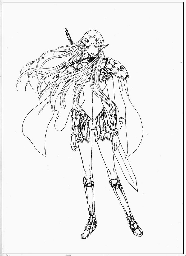
Thanks for the tips and the tree tut. And nice to see you again. I got this done a few days back. I just forgot to post it. Rather I just wanted to batch it with something else.  Newly completed trace~  This one was a little tough. The original pic was really more of a rough sketch in some parts and I had to do some of the parts. The shading is wrong in probably alot of places x_x And the blade annoys me to no end -.- Last edited by celcius; 2007-06-07 at 04:12. |
|
|
|
|
2007-06-07, 07:19
|
Link #7 |
|
I'll keep walking.
ArtistJoin Date: Jan 2006
Location: This is FLORIDAAAAAAaaa
Age: 37
 |
As expected, you've improved quite a lot, Celcius. You already drew pretty well the last time I checked, and now it's the same deal.
Although I like your traces, the original one you posted kind of amazes me. Like you said, there's a little trouble with the perspective but that's all. A little tweaking will do wonders and I'm pretty sure you know what to change, so I'll leave it up to you as to wether you think you still got the patience to work on it or not. I probably wouldn't, but I know it goes from person to person. Now to the traces. I like them, like I said. The coloring style is really good and the last Lucky Star one you posted ( don't know her name, not watching the series yet <.< ) is superb, love the way you did the hair and I need to learn that technique myself. But there're only a few problems... in almost all of your traces, you tend to leave lines sticking out in places where they don't belong. Look at her hat, for example. There're strands of hair going through, and while I think it's okay to do that over the eyes/face, the hat is opaque, right? All that there's to it is just erasing and spending like 20 seconds fixing it. I can see a little dullness in her eye, but I don't know how the original art-style is all that well, so I'd rather not comment on that. Still, everything else is great. Where're you doing your lineart, though? Photoshop or Illustrator? I'd say the latter, but I remember you liked photoshop quite a lot, so I really don't know. PS.: She's really cute. I need to start watching this series immediately... it's just that the first 10 minutes of discussing about how to eat food I never even heard about didn't quite set me on fire...
__________________
|
|
|
|
|
2007-06-08, 04:33
|
Link #8 |
|
Aspiring but lazy
Join Date: Dec 2005
Location: The Internet
|
Domo desu, Zero~ ^^
Lessee, for Yuyuko, I don't think I have the willpower to go back and redo stuff. I'd have to erase some stuff along with the colors, which when recolored would probably look different. I'd have to recolor everything, and I'd rather do a new one honestly. As for the traces and the lines, you don't miss anything do you? I was hoping no one would notice. I was working on the thought that if I resize it back to its original size then it wouldn't be noticeable. xD(Actually, what I just said isn't completely true. I probably just didn't see those xD;  For lineart, the first few bunch were on OpenCanvas 4. The latter bunch were all on Photoshop pen tool, though the way I understand Illustrator I think I'm doing the same process. =/ I've never tried coloring on Illustrator so I just stuck with CS2. Finally...  Kanna bi~ I had visualized only her upper torso so I didn't continue on with her lower body (I just did an outline of her waist up). That, and I didn't really know how her robes look like waist down. I'm probably looking at a weird / too long left arm, awkward hands, and maybe a high forehead here =.= Plug: Yeah, ep.1 and the food talk wasn't too hot. Honestly, as a long time Lucky Star fan, I was a bit disappointed at ep.1. But that's a thing of the past and it's just shifted to high gear, literally (ep.6)!! |
|
|
|
|
2007-06-08, 08:24
|
Link #9 |
|
I'll keep walking.
ArtistJoin Date: Jan 2006
Location: This is FLORIDAAAAAAaaa
Age: 37
|
Oh, I see... I thought you were using different layers for the outline and the colors, although I think you do use them in your vectors. And I know what you mean, after working and working on a piece, it's hard to have the patience to go back and start over. I'd rather start a new drawing, lol.
And nope! You know I'm a perfeccionist, right? So I have the custom of going around looking for stray lines where they shouldn't be in most of my drawings... it's already on auto, I think . But still, I don't blame you for not seeing them, they are almost imperceptible.Well, I wouldn't suggest painting with Illustrator either, you know? It's not like Photoshop, where you can just use the bucket and fill an entire area and work with your eraser to fix whatever went wrong. In Illustrator, like in most vector programs, you need to grab the vector, mold it to however you want and pshh, too much work for the same result. But Illustrator does wonders to lineart, so I thought you might want to consider it sometime. And your new one is cute! And I do see what you mean with her having a high forehead, since I'm the one who brought that up in another drawing you did a couple of months back. But in this case, I don't see anything wrong with it because of the angle her face is at, and I suppose her eyes were drawn a tad smaller than they normally are to be fir for her expression. The hairline is where it's supposed to be for this style, so don't worry about it. The only thing on her left arm that I see different is the shoulder - it's hanging a bit lower than the other one, and that's probably why you think her arm is weird. The suggestion I make is to just erase part of her left shoulder and bring that up a bit, and connect to where the arm already is. You don't need to redo the entire thing, since I think the position is just perfect where it is. And the hands are great, too, don't worry about them. What really strikes me is her expression, it's really well done. I mean, I'm staring at her and going "I WANT THIS GIRL TO STARE LIKE THAT AT ME AT STARBUCKS." It's a mix between 'Hmm, interesting' and 'I have a plan'. * Faints. * And whut... Shift into gear?... * Imatination runs wild, and Zero pictures the Lucky Star girls driving it like they stole it... * D-D-D-DOWNLOADING.
__________________
|
|
|
|
|
2007-06-27, 19:44
|
Link #10 |
|
Aspiring but lazy
Join Date: Dec 2005
Location: The Internet
|
Back from the dead!! *ahem* GG^C *ahem*
Here's a pic inspired by a topic of discussion on whether Cirno or Chuugoku is more stupid. Pencils shrunk down to uber tiny size, and a lazy ink and colored Cirno-Dante. =3 Spoiler:
Probably screwed up a bit on Cirno's head-body proportion. I was originally going for chibis while doing the quick setup, but later decided against it. Being the lazy person I am, I just went on and hoped it'd turn out well. xD Chuugoku isn't done because I forgot how her hat looks like, as well as forgot what Vergil's outfit is. Oh well, gotta play DMC3 then xD (I foresee this never getting done, if I start DMC3 again xD) |
|
|
|
|
2007-06-27, 23:28
|
Link #11 |
|
~Anpan~
ArtistJoin Date: Sep 2006
Location: Yuri Land
Age: 37
|
Aha...another artist..its always nice to see fellow artists. Your sketching is on the right track, but now move on to make complete figures, where u dont see multiple pencil marks but just one final product...
Well, i m saying this because when we practice stuff, if we practice one thing for too long, it gets tough to move on to the next step Spoiler for "one of my work:
|
|
|
|
|
2007-06-29, 00:58
|
Link #12 |
|
Retired
Graphic DesignerJoin Date: Mar 2007
Location: Princeton University
|
Wow so many good artists around here, I guess I'll bow out of the artist arena
Anyways, your works so far are great IMO. Just keep it up and you'll sure be better =] *throws you a cookie
__________________
|
|
|
|
|
2007-06-29, 07:07
|
Link #13 |
|
Aspiring but lazy
Join Date: Dec 2005
Location: The Internet
|
@kayos:
Thanks~ Did you draw that? Yum yum~ ^^@toxic_trance: ^^ I actually just did a very rough lineart for this one. I didn't have time to do pen tool lineart. But thanks for the advice. I do plan on re-doing the lineart and coloring when I get the other person done. @Ice Climbers: Thanks, and thanks for the cookie~ Don't bow down, we're always happy to see a new artist join the fun~ Please do post artworks in the near future. ^^ |
|
|
|
|
2007-06-29, 20:49
|
Link #14 |
|
I'll keep walking.
ArtistJoin Date: Jan 2006
Location: This is FLORIDAAAAAAaaa
Age: 37
|
Wow Cel, first time I've seen a pencil drawing from you, and I gotta say that you draw really well! ( I'll say it again, actually, but don't mind me ). Your pencil drawings are really good and clean, which was something I didn't always get from some of your CGs.
On the colored pic, though, see if you can round-up her breasts a little more. Not sure if you've realized it, but her torso/chest gives me the impression that she is actually a he. Not because of bust size or anything, it's just that the clothing ( open cape with nothing below it doesn't give you a very feminine tone, is what I think I want to say ) doesn't fit well. And it's also something I don't see in the pencil underdrawing too, since it's really well done from top to bottom. Btw, I don't remember asking this, but are you using a tablet?
__________________
|
|
|
|
|
2007-06-29, 22:19
|
Link #15 |
|
Aspiring but lazy
Join Date: Dec 2005
Location: The Internet
|
xD Thanks Zero. Main reason why I usually go with CGing stuff so I can practice more of it. I've been chugging along with pencils ever since DBZ (huwaw!!) but have only started doing digital inking and coloring maybe last or last, last year?
As for the clothes, well, I was playing Devil May Cry 3 when I thought of that soooo... I gave her Dante's clothes, while I'm planing on giving Meirin Vergil's. Maybe I should grab DMC1 Dante outfit. xD As for using a tablet, yeah sometimes. I'm not very comfortable with it though, and I'd say I'd do a better job when I do pencils then lineart it via pen tool / vector. That Cirno was done with a tablet though, I wanted something to color but didn't have any linearts at hand so I just did a rush job of inking by using the tablet.
|
|
|
|
|
2007-06-29, 22:57
|
Link #16 |
|
I'll keep walking.
ArtistJoin Date: Jan 2006
Location: This is FLORIDAAAAAAaaa
Age: 37
|
Yeah, I knew it looked a bit like Dante, though I'm not really familiar with Devil May Cry.
And well, even if you did use the brush just to kinda sketch it on PS, it's still pretty good, so props for that. I wanna see a drawing of yours vectored, though! All I've seen are speedpaints, so hurry it up. * Pokes with a stick. *
__________________
|
|
|
|
|
2007-06-30, 20:53
|
Link #17 |
|
Aspiring but lazy
Join Date: Dec 2005
Location: The Internet
|
Oh but I've already used pen tool for one of my own art~ The Kannabi no Mikoto quite recently (a few posts back) was done in that format.
I'll also probably do the same for the latest if I can get satisfied with Meirin. xD I was browsing through the general forum and just remembered, here are some Sony Ericsson theme I made awhile back.   For the Jigoku Shoujo, I added an "Ippen Shindemiru" message tone. For Kagamin, I used Konata's "Muuuuuuuuuuuuuuuuuuu" RakiSuta TV ad. |
|
|
|
|
2007-07-02, 15:19
|
Link #18 | |
|
AniMexican!
Join Date: Dec 2005
Location: Monterrey N.L. Mexico
|
Been lurking on this thread for a while, might as well post a comment now.
  Have you though about using colored outlines instead of plain black? I know it's a matter of taste in the end, but I feel it adds a lot when it comes to vectors and traces. Anyway, it's just a suggestion from me. Looking forward for more of your stuff. Quote:
__________________
|
|
|
|
|
|
2007-07-03, 11:14
|
Link #19 | ||
|
Dreamer
ArtistJoin Date: Dec 2005
|
Quote:
 Is this an original fanart? If so, very good (apart from the upper left hand which is a bit too short). I especially like Kanna's cunning expression. Quote:
|
||
|
|
|
|
2007-08-02, 10:44
|
Link #20 |
|
Aspiring but lazy
Join Date: Dec 2005
Location: The Internet
|
Sorry I forgot to check my thread, lol. I got in a marathon of Atelier Iris Eternal Mana, Grand Fantasm, Ar Tonelico, Grim Grimoire, Toho10 Mountain of Faith, and DDR Supernova. No matter how much I keep telling myself I should do something, it just didn't work. Fortunately, I've finished both Atelier Iris and Ar T doesn't seem to catch my fancy as much as Grand Fantasm. Grimoire shows hints of Higurashi and is very interesting; but battles can sometimes be a chore. Odin Sphere is actually waiting, but I got the chance to actually do something while I'm not pre-occupied.
@Daniel E. Well, I usually work with the linearts first using a 3-4px black brush. After the whole lineart process, only then do I think about colors. Call it laziness, but I don't think I wanna redo the lineart again. xD; I find it more tedious than coloring, since coloring can be quite fun. I'll be sure to try and remember thinking about the colors first before jumping head-on. @nani: Old habits die hard. xD I'd actually get through it all if I can finish the lineart, but lineart takes an incredible amount of time and is quite a dull job. xD I usually get overwhelmed by the thought of it. When it's time I say hello to the pen tool, most of the time I just shy away from it and turn to the tablet for a quick solution. As you may or may not have noticed, the number of lazy linearts I have done far outnumber "proper" ones. xD And backgrounds are just out of my league. xD *Whew* wall of text. I know, sorry. Anyway, I got to sit down and work on a trace yet again. I didn't finish the Cirno and Meirin, cos' well, the topic died and I didn't feel a need to complete anymore. =/ Instead, I saw a way cool sketch I reserved before for a trace.  Image enlarged to 250%, then traced using pen tool on CS2 coupled with very few freehand finishing touches. Coloring on eyes are a bit flat I must say, and lots of guessing on which line I should follow due to semi-messy parts on the original. Upon looking at the finished product, the "pillow" looks like a giant ebi fry. Doesn't help that I picked a somewhat yellowish color, though it was completely unintentional. xD |
|
|
|
 |
|
|