2011-10-01, 08:33
|
Link #61 | |
|
Criminal Unrequitor
 Graphic Designer Graphic DesignerJoin Date: Jul 2010
|
Quote:
 . I really like it that people are giving in-depth suggestions in this thread. . I really like it that people are giving in-depth suggestions in this thread.
__________________
|
|

|

|
|
2011-10-01, 09:53
|
Link #63 | |
|
it's animal, unbelievable
Graphic DesignerJoin Date: Nov 2006
Location: U.S.A
|
Quote:
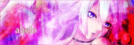
@ahelo Looks good, but your yellow text is looking rather green in comparison to the orange in the background. Maybe make it a different/lighter shade of yellow?
__________________
|
|
|
|
|
|
2011-10-01, 10:02
|
Link #64 | |
|
books-eater youkai
Join Date: Dec 2007
Location: Betweem wisdom and insanity
|
Quote:
@ ahelo, the second version is a improvement. BTW you can go up to 60kb so you could use JPEG in a higher level of quality.
__________________
|
|
|
|
|
|
2011-10-01, 10:10
|
Link #65 | |
|
Constellation
Graphic DesignerJoin Date: Jan 2008
Location: Pearl of the Orient Seas
Age: 31
|
Quote:
 but given the gradient, looks like I'll have no other choice unless I could think of something to make the colors of the gradient and the colors of Fall blend hmmm
__________________
|
|
|
|
|
|
2011-10-01, 10:13
|
Link #66 | |
|
Criminal Unrequitor
Graphic DesignerJoin Date: Jul 2010
|
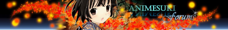 PNG PNG JPG JPGTried to improve it a bit. I'm not exactly a photoshop expert so. . . more comments please. I'd love to hear more criticisms so I can improve it. Quote:
__________________
|
|
|
|
|
|
2011-10-01, 10:22
|
Link #67 |
|
sleepyhead
AuthorJoin Date: Dec 2005
Location: event horizon
|
You made the text fade the wrong way.
Nudge the forums part so it doesn't touch the leaves (not as much anyway) and you can cover the Animesuki text. You can also use a contrasting color for it. Character looks much better. You need to get rid of some of the orbs on the right and left. Maybe bottom Yellow/Orange blobs on the left and top yellow, bottom yellow on the right. The idea is to make it more simetrical or anti-simetrical and have it go towards smaller ones so as to not mess with the effect of them going in the distance (hence why I suggested removing the big ones that look out of place). If you look at the preview you'll notice it currently feels very boxed in. There's this smodge on the left of the character, maybe cover it with some more leaves? Not too sure the new text color is that good. It doesn't really fit the theme. It's good you added a gradient to it though. You want also want to experiment just changing the font for "ANIMESUKI" since I don't think it's really working with the rest of the elements in the banner. @Frailty Oranage Blue is actually pretty awesome if you manage to get it just right.
__________________
|
|
|
|
|
2011-10-01, 10:28
|
Link #68 | |
|
Criminal Unrequitor
Graphic DesignerJoin Date: Jul 2010
|
Quote:
__________________
|
|
|
|
|
|
2011-10-01, 11:55
|
Link #69 | ||
|
fighting in my nightmare
Graphic DesignerJoin Date: Mar 2009
Location: France
|
Quote:
 The text is much better like this! The text is much better like this!Quote:
the text is very nice I think I prefer the version 2
__________________
|
||
|
|
|
|
2011-10-01, 20:56
|
Link #73 | |
|
Kaiba
Join Date: Jul 2010
Location: David Tennant's bedroom in the TARDIS
|
Quote:
I agree with Felix on the blobs, they could be smaller and fewer/more symmetrical or antisymmetrical. Also the smudged area and the key thing are kinda distracting...
__________________
|
|
|
|
|
|
2011-10-01, 22:48
|
Link #74 |
|
books-eater youkai
Join Date: Dec 2007
Location: Betweem wisdom and insanity
|
While the girl on my entry is from a artwork from Kishida Mel, it isn't Alice ( I haven't any idea of which Alice you are talking ), it's suppoesd to be Shionji Yuuko from the serie Kami-sama no memo-chou .
__________________
|
|
|
|
|
2011-10-01, 23:04
|
Link #75 | |
|
Senior Member
Join Date: May 2009
Location: classified
|
Quote:
That helps quite a bit.
__________________
|
|
|
|
|
|
2011-10-01, 23:13
|
Link #76 | |
|
Senior Member
Join Date: Jul 2010
|
Quote:
But she's more commonly known as Alice. In fact, she wants to be known as Alice.
|
|
|
|
|
|
2011-10-02, 04:01
|
Link #78 |
|
sleepyhead
AuthorJoin Date: Dec 2005
Location: event horizon
|
I think I like the one where it's more zoomed in better. Also you've gone a little too far with the black. You want black to be black (on shadows, etc) but you don't want to hide detail; for example here hair is now this black blob where previously you could see the individual strands. You can just duplicate a layer, adjust to a certain tone, then mask to the original layer to get back the detail where the adjustment ruined it. If you're using global filter you can just use the mask that comes with it.
Also too many leaves around her, it ruins the effect of a leaves circling behind her. The light spheres looked better then the butterfly and stars too IMO. The Comic Sans "A" kind of stands out too much. Good job getting rid of the smudge though.
__________________
|
|
|
|
|
2011-10-02, 04:22
|
Link #79 | |
|
Criminal Unrequitor
Graphic DesignerJoin Date: Jul 2010
|
Quote:
__________________
|
|
|
|
|
 |
| Tags |
| banner contest |
|
|