2008-05-31, 21:57
|
Link #841 | |
|
The endless sky
 Graphic Designer Graphic DesignerJoin Date: Jun 2007
Location: Oosutoraria
Age: 34
|
Hey, Shana! I like Haku-chan's gift!
 And the line...omfg. Win! xD The foreground c4d the covers the pretty neko looks kinda odd, maybe twisting it to make the flow better would be better. Oh, and a tip: Don't always use c4ds set on to lighten/screen. Sometimes it tends to look messy. Not all the time though. Keep it up! ^-^ EDIT: Quote:

Last edited by KasumiGirl; 2008-06-02 at 00:46. |
|

|

|
|
2008-06-02, 08:18
|
Link #842 | |
|
Reisen FTW!
Graphic DesignerJoin Date: Aug 2006
Location: Chicago,IL, USA!!!!
Age: 31
 |
Quote:
I like the siggy because of Reisen. 
__________________
|
|
|
|
|
|
2008-06-03, 18:58
|
Link #843 | ||
|
Senior Member

Join Date: Dec 2006
|
Quote:
if I did not like it I wouldn't have given it to her. And yeah, line = win XD. You know that sig was pretty much an experiment, I wanted to do something different for her  and so were the others xD pure experiments batch this time D: and so were the others xD pure experiments batch this time D:Quote:
Anyways... OMG LIGHT?! IN MAI SIG!!???  And no, the text doesn't say "Fairy Cake". Btw, this sig is based on Dave onii-chan's Ephemeral Harmony. EDIT: Oh yeah btw, it's a re-make of my April candidate for SOTM.
__________________
Last edited by Shana; 2008-06-03 at 19:46. |
||
|
|
|
|
2008-06-03, 20:24
|
Link #844 | |
|
~La-la Land~
Graphic DesignerJoin Date: Jul 2007
Location: Seattle
Age: 37
|
Quote:
I also found it comical that you pointed out the whole 'fairy cake' thing. I didn't read it that way initially but once you mentioned it, I looked again and laughed at my dirty mind  The sig is very pretty, but as of now, I prefer the background more than the render since she doesn't seem blended in at all along her right side. The colors are gorgeous though, very nice so far!
__________________
|
|
|
|
|
|
2008-06-03, 20:34
|
Link #845 | |
|
Senior Member
Join Date: Dec 2006
|
Quote:
Yeah, I know the render doesn't blend too well with the bg, but you know, I wasn't in the mood of searching a render, and started searching for a ugly sig of mine to re-work it.
__________________
Last edited by Shana; 2008-06-04 at 17:57. Reason: Typo. |
|
|
|
|
|
2008-06-04, 17:58
|
Link #846 |
|
Senior Member
Join Date: Dec 2006
|
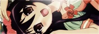
Hello? CnC please? for the siggy.
Anyways... Here's a render. The original image had, not bad quality, but not the best. A bad scanner I guess. So, for the first time I used Sponge Tool, and it helped me A LOT with the colors and quality :3 Original  Using Sponge Tool  Which one is better? I'm going for the sponge tool'd one.
__________________
|
|
|
|
|
2008-06-04, 21:44
|
Link #849 | |
|
[Never Give Up]
ScanlatorJoin Date: Aug 2007
Location: Texas
Age: 35
  |
Ahh sorry! Would have gave CnC sooner but Killer Instinct took over my day. =3
Quote:
The lighting is a bit awkward, as it seems like the right side of the BG is dark but the lighting on the stock doesn't reflect that. Maybe try burning the right side of the stock so that it matches in a way? It would help blend the stock into the BG. Try and sharpen the sig, then erase parts such as your focal point. It may make little bits of your tag stand out more. Other than that, looks pretty good. The colors are what catches my eyes since they compliment each other well.
__________________
|
|
|
|
|
|
2008-06-05, 01:30
|
Link #850 |
|
Thinking outside the box
Graphic DesignerJoin Date: May 2007
Location: The Netherlands
Age: 37
|
I like the second render(sponged one). The cut is good. Some strange spot around the right leg or is it part of the render? But either way, nice rendering and choice, moe nekomimi
__________________
|
|
|
|
|
2008-06-05, 03:32
|
Link #851 |
|
(ノಠ益ಠ)ノ彡┻━┻
 Moderator ModeratorJoin Date: Mar 2006
|
I think that's just part of the render. I did notice a small spot on the underarm of the tshirt, but it's nothing major. Clean cut, and the second version brings out the colors nicely. Good job.
I agree with Kickhopper about the lighting. It doesn't need to be alot, but try a little burn on the right side and see if it balances out some. And the text should stand out more, maybe use stroke or glow with a real light opacity to see if you can bring out the letters a little more while still keeping the see through effect.
__________________
|
|
|
|
|
2008-06-05, 20:55
|
Link #852 |
|
Mr.Corner will come soon
Join Date: Mar 2008
Location: Sitting in Mr.Corner with Chrona
|
Shana-chan!!!!! X3 I've been lurkering your pages ( cause really like your work! :3) I thought I'd finally post somthin. But I Love your siggies!!<333333333 Keep workin hard Shana-chan! :3
|
|
|
|
|
2008-06-10, 13:29
|
Link #856 |
|
Thinking outside the box
Graphic DesignerJoin Date: May 2007
Location: The Netherlands
Age: 37
|
Congrats on starting a blog
Just some things, downsize the images in photoshop instead of letting HTML do the resizing. Images look ugly when downsized by browser. Ooh and some typo's in the review. Didn't knew the special episode was released. Will have to get that soon Goodluck with maintaining your blog
__________________
|
|
|
|
|
2008-06-11, 05:34
|
Link #859 |
|
The endless sky
Graphic DesignerJoin Date: Jun 2007
Location: Oosutoraria
Age: 34
|
Ohhhooo. Gratz on the blog, Shana-chan! I used to have one about school and stuff like that for only about 1 and a half years. I got pretty lazy.
Will keep up with your blog. Btw: ancious is anxious, Shana-chan. Unless probably a typo.
|
|
|
|
|
2008-06-11, 06:07
|
Link #860 | |||||
|
Senior Member
Join Date: Dec 2006
|
Quote:
Quote:
Quote:
DING DING DING! You got a reward for being the 1st one to mention my render! Quote:
Quote:
too lazy
__________________
|
|||||
|
|
|
 |
| Tags |
| signature |
|
|


 <--- A try for my SOTM entry