 2007-06-09, 11:31
|
Link #1 |
|
Thinking outside the box
 Graphic Designer Graphic DesignerJoin Date: May 2007
Location: The Netherlands
Age: 37
|
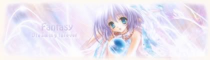
Sephi signature & avatar gallery.
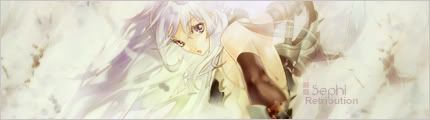
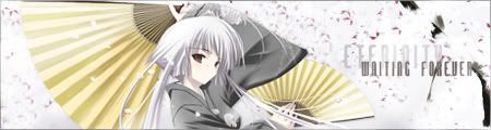
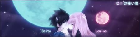
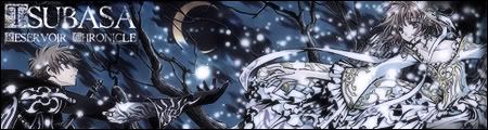
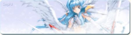
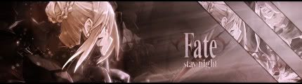
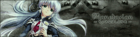
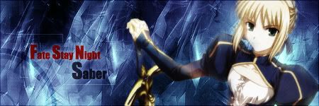
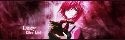
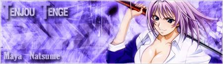
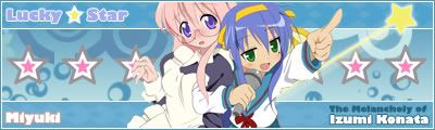
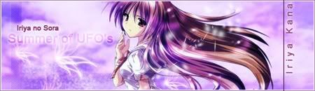
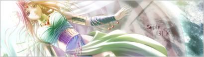
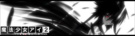
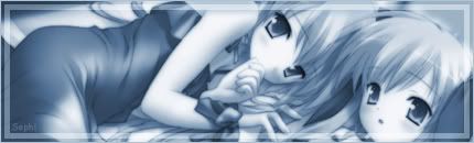
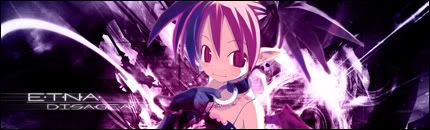
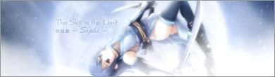
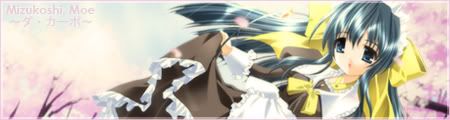
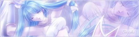
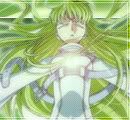
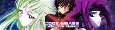
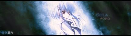
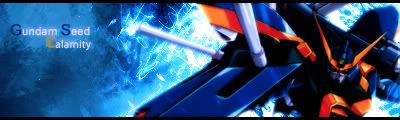
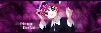
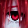
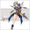
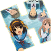
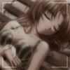
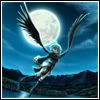
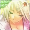
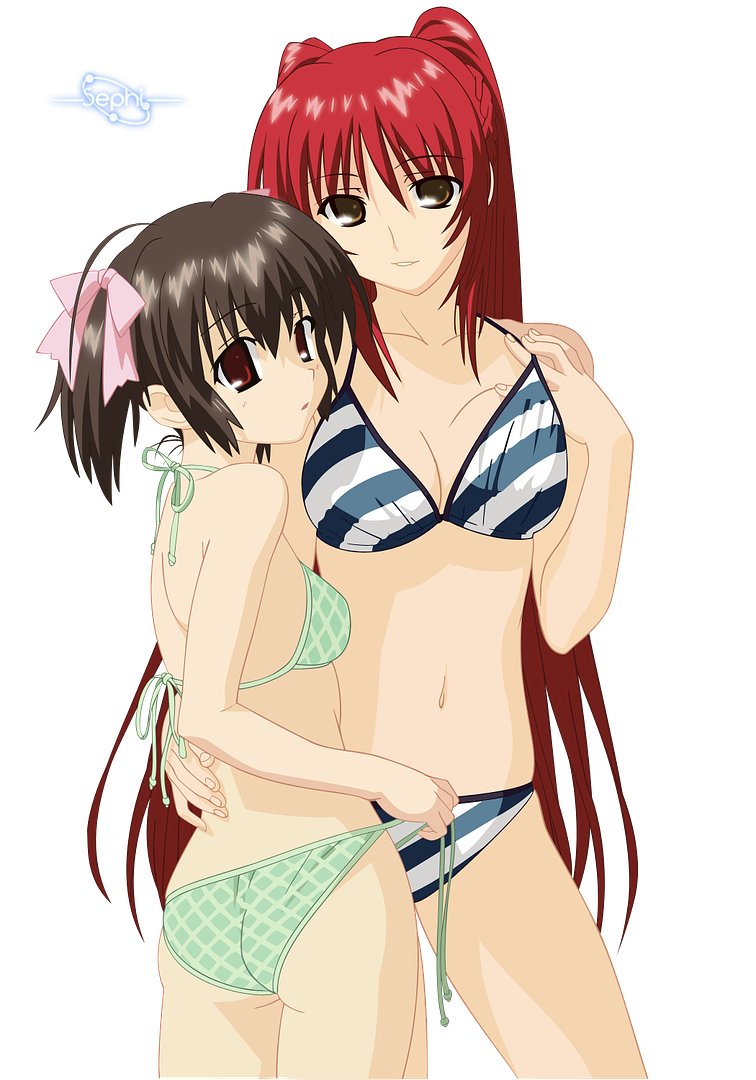
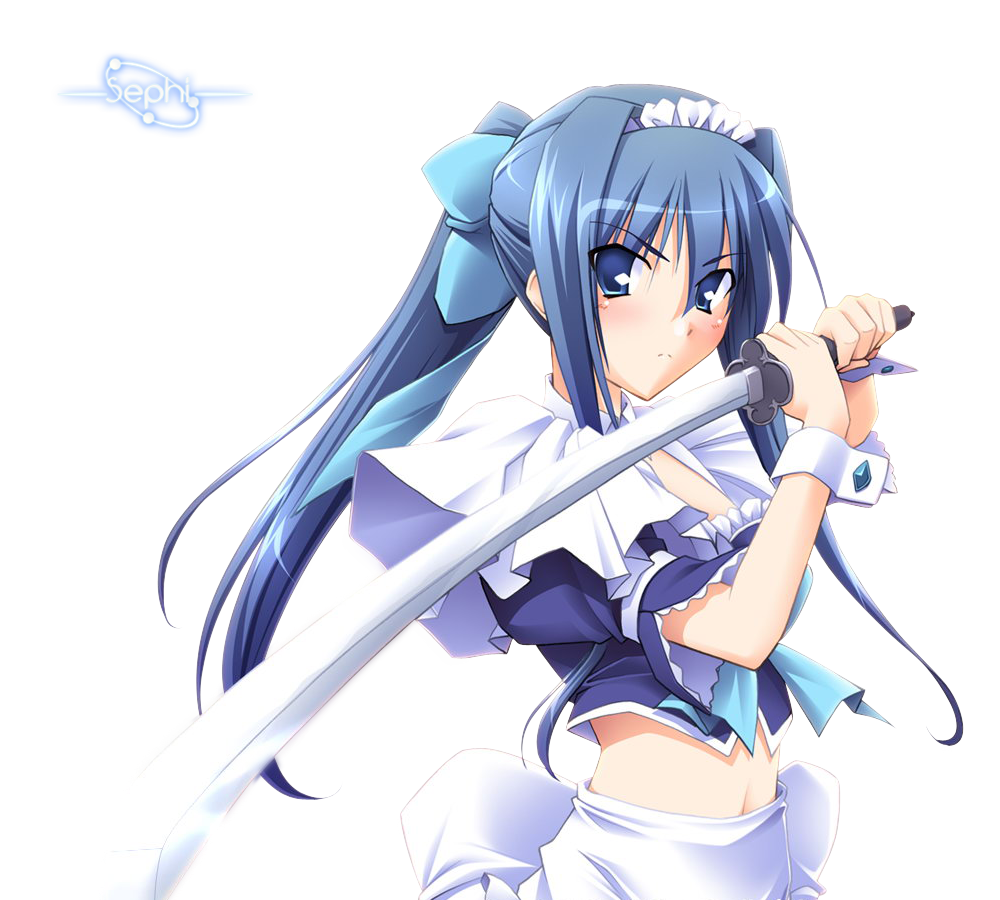
 About me. I have been seriously making signatures and avatars since somewhere in October 2006. And I decided to join in the fun of showing your work to others and receive critics and improve from it. Ever since browsing forums I was impressed by other people signatures. That was when I decided I want to make my own signatures and avatar. I use to start with paint  But since last year I got a bit more serious in learning Photoshop and variety of effects to make signatures and avatars with. I use Photoshop or Imageready to make my signatures and avatars. But since last year I got a bit more serious in learning Photoshop and variety of effects to make signatures and avatars with. I use Photoshop or Imageready to make my signatures and avatars. I think I come a long way, from my days I was messing with pain to what you see here. Though even still, there are so much I still don’t know about Photoshop. I would still rate myself a average Photoshop user. And I have been learning from tutorials posted on forums. I would like to hear your opinion about my signature and avatars, and tell me where I can improve. I have been out of inspiration and idea’s lately and I would like to hear what you think of my sigs and how I can improve my work. Most of the signatures are free. Unless it's stated otherwise, like claimed/in use or reserved. If it doesn't say anything there free Currently using: 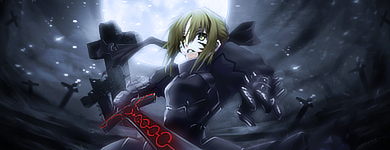 Latest 10 signatures 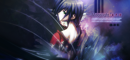 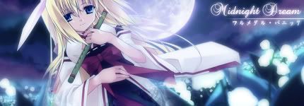  And another signature, trying things out, overall i think it turned out pretty nice.  SOTM entry for the march SOTM. 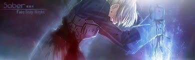 Saber sigie   February SOTM entry.  Sister Hell from Prism Ark  Early X-mas sigie.  Older signatures. Well there not very old. And some aren't that bad. But see for yourself and judge about it. Spoiler:
Crop and scale signatures These are the crop and scale signatures. I added border and text and some finishing lines to them at most. So can't really take credits for them. Spoiler:
Garbage bin Here is where my test signature and signatures that i find below my normal work end up. Some aren't that bad... But majority are quite awful. Now the question would be why the hell i make this part. Probably for the decent results i got out of some tests. Spoiler:
Banners Daytime gradient Spoiler:
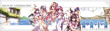
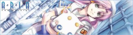
Extension banners Belldandy banner for the dawn gradient in the sky banner contest.   Aria Banner for the daytime gradient in the sky banner contest   Card Captor Sakura banner for the dusk gradient in the sky banner contest   Memories off banner for the night gradient in the sky banner contest   Avatars: I usually make a fitting avatar for the signatures. But i think talking about each individually is a bit to much. So il just post them. I know some aren't suitable for Animesuki due to sizes. Currently using:  Latest five static avatars:     Latest five animated avatars:      Older Avatars: Spoiler:
Windows XP Icons Click on the image to download the icons Random Anime » For more icons go here « Renders Latest 5 Renders:      Spoiler for more renders:
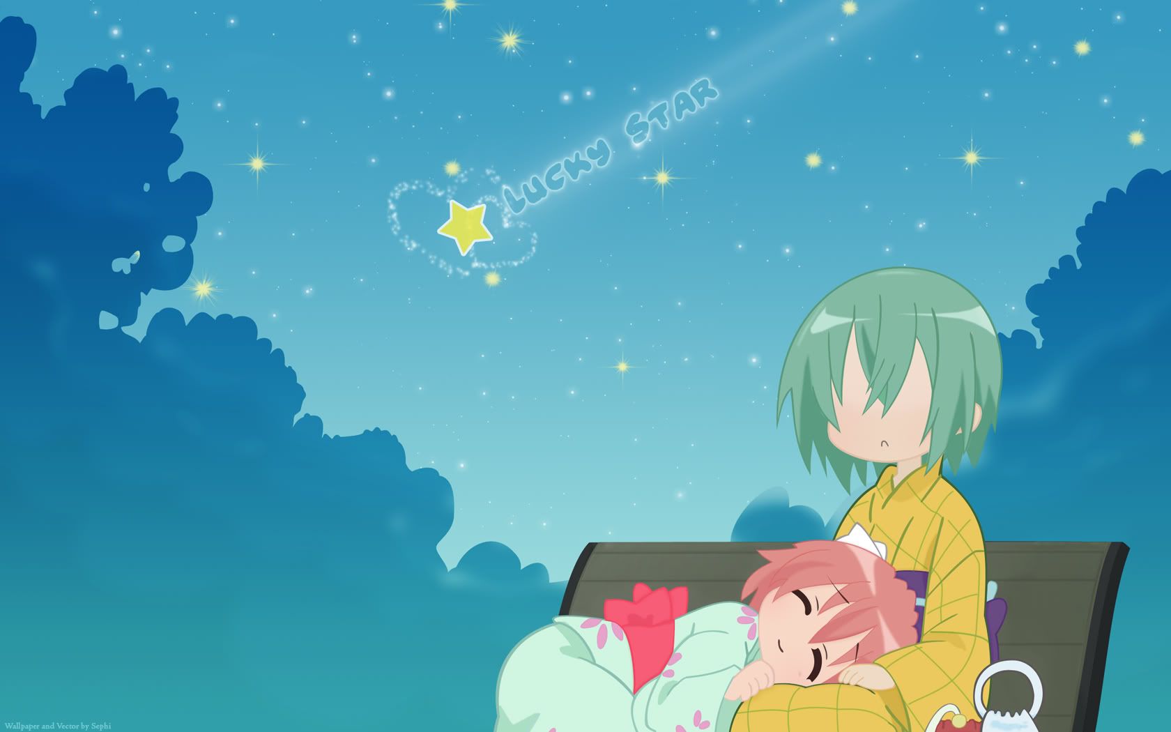
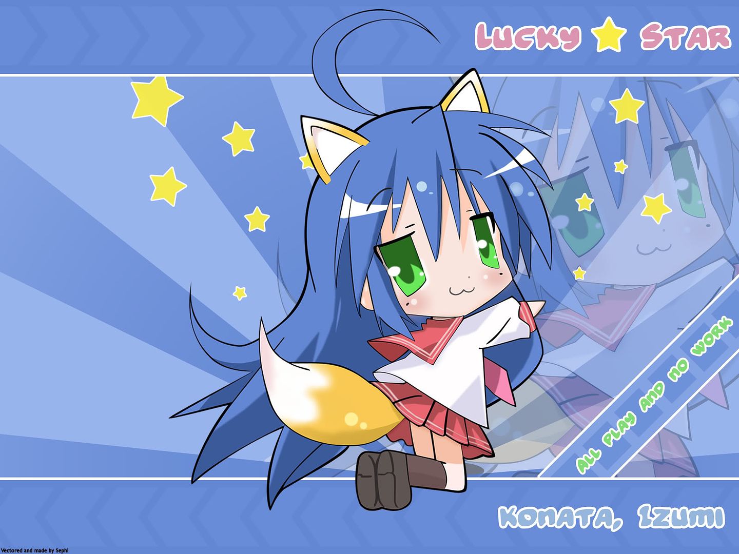
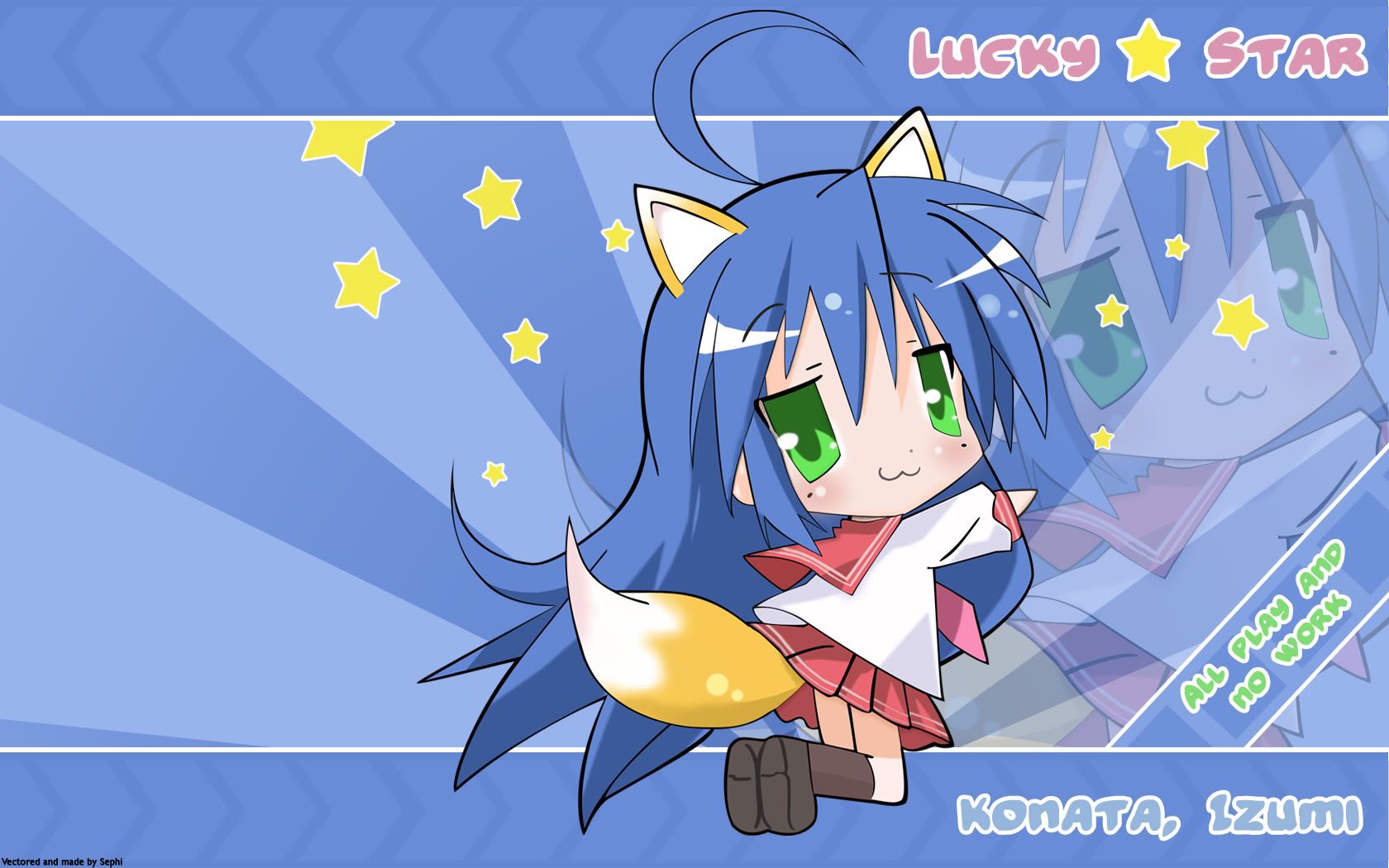
Vectors ToHeart 2 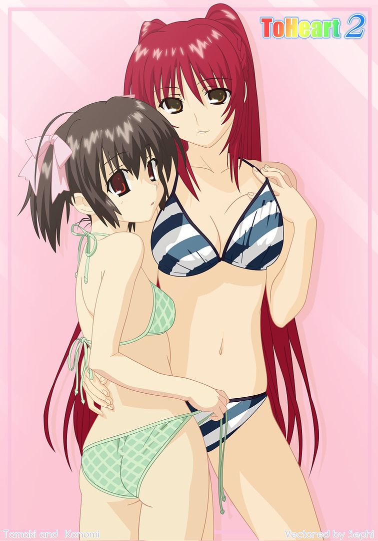 Lucky Star vectors and wallpaper Konata 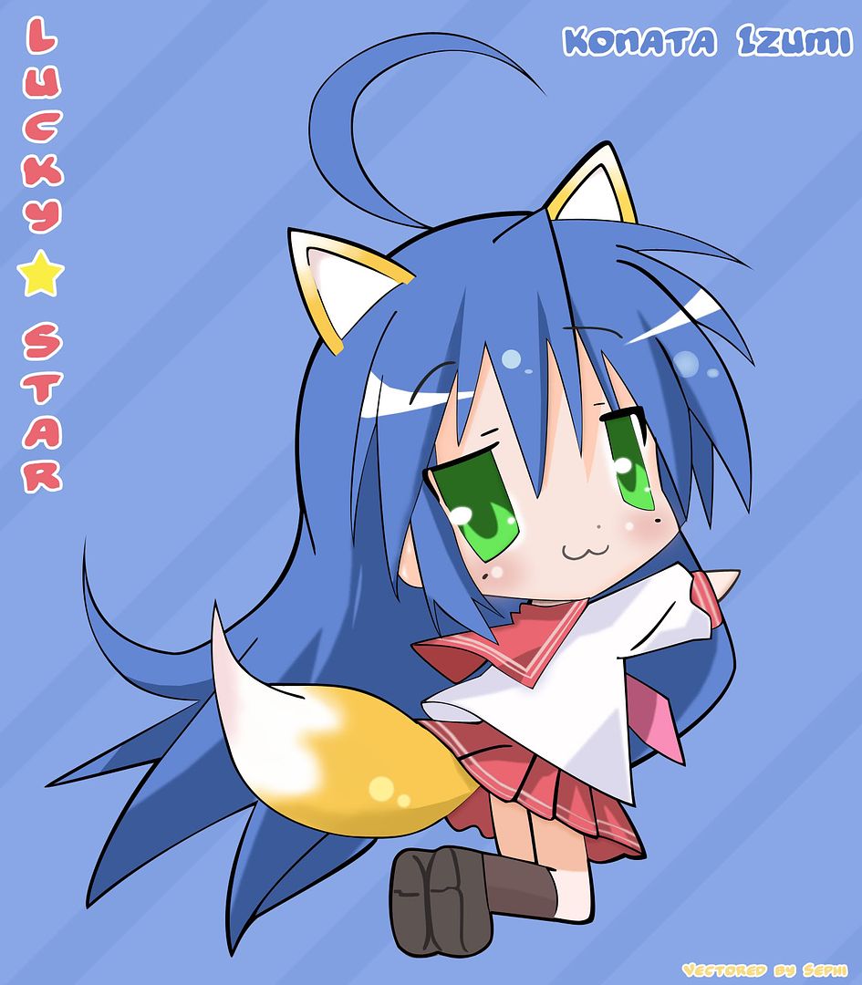 Yutaka & Minami  Azumanga Daioh cats  Wallpaper versions of the vectors. Spoiler:
Wallpaper 1680x1050 (16:10) 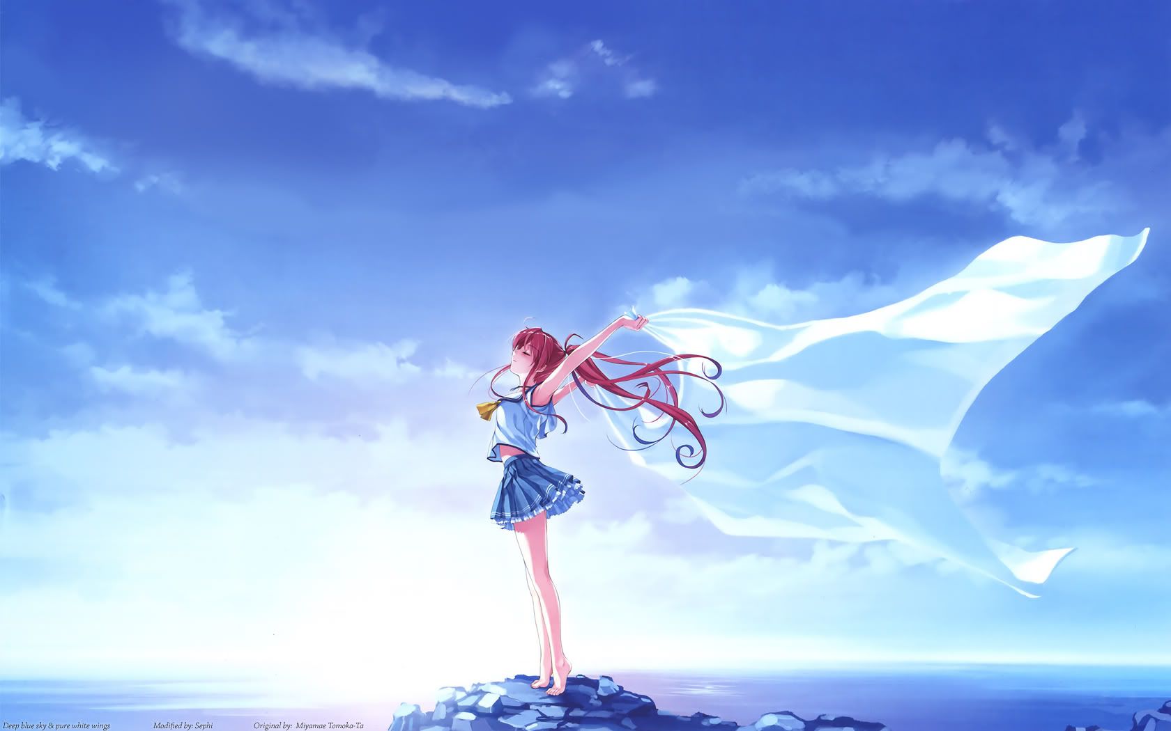 1600x1200 (4:3) 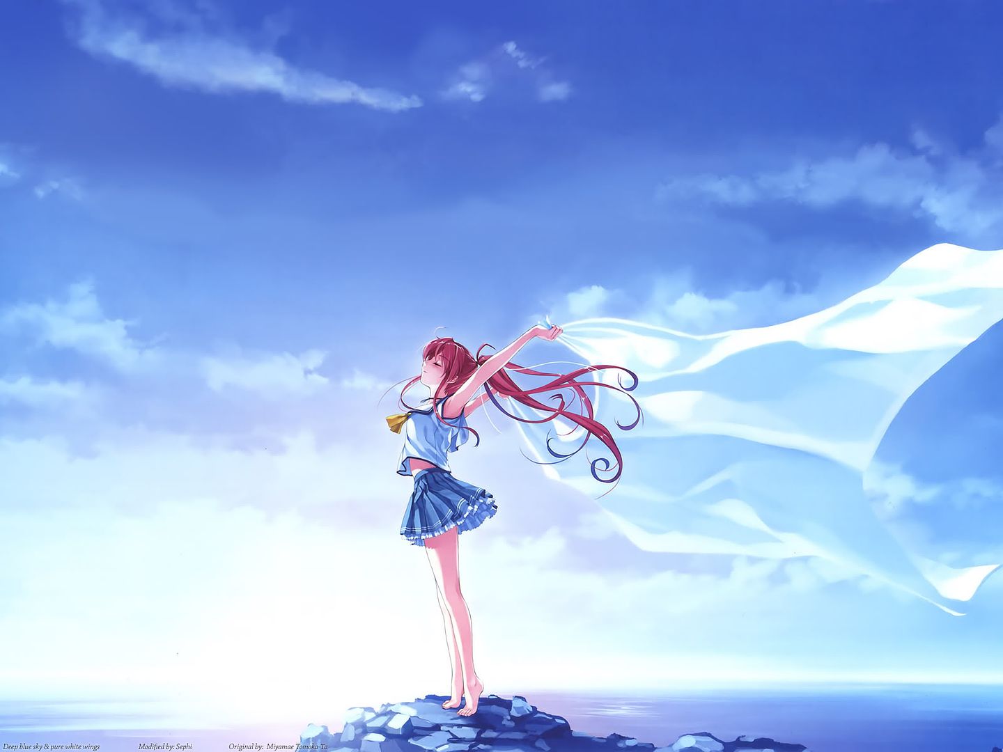 Spoiler for Info wallpaper:
Misc Corner The misc corner contains random stuff i couldn't place anywhere. Spoiler:
__________________
Last edited by Sephi; 2008-07-23 at 06:19. |

|

|
|
2007-06-09, 11:41
|
Link #3 |
|
Hail pork!
Graphic DesignerJoin Date: May 2007
Location: Silicon Valley
|
Well you have presentation. That's a plus... I don't have much time right now but I'll surely critique your work. One thing to keep in mind is you have vibrant colors on all your bg's except that you don't exploit them. A simple levels modification and you'll have a totally different look. Trust me, it will be for the better. The levels feature works with the low, mid and high tones of color so you'll have three scrubbers to play with. I'm sure by playing with it, you'll see what I'm talking about.
__________________
|
|
|
|
|
2007-06-09, 14:27
|
Link #5 |
|
sleepyhead
AuthorJoin Date: Dec 2005
Location: event horizon
|
~ WING
3? ~ that's weak xP 12 for me. Play with Red|Green|Blue to get different looks. Then tweak the General for either optimizing reasons (removing color tones) or just an extra touch. We'll that's how I do it for levels and curves. Do note that levels and curves are the same thing presented in a different way. It's just a way to make it easy on you to tweak.
__________________
|
|
|
|
|
2007-06-09, 18:44
|
Link #6 |
|
AniMexican!
Join Date: Dec 2005
Location: Monterrey N.L. Mexico
|
Tee-hee, this two are my favorite so far.
 <-- getting a bit full of himself lately <-- getting a bit full of himself lately    This two are also full of win and awesome!   And Saber seems to be extremely popular among sig creators; A lot of people posting sigs here have made at least one of her at one point or another. Keep up the good work!
__________________
|
|
|
|
|
2007-06-09, 22:05
|
Link #8 | |
|
Hail pork!
Graphic DesignerJoin Date: May 2007
Location: Silicon Valley
|
Quote:
It's cool you say that you tweak out 12 levels for color... You should put up some of your work plus the original renders used so we can all see... and of course if all possible a little vid tut or static tut to see how you apply 12 levels of color. I've seen your little work shop and really nothing impressive to the point where I can see atleast 12 levels of hue were adjusted... but if you say so lol. So before you go off shooting your mouth mentioning that it's weak because I use the levels function, think about some work you've done to show as examples of 12 hue adjustments. I stand by my critiquing skills and offer help to others unlike you being all cocky because you use 12 hue adjustments in your work and bagging on me because I use a different photoshop function. You're not being a team player here buddy. I'm telling it to you straight because you're being a bit cocky so no hard feelings =) I'm just trying to help out our fellow members here on AS. ~My apologies Sephi for ranting on your thread.
__________________
Last edited by WINGZERO619; 2007-06-09 at 22:41. |
|
|
|
|
|
2007-06-10, 01:47
|
Link #10 | ||||
|
Thinking outside the box
Graphic DesignerJoin Date: May 2007
Location: The Netherlands
Age: 37
|
Quote:
I usually make the background with brushes and than color it with Color Balance. Can you give a example which sig i made would profit the most of the use of Levels?Or if you want i could upload the PSD somewhere and you can show me what you would do with Levels to give it a more vibrant look as i'm really clueless about the use of Levels beside darken and brighten stuff  I did played a bit with Levels on some sig just now. But the effect seems quite similar to Color Balance or am i doing something wrong? I'll go look up some more info about levels in the mean time. Quote:
Quote:
. The saber sig is the first sig i made with use of Brushes.Quote:
Thanks for comment guys/girls Ps: i just found out sig limit is 500x120 if i want to put text under my sig.. Guess i been making sigs at wrong format. Luckily i never got caught with 450x130 and 1 line of text. Though i will start making sig at 420x120 or something around that format.
__________________
Last edited by Sephi; 2007-06-10 at 03:07. |
||||
|
|
|
|
2007-06-11, 02:16
|
Link #12 | |
|
Thinking outside the box
Graphic DesignerJoin Date: May 2007
Location: The Netherlands
Age: 37
|
Quote:
And Wingzero. Thanks for the PM with the video tutorial. I understand what you mean now and i played around with Levels a bit yesterday. I could see the difference. Though still really hard to get the exact right color because i'm not really good at choosing colors. But i can see the colors becoming more vivid. I'll post some results when i got more time to make signatures. Damn exams and overload of homework. Next few sig would probably be Arcueid from Tsukihime (my new found goddess to worship ) And some Shuffle one as a tribute to the cuteness of the girls.
__________________
|
|
|
|
|
|
2007-06-11, 10:09
|
Link #13 |
|
Falling for Ginsama ^3^
Graphic DesignerJoin Date: Feb 2007
Location: Airantou
 |
Hey hey Sephi u have a thread!!!!! ^_____^
Ur sigs look so awesome!! Real nice Job :3 Me wants to see moar! xD O and about that render thing this was the one I was talking about for kuea and if its the one from animerender then meh. Spoiler for for the pic of Kuea:
__________________
|
|
|
|
|
2007-06-13, 13:18
|
Link #14 |
|
Thinking outside the box
Graphic DesignerJoin Date: May 2007
Location: The Netherlands
Age: 37
|
Thanks bigdave. I had that render, But your's is alot better since i won't have to cut it out if i decide to use it. I got several pics of her now. But the problem is lack of inspiration and i can't decide what color's to use. I usually use the hair or skin or cloth color as background. But Kuea hair/skin/cloth color don't make the most intresting backgrounds
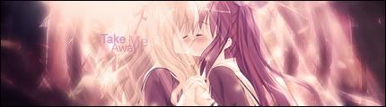
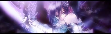
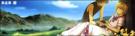
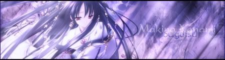
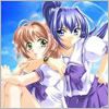
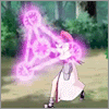
I tried a few but i'm not gone waste people bandwich with it, it's quite bad. Once i got some more inspiration i'll get working on Kuea sig. She's so lovely  But i did found time and inspiration to make sigs of TsukiHime. Arcueid  This one is my favorite for now. Thanks wingzero for the help with it to.  Simple crop and scale one... Hope it's ok to post a sig like this.  And another :P Have to work a bit more on the levels on this one i think. But couldn't get any good results when i tried.  Another tribute to Arcueid  I couldn't possibly not make a sig of this... The result's aren't very good. But it's okish Arcueid and Saber  Also my first attempt at a sig with the use of C4d. I think the result isn't to bad for a first attempt. But have to work on blending the render better with the rest. Some avatars    Didn't got around making much avatars yet. But more to come. And when i find some inspiration for shuffle i'll start with that. PrimulaComment's criticism are welcome.
__________________
|
|
|
|
|
2007-06-17, 14:07
|
Link #15 |
|
Thinking outside the box
Graphic DesignerJoin Date: May 2007
Location: The Netherlands
Age: 37
|
Some sigs i did last couple of days between studying.
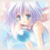
Trying some new style as i got bored of the brush backgrounds.  Found a wallpaper of Kanon. And i decided to try a new style on it. I wonder who the girl is on the left though... Even took me awhile to figure out who the right one was. 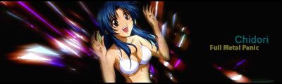  2 more sigs with use of C4d. Didn't turned out as well as the Ciel one above. But i think i'm getting the hang of it. Guess my Ciel c4d choice was beginners luck. Overall i think the sigs are just worth a 6-7 out of 10. Gotta improve more. Hope i got more inspiration the next week.
__________________
|
|
|
|
|
2007-06-17, 14:22
|
Link #16 |
|
Hail pork!
Graphic DesignerJoin Date: May 2007
Location: Silicon Valley
|
out of the your two last c4d sigs, the last one is a good compilation. Colors go well with the render. As for the one before it, I would say if she had clothes on, it would be more complimenting with the bg. Either than that, they both look fantastic. Very vibrant colors on the first one. 2nd one is nice and smooth. Keep up the great work.
__________________
|
|
|
|
|
2007-06-20, 17:49
|
Link #17 |
|
Junior Member
Join Date: Jun 2007
|
Hi, any guy create for me a signature of major in 500 x 120 pixels plz ?
With effects and acessories, wakaranai desu, tonikaku with your personal, ty xD http://img8.imageshack.us/img8/7681/gorotitre3co.jpg |
|
|
|
|
2007-06-20, 17:57
|
Link #18 |
|
Falling for Ginsama ^3^
Graphic DesignerJoin Date: Feb 2007
Location: Airantou
|
Shinn>> ur supposed to request that up at the request thread ^^
Sephi>> Let me ask u something do u visit anime-source site? cuz if u do then U should know who I am. xD LOL but if not then I guess im mistaking u as someone else T_T I feel all lonely cuz everyone is leaving me in the dust with all the c4d sigs getting made. =__=
__________________
|
|
|
|
 |
| Thread Tools | |
|
|


 hope someone identify her soon.


 Hope to see more in the future


 Nice work btw. Really like it too. *throws a cookie filled jar*


