2008-11-17, 23:02
|
Link #7941 |
|
Saber's Husband XD
Join Date: Oct 2006
Age: 36
 |
Kaze ~ its SABER!!!!!!!!!!!!!!!!!!!!!!!!! that's my waifu >_< 10/10 instantly XD
ganbaru ~ yup LQ over there the name is kinda ruined too... 6/10 Tsuzuki ~ though looks like small and fit the size is kinda heavy for the forums make sure you change it before some hordes of sig eating bunnies will eat that >_< 7/10 Katocchi ~ simple yet good 8/10 ... btw death the kid rocks XD Evil Rick ~ ^^ dont know who it is but I hope the penny will be mine ^^ 8/10 Saber-chan ~ bluuuurrrryyy but it's rein ^^ 8/10 Arceon ~ luv it 10/10 ^^ been a while that's why I'm tooooooo rustyyyyyy when it comes to sig making oh well here's mine a simple eruruu since she's so adorable ^^ don't bash it too much k? 
__________________
|

|

|
|
2008-11-17, 23:20
|
Link #7942 |
|
"Show it to me"
Join Date: Dec 2005
Location: In solitude, where we are least alone
|
@ OutSmart: very stylish. I like it. It gives off a noir/gangster kinda feeling. Also, a perfect atmosphere for them three. 9/10
@ Arceon: The background seems a little "too real" for the render. Hm how do you explain it? It's not anime-ish? It's leaving the render a little off IMO. 7/10 @ Kaze: Render could blend a little more. 7/10
__________________
|
|
|
|
|
2008-11-18, 01:10
|
Link #7943 |
|
♫Wings of Fallen Angel♫
Join Date: Nov 2008
Location: Cali ♥, US
  |
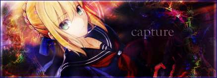
@Kaze: agree with Cyz. Preferred slighter darker color. 8/10
@capture: i love it! 9/10 @Cyz: Is that Rosario to Vampire? o.O 9/10 My siggy sucks. i made this in less than 30 seconds (i'm serious. all i did was put text, and put some brushes. i can do so much better than this XD) don't even think about rating it higher than a 5.
__________________
|
|
|
|
|
2008-11-19, 18:21
|
Link #7947 |
|
Ha ha ha ha ha...
 Graphic Designer Graphic DesignerJoin Date: Apr 2006
Location: Right behind you.
Age: 35
|
Katocchi: Nice, but i don't really like the font style of your username. 7/10
Asmodeus: The graininess of the source pic kinda ruins the cuteness of the girl. 6/10 UltimaWolf: Back to an old favorite, I see.  I love the blinking... how did you do that? 10/10 I love the blinking... how did you do that? 10/10
__________________
|
|
|
|
|
2008-11-19, 18:41
|
Link #7948 |
|
Comic Relief
Join Date: Oct 2008
Location: Portugal
Age: 33
|
Asmodeus - 8.5/10, it looks good, great even, but I've seen better
Katocchi - 8/10, I HATE KID X MAKA PAIRING!!!!!!!! but the sig looks cool anyways ^^ spec and ultima have already been rated with those sigs previously ^^
__________________
|
|
|
|
|
2008-11-19, 20:02
|
Link #7949 |
|
books-eater youkai
Join Date: Dec 2007
Location: Betweem wisdom and insanity
|
Katocchi 8.8/10 sober than the previous sig.
Asmodeus 8.5/10 like said before, the problem of this picture is the grains. UltimaWolf 9.5/10 Good animation Spectacular Insanity 8/10 interesting text.
__________________
|
|
|
|
|
2008-11-20, 05:59
|
Link #7950 |
|
~Nani...?~
Join Date: Aug 2007
Location: ~Bleh~
|
Speci: I've always liked that sig, Simple but nice and very creative place to put your name. 9/10
OutSmart: I like the slideshow effect (I'm not sure if thats whats its called but I'll call it that.  ) Really nicely done. 9/10 ) Really nicely done. 9/10ganbaru: I'm not sure if its suppose to look like a painting(-ish) Creative if so. 8.5/10
__________________
|
|
|
|
|
2008-11-20, 09:10
|
Link #7952 |
|
Constellation
Graphic DesignerJoin Date: Jan 2008
Location: Pearl of the Orient Seas
Age: 31
|
gigaloki: simple I guess, dunno Saber doesn't fit in with the color red in my taste 6.8/10
Ultimawolf: I've got nothing else to say  9/10 9/10Outsmart: nice, Sid and the Thompson sisters are cool \m/('. '\m/) 8/10 ganbaru: too simple and change the text  5/10 5/10Speci: that's simon right? then its 9/10 oh if you like, please rate this also 
__________________
|
|
|
|
|
2008-11-20, 09:21
|
Link #7954 |
|
nope
Graphic DesignerJoin Date: Jun 2007
|
OutSmart: Nice. Marina really knows what she's doing 9.5/10
ganbaru: ... 4.5/10 UltimaWolf: Looks good :3 8.5/10 gigaloki: 7/10 Frailty: The first one - Nice! I really like the render  would be better without the "crowlanser" text ^^ 7.5/10 would be better without the "crowlanser" text ^^ 7.5/10The second one - It looks good :3 8/10 Katocchi: Maka x Soul!!! 10/10  |
|
|
|
|
2008-11-20, 11:17
|
Link #7955 |
|
Black Dragon
Graphic DesignerJoin Date: Dec 2007
Location: In the Netherrealm, thinking who to betray next...
|
UltimaWolf: O.O! 9/10
Spectacular Insanity:  8/10 8/10OutSmart: Really cool 8/10ganbaru: Peacefull sig 7.5/10 Frailty: (normal sig) The render is kinda hard to see O.o 7/10 Frailty: (posted sig) Sexy :3 8/10 Katocchi: Maka x Soul lol 8/10 Malin: The text is just a bit hard to diferenciate but still cool 8/10
__________________
|
|
|
|
|
2008-11-20, 12:01
|
Link #7956 |
|
Ha ha ha ha ha...
Graphic DesignerJoin Date: Apr 2006
Location: Right behind you.
Age: 35
|
Frailty: Posted: I know who that is and what anime she's from, lol. 8/10
Katocchi: Nice! Cool border and awesome Maka x Soul siggie. 10/10Evil Rick: Dude, you always have the coolest text for your sigs. Where do you get them? 9/10
__________________
|
|
|
|
|
2008-11-20, 14:28
|
Link #7958 |
|
Comic Relief
Join Date: Oct 2008
Location: Portugal
Age: 33
|
"OutSmart: Nice. Marina really knows what she's doing 9.5/10" - mallin
she does.. she SO does... w8 until I change my avy/sig set with other piece from her... it will blow your mind!!! ^^ Master Anime - I cant enter your profile for wathever reason. Evil Rick - looks cheap, but I like the femail warrior pic, 7/10 Mallin - 9/10, beautiful
__________________
|
|
|
|
 |
| Tags |
| rate, signature |
|
|