 2010-04-10, 13:43
|
Link #101 | |
|
Senior Member
 Artist ArtistJoin Date: Mar 2009
Location: Normandy SR-2
Age: 29
|
Quote:
__________________
|
|

|
|
2010-04-10, 15:10
|
Link #102 | |||
|
~La-la Land~
Graphic DesignerJoin Date: Jul 2007
Location: Seattle
Age: 37
|
Quote:
Maybe I'll make even smaller, or erase altogether :S Quote:
Quote:
Awesome work as usual ichigo-sora ^_^
__________________
|
|||
|
|
|
2010-04-10, 17:21
|
Link #103 | |
|
Paparazzi
Join Date: Mar 2008
Age: 41
|
Quote:
 ) )For the love of ... don't make the text smaller. It's mean enough as it is.  I've had my encounters with nonsensical texts, usually involving my head, a wall and a whole lot of perpetual motion. Either way I think it's better if you're quite clear on whether it's supposed to be read or not. If you can guess right away what it is, like your nick or a name of a well known character, you can get quite creative with it. If it's just some text I'd rather use something else instead. There are a whole bunch of alternatives to using actual letters, bar codes, shapes, braille (it's redundant enough in a picture, albeit it has a slight undertone of inconsiderability). As it is, it's just an unnecessary tease. It balances the main text nicely though so I'd rather consider options to the text rather than removing it altogether. To nitpick a bit more the initial "P" could have better coloring. Now it get's a bit lost in the background. Slightly more contrast would be nice. There's something in the coloring that's bothering me a bit as well. Towards the edges the coloring seems to turn a bit dull. The brighter blobs (what ever they are ) seem a bit too gray. Dropping the saturation works quite nicely but I'd give them a slight hue, maybe bluish or purple to spice up the color scheme a bit.
|
|
|
|
|
2010-04-10, 17:53
|
Link #104 |
|
books-eater youkai
Join Date: Dec 2007
Location: Betweem wisdom and insanity
|
Haladflire65 I would go with ver1
Bea Rabbit I have to agree with Moonie on this one. Sciel I would rework thre render, Reimu's skin look yellow. Ichigo-Sora the only thing I could say is about the last e of Medecine, it could be more visible.
__________________
|
|
|
|
2010-04-10, 19:15
|
Link #105 | |
|
Chrome.o23
Graphic DesignerJoin Date: Aug 2009
Location: Animanga Empire
Age: 27
  |
Quote:

__________________
|
|
|
|
|
2010-04-10, 23:23
|
Link #107 | |
|
Stained Member
Graphic DesignerJoin Date: Aug 2009
Location: Abyss
|
Quote:
btw, I made a second version. 
|
|
|
|
|
2010-04-11, 01:55
|
Link #109 | ||
|
(ノಠ益ಠ)ノ彡┻━┻
 Moderator ModeratorJoin Date: Mar 2006
|
Quote:
Since I'm nice I'll save you some time looking it up - Quote:
__________________
|
||
|
|
|
2010-04-11, 03:44
|
Link #111 | |
|
Stained Member
Graphic DesignerJoin Date: Aug 2009
Location: Abyss
|
Quote:

|
|
|
|
|
2010-04-11, 06:24
|
Link #112 | |
|
sleepyhead
AuthorJoin Date: Dec 2005
Location: event horizon
|
^ The entry is fine. Your signature isn't though, at 75,843 bytes over the limit (switch it to jpeg to save a lot of space).
Quote:
Or, you can just pm it to Solace.
__________________
|
|
|
|
|
2010-04-11, 18:10
|
Link #116 | |
|
"Show it to me"
Join Date: Dec 2005
Location: In solitude, where we are least alone
|
Quote:
 ^ Version 2 of the sig......hm, epic fail.
__________________
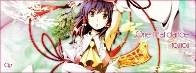
Last edited by Cyz; 2010-04-11 at 18:30. |
|
|
|
|
2010-04-11, 18:46
|
Link #117 | |
|
Stained Member
Graphic DesignerJoin Date: Aug 2009
Location: Abyss
|
Quote:
http://i280.photobucket.com/albums/k...ahs/Touhou.jpg @felix I think I am doing it right, it's 34,742 bytes |
|
|
|
|
2010-04-11, 22:04
|
Link #120 | |
|
Junior Member
Join Date: Apr 2010
Location: Kagutsuchi
|
Quote:
FINAL ENTRY: 
__________________
|
|
|
|
 |
| Tags |
| contest, signature of the month, sotm |
|
|


