2008-04-24, 18:38
|
Link #22 | ||
|
Rated P.G. Superstar
Join Date: Aug 2006
Location: Boracay, PH
 |
Quote:
Quote:
Spoiler for rendered by chibi:
Last edited by P.G.; 2008-07-09 at 23:25. |
||

|

|
|
2008-04-28, 09:05
|
Link #23 |
|
Rated P.G. Superstar
Join Date: Aug 2006
Location: Boracay, PH
|
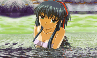
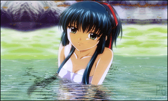
Ok Ok, I tried the water animation of KiNa's Tut, here's my outcome. I only animated half of it then blurred the other half of the sig. water is a bit off? CnC would really be appreciated.
v1 Spoiler for v1:
v2 Spoiler for v2:
Spoiler for AS safe:
Last edited by P.G.; 2008-04-28 at 09:40. |
|
|
|
|
2008-05-05, 13:49
|
Link #26 |
|
~ You're dead ^__^* ~
 Graphic Designer Graphic DesignerJoin Date: Apr 2006
Location: uk, England
Age: 34
|
Wow...I really like the siggy O.O
Good work on the BG too. The lighting though, is a tad too strong (as you can hardly any facial features). Just decrease the brightness and its perfect. Oh and decrease the opacity of your text too. Ps...VIVA NO BORDER! ^^
__________________
|
|
|
|
|
2008-05-08, 17:01
|
Link #31 |
|
Rated P.G. Superstar
Join Date: Aug 2006
Location: Boracay, PH
|
just tweaked a bit of my trial entry: C&C are much pretty appreciated.
fade gaussian:  gaussian blurr-soft light:  as for my sig, I first used it as a logo for my cuts. v1:  v2:sig style  just wanted to share this one: Spoiler for rimi:
avatar of her:  kuon avatar: was bored that time and made this. Spoiler for ava:
|
|
|
|
|
2008-05-09, 07:03
|
Link #32 |
|
Thinking outside the box
Graphic DesignerJoin Date: May 2007
Location: The Netherlands
Age: 37
|
Sharpen the focal a bit. I think someone already told that in the SOTM thread. Personally not to found about the text, looks somewhat to plain, and the squares near it are a bit to big.
Other than that. The sig looks quite nice  And i to have to add. SHES MISSING A HAND! Didn't notice it until someone mentioned it when you posted the render up. And i to have to add. SHES MISSING A HAND! Didn't notice it until someone mentioned it when you posted the render up.As for the render, not notable on this white bg and i don't think anyone mentioned it at AR, but the ribbon has some white spots. And the rest already mentioned the white spots around the hair. Other than that. Good render, very cute V2 of your logo looks better. But i see your already using it
__________________
|
|
|
|
|
2008-07-10, 18:43
|
Link #34 |
|
~La-la Land~
Graphic DesignerJoin Date: Jul 2007
Location: Seattle
Age: 37
|
Are you kidding me? Those banners are pretty gorgeous. My favorite is the bottom one with the twilight-like colors.
The text for the first one could use some work though. Also your opening banner = *Drool* Nice work there PG
__________________
|
|
|
|
|
2008-07-10, 22:07
|
Link #36 | |
|
AniMexican!
Join Date: Dec 2005
Location: Monterrey N.L. Mexico
|
Very good work on those banners. Really dig the Aria one.
 Quote:
 Btw, who is she? 
__________________
|
|
|
|
|
|
2008-07-11, 01:33
|
Link #39 | |
|
is not amused
Graphic DesignerJoin Date: Jul 2007
Location: Naval Base
|
Quote:
 Can't wait for updates on this one. Keep it up PG-san!
__________________
|
|
|
|
|
|
2008-07-11, 03:13
|
Link #40 | |
|
"Show it to me"
Join Date: Dec 2005
Location: In solitude, where we are least alone
|
Quote:

__________________
|
|
|
|
|
 |
| Tags |
| avatars, signatures |
|
|