 2012-06-23, 21:03
|
Link #1 |
|
Member
Join Date: Sep 2009
Location: Puerto Rico
|
Yenesis's Sigs & Avatars
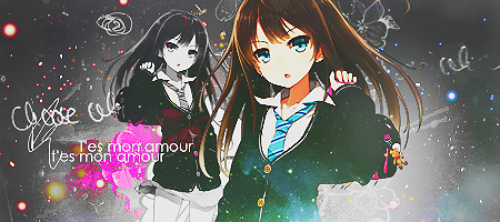
Hiya, I was pretty bored so I decide to post a couple of sigs and avatars I have done ^^ Many of them are pretty old since I don't make many designs now. hope someone like it :I
Spoiler for Avatars:
Spoiler for Sigs:
__________________
|

|

|
|
2012-06-30, 15:19
|
Link #8 | |
|
Member
Join Date: Sep 2009
Location: Puerto Rico
|
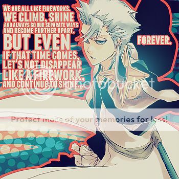
Thanks again for all the comments, here's a couple of more sigs and avatars I have done.
Spoiler for Avatars:
Spoiler for Sigs:
Quote:
 so yeah. so yeah.Glad ya like the sig and for the compliment I really appreciate it >w< and thanks for the welcoming ^^
__________________
|
|
|
|
|
|
2012-07-06, 13:28
|
Link #12 |
|
Barrel!
 Graphic Designer Graphic DesignerJoin Date: Jul 2011
Location: still under a rock
Age: 34
|
Weird... Thought I posted in here before, must of deleted it before I submitted.
Amazing work here, quite unique but in a good way.  Love this one, it fits the character well (from wolf guy?).
__________________
|
|
|
|
|
2012-07-07, 02:11
|
Link #14 | ||||
|
Member
Join Date: Sep 2009
Location: Puerto Rico
|
Quote:
Quote:
Quote:
this one:  is pretty simple I know >_> I still prefer the avi Quote:
__________________________________________________ ______ And here's couple of more avatars and sigs I have done. Spoiler for Avatars:
Spoiler for Sigs:
__________________
|
||||
|
|
|
|
2012-07-07, 12:36
|
Link #16 |
|
Quietly Lurking
Graphic DesignerJoin Date: Mar 2010
Location: Beneath the prodigious sky...
|
First of all, welcome to the FC subforum!
You have some really good tags and my favorite is this one  I love the vibrance, the creativity, the typo, pretty much everything  Take away that border and it'd be even better. Take away that border and it'd be even better.As for your work in general, I would suggest watching the contrast on some of your tags. Overcontrasted sigs look good in some cases, but it's easy to go overboard with it. Also don't spam effects like in the 3rd and 4th tags on the left in the OP (although I suspect you've already gotten past this as those look like older works). Amazing work in general and keep it up!
__________________
|
|
|
|
|
2012-07-07, 14:12
|
Link #17 | ||
|
Member
Join Date: Sep 2009
Location: Puerto Rico
|
Quote:
Quote:
__________________
Last edited by YeyeC; 2012-07-07 at 17:34. |
||
|
|
|
|
2012-10-31, 07:47
|
Link #18 |
|
Constellation
Graphic DesignerJoin Date: Jan 2008
Location: Pearl of the Orient Seas
Age: 31
|
Just saw your work on the sig request thread so I looked up on your profile to see if you had a thread
hence, the post anyway, You're pretty good I like your style. the colors really work well with the focal of your works. And amazingly, the sharpness of your works makes it look better too. Sometimes, sigs tend to be oversharpened but on your case, it's different. It creates this some kind of grungy effect that flows well with the colors. in short, Pro-level work cookies for the thread! I can't believe I missed this. Oh well, better late than never right? you should post more of your work more often btw I'm really looking forward to see more of your works!
__________________
|
|
|
|
|
2012-11-01, 04:44
|
Link #19 | |
|
Member
Join Date: Sep 2009
Location: Puerto Rico
|
Quote:
Awwww thank you so much, I really appreciate your comment, I really wish I could so more petition for other people here but is so hard with size limitation :/ but at least here in this topic some people can see some of my works ^^ Here's some works I done this couple month ;3 Spoiler for Recently works:
__________________
|
|
|
|
|
 |
|
|


 :|::|
:|::|