2008-06-12, 19:10
|
Link #841 |
|
~Rock ☆~
 Graphic Designer Graphic DesignerJoin Date: Apr 2007
Location: In The Farplane
|
I have a question regarding texts in a signature....This has always been my biggest weakness when it comes to sig making. I can't seem to get my texts to look right with my sigs. Anyone have any suggestions?
|

|

|
|
2008-06-12, 19:41
|
Link #842 |
|
Not an expert on things
Join Date: Jun 2007
|
Text is really difficult and can usually ruin a signature, especially since people take it so lightly. It's a part of the design, so badly placed text can damage a signature as much as bad colors, a poorly placed render, or a bad background.
It depends on the type of effect. I'll try to give some suggestions, but it's easier to explain if I have examples, and I'm not good with explaining concepts without examples. Everything I say is a guideline [Or is something I made up.] and is meant to be taken as such. There are always exceptions, and good effects can be created from exceptions. No matter what, good text must have good placement [This doesn't have an exception. But the things following it do.]. For that, you have to learn how to balance your signatures. If the render is to the right of the signature, you don't want to stick the text on the right side because it'll overcrowd and create too much empty space on the left side. If your render is in the middle, you'll have to balance it with your effects. The text is as much of an effect as any brush or C4D. If your render is in the middle and it seems like you have more brushing/C4D effects on the left side, stick your text on the right side. You want the signature to have an equal amount of "weight" [Like, the amount of negative and positive space.] overall, and a bad placing of text can mess that up. You want the color of the text to agree with what effect you want. If the text is what you want to draw attention to [A really difficult idea, since many times text doesn't take up enough negative space to be a good subject.], you're going to create more contrast with the rest of the signature. If you want it to compliment the focal, then you want less contrast. Contrast is the opposition of two elements. For example, if you look at a RBY color wheel, red and green are opposites on the color wheel. They contrast with each other, and therefore make each other brighter. Red text on a green background would be more noticeable than blue text on a green background. Also, the saturation and brightness of the text can contrast as well. Less saturation [duller colors] will contrast with more saturation [richer colors]. Also, dark text will be a lot more noticeable on a light background than dark text on a darker background. Again, it depends on what you want the text to do. I personally find these two factors, contrast and placement, to be the two things I consider the most when I make a signature. If I want the text to stand out, I'll make it contrast. If I want it to be noticeable and compliment the render, yet have the render stay the main focus, I'll create less contrast so that it isn't as strong. That leads into placement. The stronger the contrast is, the more visual weight it has, and the more it'll impact where it's placed. Sometimes it's good for text to have a good amount of visual weight, and sometimes it doesn't. It's hard to explain well. Understanding the principles of art will help you a lot with text, since understanding what makes a design well designed helps you understand how to put it together. Again, remember that there are exceptions to everything I just said. |
|
|
|
|
2008-06-12, 23:26
|
Link #844 | |
|
Kira_Naruto, the ecchi
Graphic DesignerJoin Date: Dec 2005
Location: http://www.exciting-tits.com/
|
Quote:
Filter-> render -> cloud. Press F if you dont like the cloud effect. Now while that layer selected, press Ctrl+Shift+U to get the Hue window, make sure the colorize button is ticked, now just go crazy with the sliders ( top is color, middle control how the color is tone, bottom is the brightness) press ok when you satisfied. @ cicido, gratz then  @ Endrance, dont worry, even seasoned sigmakers do have the same problem.. OB made some good point.. I'll add 1 more, experiment.. and with experiment comes experience 
__________________
|
|
|
|
|
|
2008-06-13, 15:11
|
Link #845 |
|
Senior Member
Graphic DesignerJoin Date: Nov 2007
Age: 33
|
I've got a little (actually a big -.-) problem with my sliced sig.
question: how the hell can I put the parts together?  Sry if there is already a tut about this. If there is one please give me a link cause I didn't find one by myselve  Thanks i advance
__________________
|
|
|
|
|
2008-06-13, 15:42
|
Link #846 | |
|
Thinking outside the box
Graphic DesignerJoin Date: May 2007
Location: The Netherlands
Age: 37
|
Quote:
Just like here. You can see the Code Geass sig has 3 image links(3 image slices), and the Subaru sig has 2 image links (2 slices).
__________________
|
|
|
|
|
|
2008-06-13, 16:15
|
Link #848 | |||
|
Peek a boo
Graphic DesignerJoin Date: Dec 2005
|
Quote:
Confusing? Then see the image below for illustration.  It's actually possible to piece together the 2nd type of slicing through the use of tables with cellspacing and cellpadding set to 0. However, since this forum doesn't allow those settings to be specified, you will get a spacing between the slices when you piece them together. e.g.
Now for an example on how to piece together the 1st type of slicing.  Typing: Code:
[img]Slice 1[/img]
[img]Slice 2[/img][img]Slice 3[/img][img]Slice 4[/img][img]Slice 5[/img]
Will give you:     
|
|||
|
|
|
|
2008-06-15, 01:16
|
Link #849 |
|
King Of The Night Sky
Graphic DesignerJoin Date: Jun 2007
Location: Indonesian`s Catacomb
Age: 33
|
hey KiNa, cicido thanks for before
at last i can make something like that too, although the animated parts still has big size nice one rika i think i must study slicing more |
|
|
|
|
2008-06-16, 15:31
|
Link #853 |
|
Senior Member
Graphic DesignerJoin Date: Nov 2007
Age: 33
|
That's the video tut I found most informative. Use the 6 mins and believe me, it's no wasted time =)
Klick me for video tut
__________________
|
|
|
|
|
2008-06-16, 19:00
|
Link #854 |
|
Busy busy busy
Graphic DesignerJoin Date: Mar 2008
Location: Slovenia
Age: 36
|
Animated fire tutorial Part I: starting from scratch
--- Difficulty: easy Time: several minutes --- Step 1: Let's start this tutorial by making image with the black background, size doesn't matter.  Step 2: Now create another layer with the rectangular marquee tool and colour it white, usually it should be 1/5 of the whole image height.  Step 3: Apply this filter: go to Filter > Blur > Guassian Blur and enter around 10 - 15 px.  Step 4: Duplicate the layers. 4 or 5 times is suggested for a clean animation. Step 5: Select the Smudge tool in your toolbox. In case you don't know how it looks, check the image.  Step 6: Use the smudge tool to smudge the white blur layer. You do this by clicking and draging from the bottom up.  Step 7: Repeat the above thing through the whole image.  Step 8: Repeat step 6-7 on all the layers. Then just simple create each frame for the each layer you have aka basic animation . At the end, just throw some colour and you should get something like this: --- Part II: Using the above tutorial on signatures with a non animated fire
__________________
Last edited by Eps~; 2008-06-17 at 04:09. |
|
|
|
|
2008-06-16, 19:10
|
Link #855 |
|
Busy busy busy
Graphic DesignerJoin Date: Mar 2008
Location: Slovenia
Age: 36
|
Animated fire turorial Part II: Using the basic tutorial on signatures
--- Diffuculty: easy (you should have read Part I: starting from scratch) Time: sever minutes --- Step 1: Get a signature with a non animated fire, like mine bellow.  Step 2: Duplicate the layer 4-5 times (prefered). Step 3: Use the smudge tool on the part of the image where the fire is, then simply drag it from bottom to up.  notice the flames on the fire place Step 4: Repeat it on all of the layers. Step 5: Animate it!  --- Simple eh?
__________________
|
|
|
|
|
2008-06-17, 10:27
|
Link #857 |
|
User Title eaten by ravenous bunnies
IT SupportJoin Date: Sep 2007
Location: Zeon
Age: 33
|
I back again ._.
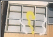
THis time in need help with Resizing images to 100x100(using Gimp) ... when i do it ends up like this...i did press center Spoiler for This:
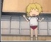
The Origanal Picture Spoiler for Origanal:
This is the gif i'm trying to resize Spoiler for Cation its huge:
__________________
|
|
|
|
|
2008-06-19, 14:09
|
Link #858 |
|
Junior Member
Join Date: May 2008
|
Minna!
Its me Again I want TO CREATE a SIMPLE ANIMATIONS USING ADOBE IMAGE READY? ANYONE CAN TEACH ME THE BASIC animations THank You SO much!!!!!i really appreciate if thers someday wants to help me! 
|
|
|
|
|
2008-06-19, 14:52
|
Link #859 |
|
Busy busy busy
Graphic DesignerJoin Date: Mar 2008
Location: Slovenia
Age: 36
|
There's already a tutorial on the first page made my KiNa. Or just simply follow this link to the mentioned tutorial:
http://forums.animesuki.com/showpost.php?p=792757
__________________
|
|
|
|
 |
| Tags |
| avatar, graphic, photoshop, signature |
| Thread Tools | |
|
|


 "]
"]