 2006-01-05, 09:40
|
Link #101 |
|
♪♫ Maya Iincho ♩♬
 Artist ArtistJoin Date: May 2004
Location: Unnecessary
Age: 37
 |
Kira_Naruto - me likey. It's good KN, the towels great huh? 7/10
Lina Inverse - the red borders, matches your other red colors. But i think you could've done something else to your picture. 7/10
__________________
|

|

|
|
2006-01-05, 10:27
|
Link #102 |
|
Inflammation
Join Date: Sep 2004
Location: Cardboard Box
Age: 40
|
Aoie, I like it. One thing that I'd recommend is that your name ont he shoulder where it's lighted, that should part should be lighted as well so it fits into context with the image.
8.5/10 Nice, easy and effective. |
|
|
|
|
2006-01-05, 20:17
|
Link #104 |
|
Inflammation
Join Date: Sep 2004
Location: Cardboard Box
Age: 40
|
Tried making a new sig, don't know which one is better.
I like my previous one but it's getting old. How do you guys like this one?  Sasurai - I love your sigs, as always. Nice background, your character blends perfectly and the colour's just right. Excellent work. 9.3/10 |
|
|
|
|
2006-01-05, 23:32
|
Link #105 |
|
Kira_Naruto, the ecchi
Graphic DesignerJoin Date: Dec 2005
Location: http://www.exciting-tits.com/
|
@ ForeverGoNe .. A bit striking in color .. but match the girl well .. one thing tho.. the Go seems a bit away from your overall name .. dunno how to explained it but I think you can understand what I'm trying to say .. I think
 and the horizontal text fails since I cant read it... sig wise a bit better then your current .. it just the text that failing it ... 78% and the horizontal text fails since I cant read it... sig wise a bit better then your current .. it just the text that failing it ... 78%
__________________
|
|
|
|
|
2006-01-06, 00:59
|
Link #106 |
|
Member
Join Date: Dec 2005
Location: Canada!
Age: 38
|
KIRA - 7.9/10
the text could less pixelated annd maybe but the bg isnt working for me. i'd go with the oh so controverial pink. take a look at this one, this is my favourtie sig i've done up to date! 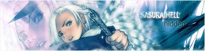 i think its quite excellent |
|
|
|
|
2006-01-06, 08:02
|
Link #108 |
|
Junior Member
Join Date: Dec 2005
|
Aoie_Emesai I like the crop but not the way you put your nick on it... try to blend it a bit more... 6/10
SasuraiHell Really nice... nice. Perhaps I'd lowed the opacity of the tex a little bit. Not to much. 9/10 JOJOS'STAR Nice girls... hehe For me the text is kinda big.... but nice sig 8/10. (I love your avatar). |
|
|
|
|
2006-01-06, 09:27
|
Link #109 |
|
nya`
ArtistJoin Date: Feb 2004
|
*Speechless* This thread only 6 page long . . . .
---------------------  Tiamat *cover eyes* 10/10 >_<  Vulkanito Nice! It's been a long time since I watched ALF and I love that idea. 9/10. I think it looks better as avatar... maybe. ^-^  Itachikun Simplicity make this sig realy stand out. 10/10 Last edited by Secca; 2006-01-06 at 09:56. |
|
|
|
|
2006-01-07, 00:16
|
Link #112 |
|
Disheartened and Retired
Join Date: Jan 2004
Location: 加拿大
Age: 37
|
ForeverGone - 80% - This sig's got a lot of style, and fancy BG effects to go with it.
Kira_Naruto - 77% - While the girl is hot and the BG is interesting, I'm not sure they go well together. XxNarutoFanxX - 74% - I take it you are a fan of that female in your sig. Nirvaphreak - 79% - Very cute image and concept. Only complaint is the lack of a border. Wanted to translate that Chinese into English, but then I thought, you must've purposely wrote that in Chinese for a reason, and I'll respect it. XxChris43xX - 78% - I love the subtle hue gradient across all the captains. But it seems like the individual captain portraits are linearly resized, or resized without anti-aliasing, resulting in noticeble "jaggies" (of their hair, glasses). Xellos-_^ - 75% - Asa is a great girl (judging from what very little I have watched of Shuffle). Sig itself is fine, with no complaints. Catgirls - 78% - Avatars as signature? Well, I praise you for your effort and impeccable taste in capturing the faces of anime. Lina Inverse - 74% - Cute and a bit ecchi image source. The red candy hearts around the corners just doesn't work for me. SirHellsing420 - 69% - A bit small by our forum standards. The dark red font is a bit hard to read. 1.0.7. - 74% - I understand this sig relies on the mood and aura that captain Byakuya exudes as a character. Just needs a black border. Vulkanito - 70% - The joke is lost on me. Oh well. Drake - 82% - CCC. Cute, clean, and crisp, on top of a nice idea. *Thumbs up* Cyz - 81% - This is a well done sig. Balanced, fitting BG, and the text keeps the signature busy enough as a whole. Aoie_Emesai - 76% - A sleeping beauty. Nice source, but the image seems a bit too dim. SasuraiHell - 79% - I like the blue hues, and how it compliments the BG effects. Fitting font choice as well. JOJOS'STAR - 77% - The right girl is hot, but I see jelly rolls on the left .Secca - 79% - Simple, but interesting crop and image. i0td - 78% - Good crop on a good, albeit "standard", source image. Misuzu for the gao! My signature is a simple crop (as my signatures has been for quite a while), of a not quite black and white, but grey and white image. I chose this signature because I love the source fanart, as the image captures that softer, more innocent side of Shinku, in addition to being endearingly cute. Everytime I look at the source picture I can't help but reveal a wistful grin on my face; furthur strengthening my appreciation for Shinku as a character. Just a warning, my signature is divided into three essentally equal parts to accomodate three different links. Occasionally not all three parts are loaded at once. If so, reload the page. If that doesn't work, clear your internet cache and reload. It happens sometimes. Last edited by Muir Woods; 2006-01-07 at 13:25. |
|
|
|
|
2006-01-07, 01:37
|
Link #114 |
|
Inflammation
Join Date: Sep 2004
Location: Cardboard Box
Age: 40
|
Gonna try with that render too, Sasurai.
Currently am fond of magna carta so  . .I'll post in a jiffy.. sort of same style. Testing out some fonts. Here:  Cyz - Look's simple but effective. 9/10 Last edited by ForeverGoNe; 2006-01-07 at 02:24. |
|
|
|
|
2006-01-07, 18:12
|
Link #115 |
|
...
Join Date: Nov 2003
|
ForeverGoNe - 8/10
Cyz - 7.5/10 needs higher resolution Muir Woods - 8.5/10 maybe a bit longer? i0td - 7.5/10 shrink the sig a bit to increase the resolution (TV screenshot doesn't make good raw) Drake - 8/10 Secca - 8.5/10 Here is a signature that I just made within the last 5 minutes. I will not use it, however, for obvious reason 
__________________
Last edited by Thelastguardian; 2006-01-07 at 18:42. |
|
|
|
|
2006-01-08, 03:02
|
Link #116 |
|
Junior Member
Join Date: Jan 2006
Location: Absurdistan
 |
Aoie Emesai:
Nice siggy,but like ForeverGoNe has said,the signature would look better with you name not placed on the arm,maybe towards the bottom right-hand corner would make the signature look better?Simple but nice borders. An 8/10  SasuraiHell: I like the nice blend of blue,light blue and black colour.I feel that it sorta fits the mood that the guy in your sig's eyes are trying to say. 8.5/10 Your newest signature again has a really sweet blend of colours,its very visually pleasing.Again,it supports the picture in the signature perfectly. 9/10 JOJO'STAR: Very erhm,nice sex appeal.Tithering on the edge of whats allowed and whats not  Words are a bit distracting though Words are a bit distracting though 8/10 Vulkanito: Not much to comment here except that like what Secca said,it would look better as an avatar. 7.5/10 KiNa: Tama-nee from TH2?Nice background and colours.Bathtowels are always good  Secca: I LOVE the kitty in the sig.Nice bright colours,goes well to support the smile of the kitty. 8.5/10 Drake: Chibi-ish Kill Bill coupled with nice bright colours for the win 8.5/10 Itachikun: Really really love your sig.Is it hand-drawn?It's a really sweet sketch/drawing. 8.5/10 i0td: Nice AIR sig.To me it represents freedom 8.5/10 Cyz: A Shuffle sig,but at least its not those KKK,RRR,AAA or <insert popular character>.As usual,I love the blend of orange and yellow. 8/10 Thelastguardian: 'DISCLAIMER'.It certainly draws attention subtley. (No rating because you aren't using it) Pinklynx: Yup,mine's pretty crappy in comparison to all the others .I took a photo of my Freedom and Providence HG 1/144 dancing a waltz,SnagIt'ed it and added the 'aishiteru' and my name.Pretty basic for a Photoshop noob like me There are probably 100 areas I could improve like adding a border and not using JPEG(the picture quality oh why oh why ;_; )but stiil,its pretty much an accomplishment for my first sig(baby steps )
Last edited by Pinklynx; 2006-01-08 at 03:13. Reason: Left out KiNa's rating |
|
|
|
|
2006-01-08, 03:33
|
Link #117 |
|
Kira_Naruto, the ecchi
Graphic DesignerJoin Date: Dec 2005
Location: http://www.exciting-tits.com/
|
@ Thelastguardian ... I actually waited to see what image you have in store ... damn you for making me wait
 .As for your current one.. there are not much to complain. limited by filesize limit it quite good albeit threading the water by an extra bytes =x . 87% extra points for being animated .As for your current one.. there are not much to complain. limited by filesize limit it quite good albeit threading the water by an extra bytes =x . 87% extra points for being animated @ Pinklynx .. For a start, its quite OK .. your name needs to be more pronounces. And the overall Bg is kinda tame .. 65% You'll get better as you play more ^-^ @ KiNa .. No more Tamaki T-T but Soi Fong is a "delicious" babe as well  so meh .. cant find towels for her tho =3. I have a hidden name there as well .. see if you can spot it ~_^v so meh .. cant find towels for her tho =3. I have a hidden name there as well .. see if you can spot it ~_^v
__________________
|
|
|
|
|
2006-01-08, 09:25
|
Link #119 |
|
Inflammation
Join Date: Sep 2004
Location: Cardboard Box
Age: 40
|
Don't worry, you'll get the hang of it in no time.
Nice starter sig, 8/10 cuz the colours of the background are well suited with your character. I was wondering if this ones anygood:  This one didn't take as much time though. I was testing around with different smudges. |
|
|
|
|
2006-01-08, 17:13
|
Link #120 |
|
"Show it to me"
Join Date: Dec 2005
Location: In solitude, where we are least alone
|
pinklynx: im not a big fan of gundam and the pic seems to be just cut out from something (sorry!) 6/10
kira naruto: ah! soifong. nice image and the color...well, it's okay. 8/10 d3athscythe: the blending of colors is cool. i only wish i could see the image a bit better instead of just the face. 9/10 forevergone: a magna carta sig. nice bg and colors. the pic is cool too. 9/10
__________________
|
|
|
|
 |
| Tags |
| rate, signature |
|
|


