2009-10-01, 03:57
|
Link #42 | |
|
Busy busy busy
 Graphic Designer Graphic DesignerJoin Date: Mar 2008
Location: Slovenia
Age: 36
|
Quote:
 However, the AS safe version has a little bug. After the 3rd frame the left hand moves upwards while the right hand disappears (looking from the viewers point). Now I don't know if that was intentional to add the feel that the scary person is scratching and trying to get out. Personally, because of the AS limit we can only have a handful of frames, I'd like it better if the right hand also disappeared since some might think it's a bug. But that's just me 
__________________
|
|

|
|
2009-10-01, 07:14
|
Link #44 |
|
books-eater youkai
Join Date: Dec 2007
Location: Betweem wisdom and insanity
|
KiNA great idea, I prefer the 4th version, the one you posted on your thread.
I changed my second text layer for something more appropriate and tonnes down the gradiant map. C&C would be welcome. ( By the waqy Should I make her stand more out of the background ?)  Spoiler for previous version:
__________________
|
|
|
|
2009-10-01, 09:07
|
Link #46 | |
|
Senior Member
Join Date: Nov 2006
Location: Virginia, USA
Age: 62
|
Quote:
(a) This is the only picture I found that I liked & thought was useable. (b) Transparency is the personal goal I set for myself this month. a + b = the mess that is my current entry.  Looking at it from a philosophical standpoint though, working through messes is a good way to learn & improve oneself.
__________________
|
|
|
|
|
2009-10-01, 09:26
|
Link #47 |
|
time waits for no one <3
Graphic DesignerJoin Date: Aug 2008
Location: Portugal, Lisbon
Age: 32
|
hiii everyone ^^
so I've already made 5 versions of the same sig and decided to show you only this last one that all my friends think looks better... 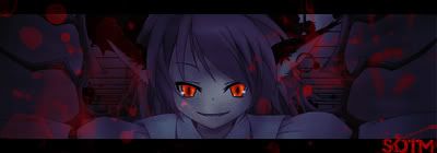 C&C is much appreciated :3
__________________
|
|
|
|
2009-10-01, 10:23
|
Link #49 | |
|
Anxious bookseller
AuthorJoin Date: Aug 2006
Location: Shibuya Psychic Research
|
Quote:
__________________
|
|
|
|
|
2009-10-01, 10:23
|
Link #50 | |||
|
Black Dragon
Graphic DesignerJoin Date: Dec 2007
Location: In the Netherrealm, thinking who to betray next...
|
Quote:
Quote:
Quote:

__________________
|
|||
|
|
|
2009-10-01, 10:35
|
Link #51 |
|
time waits for no one <3
Graphic DesignerJoin Date: Aug 2008
Location: Portugal, Lisbon
Age: 32
|
D: awww man, I'm afraid of making really really dark/ spooky sigs because I don't want people to think the sig is too scary..... but finding the sig moe is just.... D:
I really need to do something scarier then *starts to look for really scary imeages* - don't complain if you can't sleep afterwards 
__________________
|
|
|
|
2009-10-01, 12:39
|
Link #52 |
|
~Nanchatte Renai
ScanlatorJoin Date: Mar 2006
Location: Australia
Age: 30
|
I won't have much time to edit my entry as school is approaching a new semester.
So this will be my Final Entry.  C&C is always welcomed. Since I may get time to edit it (but doubt it)
__________________
|
|
|
|
2009-10-01, 17:52
|
Link #53 | |
|
Anxious bookseller
AuthorJoin Date: Aug 2006
Location: Shibuya Psychic Research
|
Quote:
__________________
|
|
|
|
|
2009-10-01, 18:00
|
Link #54 |
|
books-eater youkai
Join Date: Dec 2007
Location: Betweem wisdom and insanity
|
vandakiara I wouldn't go as far as the others said, but red eyes and a few drop of blood aren't enough to make a spooky/horror sig. Maybe adding more contrast betweem the girl and the background ?
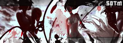
LKK I wouldn't suggest to anyone to use transparency for this month, especialy as much as you did. Background can be very effective for making the ambiance of the sig, which will be very important this month. SweetHoney I would say it's creepy for sure but why the ramdomness? The gorl as the principal render, the Rena at ht emiddle and I am not sure what at the othe side. 5th version of my sig. Make the render and one of the text layer stand a bit more. C&C would be welcome.  Spoiler for 4th version:
If you are curious , the idea to putting the kanji 甘( amai/sweet) and 赤 (akai/red) in the background came to me because of this video: Spoiler for saving space:
__________________
|
|
|
|
2009-10-01, 18:22
|
Link #55 | |
|
toptoptoptoptoptoptoptopt
Graphic DesignerJoin Date: Jun 2008
Location: Behind you >:)
Age: 27
 |
Quote:
Ok I couldn't turn her eyes red since my Photoshop Elements doesn't have that feature so i just used brushes with either blue or red. I tried to do sparks but they're don't seem to be any brushes for that. =/ 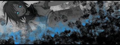 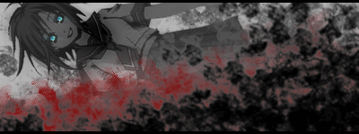
__________________
|
|
|
|
|
2009-10-01, 18:47
|
Link #56 |
|
books-eater youkai
Join Date: Dec 2007
Location: Betweem wisdom and insanity
|
Ayu-smepai as a Photoshop Element user myself, I think I can help you. First copy paste the render on a blank file. Make a copy of the render's layer, and hide first one . Errase all but the eyes on the visible layer. With a hue/saturation layer change the color of the eye. Merge the visible layer. Make visible the hided layer. Now you should be abble to copy merged the render now with the red eyes back on the sig.
__________________
|
|
|
|
2009-10-01, 21:49
|
Link #57 |
|
Kira_Naruto, the ecchi
Graphic DesignerJoin Date: Dec 2005
Location: http://www.exciting-tits.com/
|
May I suggest that PS Element users to migrate to gimp? You can try out gimpshop version which are set up to emulate PS environment.
It seems from several posts from Element users that its kinda missing a lot of stuff from the normal PS version.
__________________
|
|
|
|
2009-10-02, 01:49
|
Link #60 | ||||
|
Black Dragon
Graphic DesignerJoin Date: Dec 2007
Location: In the Netherrealm, thinking who to betray next...
|
Quote:
At least the "too dark" problem is being fixed. Try some lighting efects maybe.  Quote:
Red = The black stains over the red stains make them look like mere paint stains, not blood, red eyes are meeded for this one too. >_> Quote:
 Quote:
__________________
|
||||
|
|
 |
| Tags |
| contest, sotm |
|
|


 Administrator