2007-08-26, 12:51
|
Link #41 |
|
Ever Bright, Ever Blue
 Graphic Designer Graphic DesignerJoin Date: May 2007
Location: Ontario, Canada
Age: 34
|
wow i tend to disappear of this site alot, well i did one new sig, i think ive had a little sigmakers block, so yeah, here it is, hope you like/
 these other two were just kinda random ones i made after watching and finishing sola, i got into Da Capo, Nemu is pretty cool  
|

|

|
|
2007-08-26, 13:39
|
Link #42 |
|
noLife
ArtistJoin Date: Jul 2007
Age: 35
|
Borders! You're missing the borders! tehee~
The first one is maybe a bit over-effected/brushed and that kinda tears the attention away from the render. You should bring out the render a bit more and maybe soften the background a bit. From the other two, I like the first one more. But it's a bit empty, maybe if you made the render a bit bigger, it would fill it more. I like the lighting of it though. The second one's render has a poor quality and I don't really like it much. |
|
|
|
|
2007-08-27, 15:41
|
Link #43 |
|
Ever Bright, Ever Blue
Graphic DesignerJoin Date: May 2007
Location: Ontario, Canada
Age: 34
|
yeah, i keep forgeting borders, i rip of so many sigs it just slips my mind. i see that it is quite busy in the basckground, but ive hada little sigmakers block, so im trying to work my way out of it. out of the other 2 i like the top one more, i suck at text so it is hard to fill random space,
thanks for the info thought, i need a good bit of criticism to get me moving a bit. |
|
|
|
|
2007-09-25, 19:19
|
Link #44 |
|
Ever Bright, Ever Blue
Graphic DesignerJoin Date: May 2007
Location: Ontario, Canada
Age: 34
|
Hey, i did this animated sig of Cagalli, but i somehow screwed up my imageready setting and now im reduced to some really pixilated image. i cant figure out what i did, does anyone know, and can tell me what the heck i screwed up?
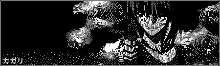 edit i fixed it, yay! illpost it fixed up simple rain effect, nothing too fancy 
|
|
|
|
|
2007-09-27, 15:36
|
Link #46 |
|
Ever Bright, Ever Blue
Graphic DesignerJoin Date: May 2007
Location: Ontario, Canada
Age: 34
|
^^ yeah, i forget sometimes, gotta file that away a bit better. i havent been in a arts mood, but i got it turned around now.
Im in love with Cagalli from Gundam SEED so i went on a tanget and made a few cagalli sigs, and a few other recent ones i did Spoiler for sigs:
|
|
|
|
|
2007-09-27, 16:49
|
Link #47 |
|
Thinking outside the box
Graphic DesignerJoin Date: May 2007
Location: The Netherlands
Age: 37
|
I think the animated Cagali sig is in only 2 colors. That is why it looks like that (i think)
It's quite rare to see someone making sigs of cagali  But you got good taste But you got good taste  I bet it was the dress episode that made you make all those Cagali sigs ^.^ I bet it was the dress episode that made you make all those Cagali sigs ^.^Btw, you should work a bit on your font. The font on 5Cm a second doesn't really fit well with the anime. The font look like some medieval font... And you can work a bit on the blending option/style on text from your other sigs. Plain black is a bit... meh >.<
__________________
|
|
|
|
|
2007-09-28, 18:48
|
Link #48 |
|
Ever Bright, Ever Blue
Graphic DesignerJoin Date: May 2007
Location: Ontario, Canada
Age: 34
|
Thanks Sephi
I hate text, i can never get it good. it is definitely a problem ive developed. im not sure why i really like cagalli, but she was easily my favourite character in SEED. not to mention how hard it is to make sigs of her. no pictures anywhere! |
|
|
|
|
2007-10-01, 11:54
|
Link #51 | |
|
Uchiha Sasuke
Join Date: Oct 2007
Location: In The Pian World
Age: 30
 |
Quote:
Wow Cool + Nice 
|
|
|
|
|
|
2007-11-02, 08:50
|
Link #56 |
|
Reisen FTW!
Graphic DesignerJoin Date: Aug 2006
Location: Chicago,IL, USA!!!!
Age: 31
 |
@Nyao and Geki: It sometimes will b better if there were no borders on any creations, unless if it doesn't look right. Also it sometimes unnessesary to have one too depending on the graphic style.
@Ayame_: I love your siggys epsecially this Haruhi one  Good job. 
__________________
|
|
|
|
|
2007-11-02, 13:10
|
Link #57 | |
|
Ever Bright, Ever Blue
Graphic DesignerJoin Date: May 2007
Location: Ontario, Canada
Age: 34
|
Quote:
@Konstargirl, thank you, i liked those ones too. I usually go overboard in colour, so I thought i would bleed it all out on those. |
|
|
|
|
 |
|
|