2007-01-28, 00:03
|
Link #2521 |
|
Name means little...
 Graphic Designer Graphic DesignerJoin Date: Dec 2004
|
Laharu: I like this sig. 8/10.
Deathkillz: It's a bit on the dark side, but the technically impeccable. I'd opt for the original, 8.6/10 Crystal_Method: 8.5/10. mini_girl: 8/10 This is one that I am thinking of using next, as a tribute to AIR as well. 
__________________
Last edited by panzerfan; 2007-01-28 at 00:14. |

|

|
|
2007-01-28, 00:35
|
Link #2522 |
|
Kira_Naruto, the ecchi
Graphic DesignerJoin Date: Dec 2005
Location: http://www.exciting-tits.com/
|
@ Crystal .. Dunno if its my monitor.. but Shenhua is a bit blurry compared to the other 3 beauty ^^ .. Also, where's Elda the crazy sister?
 @ Pelli .. better .. but still her shoulder bothering me >.< @ Dk .. hmm... kinda feel a bit empy.. but good job on the BG.. You still got room to play, add more frames!!! Animate the text (make it glow) when the green bar move under it ^^ .. see if you can figure this 1 out ..Also, this is kinda weird.. but both Yuki dont match in style..dunno how to explain it .. Lastly, border is teh sux *runs*@ Laharu .. Another one that never bother to change sig.. I think this one is used since you registered .. Kudos !@ Panzer .. hmm.. the color took a big hit , especially noticeable in the last frame (and also on the clouds)  .. Also, since you have a marquee type of name going across.. would be better if it stay the same speed troughout the length. .. Also, since you have a marquee type of name going across.. would be better if it stay the same speed troughout the length.Seems like I settled with that animation style... I'll try to make one again later tonite.. if I'm not playing >.<
__________________
|
|
|
|
|
2007-01-28, 01:10
|
Link #2523 |
|
Name means little...
Graphic DesignerJoin Date: Dec 2004
|
KiNA: Your signature demonstrates why it's better to have static. Image quality really is the big killer. 8.7/10
Thanks for the input. Timing is slightly tricker with this one... I have a still version as well. It looks far better. 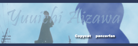
__________________
Last edited by panzerfan; 2007-01-28 at 01:24. |
|
|
|
|
2007-01-28, 04:22
|
Link #2524 |
|
♪~ Daydreaming ~♪
Graphic Designer Administrator AdministratorJoin Date: Dec 2005
Location: Italy
|
panzerfan: which one should I rate? ^^ oh well, all three then ^^
The animated one, quality aside (I don't pick on artifacts for animated signs, seeing the limit), is something I'm not really fond of. It's basically the concept: throwing a shower of frames at that speed really doesn't work, imho. Because it is difficult for the mind to focus on them, even if you're a Kagikko (and I am one). A sign should be relaxing. Also I don't like at the end, how Yuuichi face is dragged to the right inbetween the next to last and the last frame. Small bonus for effort 6,5/10 The static feels a lot empty. I think that, if there isn't much content to put inside, it's not convenient to use the whole allowed size of 500x160 (or near that). Plus that character could be whoever, just the name makes his acknowledgement easy. Also that "copycat panzerfan" is not in the tone with the rest of the sign at all. Quality is good, ok, but you should think of something more to throw in. 6/10 As for your current sign, it's nice, adding the logo completed it (I remember when you first posted the sign without that). I really have nothing to say, Shiori is Shiori after all. Too bad you couldn't save it as .png, quality is a bit penalized. But nice and sweet nonetheless. 8/10 @KiNA: maybe I found the cause ... the shoulder *should* look better now. Also enhanced to 128 colours with 10 frames and tried to reduce the artifacts effects to the less >_<
__________________
|
|
|
|
|
2007-01-28, 16:41
|
Link #2526 |
|
Jag äter idioter
Graphic DesignerJoin Date: Dec 2005
Location: Vereinigte Staaten
Age: 34
  |
KiNa ~ For some reason your sig just doesn't attract me. 8/10
Crystal Meth ~ busy busy busy 7/10 Laharu~ very nice. 9/10 me~ meh, learning transparency and trying not to suck is a hard thing to do. (>_<)!
__________________
|
|
|
|
|
2007-01-29, 05:43
|
Link #2529 |
|
Kira_Naruto, the ecchi
Graphic DesignerJoin Date: Dec 2005
Location: http://www.exciting-tits.com/
|
@ Raiju .. BG kinda messy.. but clean job there
@ Panzer .. WOA, 1 sig per day .. I r loose ;_; .. the animation kinda unealistic if its trying to potray snow falling =/ .. and when you have embossed border.. having an outside pic that got crop is just  @ Areguzanda .. Found a couple of aoi pic when I'm out hunting pic.. You know what? I want her to marry me as well  .. Its overlimit pic + text combo .. text mustnt exceed 2 lines... yours .. 5 lines =/ .. Its overlimit pic + text combo .. text mustnt exceed 2 lines... yours .. 5 lines =/ @ KiNA T^T .. original is +100Kb .. I tried to get the fairy to dance over from outsig the sig ... So instead, they now fade in before the handwriting stuff .. Overall, stil not satisfied, because I have to throw a lot of frames away.. so I probably gonna ditched the style.. too troublesome to conform to sig limit =/
__________________
|
|
|
|
|
2007-01-29, 05:56
|
Link #2530 |
|
Name means little...
Graphic DesignerJoin Date: Dec 2004
|
KiNa: That signing work is just sweet. 9/10 for this one.
I wasn't trying to animate snow... that was the the fountain scene actually (so we're looking at a wall of water), and I just updated my signature a little... with your advice in mind!
__________________
Last edited by panzerfan; 2007-01-29 at 09:53. |
|
|
|
|
2007-01-29, 06:02
|
Link #2531 | |
|
Ecchi!
Join Date: Nov 2006
Location: Oslo, Norway
Age: 36
|
Quote:
better now?  yeah I know. Aoi = Kawaii (and hot )Think I have a lot of wallpapers and other pics of her somewhere on my computer. If you wants some I'll send them to you  Kira_Naruto: 8.5/10 I really like the text-effect and colors
__________________
|
|
|
|
|
|
2007-01-29, 07:45
|
Link #2532 | |
|
sleepyhead
AuthorJoin Date: Dec 2005
Location: event horizon
|
Quote:
------------------------- Kina - Nice trick :) 9|10 (Quality | Awee-Factor) ---- Guess I'll rate some more while I'm here. 5|5 Proud ASIAN 8|9 panzerfan 9|8 Crystal_Method 10|10 Pellissier 10|10 Laharu -|8 kira_lacusXX 9|10 Potatochobit 7|6 mimi_girl -|10 Riker 9|9 Ai Suzuki 10|9 saphyre 8|8 Deathkillz 7.9|9 capture 9|10 Xellos-_^ 10|10 Raiju32 8.9|9.9 Arimfe 8|8 shinobiknight0 8|9 Late Splinter -|10 Renvi 8|8 Spectacular_Insanity 8|10 Jinto Lin 8|9 DjTrizz 9|9 Geta Boshi 7|9 Vexx 9|9 Aoie_Emesai 7|8 hyperlion 9|9 monir 9|10 Radiosity 8|10 NeoSam 10|9 Itachi-chan 10|9.5 martino 9.5|9 milkmandan 10|10 Maids! Maids! Maids! -|9 NightWish 7|8 Green² 7|9 NoSanninWa 8.9|9 Daniel E. 8.5|9 raikage 10|9 Shiroth 8|10 Li Jianliang 8|8 orion 10|10 White Manju Bun 10|10 [Woland] 10|10 Klashikari 9|9 Sakuya 9|9 WarpObscura 8|9 cpxmay 9.5|10 sei 9|8 -KarumA- 9.9|10 Shikimori Kazuki Ok that anbout covers most of the people in the forum with some kind of sig. Bye bye now...
__________________
|
|
|
|
|
|
2007-01-29, 08:34
|
Link #2533 | |
|
Kira_Naruto, the ecchi
Graphic DesignerJoin Date: Dec 2005
Location: http://www.exciting-tits.com/
|
Quote:
 @ BC ..hmm.. nice 1 .. I like scenic stuff on OTHER people's  .. you really love cats arent you? .. the clouds too sharp tho .. .. you really love cats arent you? .. the clouds too sharp tho ..
__________________
|
|
|
|
|
|
2007-01-29, 09:23
|
Link #2534 |
|
♪~ Daydreaming ~♪
Graphic DesignerAdministratorJoin Date: Dec 2005
Location: Italy
|
13: Usually I pick on large signs with no text, but heh.. you managed to throw in all things of my extreme licking: a blue sky with clouds, a cute girl, little cats... Wonderful feeling and amazing sign to say the least. One of those few piece of arts I'll be saving to my hd
10/10panzerfan: quality so so, but appreciable results and in any case very nice effort. 8/10 KiNA: Oh, a combo sign, not something we see everyday ^^ She's a bit blurry, her nose is not much detailed (it's difficult to spot with the line of her left side of the face). Nothing to say on the left part, the text is very stylish and the font fits. But what's that thing you put on her black dress? Should it mean "KiNA" (but whatever you wrote there, is unreadable) ... if so .. either remove it either consider switching the font and colour, as it is now, that is plain horrible. All in all I'm granting you a 8/10 ... considering how much you can still improve it ^^
__________________
|
|
|
|
|
2007-01-29, 19:55
|
Link #2535 |
|
~ You're dead ^__^* ~
Graphic DesignerJoin Date: Apr 2006
Location: uk, England
Age: 34
 |
ahh kiNa you sure know the key to my heart
great pic of gin sama i have to say ~ and the animation tech in just cool in everyway (but a bit fast) ~ some detail flaws you not using your signature font for your name being one but overall im impressed 10/10 biased ^__^cats ~ i duno...is the contrast a bit too high? but quite an artistic setting it feels like a water painting ^__^ 8.5/10
__________________
|
|
|
|
|
2007-01-30, 08:52
|
Link #2538 |
|
"Show it to me"
Join Date: Dec 2005
Location: In solitude, where we are least alone
|
Raiju32: Much better than your last one. 8/10
panzerfan: A little blurry but good nonetheless. 7/10 Cats: nice sig. I thought it was another catgirl but I guess not . 8/10KiNa: So shiny and bright. I like the name animation and the BG color btw. 9/10 Pellissier: Well, as expected from you no? 8/10
__________________
|
|
|
|
|
2007-01-30, 09:12
|
Link #2539 |
|
Ecchi!
Join Date: Nov 2006
Location: Oslo, Norway
Age: 36
|
Pellissier: funny and cute
maybe a little one-sided? 8/10Deathkillz: nice colors, though the text to the right is a little unclear. 8.5/10 Cyz: nice. really nice. like the colors and transparent effects. 9.5/10
__________________
|
|
|
|
|
2007-01-30, 19:22
|
Link #2540 |
|
Name means little...
Graphic DesignerJoin Date: Dec 2004
|
Nightwishfan: 7.5/10.
Deathkillz: 8.8/10. I like it even more now. and thanks for the advice. I had not done everything I can to preserve quality. The blur is now finally removed. EDIT: Here's how it appears as a png 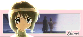
__________________
Last edited by panzerfan; 2007-01-31 at 02:44. |
|
|
|
 |
| Tags |
| rate, signature |
|
|