2011-01-24, 22:36
|
Link #121 | |
|
練紅玉
 Graphic Designer Graphic DesignerJoin Date: Apr 2010
Location: Magic Land
|
Quote:
 OMG! wth!... I forgot that you're a gimp user >_<,,... gahh sorry, hope I can lend you my PS >_<.. OMG! wth!... I forgot that you're a gimp user >_<,,... gahh sorry, hope I can lend you my PS >_<..
__________________
|
|

|

|
|
2011-02-01, 00:26
|
Link #123 | |||
|
Quietly Lurking
Graphic DesignerJoin Date: Mar 2010
Location: Beneath the prodigious sky...
|
Quote:
 Quote:
 Quote:
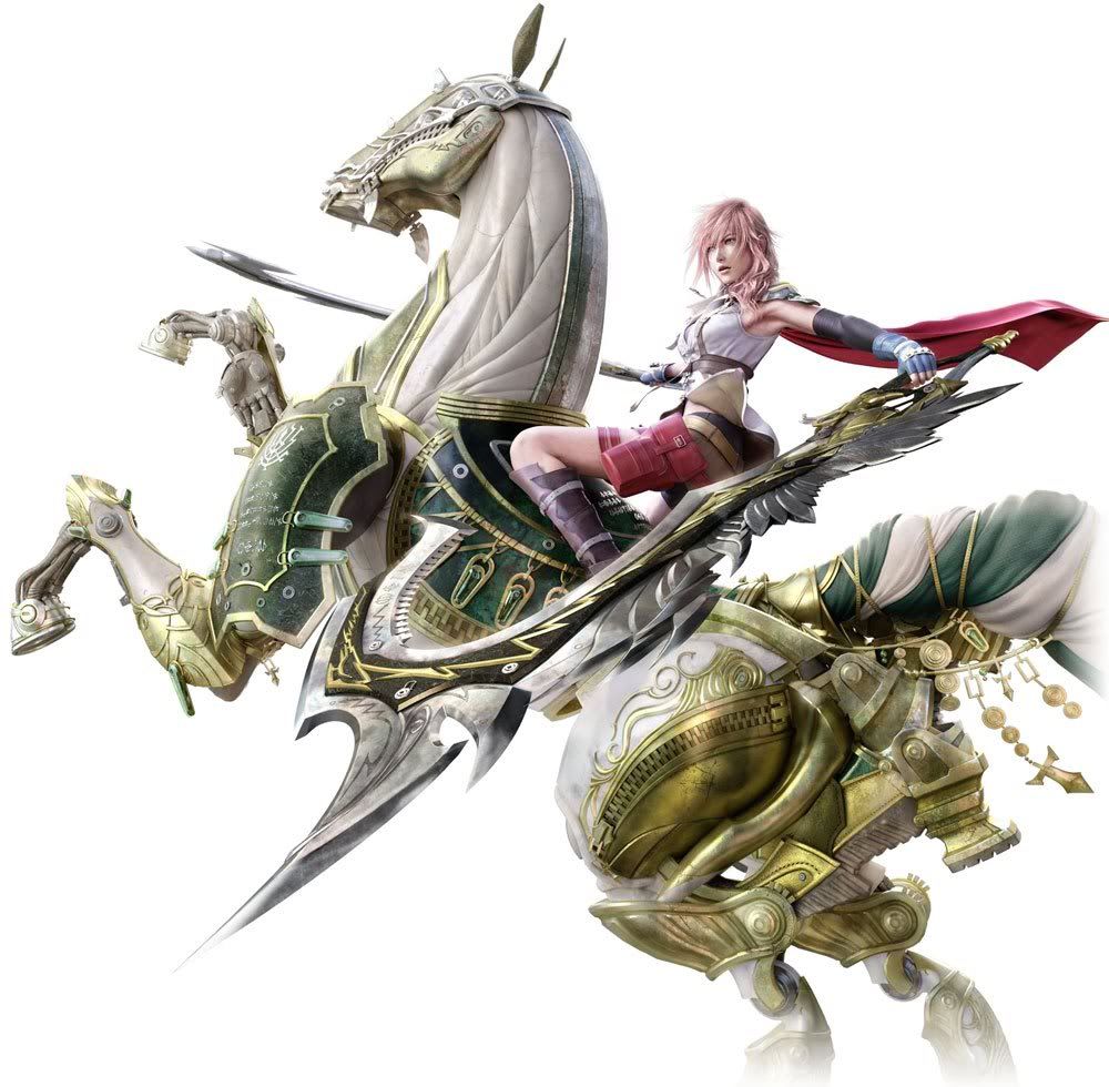
 Some avatar updates       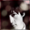    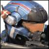    Oh and a render. I think this is Kat...? Spoiler for space:
__________________
Last edited by Rennir; 2011-02-01 at 00:47. |
|||
|
|
|
|
2011-02-01, 23:45
|
Link #127 | |
|
練紅玉
Graphic DesignerJoin Date: Apr 2010
Location: Magic Land
|
Quote:
oh some good avatars there.. picking... these.. ...they're good and have some nice effects.. Credits for being scary >>> and of course the renders is clean as always, no choppiness and error to look at.. ^^  good work Ren-sama good work Ren-sama
__________________
|
|
|
|
|
|
2011-02-02, 11:39
|
Link #128 | |
|
❙❙❙❙❙❙❙❥
Join Date: Jul 2008
Location: in the wild
   |
Quote:
The non-anime avatars look kinda fluffy, in a good way  Really cute. And the Halo avatars look like they should: Awesome. Really cute. And the Halo avatars look like they should: Awesome.And I think it's Kat, too. The render looks really clean to me (looked at it closely this time! :P). |
|
|
|
|
|
2011-02-12, 00:59
|
Link #129 | ||||
|
Quietly Lurking
Graphic DesignerJoin Date: Mar 2010
Location: Beneath the prodigious sky...
|
Quote:
 Are you ok? Are you ok? Quote:
He's a good actor with a great sense of humor.Quote:
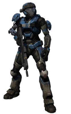
 I wait to see you do some non anime sigs Thanks Patchy-sama Oh and that's the skull helmet that you can get in Halo reach once you reach Inheritor rank... I wait to see you do some non anime sigs Thanks Patchy-sama Oh and that's the skull helmet that you can get in Halo reach once you reach Inheritor rank... Quote:
Hmmmdo you play reach?  Anyways, I GOT CS5!!!! Sorry, I'm really excited. Small update:  Photo manipulation:  Think I overdid the GM a bit... Oh yeah, I also found a stock, which I'm going to start rendering soon... Spoiler for space:
__________________
|
||||
|
|
|
|
2011-02-23, 20:57
|
Link #130 | |
|
練紅玉
Graphic DesignerJoin Date: Apr 2010
Location: Magic Land
|
Quote:
@Ren-sama yep but seeing the gallery in Pixiv, @_@ I think it will take sake time before I switched out Hahaha... CS5!!!!.... >_< I can only reach it through my dreams, maybe I'll switch when it is CS7 or CS8, then I can say goodbye to my CS2... >_< XD oh and that Stock O_O.... it's quite really really good... I think the only part irritating in rendering that is her fine very thin strands of Hair >_<
__________________
|
|
|
|
|
|
2011-02-25, 21:28
|
Link #131 |
|
~Official Slacker~
AuthorJoin Date: Aug 2010
Location: Xanadu
Age: 29
|
Ahhhh!!! I made a horrible mistake here!! Uwwaahh!! Its like the time I mistaken someone for a guy... *bonks own head* Baka, Baka, Baka! I'm sorry Rennir! I got mixed up again between the various designers that I hop around alot on this forum....
__________________
|
|
|
|
|
2011-06-17, 23:59
|
Link #132 |
|
Quietly Lurking
Graphic DesignerJoin Date: Mar 2010
Location: Beneath the prodigious sky...
|
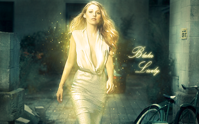
Sigh...well I wasn't going to revive this place until I had everything done and then there could be a huge update, but I would really appreciate some C&C on this one
I wanted to go for somewhat of a surreal feeling with this one. The lighting was a b****, took like 10 different layers of exposure, contrast, and burning and dodging, but I finally got it right Spoiler for tag:
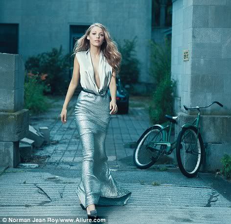
Spoiler for Original for comparison:
Ok, after this, hopefully my thread dies again so I can finish everything up and have a massive update next time
__________________
|
|
|
|
|
2011-06-23, 00:49
|
Link #135 |
|
練紅玉
Graphic DesignerJoin Date: Apr 2010
Location: Magic Land
|
Woah! so cool!!...
she's shining and sparkling >_<... gahhhh~~~ my eyes were burning ... seriously... it's really beautiful... looks like the fruits of training and reading some tutorials became ripe already ^^...
__________________
|
|
|
|
|
2011-06-23, 01:09
|
Link #136 | |
|
Quietly Lurking
Graphic DesignerJoin Date: Mar 2010
Location: Beneath the prodigious sky...
|
Quote:
I'm still a complete novice compared to what some of those people on gfx sites can do Here's the newest version:  I decided that the original tag was a bit too saturated so I applied a cooling filter. Got rid of text because it wouldn't blend, and sharpened it a bit. Still messing around with topaz but I don't think I'll be using it much anytime soon I'm working on a new style with C4Ds and slight glow atm, hopefully it'll turn out good
__________________
|
|
|
|
|
|
2011-07-04, 11:10
|
Link #137 |
|
Covered in Darkness
Graphic DesignerJoin Date: Jul 2010
Location: Missing~
|
Oh I am back...finally! And you added me to your gift-list O_O I am flattered you still
remember me..btw, thanks for adding me ^_^ And sry if I am talking weird, it's just that I am totally excited to be back Btw, what really made me stop by is your latest sig....it's STUNNING! Really beautiful! I am tempted to steal that style >.> How did you actually do that? Plus, I think I prefer the first version of it...just a personal opinion ^^; (Btw, did you burn the edges? I can't tell...I have lost my PS touch -_-; ) Will drop by again, need to go now ^^;
__________________
|
|
|
|
|
2011-07-04, 23:21
|
Link #138 |
|
Senior Member
ArtistJoin Date: Mar 2009
Location: Normandy SR-2
Age: 29
|
Renn-kun! Love the latest version of that tag, the effects, colours and quality are all stellar
Maybe you can consider doing something with the edges to establish the focus a bit more. But dang, you're improving so much lately
__________________
|
|
|
|
|
2011-07-05, 00:22
|
Link #139 | ||
|
Quietly Lurking
Graphic DesignerJoin Date: Mar 2010
Location: Beneath the prodigious sky...
|
Quote:
(Sorry everyone ) I decided to wait until I spent all the time I could learning (i.e. the entire summer) before I start them again so that the gifts are better. But don't worry, I will definitely do you gift Star-chan Glad to see you back btw I could give you the PSD if you like...full posting rights (although I can't imagine a situation in which you would need it ). The focus of that particular tag was paying attention to the small details. The "wow" factor was created using multiple light textures/fractals on screen/linear dodge at various opacities. After that, I duplicated applied image twice and motion blurred them and then blended them together and set them on overlay for some subtle flow and increased contrast. Then I did a hue/saturation to change the color of the plants to a darker/bluer color so that it fit with the rest of the tag. Next came the lighting. You can tell that the person is in the foreground and is emitting light, so accordingly, the bg had to be dark and the fg had to be lighter. I applied image and dodged/burned accordingly. Then I used Curves and Exposure for some more lighting changes, specifically making the bg darker in order to accentuate the focal. Then a gradient map and some other adjustment layers and finally, applied image, blurred the bg, erased over focal, lowered opacity, applied image again, and ran it through Topaz on a low setting and that was the result.Quote:
Hmmm I considered that but I thought it kind of ruined the realistic lighting so I decided against it. But thank you for the suggestion. Feel free to give me more
__________________
|
||
|
|
|
 |
| Tags |
| avatars, rennir, signatures |
|
|