 2009-03-12, 01:39
|
Link #561 | |
|
柊ユカ
 Artist ArtistJoin Date: Feb 2009
Location: Israel,But born in Ukraine >w<
Age: 30
|
Quote:
I really love it the way it is , no need to change anything ^_^ |
|

|

|
|
2009-03-12, 02:23
|
Link #562 | |
|
Kira_Naruto, the ecchi
Graphic DesignerJoin Date: Dec 2005
Location: http://www.exciting-tits.com/
|
Quote:
__________________
|
|
|
|
|
|
2009-03-12, 04:21
|
Link #564 |
|
(ノಠ益ಠ)ノ彡┻━┻
 Moderator ModeratorJoin Date: Mar 2006
|
I really like the theme you have going with the ISML signatures. The N in Nagato is a bit hard to read (the font is thin and white, and it blends in with the white shelf a bit easily), but the overall look is classy and I love it. ^^
__________________
|
|
|
|
|
2009-03-12, 10:11
|
Link #567 | |
|
I rise, you fall!
Join Date: May 2008
Location: In the grass looking up at the sky
Age: 32
 |
Quote:

|
|
|
|
|
|
2009-03-13, 03:57
|
Link #568 |
|
~La-la Land~
Graphic DesignerJoin Date: Jul 2007
Location: Seattle
Age: 37
|
Thanks guys
 I had a lot of fun with that render; it's probably one of my favorite Yuki renders up to date. I had a lot of fun with that render; it's probably one of my favorite Yuki renders up to date.And for another update: Chaos Request:  Not AS-safe here, but I sliced it up for her for use both here and on MAL. Matching Avatars:   New little logo:  and render: and render: 
__________________
|
|
|
|
|
2009-03-13, 04:02
|
Link #569 | |
|
I rise, you fall!
Join Date: May 2008
Location: In the grass looking up at the sky
Age: 32
|
Quote:
What anime/game is it from? |
|
|
|
|
|
2009-03-13, 07:13
|
Link #571 | |
|
ǾΝΈ ΡЇΈÇΈ is the Best !!

Join Date: Apr 2007
Location: away from you
Age: 35
|
Quote:
 I'm not used to Sliced Sig  too bad I can't give you any cookies yet 
__________________
|
|
|
|
|
|
2009-03-14, 19:26
|
Link #574 |
|
~La-la Land~
Graphic DesignerJoin Date: Jul 2007
Location: Seattle
Age: 37
|
@Chaos-chan - I'm glad you like it >.< It was a really fun render to work with.
@dave-kun - I wouldn't say I'm a steady "force," but I do try and keep playing around PS ^_^ You've been absent for so long! Get back into action! (a.k.a. turn-in a sig for this months sotm  ) )@SkyLight - The girl in Chaos' sig is Black Rock Shooter, a song by Hatsune Miku. Click here for vid! Some more ISML requests:    ^text is fail... 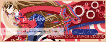
__________________
|
|
|
|
|
2009-03-14, 19:33
|
Link #575 | |||
|
Paparazzi
Join Date: Mar 2008
Age: 41
|
Quote:
Quote:
Apart from that very nice. Quote:
|
|||
|
|
|
|
2009-03-14, 19:33
|
Link #576 |
|
The Interstellar Medium
AuthorJoin Date: May 2008
Location: [SWE]
Age: 34
|
I think the point is the text should be hard to read, IMO, but otherwise good colors and effects on all of them.
Although I adore the last one. Wonderful combo of the colors and text bg. Only thing might be that the "vote" looks very out of place, either because of the color, having no bg or the wrong font.
__________________
|
|
|
|
|
2009-03-14, 20:04
|
Link #577 | |
|
I rise, you fall!
Join Date: May 2008
Location: In the grass looking up at the sky
Age: 32
|
Quote:
2:05 night *Falls asleep* |
|
|
|
|
|
2009-03-19, 16:09
|
Link #578 |
|
~La-la Land~
Graphic DesignerJoin Date: Jul 2007
Location: Seattle
Age: 37
|
I agree that I'm best with peaceful, simplistic sigs, like that first Index one. I'm trying to improve my skills on busier sigs though, because I do admire those who are skilled with utilizing many different techniques to one sig.
I'm quite fond of the vector style used on Taiga, but I see where escimo is coming from with saying it's "busy," but I have to admit to liking like that. I agree with AtomicoX that the text "VOTE" looks out of place since it's the only one without a box. Thanks for your comments guys Another update, here's another attempt at the march sotm:  And a request: 
__________________
|
|
|
|
|
2009-03-19, 16:18
|
Link #579 | ||
|
The Interstellar Medium
AuthorJoin Date: May 2008
Location: [SWE]
Age: 34
|
Quote:
Quote:
Otherwise, good blending and effects. However, I can't help feel that the girl has the wrong colors to fit in. The green hair (is it green? I don't know but it looks like it  ) differences a lot from the soft light colors. It's good quality though so it works. I'm just being picky now. ) differences a lot from the soft light colors. It's good quality though so it works. I'm just being picky now.EDIT: Now that I think about it, it might be my colorvision that makes it not fit. Perhaps someone else has input on it.
__________________
|
||
|
|
|
|
2009-03-19, 16:29
|
Link #580 | ||
|
~La-la Land~
Graphic DesignerJoin Date: Jul 2007
Location: Seattle
Age: 37
|
Quote:
V2:  (I didn't use a C4D) V3:  Quote:
Anyways, further CnC would be appreciated ^_^
__________________
Last edited by Marina; 2009-03-19 at 17:03. |
||
|
|
|
 |
| Tags |
| avatars, banners, signatures |
|
|


