2008-01-08, 20:41
|
Link #42 | |
|
~La-la Land~
 Graphic Designer Graphic DesignerJoin Date: Jul 2007
Location: Seattle
Age: 37
|
Quote:
__________________
|
|

|

|
|
2008-01-12, 23:08
|
Link #45 |
|
noLife
ArtistJoin Date: Jul 2007
Age: 35
|
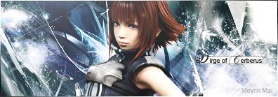
I think it looks good (the one without text is slightly better). I like the lighting of it and it gives the whole signature kind of a feeling that you would see this moment that is captured there only for a blink of an eye (I fail at explaining D: )
|
|
|
|
|
2008-01-15, 19:48
|
Link #48 |
|
I LOVE FLAN_CHAN
Graphic DesignerJoin Date: Oct 2007
Location: Flan-chan
Age: 21
 |
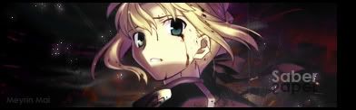
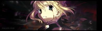
You saber sig is way to go. Blending need a little work, as well as Lightening. I personally don't like the fonts, too fancy for me.
__________________
Last edited by Izayoi; 2008-01-15 at 20:28. |
|
|
|
|
2009-01-31, 12:37
|
Link #50 |
|
Reimi Saionji
Join Date: Nov 2006
Location: AbySs
|
 Time: 5 mins From: Star Ocean: The Last Hope [Game] Girl in SiG: Reimi Saionji I just wanted to post it here because I don't ever post my Sig up When I make one and want to see what people think about it.... I'm not good but I like the colors on it ^^ Just got back at making Sigs |
|
|
|
|
2009-01-31, 14:30
|
Link #51 | |
|
AniMexican!
Join Date: Dec 2005
Location: Monterrey N.L. Mexico
|
Quote:
 I prefer the way the background looks on the left side compared to the right one, but it's a great sig regardless. 
__________________
|
|
|
|
|
 |
|
|