2011-10-27, 15:26
|
Link #21 |
|
Strangely dependable...
Join Date: Nov 2006
Location: some random place out there...
|
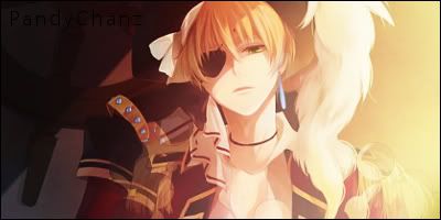
A belated welcome but welcome to FC! *cookies*
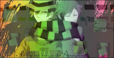
You have a very nice style here. I like the pop-outs and colour variations. I agree with some of the previous posters that you should try to add dark colours and shadows to balance out the brightness in your sigs. What you are lacking is depth and adding shadows along with light will give you that (your current sig is a nice example with good depth). Also, your use of colours and brushes are very nice but keep in mind the flow of your sig and how well it goes/blend with your render. A good gallery and I look forward to seeing more.
__________________
|

|

|
|
2011-10-27, 21:53
|
Link #22 | |
|
セクシーなユニコーン
Join Date: Aug 2011
Location: Stillwater, Oklahoma
|
Quote:
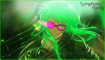
 And I'll keep that in mind Small Update Spoiler:
__________________
|
|
|
|
|
|
2011-11-06, 19:09
|
Link #28 | |||
|
セクシーなユニコーン
Join Date: Aug 2011
Location: Stillwater, Oklahoma
|
Quote:
!Quote:
Quote:
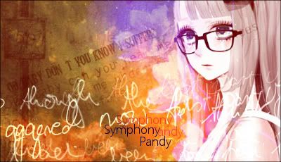
 A small update, Idk if I liked this one to much. What's you're opinion?  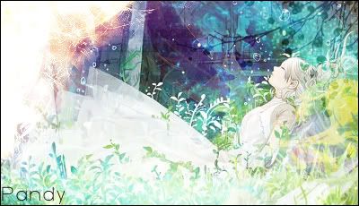
__________________
|
|||
|
|
|
|
2011-11-07, 20:43
|
Link #29 | |
|
Kaiba
Join Date: Jul 2010
Location: David Tennant's bedroom in the TARDIS
|
Quote:
 My only negative comment is the left top corner is very bright compared to the rest of the sig, maybe get rid of it or tone it down/reduce opacity. I love it otherwise, well done with color and text and image choice. Also the brushwork is amazing.*nodnod* I love me some great brushwork My only negative comment is the left top corner is very bright compared to the rest of the sig, maybe get rid of it or tone it down/reduce opacity. I love it otherwise, well done with color and text and image choice. Also the brushwork is amazing.*nodnod* I love me some great brushwork
__________________
|
|
|
|
|
|
2011-11-12, 15:11
|
Link #30 | |
|
セクシーなユニコーン
Join Date: Aug 2011
Location: Stillwater, Oklahoma
|
Quote:
A few simple ones that I just did  This was a request on another forum 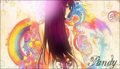
__________________
|
|
|
|
|
|
2011-12-18, 00:42
|
Link #31 |
|
セクシーなユニコーン
Join Date: Aug 2011
Location: Stillwater, Oklahoma
|
I feel like I've been gone forever, and never updated this thread to what I've been doing for the last couple of weeks, months? Though, not many people may be interested! I just thought, why not.
Avatars Harvest Moon TOTT: 'Lillian'            Harvest Moon TOTT: Cam (Or Kamil.)  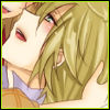    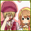     Touhou: Reiuji Utsuho      Tengen Toppa Gurren-Lagann: Yoko Littner     
|
|
|
|
|
2012-01-11, 19:09
|
Link #33 | |
|
セクシーなユニコーン
Join Date: Aug 2011
Location: Stillwater, Oklahoma
|
Quote:
Anyways, not much of an update cause I've been "Slightly" busy with school, just two I did a few minutes ago. I don't think there very well made, so eh. But, I want some of your guys opinions lol. (Just so It's not taken the wrong way, "★B. Rabbit★" Is my name on another forum) Ver. 1 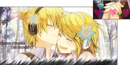 Ver. 2 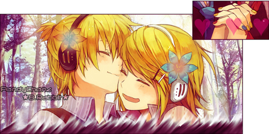 Simple really, just used a gradient for the 2nd ver. |
|
|
|
|
|
2012-01-11, 20:19
|
Link #34 | |||
|
Kaiba
Join Date: Jul 2010
Location: David Tennant's bedroom in the TARDIS
|
Quote:
It's so paint-like and artistic! The text goes perfectly with the feel of the sig, which is really hard to do. I would say reduce the opacity of the light brush thouigh and maybe put it on overlay so it's less white and obvious. Otherwise BEAUTIFUL! May I have the brushes or bg or whatever it is you used to create the bg?Quote:
Quote:
__________________
|
|||
|
|
|
|
2012-01-11, 20:44
|
Link #35 | |||
|
セクシーなユニコーン
Join Date: Aug 2011
Location: Stillwater, Oklahoma
|
Quote:
Quote:
Quote:
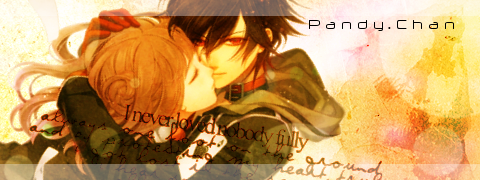
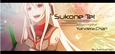
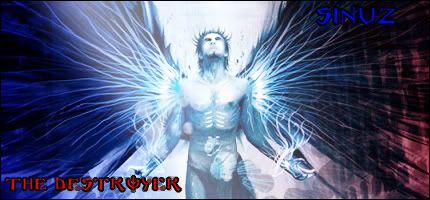
I had just saved it and forgot to save the layer file to edit it if I messed up, but right as I saved it and x-ed it out, I noticed it >:lEdit: P.C Is going to be the username I use in my signatures for now until I find a better font that you can actually tell what it says in small. Small update, sigs I've done in the past hour now, so don't expect them to be that good XD; (One Icon also<3) Shou Kurusu Signatures Ao No Exorcist Ver. 1 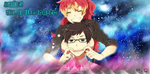 (Sowwy, this one I forgot the border >.<) (Sowwy, this one I forgot the border >.<)Ver. 2 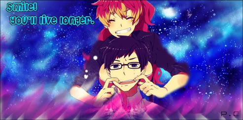 Render Ver. 1 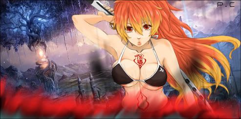 Ver. 2 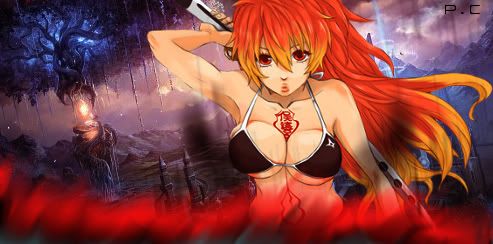 Ver. 3  (This one was supposed to look like an old movie film, as you can see, it kind of.. failed) (This one was supposed to look like an old movie film, as you can see, it kind of.. failed)Render Vocaloid Ver. 1 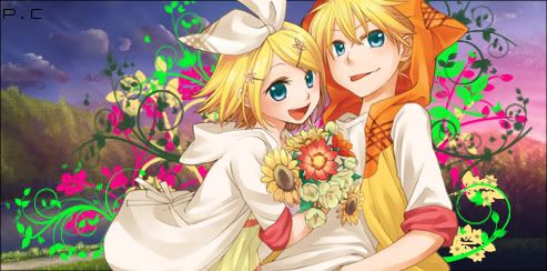 Ver. 2  Render ? Ver. 1  Ver. 2 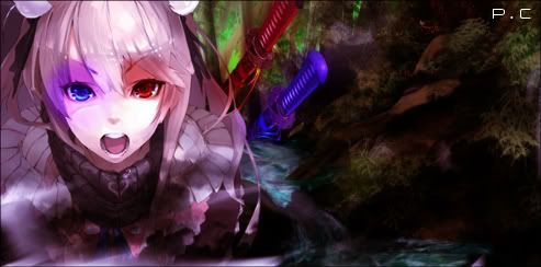 Render Of course, All renders belong to there rightful owners, and I did not make them. Last edited by PandyChanz; 2012-01-11 at 22:59. |
|||
|
|
|
|
2012-01-12, 16:57
|
Link #36 |
|
セクシーなユニコーン
Join Date: Aug 2011
Location: Stillwater, Oklahoma
|
Most of these don't have Borders, but I'm going to add the bordered versions soon >.<
Touhou, Houjuu Nue      Okami, Amaterasu       Nico Nico Singer, 96Neko       Others              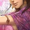     Was playing around and decided to airbrush a few colors here and there on one, got this. 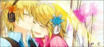
Last edited by PandyChanz; 2012-01-15 at 14:48. |
|
|
|
 |
|
|


 :|::|
:|::|


 Graphic Designer