 2007-06-14, 02:56
|
Link #1 |
|
(ノಠ益ಠ)ノ彡┻━┻
 Moderator ModeratorJoin Date: Mar 2006
|
Solace's projects
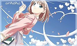
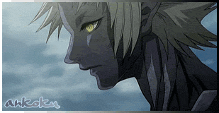
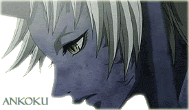
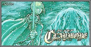
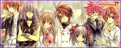
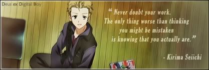
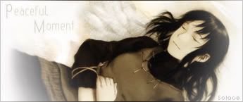
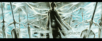
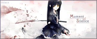
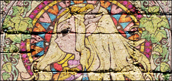
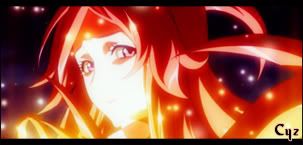
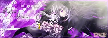
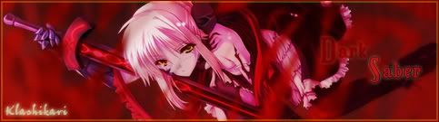
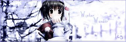
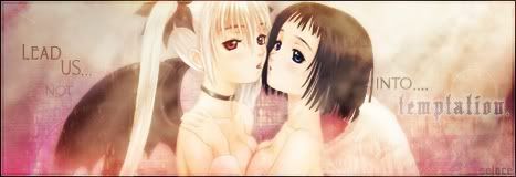
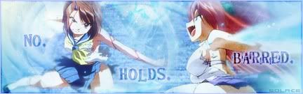
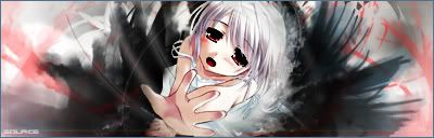
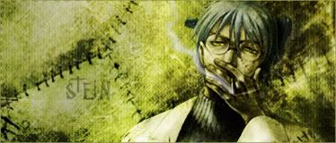
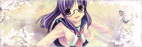
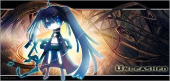
 Welcome to my thread! I've been using Photoshop for almost a year now. This is a collection of many of the works I have done. I make no claims that I'm any good at this, but it is fun so I hope everyone enjoys seeing them. You might note some of these are tagged with a different user name. That was me before I became Solace.  With that, on with the show! With that, on with the show!All signatures are in thumbnails, click to see full size version. Earliest signatures - These are some of my earliest works: Spoiler for Early signatures:
Somewhat earlier signatures - These were more like a side step to what I started with. There's improvement in there...somewhere. Mostly in text. Spoiler for Second batch:
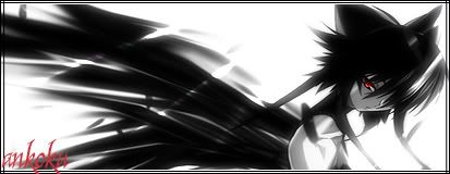
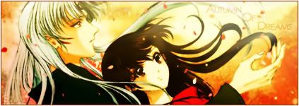
Third phase - I took a break after the previous batch, but came back with a renewed interest in Photoshop. I started with a few crop signatures but eventually starting working with renders and making my own backgrounds. Spoiler for Newer stuff:
Fourth Phase - These are signatures I've made this year, not including SOTM entries. Spoiler for So far in 2008....:
Special Projects Christmas Signatures - Winter 2007 brought a flurry of sig making from many people, which were exchanged as gifts. I think quite a few of us burned out from it, but it was fun.  Here's the signatures I made, over the course of two days: Here's the signatures I made, over the course of two days:Spoiler for Xmas Sigs:
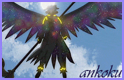
Renders - I've recently started to render images. I've learned it's not as easy as other make it look.  Spoiler for Renders:
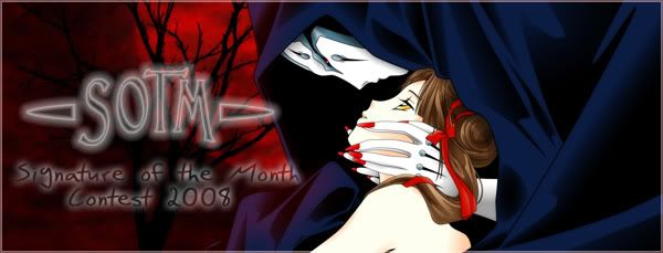
SOTM Entries - Even though I spend much of my recent time on the forums working on the Signature of the Month contest, I do find some time to enter my own signatures into the contest. It's been interesting, creating signatures with themes I've never really done before. Here's some of my entries: Spoiler for SOTM entries:
SOTM Banners - Banners I've created for the contest Spoiler for Banners:
Banner Contest Signature -  That about wraps it up for now. I hope you enjoyed seeing a look at some of my work from the past year. I'll be updating this with newer projects, as they happen.  Last edited by Solace; 2009-03-09 at 23:51. Reason: Updating thread |

|

|
|
2007-06-15, 22:56
|
Link #4 |
|
(ノಠ益ಠ)ノ彡┻━┻
ModeratorJoin Date: Mar 2006
|
Latest sig, this one is a screencap from Red Garden. Tried to clean it up and give it a soft tone to the lines, also added some clouds to the background. The placing of my name seems odd to me, but I couldn't think of any other area to put it.
Edit: Picture has been moved to first post.
__________________
Last edited by Solace; 2007-11-11 at 17:49. |
|
|
|
|
2007-06-22, 21:55
|
Link #7 |
|
(ノಠ益ಠ)ノ彡┻━┻
ModeratorJoin Date: Mar 2006
|
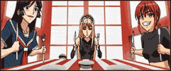
Two more sigs today, nothing too fancy just some basic brushes and filters. Still trying to experiment with more advanced stuff like renders and making my own backgrounds, but the results are umm...pretty bad, hehe.
Ah well, it's fun to learn. Edit: Pictures have been moved to first post.
__________________
Last edited by Solace; 2007-11-11 at 17:50. |
|
|
|
|
2007-06-27, 13:35
|
Link #8 | |||
|
(ノಠ益ಠ)ノ彡┻━┻
ModeratorJoin Date: Mar 2006
|
Quote:
Quote:
Quote:
I've seen your work and it is quite good!Thanks for the support guys! 
__________________
|
|||
|
|
|
|
2007-10-06, 19:55
|
Link #13 |
|
Falling for Ginsama ^3^
 Graphic Designer Graphic DesignerJoin Date: Feb 2007
Location: Airantou
 |
Argh another person changed there name and has confused me XD
ur tweaked one looks good. If u want to make it more vibrant u can't just use Hue/Saturation try to use the layer blending settings, and go gaussian blur a duplicate of ur whole sig and set that layer to Overlay or Soflight. And then duplicate ur whole sig again and put it on multiply.(this one is above ur overlay one.) of course with both layers play with the opacity. besides this u can try using gradient maps too. ^___^ gj though Solace/aka Ankoku XD
__________________
|
|
|
|
|
2007-10-06, 21:16
|
Link #14 | |
|
(ノಠ益ಠ)ノ彡┻━┻
ModeratorJoin Date: Mar 2006
|
Quote:
Thanks for the advice, I'll try and tweak a bit more with the layers.
__________________
|
|
|
|
|
|
2007-10-09, 05:38
|
Link #16 | |
|
(ノಠ益ಠ)ノ彡┻━┻
ModeratorJoin Date: Mar 2006
|
Quote:
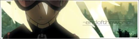
I try to balance dark and light idea when I decide to work on projects. If all I do is make dark work, I start to get depressed. But yeah, the text needed work on that one for sure. I'd like to think I've improved upon that with later works though, hehe.My latest sig and avy set, from a Shana render I found. Loved the look, but man did I struggle with the background. As you can see, I just left it transparent, because no matter what I thought of trying, it just made it look way too busy.  Edit: Picture has been moved to first post. I think it looks pretty decent for being so simple, but I'm struggling with going from drawing on paper to drawing on a computer. There's tons of brushes and effects but they never seem to help me get my ideas from my head to the screen.
__________________
Last edited by Solace; 2007-11-11 at 17:51. |
|
|
|
|
|
2007-10-10, 05:49
|
Link #17 |
|
(ノಠ益ಠ)ノ彡┻━┻
ModeratorJoin Date: Mar 2006
|
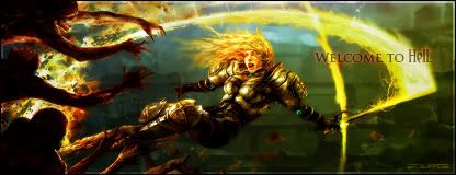
The Shana sig just wasn't doing it. So I stumbled upon a thread with a certain you know who and found a ton of pics....and well, I couldn't help but do something with them!
So here's my latest work. I took bigdave's advice on the layers, so I hope these are a bit more vibrant than my usual stuff. Edit: Picture has been moved to first post. She's so cute!
__________________
Last edited by Solace; 2007-11-11 at 17:51. |
|
|
|
|
2007-10-10, 05:56
|
Link #18 |
|
The endless sky
Graphic DesignerJoin Date: Jun 2007
Location: Oosutoraria
Age: 34
|
Kyaa~ *Goes into Miku fangirl mode*
Miku looks so kawaii there O-O Very nice, but maybe change the text font...it looks good atm but it might look better if you changed the font. Great job!
Last edited by KasumiGirl; 2007-10-11 at 02:50. |
|
|
|
 |
|
|


 ... lol, but then again, i like freaky...


