2009-01-27, 17:20
|
Link #121 | |
|
Peek a boo
 Graphic Designer Graphic DesignerJoin Date: Dec 2005
|
Quote:
|
|

|

|
|
2009-01-27, 17:46
|
Link #122 | |
|
♪ ~ ♫
ArtistJoin Date: May 2008
Location: Europe
Age: 35
  |
Quote:
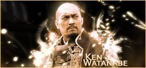
 I thought so. Well, my best version so far, the original one, which took me 2 hours to make, was unexpectedly lost in a Photoshop crash (happened for the first time). So much for not saving my work during the process. So I ended up with these 30 min "copies".  Saying that, It's far from completion, I don't want to hasten this one, being a tribute to such a great actor, but before going on, I'll wait for a few more opinions on the subject. 
__________________
|
|
|
|
|
|
2009-01-27, 19:28
|
Link #123 |
|
The Interstellar Medium
AuthorJoin Date: May 2008
Location: [SWE]
Age: 34
|
Oughta say I love the light effect, seemingly streaming from the render. Fits in very nicely, although the text can be worked on a little bit. Perhaps make it more metallic and reflect the light on it.
Also, I like that it isn't too empty, but still not much effects. Try not to fill it just for the sake of filling space, try to keep it moderate. It's already good in my eyes. Version 1 that is, scrap the second altogether imo
__________________
|
|
|
|
|
2009-01-28, 06:33
|
Link #125 |
|
The Interstellar Medium
AuthorJoin Date: May 2008
Location: [SWE]
Age: 34
|
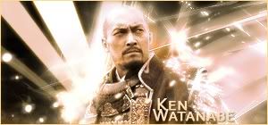
Glad you kept parts of version 1, this looks great. I do have something against the light to his left, the beams. They kinda differences from the other light effects, but I think it works. Maybe lower the opacity/sharpening a bit will help.
For the text, it looks a tad bit pixlie, but that happens for me too and it never want to fix itself >.>;
__________________
|
|
|
|
|
2009-01-28, 06:56
|
Link #126 | ||
|
♪ ~ ♫
ArtistJoin Date: May 2008
Location: Europe
Age: 35
|
Quote:
Quote:
But yeah, in the end, it's not that agressive; looks more natural.
 Now it's more of a moonshine than a concert spotlight. Thx for the input, btw.
__________________
|
||
|
|
|
|
2009-01-28, 07:12
|
Link #127 | ||
|
The Interstellar Medium
AuthorJoin Date: May 2008
Location: [SWE]
Age: 34
|
Quote:
Quote:
__________________
|
||
|
|
|
|
2009-02-02, 15:18
|
Link #130 |
|
The Interstellar Medium
AuthorJoin Date: May 2008
Location: [SWE]
Age: 34
|
Interesting design. The red fits very nicely with the black, creating that feeling...something. I do think the text looks a little out of place, but I'm not sure. Maybe the vector lines makes the text look lower quality, while it isn't.
The render does fit, but there are some white outlines that can be worked on, only to improve the blending. And yea, it might work better on darker forums, but it looks good anyway
__________________
|
|
|
|
|
2009-02-02, 15:59
|
Link #131 | |
|
♪ ~ ♫
ArtistJoin Date: May 2008
Location: Europe
Age: 35
|
Quote:
...  I'll fix that up tomorrow. The font was stretched to 150% vertically. The original is like a hobbit among all the other fonts. 
__________________
|
|
|
|
|
|
2009-03-12, 10:50
|
Link #133 | |
|
♪ ~ ♫
ArtistJoin Date: May 2008
Location: Europe
Age: 35
|
Quote:
 Not final, may be improved later...If I get any ideas.  Seriously, I'm out of ideas lately. +2 latest sotm sigs added on the first page. I'll try to make some more stuff later... (later = +/- 2 weeks)
__________________
|
|
|
|
|
|
2009-03-12, 10:56
|
Link #134 | ||
|
The Interstellar Medium
AuthorJoin Date: May 2008
Location: [SWE]
Age: 34
|
Quote:
Quote:
__________________
|
||
|
|
|
|
2009-03-12, 17:18
|
Link #135 | ||||
|
♪ ~ ♫
ArtistJoin Date: May 2008
Location: Europe
Age: 35
|
Quote:
Okay then, now the real question. Is this an improvement (excluding the text from rating)?  Quote:
Abstract, you say...never actually tried one. Can't imagine what layer-blending horrors reside beneath the render layer. Still, I'll think about it.
__________________
|
||||
|
|
|
|
2009-03-12, 17:20
|
Link #136 | ||
|
The Interstellar Medium
AuthorJoin Date: May 2008
Location: [SWE]
Age: 34
|
Quote:
Edit: Actually, the "Te" part of the last name is fairly hard to see as it uns over the white...some compromise might be done there. Quote:
__________________
|
||
|
|
|
|
2009-03-14, 00:07
|
Link #139 | |
|
AniMexican!
Join Date: Dec 2005
Location: Monterrey N.L. Mexico
|
Quote:
Though, I think it would be better off without text.
__________________
|
|
|
|
|
|
2009-03-14, 11:17
|
Link #140 | ||
|
ǾΝΈ ΡЇΈÇΈ is the Best !!

Join Date: Apr 2007
Location: away from you
Age: 35
|
Quote:
Quote:

__________________
|
||
|
|
|
 |
| Tags |
| avatars, signatures |
| Thread Tools | |
|
|