AnimeSuki Forums

Register Forum Rules FAQ Community Today's Posts Search

Go Back   AnimeSuki Forum > Anime Related Topics > Fan Creations

Notices

Reply
 
Thread Tools
Old 2007-11-15, 05:37   Link #21
MaxwellDemon
"Bi?!" BI?!
*Graphic Designer
 
 
Join Date: Oct 2007
Quote:
Originally Posted by Shana View Post
It's nothing, you're welcome and I think I've got my new desktop

Well, excuse me, I have to clean my desktop or Kagamin will be drowned
Yeah, I was thinking of making a better wallpaper version of that someday, so I could move Kagami more to the right then she won't be drown by menacing Windows icons and shortcuts.

Anyway, latest update:

Made quite a few signatures. Some of them have avatars to follow them (well, actually, there is only three signatures that have avatars).

About my next vector project, I am going to make a Rozen Maiden one... I just can't seem to decide on whether it should be Suigintou or the Seki twins.
__________________
MaxwellDemon is offline   Reply With Quote
Old 2007-11-15, 07:28   Link #22
innominate
hiatus almost permanent
 
Join Date: Apr 2007
Quote:
Originally Posted by MaxwellDemon View Post
Oh, I get what a cookie mean, I just didn't get what innominate was trying to say with this part "why are you vectoring afterschool of the 5th year's work... O_O".
The source picture was drawn by afterschool of the 5th year, one of my favourite artists. =)

I find it a little odd to vector fanart, that's all xD
innominate is offline   Reply With Quote
Old 2007-11-19, 13:12   Link #23
MaxwellDemon
"Bi?!" BI?!
*Graphic Designer
 
 
Join Date: Oct 2007
Quote:
Originally Posted by innominate View Post
The source picture was drawn by afterschool of the 5th year, one of my favourite artists. =)

I find it a little odd to vector fanart, that's all xD
Oh, I didn't know that was the artist's name.

And yeah, that's what I thought too when I vectored that art... but it did clear it up for me and I managed to do what I want with it, so I guess it is okay.

Anyway, latest update: made a wallpaper version of the wedding vector... and my apologies for having no sounds about my current project, been overrun by courseworks.
__________________
MaxwellDemon is offline   Reply With Quote
Old 2007-11-21, 16:09   Link #24
MaxwellDemon
"Bi?!" BI?!
*Graphic Designer
 
 
Join Date: Oct 2007
Finally got around to start with my project... current status is:


The base picture is this:


Lots of space to leave for my imagination unfortunately. I just hope it turns out alright. x_x;
__________________
MaxwellDemon is offline   Reply With Quote
Old 2007-11-21, 16:37   Link #25
Daniel E.
AniMexican!
 
 
Join Date: Dec 2005
Location: Monterrey N.L. Mexico
Quote:
Originally Posted by MaxwellDemon View Post
The base picture is this:


Lots of space to leave for my imagination unfortunately. I just hope it turns out alright. x_x;
That sure looks hard. You could always use a second source (something somewhat similar) for the finer details.

Good luck with it.
__________________
Daniel E. is offline   Reply With Quote
Old 2007-11-21, 16:57   Link #26
Solace
(ノಠ益ಠ)ノ彡┻━┻
*Moderator
 
 
Join Date: Mar 2006
Yeah it does look pretty tough. How long has it taken so far?
__________________
Solace is offline   Reply With Quote
Old 2007-11-21, 18:01   Link #27
MaxwellDemon
"Bi?!" BI?!
*Graphic Designer
 
 
Join Date: Oct 2007
Quote:
Originally Posted by Daniel E. View Post
That sure looks hard. You could always use a second source (something somewhat similar) for the finer details.

Good luck with it.
Thanks!

That's exactly what am I doing to understand how Suigintou's dress go and how should I trace it.

Quote:
Originally Posted by Solace View Post
Yeah it does look pretty tough. How long has it taken so far?
As of now, it has taken me 2 and a half hours... one hour to create a rough sketch of the base picture, so I know what color go where and where the lines will go... thirty minutes to trace the colors in, another thirty minutes to fix the colors up and make sure they are in the right place... and right now, I am working on the outline.
__________________
MaxwellDemon is offline   Reply With Quote
Old 2007-11-25, 07:53   Link #28
jusuchin85
Asuka's Secret Admirer
 
Join Date: Nov 2007
Location: Petaling Jaya, Malaysia
Age: 38
Nice vectoring on the Kagami x Konata wall! Looks good, mate!

Hope to see more Lucky Star goodness from ya!

*takes wallpaper, sets as background!*
jusuchin85 is offline   Reply With Quote
Old 2007-11-26, 22:14   Link #29
MaxwellDemon
"Bi?!" BI?!
*Graphic Designer
 
 
Join Date: Oct 2007
Quote:
Originally Posted by jusuchin85 View Post
Nice vectoring on the Kagami x Konata wall! Looks good, mate!

Hope to see more Lucky Star goodness from ya!

*takes wallpaper, sets as background!*
Thanks for the compliment! It seems like that is my most popular work... I guess that speaks for how many root for Konata x Kagami.

Anyway, a break from that Suigintou vector because it is giving me a headache...

Here are three new signatures (one of them is Christmas theme ) plus my first animation avatar.


Also did some editing on my front page. I no longer have a spoiler tag on my signatures and added status and colors indicating those status.
__________________

Last edited by MaxwellDemon; 2007-11-30 at 15:01.
MaxwellDemon is offline   Reply With Quote
Old 2007-11-27, 01:45   Link #30
UltimaWolf
~Nani...?~
 
 
Join Date: Aug 2007
Location: ~Bleh~
Quote:
Originally Posted by MaxwellDemon View Post
Thanks for the compliment! It seems like that is my most popular work... I guess that speaks for how many root for Konata x Kagami.

Anyway, a break from that Suigintou vector because it is giving me a headache...

Here are three new signatures (one of them is Christmas theme ) plus my first animation avatar.


Also did some editing on my front page. I no longer have a spoiler tag on my signatures and added status and colors indicating those status.
Nice, They look good! And congrats on you're first Animated Avie!
__________________
UltimaWolf is offline   Reply With Quote
Old 2007-11-27, 03:24   Link #31
Izayoi
I LOVE FLAN_CHAN
*Graphic Designer
 
 
Join Date: Oct 2007
Location: Flan-chan
Age: 21
Send a message via MSN to Izayoi
Do you give vector classes?? Do you!? As for you signature, keep them small, gives a better focus to everything.
__________________
I love Flandre Scarlet
Izayoi is offline   Reply With Quote
Old 2007-11-27, 05:46   Link #32
Solace
(ノಠ益ಠ)ノ彡┻━┻
*Moderator
 
 
Join Date: Mar 2006
I see someones been working overtime! I like all three, especially the first one.
__________________
Solace is offline   Reply With Quote
Old 2007-11-27, 06:06   Link #33
KasumiGirl
The endless sky
*Graphic Designer
 
Join Date: Jun 2007
Location: Oosutoraria
Age: 34
Ooh, wow. ^^
You're improving aren't you!? Aren't you!!??
I really like the Suigintou sig, im not going to explain why, because I just think it's nice. ^^

Spoiler for X|:
KasumiGirl is offline   Reply With Quote
Old 2007-11-27, 06:13   Link #34
The Chaos
ǾΝΈ ΡЇΈÇΈ is the Best !!
 
 
Join Date: Apr 2007
Location: away from you
Age: 35
Good Work on your Sigs ....I loved this one....
__________________
The Chaos is offline   Reply With Quote
Old 2007-11-27, 11:26   Link #35
MaxwellDemon
"Bi?!" BI?!
*Graphic Designer
 
 
Join Date: Oct 2007
Thanks for the comments and encouragement. ^_^
Maybe hopefully by time, I'd learn how to apply animation to my signatures as well.

Quote:
Originally Posted by Setsilya~ View Post
Do you give vector classes?? Do you!? As for you signature, keep them small, gives a better focus to everything.
I might work on a tutorial after I am done with my Suigintou vector... but there are better vector artists that had made tutorials. *cough solwyvern cough!*

Thanks for the advice, I might try my hand on smaller signatures... but for now, I am planning to stick with 500 x 120 as my previous signature sizes from previous forums were 500 x 250.

Quote:
Originally Posted by Solace View Post
I see someones been working overtime! I like all three, especially the first one.
The signatures actually didn't take that long. The only one that gave me some problems was Suigintou's... which I just finally decided to removed the text implemented in her signature and it looked a whole lot better (imagine the 2 hours I could have spent doing other things if I wasn't stubborn. ).

Quote:
Originally Posted by KasumiGirl View Post
Ooh, wow. ^^
You're improving aren't you!? Aren't you!!??
I really like the Suigintou sig, im not going to explain why, because I just think it's nice. ^^

Spoiler for X|:
I think I am slowly getting my touch back since it has been a long time since I had been actively making signatures and vectoring. Don't worry though, I don't think you are having too much of a blond moment!
__________________
MaxwellDemon is offline   Reply With Quote
Old 2007-11-28, 08:32   Link #36
Sephi
Thinking outside the box
*Graphic Designer
 
 
Join Date: May 2007
Location: The Netherlands
Age: 37
Quote:
Originally Posted by MaxwellDemon View Post
Thanks for the compliment! It seems like that is my most popular work... I guess that speaks for how many root for Konata x Kagami.

Anyway, a break from that Suigintou vector because it is giving me a headache...

Here are three new signatures (one of them is Christmas theme ) plus my first animation avatar.


Also did some editing on my front page. I no longer have a spoiler tag on my signatures and added status and colors indicating those status.
I like the Suigintou sig the most of all 3. The text on the Clannad sig is a bit to much for my taste. As for the Rena sig. I would suggest to flip the snow/star layer horizontal so it compliments your sig more flow wise. And the text could use some work imho.

I can see where the headache comes from with the Suigintou trace.
I wish you the best of luck with the Suigintou trace. Looks crazy to do. I wouldn't dare to attempt such a trace where there is so little detail on the stock to work with. But it's a nice challenge nonetheless. Good luck with it.
__________________

Currently watching: Aria the Origination & Dennou Coil
Sephi: Anime Icons | Signatures & Avatars | Renders
Sephi is offline   Reply With Quote
Old 2007-12-01, 23:49   Link #37
MaxwellDemon
"Bi?!" BI?!
*Graphic Designer
 
 
Join Date: Oct 2007
Quote:
Originally Posted by Sephi View Post
I like the Suigintou sig the most of all 3. The text on the Clannad sig is a bit to much for my taste. As for the Rena sig. I would suggest to flip the snow/star layer horizontal so it compliments your sig more flow wise. And the text could use some work imho.
I actually have one layer that is made as stars, while another as snow. It ended up being hard to tell which is snow and which one is star.

Texts... I agree, I haven't been able to get a nice grasp on the text for some reason (that is usually my best part, somehow that went away when I took my Photoshop break ).

Quote:
Originally Posted by Sephi View Post
I can see where the headache comes from with the Suigintou trace.
I wish you the best of luck with the Suigintou trace. Looks crazy to do. I wouldn't dare to attempt such a trace where there is so little detail on the stock to work with. But it's a nice challenge nonetheless. Good luck with it.
Thanks! It is turning out to be very difficult... especially when it came to Gin's face! XD

My latest update on Gin-sama:


I need some really technical advice on Gin's face... no matter how I try, I either cannot pin down Gin's evil look or her smiling evil facial expression.

Some help?
__________________
MaxwellDemon is offline   Reply With Quote
Old 2007-12-02, 00:09   Link #38
KasumiGirl
The endless sky
*Graphic Designer
 
Join Date: Jun 2007
Location: Oosutoraria
Age: 34
Hmm,maybe use another Gin-sama pic for her face if you're not doing that already.
I don't vector, so just be sure you know that im not the one you should be really listening to.

Maybe these could help?


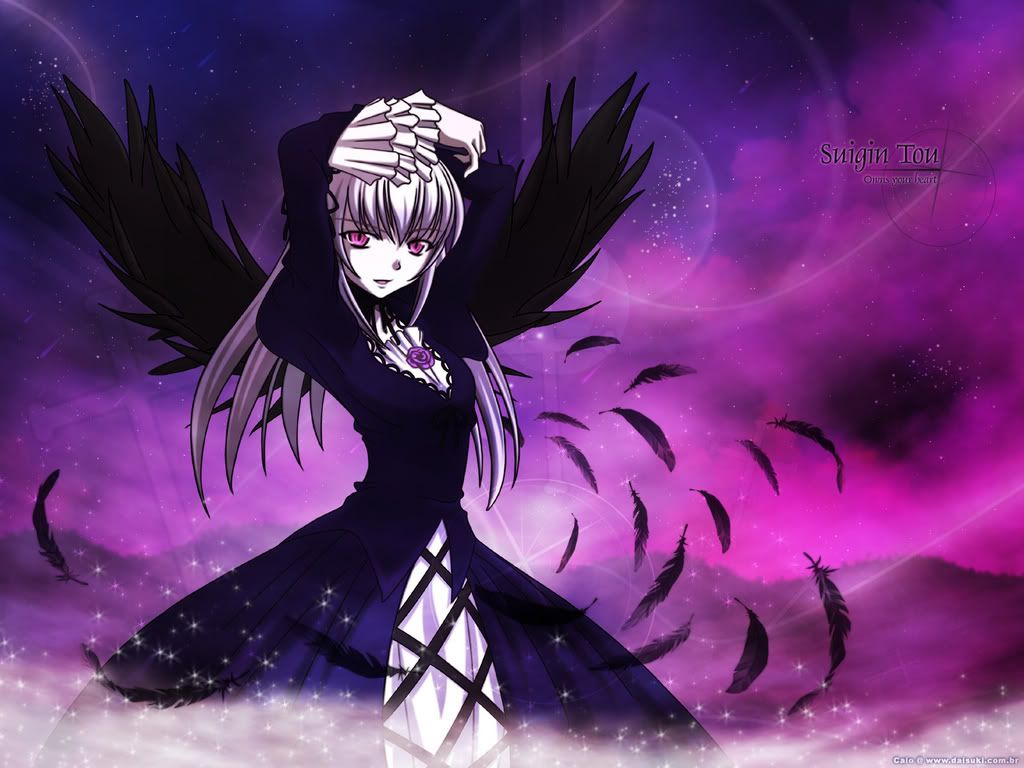
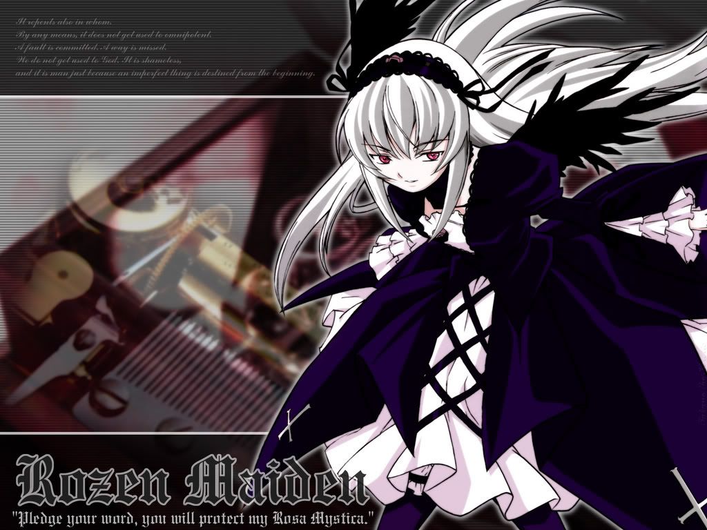
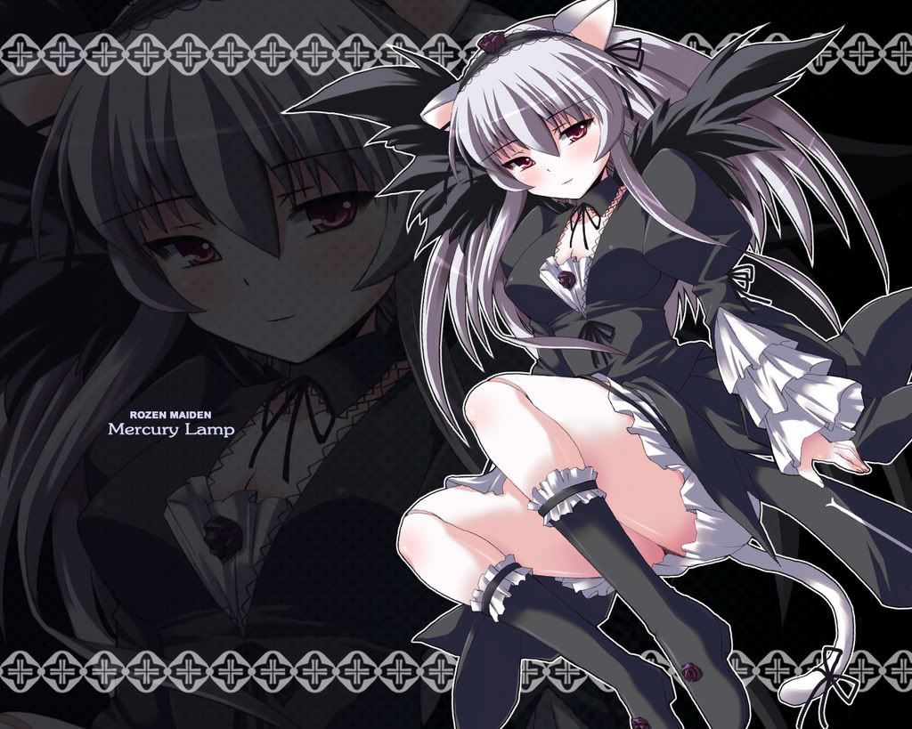
I kinda of lost most of my Gin-sama pics. (Or more so, all my RM pics. )
KasumiGirl is offline   Reply With Quote
Old 2007-12-02, 00:29   Link #39
Terrestrial Dream
勇者
 
 
Join Date: Dec 2006
Location: Tesla Leicht Institute
Age: 34
I don't know much about vectoring, but since your creating something that is not in the original picture I think following KasumiGirl's advice is the best. Anyhow all your works are very impressive

I like this one the best out of your recent ones.
__________________
Terrestrial Dream is offline   Reply With Quote
Old 2007-12-02, 02:58   Link #40
Daniel E.
AniMexican!
 
 
Join Date: Dec 2005
Location: Monterrey N.L. Mexico
Quote:
Originally Posted by MaxwellDemon View Post
I need some really technical advice on Gin's face... no matter how I try, I either cannot pin down Gin's evil look or her smiling evil facial expression.

Some help?
I didn't notice this at first, but your vector is actually very different from the source pic. In all honesty, I think you need to redo all of her head again.

If you decide to do that, be very careful about the shape and deepnes of her hair (not everything is on a first plane). Also, if check the position of her face you'll notice that she is actually looking down a bit (as if she is raising her head to look to the front)

"I think" the eyes are a bit visible in the source; If anything, you could use this to get the position of both eyes right.

And using a brush size of 2 px instead of 1 px will improve the smoothness of your outlines greatly.
__________________
Daniel E. is offline   Reply With Quote
Reply


Posting Rules
You may not post new threads
You may not post replies
You may not post attachments
You may not edit your posts

BB code is On
Smilies are On
[IMG] code is On
HTML code is Off

Forum Jump


All times are GMT -5. The time now is 14:30.


Powered by vBulletin® Version 3.8.11
Copyright ©2000 - 2024, vBulletin Solutions Inc.
We use Silk.