2009-04-02, 12:27
|
Link #61 | |
|
books-eater youkai
Join Date: Dec 2007
Location: Betweem wisdom and insanity
|
Quote:
Honestly I don't know yet if I will keep going on one of those way. I might try to go toward キノの旅, there is alot of tought peoples Spoiler for spoiler from the novel:
__________________
|
|

|
|
2009-04-02, 14:48
|
Link #65 |
|
time waits for no one <3
 Graphic Designer Graphic DesignerJoin Date: Aug 2008
Location: Portugal, Lisbon
Age: 32
|
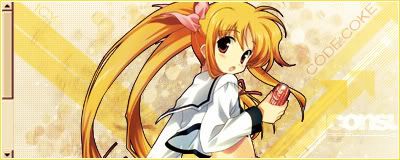
ok based on everyone's feedback *thank you so much everyone ~<3* I've made a v4 of the moo sig x)
 working on a v2 of the other sig too... although I think the moo sig is the one I'm going to submit in the end x) ok now, v2 of the Disgaea sig: 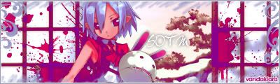 feedback is much appreciated 
__________________
|
|
|
|
2009-04-02, 18:02
|
Link #69 |
|
it's animal, unbelievable
Graphic DesignerJoin Date: Nov 2006
Location: U.S.A
|
Edit: Not sure if I'm going to have enough free time this month to work on this anymore, so I'm just going to put this as my Final Entry.
 Gah, I spent wayyyyyyyyyy too much time on this. 8D; Originally, the text *did* say 'à la mode' and under that, it said 'SOTM 09'. ....But, one of the effects completely screwed it up... ;__; C&C would be really appreciated.
__________________
Last edited by Faeyice; 2009-04-03 at 19:07. |
|
|
|
2009-04-02, 20:28
|
Link #70 | ||||||||||
|
Black Dragon
Graphic DesignerJoin Date: Dec 2007
Location: In the Netherrealm, thinking who to betray next...
|
Quote:
Quote:
I mean, the area on the left side looks a bit empty, maybe that's the perfect place for the add of a text Quote:
 ganbaru, insteda of just pasting a simple image as bg, try to create a bg that focus the atention on the render, the ones you picked distrac the atention a lot Quote:
I don't see food, I don't see a though girl and I don't see any fluffy creature  Maybe they're there but I canot see them Quote:
Quote:
Quote:
 Quote:
The animations is good, the problem I see is that kind of white line who's separating the render of the 2 characters from the animated ones, it doesn't look good Quote:
Quote:

__________________
|
||||||||||
|
|
|
2009-04-02, 21:06
|
Link #71 | |
|
~La-la Land~
Graphic DesignerJoin Date: Jul 2007
Location: Seattle
Age: 37
|
Quote:

__________________
|
|
|
|
|
2009-04-02, 21:34
|
Link #72 | |
|
Your Order ?
Graphic DesignerJoin Date: Aug 2008
Location: in Your Planet
Age: 32
 |
Quote:
__________________
|
|
|
|
|
2009-04-02, 22:00
|
Link #73 | |
|
Black Dragon
Graphic DesignerJoin Date: Dec 2007
Location: In the Netherrealm, thinking who to betray next...
|
Quote:
It doesn't look like  I though that it was a... uhmmm... never mind I though that it was a... uhmmm... never mind 
__________________
|
|
|
|
|
2009-04-03, 02:43
|
Link #78 | |
|
Black Dragon
Graphic DesignerJoin Date: Dec 2007
Location: In the Netherrealm, thinking who to betray next...
|
Quote:
Ehemm... the animation is really good, but the text's font doesn't convince me at all, looks to rude for an icecream if you get my point 
__________________
|
|
|
|
|
2009-04-03, 02:45
|
Link #79 | |
|
Kira_Naruto, the ecchi
Graphic DesignerJoin Date: Dec 2005
Location: http://www.exciting-tits.com/
|
Quote:
yea.. thats the idea.. And the font was just a temporary holder until I can think of more ecchi quote .. and I still got 20Kb to burns 
__________________
|
|
|
|
|
2009-04-03, 02:59
|
Link #80 | |
|
Pieces Of Me
ArtistJoin Date: May 2008
Location: Tokyo,JP
Age: 39
 |
Quote:
I loved the angle u picked and I'm sure that u gonna fix the text too since u have 20kb to burn 
__________________
|
|
|
|
 |
| Tags |
| contest, sotm |
|
|