2004-09-27, 18:21
|
Link #1 |
|
KAWAIII-III!!!! >^_^ >
Join Date: Jan 2004
Location: Magical land! (Magica-ru land!)
|
nh1's Art Thread?
Okay! I too have my own thread!
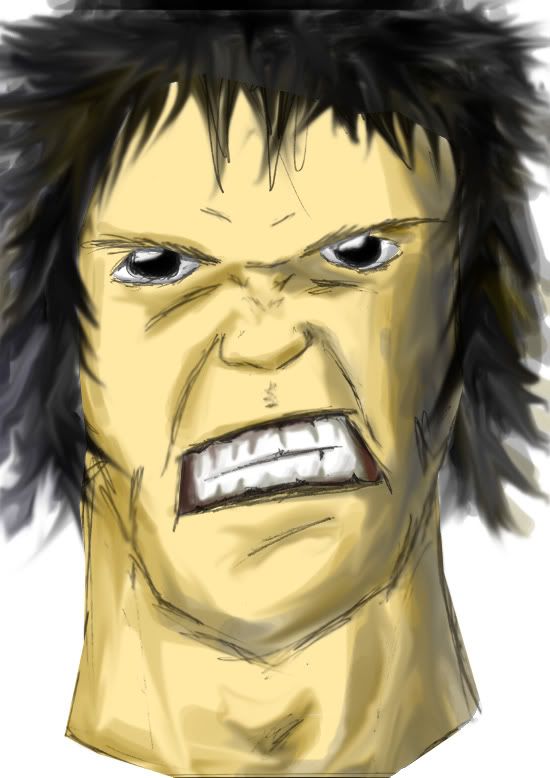
First up is some CG-Practice. I'm still pretty newbie at Photoshop, so there should be lots of room for improvement. Sketch: 15 Minutes CG: 5 Hours Spoiler:
I noticed the head is too large, the right eye is somewhat misplaced, and the shoes used to be too small so I had to replace them with some larger, uglier ones. The lightreflection in his hair is not right (Someone please tell me what to do here!). I'm sure there's plenty of other mistakes! More to come...
__________________
|

|

|
|
2004-09-27, 19:13
|
Link #2 |
|
CG / Color
Join Date: Dec 2003
Location: Eastern United States
Age: 35
 |
since I'm much better with photoshop than I am at drawng, I'll give you some tips there.
You did a decent job with the texturing on the shirt, most of the wrinkles are in good sopts, and the shadows are good. One thing you have to watch out for is the highlights. Highlights are generally a good indicator of material type, and you don't wanna make stuff too shiny. The highlight on the rim of his colar is a little too bright for a cotton (or someother simple material) shirt, although I personally love highlighting EVERYTHING (but alas, I cannot). The hair could use some work, but it's basically how I did hair when I started. Eventually start thinking about individual strands (kinda, more of individual "clumps"). It helps to make the hair stand out better. Also, try to make the highlights on the hair (the "halo") go around his head, as that is essentially what it does. Going by where the origin of his hair (kinda where all the hair on your head seems to revolve around) is, form the highlight halo around that (except in certain uncomon lighting situation, like if there was only one light for some reason, right next to his head). The next part is style oriented, so if you don't care, skip it: I usually try to reserve the really shiny hair to females. The best way I've heard it described is the "Panteen Pro V" look, and I agree. I don't usually see men's hair as shiny as womens, so I try not to go full bright (pure white) with men's halos. That's why I think it's more fun to do women's hair  Before I "Submit Reply", I'd like to commend you on the skin shading. I think it's well done Looks very natural.
|
|
|
|
|
2004-09-28, 12:04
|
Link #3 |
|
Senior Member
Join Date: Aug 2004
Location: EST
Age: 38
|
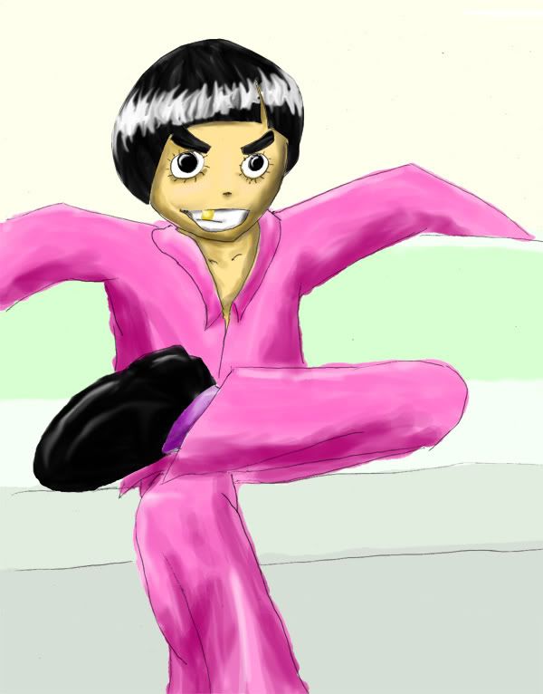
thatss greatt, it looks like he reallly has his hands inside those pocketss, = DD , yupp your right on track with the shades and sunlight projection.... you use layers right? use a bigger brush size for hightlighting and shading, and make play with the levels of % to test it out. hope that help...^^;
(me bad explaining ) |
|
|
|
|
2004-09-28, 13:00
|
Link #4 |
|
KAWAIII-III!!!! >^_^ >
Join Date: Jan 2004
Location: Magical land! (Magica-ru land!)
|
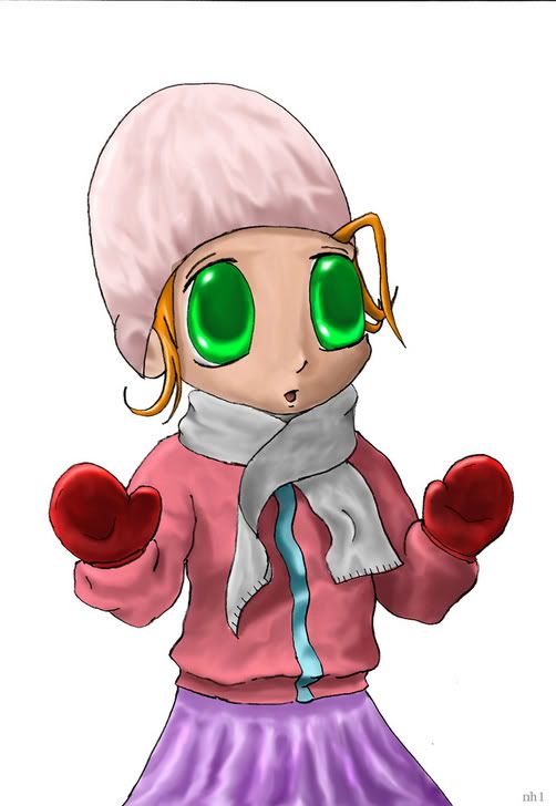
Thanks for replies! I will try different types of highlighting (although I really like the shiny look ^^) and I'll also work on the hair thing. Couldn't do it this time though...
Sketch: 20 Minutes CG: 4 Hours Spoiler:
__________________
|
|
|
|
|
2004-09-28, 14:06
|
Link #5 |
|
CG / Color
Join Date: Dec 2003
Location: Eastern United States
Age: 35
|
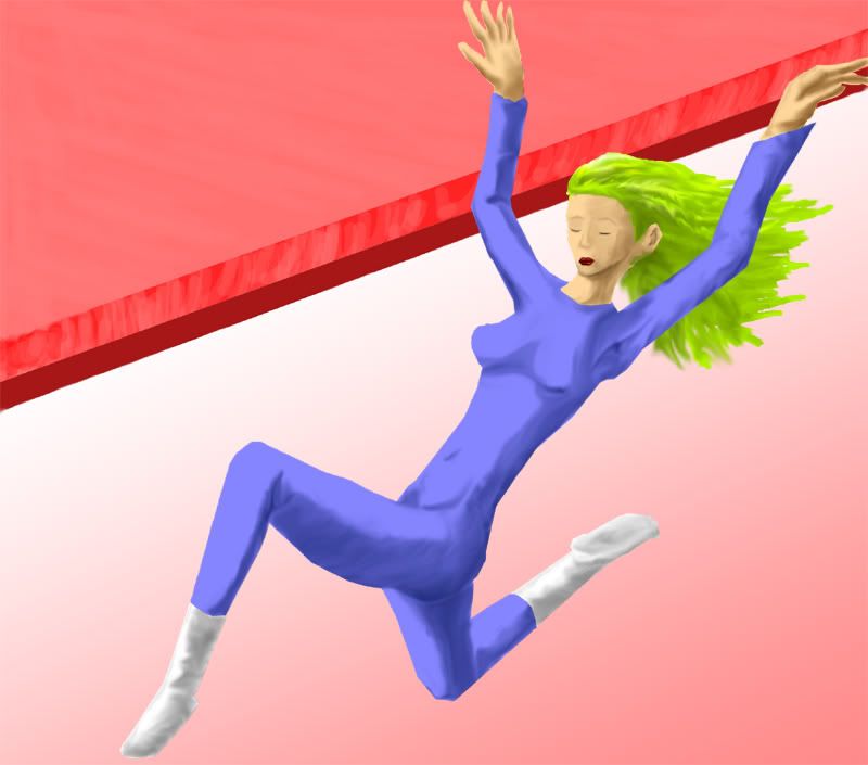
hey, i like it (however creepy those eyes are)! Shading is pretty good, and once again, nice cloth and skin shading/texturng.
Yeah, I love highlighting everything too That's why I wanna draw/color a girl with leathery clothes all shiny.
|
|
|
|
|
2004-09-28, 14:55
|
Link #7 |
|
KAWAIII-III!!!! >^_^ >
Join Date: Jan 2004
Location: Magical land! (Magica-ru land!)
|
Thanks
I had already drawn huge eyes, then I saw those four chibigirls on the top of a page here... I wanted to draw such cute eyes! So I copied it, but it didn't go so well >_<
__________________
|
|
|
|
|
2004-10-20, 10:35
|
Link #8 |
|
KAWAIII-III!!!! >^_^ >
Join Date: Jan 2004
Location: Magical land! (Magica-ru land!)
|
This is a picture of a pretty woman gone mad
 I know her ear is misplaced, but I just had to colour it. I removed the line layer, so she might have a white outline (and believe it or not, that was not my favourite background -.-). Spoiler:
Will add highlighting later (and hopefully a new background)... maybe... 
__________________
|
|
|
|
|
2004-11-11, 14:55
|
Link #9 |
|
KAWAIII-III!!!! >^_^ >
Join Date: Jan 2004
Location: Magical land! (Magica-ru land!)
|
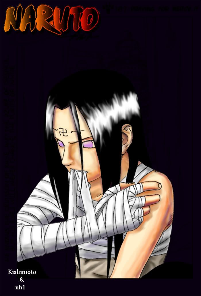
Triple post :dies: ...
... Well, I tried to color the old "Neji-wrapping-bandages-around-his-arm -first page for Naruto chapter", and hopefully I did good (TELL MEEE!!!!). Spoiler:
Took about 1:30 hours... If you don't have anything to say... Just post a "Meh... ... ...", "You stink, but you could be worse", "  " or something like that, to avoid me quadruple posting (Which is actually kind of embarrasing). " or something like that, to avoid me quadruple posting (Which is actually kind of embarrasing).
__________________
|
|
|
|
|
2004-11-11, 15:54
|
Link #10 | |
|
///_^
Join Date: Feb 2004
Location: Mushroom County, Mario World
Age: 36
|
Quote:
This one's a lot better than the previous one. Keep trying and I'll know you'll become a great artist since your sketches are good. |
|
|
|
|
|
2004-12-07, 16:10
|
Link #12 |
|
KAWAIII-III!!!! >^_^ >
Join Date: Jan 2004
Location: Magical land! (Magica-ru land!)
|
I was bored and wanted to color something, but was too lazy to scan anything. So I colored the one I posted in the quick sketch thread a while back. Hope you like. Sloppy work, took about 15-20 min.
Spoiler for the man without candy:
Edit: Here's another one. A bit sloppy this one too, although it took me almost an hour. Spoiler for Leepimp.:
__________________
Last edited by nh1; 2004-12-07 at 18:37. |
|
|
|
 |
|
|


 !
!