2008-02-29, 16:25
|
Link #201 | |||
|
I'm a Senior Member!
 Graphic Designer Graphic DesignerJoin Date: Oct 2006
Location: The Bronx
Age: 31
|
Quote:
Quote:
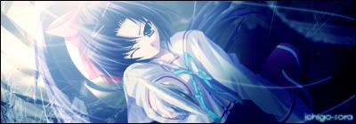
It was the large needle type thing that Asakura stabbed her with(and a few of them), I guess I should make that a little more pronounced by editing the render to make it look like it really went through her. Quote:
Thanks for the comments guys(I read all of them). Hopefully that criticism will help me improve my sig.
__________________
|
|||

|
|
2008-02-29, 17:12
|
Link #203 | ||
|
Love Yourself
Join Date: Mar 2003
Location: Northeast USA
Age: 38
|
Quote:
Quote:
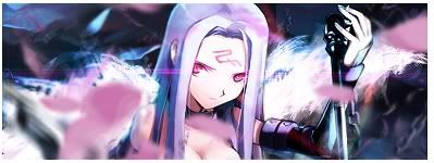
Compare that with the third. The colors of the background suddenly look better - they're combining well and contributing more to the image. I also prefer the way you have the character there, although the image quality seems to be suffering a little (particularly noticable along the chain). You may want to blur some of the edges a bit more before applying the outer glow effect (if you did). Blurring is a tricky business, and I can't offer any particularly good tips on technique. Just be careful that you don't warp the silhouette when blurring - I usually only run the blur over an edge once, maybe twice if it still looks a bit ragged. The tranparent face of unmasked Rider didn't stand out to me at all when I initially glanced over the image. I don't know that it contributes anything to the picture, especially with the chain there. If you want to keep both, perhaps flip and move either the chain or the face to the other side of the picture. If you want to keep the face, look on the lower right - you can see some of the jagged cutting that I mentioned. Using the blur tool you should be able to fix that quite easily  Keep up the good work, you're showing a lot of improvement! I don't know where your image sources are coming from (and in my experience, that's an artist's best-kept secret) but if you're having trouble finding high-quality Rider images, I may be able to help you out. Reply back or PM me if you're interested.
__________________
|
||
|
|
|
2008-02-29, 17:36
|
Link #204 | ||
|
(ノಠ益ಠ)ノ彡┻━┻
 Moderator ModeratorJoin Date: Mar 2006
|
Quote:
 Quote:
 Dunno. It's still kind of rough.
__________________
|
||
|
|
|
2008-02-29, 18:10
|
Link #205 | |
|
Love Yourself
Join Date: Mar 2003
Location: Northeast USA
Age: 38
|
Quote:
Might just be me, it sounds weird when I think about it.Did I mention it before that your signature so far is really the only one that conveys a sense of "fierce"? I'm sort of surprised - for combat, the vast majority of signatures (and so far, my own) are pretty laid back. Yours is the only one that feels fighty.
__________________
|
|
|
|
|
2008-02-29, 19:40
|
Link #206 | |
|
(ノಠ益ಠ)ノ彡┻━┻
ModeratorJoin Date: Mar 2006
|
Quote:
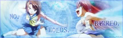
The only other variation I could think of was "No... Holds... Barred." Using the ellipses (without the parentheses) might have the same pause effect of the periods and lead the viewers eyes across the image. You didn't mention it before, but Speci did. The idea seemed natural to me, but renders can be difficult to find with a theme like this so it's understandable. You're more likely to find an image of a female posing with a weapon than you are to find one in a fighting stance or in actual combat.
__________________
|
|
|
|
|
2008-02-29, 19:54
|
Link #207 | |||||||
|
I'm a commin'
Graphic DesignerJoin Date: Dec 2007
|
Mass critisism warning.
Quote:
Quote:
Quote:
Quote:
Quote:
Quote:
Quote:
|
|||||||
|
|
|
2008-02-29, 20:44
|
Link #209 |
|
Reisen FTW!
Graphic DesignerJoin Date: Aug 2006
Location: Chicago,IL, USA!!!!
Age: 31
 |
^ I like it alot.
The font is like full of love. Everyones entries look awsomeHey guys, which one you think looks better: This one: 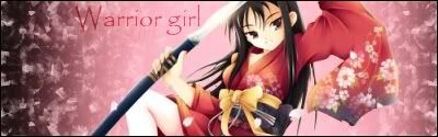 or this one:  I don't know what to pick though but I know I'm still going to use the render. 
__________________
|
|
|
|
2008-02-29, 20:51
|
Link #210 | |
|
I'm so moe I kill myself
ArtistJoin Date: Jun 2007
Location: your basement
|
Quote:
Decision time!  Spoiler for Ver.1:
or Spoiler for Ver.2 Changed font size, image size, and added minor depth (I read tutorial for that! O_O):
EDIT: @ konstgirl Mind me but I don't see the difference other than the file size O_O See, this is why I like competitions like this, you get to experience with new things and try to learn something new from the experienced, normally I would just be satisfied with my poor skills ^_^ |
|
|
|
|
2008-02-29, 20:57
|
Link #212 | |
|
Life's better in a harem.
Graphic DesignerJoin Date: Dec 2007
Location: Oakville, Ontario, Canada
|
Quote:
And I prefer your second version. The depth makes a big difference and the text isn't distracting like the first version.
__________________
|
|
|
|
|
2008-02-29, 22:05
|
Link #214 | ||||||||||||
|
Kira_Naruto, the ecchi
Graphic DesignerJoin Date: Dec 2005
Location: http://www.exciting-tits.com/
|
Quote:
Quote:
Quote:
Quote:
 Quote:
Also, if you made the current one you using, its not cheating.  Quote:
Quote:
.. it didnt carry enough emotion. Quote:
Quote:
Quote:
Quote:
2nd is much better.. but to be honest.. there's nothing splendid to cheer for it either ._.
__________________
|
||||||||||||
|
|
|
2008-03-01, 00:16
|
Link #216 | |
|
Love Yourself
Join Date: Mar 2003
Location: Northeast USA
Age: 38
|
Quote:
But then I'm sensitive about fonts. I have ~2000 fonts on my system and before this contest I probably spent about half of the time on any given signature changing the fonts and positioning of the text. To me, the appearence of the text plays a very large role in the "voice" that it speaks with. Maybe that's unusual, but as a result the punctuation feels like an unnecessary detail (if not an obstruction) to me. If most people feel that the punctuation positively adds to the feeling that the image conveys, I'd say that one should go ahead and use it, of course
__________________
|
|
|
|
|
2008-03-01, 01:58
|
Link #218 |
|
(ノಠ益ಠ)ノ彡┻━┻
ModeratorJoin Date: Mar 2006
|
Sometimes using punctation is less about being grammatically correct and more for artistic use. In this case, an English user would know the words are supposed to be read as one phrase but also see the periods and assume each word ends "hard" for emphasis. So the periods are more for decoration and making each word definitive.
In any case yeah, text is a pita. On some sigs I've spent more time making the text "just right" than I did creating everything else. Hairpulling, but fun. Well, keeping with the idea, a version three, with spoilers for comparisons: Spoiler for Previous versions for easy comparing:
Version 3 -  Pictures are supposed to be worth a thousand words....so why is text such a pita?! 
|
|
|
|
2008-03-01, 02:47
|
Link #219 |
|
Love Yourself
Join Date: Mar 2003
Location: Northeast USA
Age: 38
|
Hmm... well I still prefer it without the punctuation, but version 3 does seem better than version 1 in my mind. It may be because the punctuation chosen (ellipses) contributes to the way I'd be reading it given the spacing, whereas the periods clash with it by making it seem more like a short stop. With that punctuation, even if the words were closer together I'd still read it the same way. But again, the way I'd read it in version 2 and version 3 is the exact same - the gaps between the words (and the fact that there's image matter in between them, as opposed to blank space) sort of does that on its own. This is really hard to explain, now I understand that situation when engineers get angry at artists when the artists start seemingly making up terms to describe things - there's no easy way of expressing it.
Yeah, I just have a thing against end punctuation when the purpose of the words is different from regular communication. But if it were something like "Don't hold back" and you had it as "Dont hold back" then I'd be whining about how you're missing the apostraphe and that's a distraction Now that I've spent a few minutes looking at them, I don't know whether I prefer version 2 or 3.Ah well, off to bed with me. There wasn't a lot to do at work today so I've decided to leave my comfort zone of being an image cropper and looked up some Photoshop tutorials. I'm going to try out some snazzy effects with this one. Yeah!
__________________
|
|
|
|
2008-03-01, 03:19
|
Link #220 | |
|
Kira_Naruto, the ecchi
Graphic DesignerJoin Date: Dec 2005
Location: http://www.exciting-tits.com/
|
 I think this would be the one I shall be concentrating for this contest.. edit: Quote:
V1. NO! HOLD! BARRED!!! V2. no hold barred V3 NOOOOOOOOO HOOOOOLLLLDDD BAAAARRRRRREEEED. 
__________________
Last edited by KiNA; 2008-03-01 at 03:57. |
|
|
|
 |
| Tags |
| sotm |
|
|


")