 2009-01-17, 19:01
|
Link #8462 |
|
Onani Master
Join Date: Jan 2009
Location: The girl's bathroom
Age: 34
 |
ganbaru: I think you should add a border to your signature. The sudden transition between the white background of the image and the colour of this board do not work well together.
Also the image appears to have a lot of artifacts, did you by chance make it in paint? You should use a program that can specifically save an image for use on the internet at the highest quality for the least amount of size. Otherwise I do quite like what you're trying to accomplish with it. 7/10 Mind if I ask what the source/anime that is from?
__________________
|

|

|
|
2009-01-18, 00:21
|
Link #8463 |
|
books-eater youkai
Join Date: Dec 2007
Location: Betweem wisdom and insanity
|
fallschirmjager 7.8/10 good moment , interesting art,
@ Yes, I used Paint (and JPEG) for this signature, it explain the artifact and the low quality. For the source, it a Light Novel serie, the ''bungaku shoujo'' serie. If you want to try there is the prologue and 1st chapter translatred at :http://www.baka-tsuki.net/project/in...Bungaku_Shoujo I don't find the chapter very representatif of the serie about at least 1 point; the serie have a very low level of ecchiness ( but it still have some moment...) .
__________________
|
|
|
|
|
2009-01-18, 03:06
|
Link #8464 |
|
Black Dragon
 Graphic Designer Graphic DesignerJoin Date: Dec 2007
Location: In the Netherrealm, thinking who to betray next...
|
ganbaru: I have the feeling that you probably have the text setted as crispy, you should chage it to smooth 6/10
Skullchukka: Nice but a bit lightly 8/10 Katocchi: Nice draw 7/10 Risa chan: It's beautifull but also, a bit to lightly 8/10 Yumi Chan: lol 8/10 Hiraishin: Nothing as good as Edward  9/10 9/10Frailty: Very nice, I like it 9.5/10 fallschirmjager: It's very beautifull but a bit empty at the left 8/10
__________________
|
|
|
|
|
2009-01-18, 03:31
|
Link #8466 |
|
♪♫ Maya Iincho ♩♬
ArtistJoin Date: May 2004
Location: Unnecessary
Age: 37
 |
Evil Rick - nice and cute ^^ 8/10
Katocchi - I think you should add a border to it. But making a sig our of your artwork is pretty impressive  7.5/10 7.5/10(watch the size of your sig though, katocchi. for you it would be 500x120 and 2 lines of text. With your current 500x150 pixel sized sig, your sig is too big) Here goes a simply Copy, Extract, Resize and paste ^^ (LCD styled) ~~ I did want a bigger one, but the stand covered about 1/3 of the height >.< But not possible... (I also made 1 miscaculation. I only measured the area of the LCD screen and didn't add in the Stand so... Ex. of the bigger one I wanted ^^ 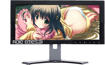
__________________
Last edited by Aoie_Emesai; 2009-01-18 at 04:03. |
|
|
|
|
2009-01-18, 23:13
|
Link #8476 | |
|
思想工作
Join Date: Mar 2008
Location: Vereinigte Staaten
Age: 31
|
King Lycan 8.5/10 wish the picture was centered, maybe a little more active (like what's going on inside the pic
ganbaru 9/10 like the colours and consistency w/avatar. note that this pic is centered. Quote:
|
|
|
|
|
|
2009-01-19, 02:36
|
Link #8477 |
|
Onani Master
Join Date: Jan 2009
Location: The girl's bathroom
Age: 34
|
Leo: 8/10
I really love the style of the image with just the outline of the tank against the sky. The only thing I'd change is the size (bigger would be nicer) and maybe add a border to make the image stand out more. By it's profile is the tank a T-72 or a T-80 by any chance?
__________________
|
|
|
|
 |
| Tags |
| rate, signature |
|
|


