2006-11-23, 20:46
|
Link #2122 |
|
Aspiring but lazy
Join Date: Dec 2005
Location: The Internet
|
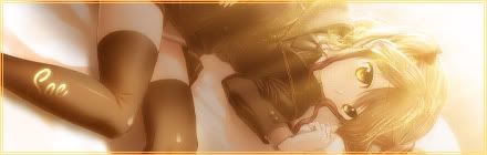
Sinestra: I really like it. Just a problem with the border though, is that it isn't too consistent. One part, it's like a picture frame of sorts while the other part is like an overlay. But Haruka = big win. 9.5/10
Ai Suzuki: o.O Well, since I see it at the top, then see it again at your posts, and for lack of creativity... 6/10 Pellisier: I think the missing frame is taking quite a bit from it. The transition from last frame to first frame is quite noticeable. Still, it's not that noticeable so... 9/10 me: Here's the sig (advertisement) I was planning, though ALOT of frames were cut just to make it below 100kb. -_-  Fufufufu~ Maybe I should zoom in for maximum damage... Last edited by celcius; 2006-11-23 at 22:28. |

|

|
|
2006-11-24, 04:49
|
Link #2125 | |
|
♪~ Daydreaming ~♪
 Graphic Designer Graphic Designer Administrator AdministratorJoin Date: Dec 2005
Location: Italy
|
Quote:
 celcius: I don't get the relation between the two pics; but I find nice the "Foooo" text effect above. A bit small, bonus for being animated. 7,5/10 Aoie_Emesai: Cute. I like how it matches with the avatar, how the borders are thought. And I also like how the sky blue is the main colour (as you can see, I'm stuck with it too at the moment ^^ ) 8/10 K. Yamato: As always nice works from you, though this one is maybe a little too much yellow-ish for my tastes ^^ 7,5/10
__________________
|
|
|
|
|
|
2006-11-24, 05:16
|
Link #2126 | |
|
Aspiring but lazy
Join Date: Dec 2005
Location: The Internet
|
Quote:
K. Yamato: I think you could reduce the width a little? It somehow looks a bit blank, the BG that is. 8/10 Aoie_Emesai: I dunno, but for this one she really looks flat. It must be because the shades on her is on the right side while her drop shadow is on the left. ^^; 8.5/10 |
|
|
|
|
|
2006-11-24, 10:43
|
Link #2127 |
|
"Show it to me"
Join Date: Dec 2005
Location: In solitude, where we are least alone
|
celcius: like the slide show
 8/10 8/10K. Yamato: not one of your best. I still like your last one better. 7/10 Aoie_Emesai: like the shape and the size is good. The img is okay too. 8/10
__________________
|
|
|
|
|
2006-11-24, 13:52
|
Link #2128 |
|
Sae's Lover
Graphic DesignerJoin Date: Apr 2006
Location: Oshawa, Ontario Canada
Age: 36
 |
Well basically haha I was trying for a powering up style background with all the crazy lights going nothing too fancy but I wanted to change it. And also being its Busou Renkin and how Kazuki is hes determined so thats why I did it with so much "Yellow" as people said.
To Cyz: Feena = Love XD 9/10 Too much of a simple background though still this wins XD. Cheers! -Jason-
__________________
|
|
|
|
|
2006-11-24, 14:03
|
Link #2129 | |
|
♪~ Daydreaming ~♪
Graphic DesignerAdministratorJoin Date: Dec 2005
Location: Italy
|
Quote:
You know what isn't working (imho) ? The timing, the change from pic 1 to pic 2 is too fast, so there's not a real surprise effect, and thus not a real reason to say "foooooo"  . This reminds me one of those webpages in which there's a still picture and they tell you to stare at it to find a random object, and then *woot* creepy pic + creepy shout. . This reminds me one of those webpages in which there's a still picture and they tell you to stare at it to find a random object, and then *woot* creepy pic + creepy shout. But seriously, I'd set the time for the first frame higher, like 6-7 seconds. And let the second half as it is. Just my two eurocents though  Deathkillz: It's very very cute, it just looks a bit empty on the middle but other than that, nothing else to say. 8,5/10
__________________
|
|
|
|
|
|
2006-11-24, 20:39
|
Link #2130 |
|
阿賀野型3番艦、矢矧 Lv180
Graphic Designer Moderator ModeratorJoin Date: Mar 2006
Location: Belgium, Brussels
Age: 37
|
@celcius : rofl... this is a smart... "eye candy"
. 8.5/10 !@K. yamato : the font texture for "Makka Na Chikai" (the top and the bottom don't really fit each other i think). The BG lacks of something... maybe some curves etc, giving some impression of "passion/movement" ? because, this BG is a bit too smooth, calm, while even with pose, kazuki is the exact opposite (and the font reveals it as well). 7/10 @Aoie_emesai : the main stroke suffers some cut leftover (around the right of the hair). also, the light and the shadow are kinda... well it doesn't really match (with this result the light is supposed to be from the left, but the shadow is expanding to the left. well nitpicking XD). the real issue about the light, though, is that brightness around the hair is way too strong, giving some impression of a paper character. :s. still simple and effective : 7.5/10 @Pellissier : though, choppy, the animation is well done for this signature size. the only issue i would say is the left edge, where you can see some darker parts, and the nose is "pierced" by some sea reflection ~~ 8/10 @Cyz : gorgeous character, with nice angle and ratio. the only problem with this would be... the fonts x_x... 8.5/10. well then... as for me, here is the second nanoha sig... fresh from the oven ^^  *cough* *prepares some pain killers *
__________________
Last edited by Klashikari; 2006-11-24 at 21:19. |
|
|
|
|
2006-11-24, 23:08
|
Link #2131 |
|
Kira_Naruto, the ecchi
Graphic DesignerJoin Date: Dec 2005
Location: http://www.exciting-tits.com/
|
Props.. GJ (^_^)b .. N's tail in Nanoha is better *if* its behind K "head"
.. Also, the white BG for the text really makes you wonder, if it was just placeholder for the text.. Nothings wrong tho (I like how it was shaped), just, I feel its a bit out of place.I'm free to spam some sigs, so maybe I'll copy your idea and make my own signature trove ^^.. Then you'll have the privilage to bash my creations ^__^ @ Pelli .. honestly, the face scares me =/ .. sorry, thus I cant concentrated for it too long to find the weaknesses =/ Gomen m(._.)m
__________________
|
|
|
|
|
2006-11-25, 05:29
|
Link #2135 | |||
|
阿賀野型3番艦、矢矧 Lv180
Graphic DesignerModeratorJoin Date: Mar 2006
Location: Belgium, Brussels
Age: 37
|
Quote:
*still taking some pain killers* i'm really sorry, but this time, i really don't understand what you mean... x_x (when you say "behind", do you mean that "nanoha" layer should be under "takamichi"? or are you suggesting to put "nanoha" slightly to the bottom left, so the N tail would be between the T and H ? Quote:
in fact, this light is part of the BG and was done on purpose to give some impression of an accelerated accel shoot (thus the triangle shaped pink/white light). just like fate sig, i wanted to put the text on a neutral area, avoiding some silly impression of placeholder. however, the space between the "bullet" and nanoha is rather small >_< also, it doesn't feel really natural (while with fate, it was good, for nanoha, you have the impression that it was forcefully placed inbetween, giving some impression of some unnatural/awkward position) but anyway, i followed your advice, this is the second version  i managed to reduced the bullet size, so there is way more space, preventing some weird "puzzle piece" impression. i didn't join nanoha and takamachi altogether since the space is expanded, and it would have some weird result with the "h" of takamachi (see this example) Quote:
@godaime hokage : i really dunno why, but the character expression (who is he by the way?) seems to be rather apart from the signature mood. also, there is some graininess around the character (especially the neck) which doesn't really render well with the BG. and finally, (is it tsukuyomi work again? ^^) the left and the right could be cut a bit slightly, because the signature is a bit empty. 7/10 @hoji12 : not really common ^^ i like the signature ratio, though the BG composed only on arrows is a bit... well not really substancial (but you don't really need fancy thing for this type of sig, indeed). since the stroke is on the topmost layer without any blending, you can notice some cut leftover around the right but nothing that wrong. overal, it is a nice idea, but i feel it lacks of some humourous impact. 8/10
__________________
Last edited by Klashikari; 2006-11-27 at 15:28. |
|||
|
|
|
|
2006-11-25, 06:12
|
Link #2136 |
|
Kira_Naruto, the ecchi
Graphic DesignerJoin Date: Dec 2005
Location: http://www.exciting-tits.com/
|
hmm.. since you have both name in different layer .. yes, Nanoha should be behind Takamachi .. if you look closely, k got beheaded >.<
I'm suggesting that you removes the white blob totally and replace it with smoother BG that goes well with you text color. And my sig is made purely of total randomness .. you gonna love em =3 @ Godaime Hokage .. Love the work, altho I'm a big fan of having own name in sig, I think your sig is an exception .. The only spot available would be the bottom left ... Even so, the font would be a hard choice because it could downgraded the whole sig feel... There's a sense of evilness in the sig, especially from his smirk ^^ @ Hoji12.. message lost, seriously ... o_O, except that I go @_@ if I stare too long at the BG =/
__________________
|
|
|
|
|
2006-11-25, 07:58
|
Link #2137 | ||
|
♪~ Daydreaming ~♪
Graphic DesignerAdministratorJoin Date: Dec 2005
Location: Italy
|
Quote:
 Ok, BgI arts are not KyoAni's , but maybe you need to learn distinguishing a sad face from a creepy face Spoiler:
Quote:
and go ahead on your way: it's nice to have people making detailed reviews about artworks, when they have the skills for it. It's of help both for the destinatary, both for the common third party reader. I myself try do the same with animated works, since I feel more comfortable with those. Well, the point is, at least imho: nobody is acknowledged of all, and there's always something to learn ^^ As for your Nanoha sign, I find it wonderful as per general appearance. Now what I'm going to say is not related nor influenced by what KiNa suggested you about the text (also because I'm not sure I've got precisely what he wanted to say). Anyway: "Nanoha Takamachi" doesn't sound good. Maybe it's my habit, but in a japanese name/surname form, I'd always prefere to go with the surname first. Even more in a case like this, when the surname is longer than the name. Hence I think "Takamachi Nanoha" (disposing it as you want) would be much better. As for the font, the one used is stylish enough. Still a very solid sign. 9/10 celcius: + half point because you listened my suggestion  .. actually it looks a bit better, for what you formerly meant to do with it 8/10 .. actually it looks a bit better, for what you formerly meant to do with it 8/10Hoji12: style-wise, it's not bad, though I'm probably missing the full meaning of the humorous message it should be meant to deliver. :/ 7/10
__________________
|
||
|
|
|
|
2006-11-25, 08:34
|
Link #2138 | ||
|
阿賀野型3番艦、矢矧 Lv180
Graphic DesignerModeratorJoin Date: Mar 2006
Location: Belgium, Brussels
Age: 37
|
Quote:
anyway, thanks for your appreciation, i hope i will still rate with the least bias reasonings possible (and i hope i will improve my vocabulary/grammar ~~)Quote:
in fact, as an asian, i'm quite used with last name first, then the first name. but it seems i was a bit too much concentrated about how to mimic that sig with the fate one >_> since the beginning i prefer this type of format (while i would prefer to put character name in their language if possible... but this will rather not work with this banner), duh... need more concentration @.@ *live correction, again!* before / after i won't show it again, this is rather "minor" and it will be smewhat a flood XD (i changed the signature in the previous post though) that aside, we are kinda not a lot about signature and stuff, duh ~~
__________________
|
||
|
|
|
|
2006-11-25, 10:06
|
Link #2139 |
|
Junior Member
Join Date: Nov 2006
|
thanks for the c&c on my " got sake?" sig, ya i know its pretty lame but im just happy i was able to make a sig, here another one i made for another forum.
 @Klashikari: 20/10, simply awesome. I love the japanese text and what not. almost feel's like a movie poster.
|
|
|
|
 |
| Tags |
| rate, signature |
|
|