AnimeSuki Forums

Register Forum Rules FAQ Community Today's Posts Search

Go Back   AnimeSuki Forum > Anime Related Topics > Fan Creations

Notices

Closed Thread
 
Thread Tools
Old 2009-08-10, 16:17   Link #21
ganbaru
books-eater youkai
 
 
Join Date: Dec 2007
Location: Betweem wisdom and insanity
Thank for the comment guys.
2nd version, added some colors to the book. C&C are always welcome.

__________________
ganbaru is offline  
Old 2009-08-10, 16:18   Link #22
White Manju Bun
Anxious bookseller
*Author
 
 
Join Date: Aug 2006
Location: Shibuya Psychic Research
Actually found something I like.

Ok before I post let me remind everyone this is my first attempt at animation...ever Actually animating wasnt hard...getting it under 50bytes was killer x_x

C&C please.


Ugh just looking at it, I can tell the flash is too fast...

If the render is okay Ill probably end up using it, though not sure about the lightning yet...
__________________
Pandora HeartsManju's Stuff
"I will always remember
when the Doctor was me."
- 11th Doctor.

Sig by TheEroKing
White Manju Bun is offline  
Old 2009-08-10, 16:31   Link #23
Solace
(ノಠ益ಠ)ノ彡┻━┻
*Moderator
 
 
Join Date: Mar 2006
Quote:
Originally Posted by ganbaru View Post
Thank for the comment guys.
2nd version, added some colors to the book. C&C are always welcome.

While not colorful, the extra color does help bring a better feeling of perspective and depth to the signature. However now that the book looks so nice, the rest of the entry feels...a little flat.

Quote:
Originally Posted by White Manju Bun View Post
Actually found something I like.

Ok before I post let me remind everyone this is my first attempt at animation...ever Actually animating wasnt hard...getting it under 50bytes was killer x_x

C&C please.


Ugh just looking at it, I can tell the flash is too fast...

If the render is okay Ill probably end up using it, though not sure about the lightning yet...
Source is fine, as you've noted the animation is a bit fast. And yeah, the optimizing is the most hairpulling part of making animated signatures work here.
__________________
Solace is offline  
Old 2009-08-10, 16:35   Link #24
LKK
Senior Member
 
 
Join Date: Nov 2006
Location: Virginia, USA
Age: 62
Quote:
Originally Posted by White Manju Bun View Post
C&C please.
Looking at the sky where the clouds are darkest, I think the lightening should originate from the upper right corner and head in toward the middle. In other words, the opposite diagonal from what you've got now. Right now, the lightening looks like it's coming from a relatively clear part of the sky and not from where the storm is coming.
__________________

Avatar: Hazuki of Natsuyuki Rendezvous / Signature: flowers from Natsuyuki Rendezvous
LKK is offline  
Old 2009-08-10, 17:47   Link #25
ganbaru
books-eater youkai
 
 
Join Date: Dec 2007
Location: Betweem wisdom and insanity
White Manju Bun, yes the animation is too fast I think you should shortening the time when the ligntning is visible but at least doubling the time betweem each lightning
Quote:
Originally Posted by Solace View Post
While not colorful, the extra color does help bring a better feeling of perspective and depth to the signature. However now that the book looks so nice, the rest of the entry feels...a little flat.
Of course the book have to look nice, what else do you think is proposed as food, the girl, the signature itself ? . Seriously, I wanted to make the sig to look like a old picture, even a drawing, so the flatness was somehow expected. I tried to get the head pop-up, C&C are welcome.


__________________
ganbaru is offline  
Old 2009-08-11, 03:07   Link #26
Frailty
Constellation
*Graphic Designer
 
 
Join Date: Jan 2008
Location: Pearl of the Orient Seas
Age: 31
so does this work??


if yes C&C
if not
back to the old drawing board

I really don't know what I'm doing
__________________

Frailty is offline  
Old 2009-08-11, 03:16   Link #27
ryuukazi
Empire of the Sun
 
 
Join Date: Aug 2008
Location: Empire of the Sun
Send a message via AIM to ryuukazi
Quote:
Originally Posted by Frailty View Post
so does this work??


if yes C&C
if not
back to the old drawing board

I really don't know what I'm doing
it fits fine. and should work. Though I dig idea. But looking at the shadows i think the bright light should come from the left and you can try to emphasize the middle through some effects.
__________________

Thought I’d never see, The love you found in me, Now it’s changing all the time, Living in a rhythm where the minutes working overtime
ryuukazi is offline  
Old 2009-08-11, 04:27   Link #28
Frailty
Constellation
*Graphic Designer
 
 
Join Date: Jan 2008
Location: Pearl of the Orient Seas
Age: 31
Quote:
Originally Posted by ryuukazi View Post
it fits fine. and should work. Though I dig idea. But looking at the shadows i think the bright light should come from the left and you can try to emphasize the middle through some effects.
hmmm I tried doing the "left part only has lighting thing"
I don't think it'll work

so I lighted everything except the floor, then I put some pyreflies(ffx) effects on the person
anyway
v2:


so C&C again
__________________

Frailty is offline  
Old 2009-08-11, 04:59   Link #29
ryuukazi
Empire of the Sun
 
 
Join Date: Aug 2008
Location: Empire of the Sun
Send a message via AIM to ryuukazi
hehe my bad, I really like the B&W version... shoulda kept it simple but what I meant was just up the contrast to highlight the black and white more and by effects maybe more snow.
__________________

Thought I’d never see, The love you found in me, Now it’s changing all the time, Living in a rhythm where the minutes working overtime
ryuukazi is offline  
Old 2009-08-11, 05:24   Link #30
Frailty
Constellation
*Graphic Designer
 
 
Join Date: Jan 2008
Location: Pearl of the Orient Seas
Age: 31
Quote:
Originally Posted by ryuukazi View Post
hehe my bad, I really like the B&W version... shoulda kept it simple but what I meant was just up the contrast to highlight the black and white more and by effects maybe more snow.
v3!!!!!


better?
kept the b&w thing and the pyreflies since they're nice

C&C
__________________

Frailty is offline  
Old 2009-08-11, 07:43   Link #31
ryuukazi
Empire of the Sun
 
 
Join Date: Aug 2008
Location: Empire of the Sun
Send a message via AIM to ryuukazi
yea think it looks great
__________________

Thought I’d never see, The love you found in me, Now it’s changing all the time, Living in a rhythm where the minutes working overtime
ryuukazi is offline  
Old 2009-08-11, 07:59   Link #32
Frailty
Constellation
*Graphic Designer
 
 
Join Date: Jan 2008
Location: Pearl of the Orient Seas
Age: 31
Quote:
Originally Posted by ryuukazi View Post
yea think it looks great
yeah I think it does too
thank you

now all it needs is a good border and a nice text that blends
__________________

Frailty is offline  
Old 2009-08-11, 08:07   Link #33
KiNA
Kira_Naruto, the ecchi
*Graphic Designer
 
 
Join Date: Dec 2005
Location: http://www.exciting-tits.com/
Quote:
Originally Posted by White Manju Bun View Post
Actually found something I like.

Ok before I post let me remind everyone this is my first attempt at animation...ever Actually animating wasnt hard...getting it under 50bytes was killer x_x

C&C please.


Ugh just looking at it, I can tell the flash is too fast...

If the render is okay Ill probably end up using it, though not sure about the lightning yet...
Welcome to the family.. if you need hairs replacement.. call Rika :x

Intriguing theme.. *digs folder*
__________________
“This be the realest shit I ever wrote.” ~Tupac
So very dead right now.. but still breathing thank you.
Top 4 Manga Waifu
>> Tsukiumi
>> Saeko Busujima
>> Himuka
>> Yui Kotegawa


KiNA is offline  
Old 2009-08-11, 09:08   Link #34
ganbaru
books-eater youkai
 
 
Join Date: Dec 2007
Location: Betweem wisdom and insanity
Fraility, the 3th version is the best, but I am not too hot about thoses pyreflire c than seem to come from the person,

I made 2 other version, reworking some elements, hoping to improuve the sig. Should I keep the sig shorter or longer, make the book popping out more by the top, maybe even reducing the the in part ? C&C would be welcome


__________________
ganbaru is offline  
Old 2009-08-11, 10:26   Link #35
LKK
Senior Member
 
 
Join Date: Nov 2006
Location: Virginia, USA
Age: 62
Does this qualify theme-wise?


(I know my shooting star needs work. Gotta find a good tutorial. This is just what I worked up all by my widdle wonesome with no clue as to what I was doing.)
__________________

Avatar: Hazuki of Natsuyuki Rendezvous / Signature: flowers from Natsuyuki Rendezvous
LKK is offline  
Old 2009-08-11, 10:30   Link #36
vandakiara
time waits for no one <3
*Graphic Designer
 
 
Join Date: Aug 2008
Location: Portugal, Lisbon
Age: 32
@Frailty - v2 is my fav 
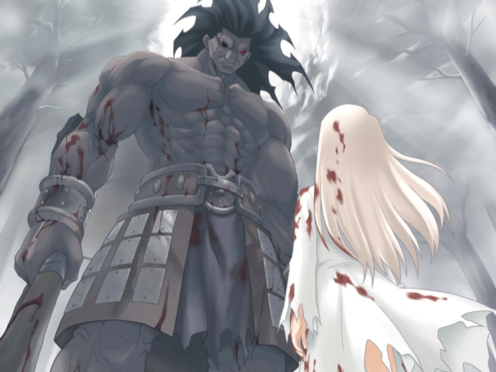
although I think the pyreflies on the person look a bit weird imo

@ganbaru - of these 2, I go with the first, smaller one which has more contrast and everything... but I think you should colour up the rest of the sig too - like colouring her hair, skin, clothes...

@White Manju Bun - it looks awkward, probably due to what's been already pointed out

@LKK - if that works, I have to say it's too empty - uhm, I don't really know how to explain but.. I think a person there would improve the sig. even if it's a tiny one, looking at the sky. that said, the shooting star looks fine to me

and now, my turn... can't decide on what to do D: and I'm really in love with ilya and berserker so... Solace, you talked about big and small...

would this image work for example?

Spoiler for size:


or this? *have to post the link cause it's HUGE resolution*
__________________

Believing oneself to be perfect is...
often the sign of a delusional mind

Last edited by vandakiara; 2009-08-11 at 11:01.
vandakiara is offline  
Old 2009-08-11, 12:12   Link #37
Evil Rick
Black Dragon
*Graphic Designer
 
 
Join Date: Dec 2007
Location: In the Netherrealm, thinking who to betray next...
Quote:
Originally Posted by Frailty View Post
v3!!!!!


better?
kept the b&w thing and the pyreflies since they're nice

C&C
This looks great!

Quote:
Originally Posted by ganbaru View Post
Fraility, the 3th version is the best, but I am not too hot about thoses pyreflire c than seem to come from the person,

I made 2 other version, reworking some elements, hoping to improuve the sig. Should I keep the sig shorter or longer, make the book popping out more by the top, maybe even reducing the the in part ? C&C would be welcome


I dunno... having a text in japanese inside the sig and a text in english outside the sig doesn't look very good.
__________________
Evil Rick is offline  
Old 2009-08-11, 15:20   Link #38
LKK
Senior Member
 
 
Join Date: Nov 2006
Location: Virginia, USA
Age: 62
Version 2.


New shooting star and a person. (Thanks for the advice, vandakiara.) Comments?
__________________

Avatar: Hazuki of Natsuyuki Rendezvous / Signature: flowers from Natsuyuki Rendezvous
LKK is offline  
Old 2009-08-11, 15:29   Link #39
vandakiara
time waits for no one <3
*Graphic Designer
 
 
Join Date: Aug 2008
Location: Portugal, Lisbon
Age: 32
@LKK - you're welcome ^^ oh and I was right, the sig looks different with a person there I think it's definitely better this way but it can still be improved maybe some text on the left side... *no idea what you could write though D: maybe SOTM or something of the sort*
__________________

Believing oneself to be perfect is...
often the sign of a delusional mind
vandakiara is offline  
Old 2009-08-11, 15:39   Link #40
LKK
Senior Member
 
 
Join Date: Nov 2006
Location: Virginia, USA
Age: 62
Quote:
Originally Posted by vandakiara View Post
@LKK - you're welcome ^^ oh and I was right, the sig looks different with a person there
Your idea was great. Adding him made a real impact.

Quote:
I think it's definitely better this way but it can still be improved maybe some text on the left side... *no idea what you could write though D: maybe SOTM or something of the sort*
I have no idea what to add to the left side either. I think I'm gonna mull it over for a few days.
__________________

Avatar: Hazuki of Natsuyuki Rendezvous / Signature: flowers from Natsuyuki Rendezvous
LKK is offline  
Closed Thread

Tags
contest, sotm


Posting Rules
You may not post new threads
You may not post replies
You may not post attachments
You may not edit your posts

BB code is On
Smilies are On
[IMG] code is On
HTML code is Off

Forum Jump


All times are GMT -5. The time now is 03:28.


Powered by vBulletin® Version 3.8.11
Copyright ©2000 - 2024, vBulletin Solutions Inc.
We use Silk.