2006-06-10, 04:19
|
Link #1003 |
|
Garden of Tsubaki
 Graphic Designer Graphic DesignerJoin Date: Mar 2006
 |
shini_gami : nice yuki pic but no border and it's plain.6.5/10
keios : nice sig but too much red but it's still matching.8.6/10 C.A : very creative but theres no colour.9.4/10 Diaboso : it's nice but the text is not too visible to me.8.7/10 Amaranthine : speechless with the pic and the font fits well.10/10 Shiryuu : it's very creative.8.7/10 |

|

|
|
2006-06-11, 09:31
|
Link #1004 |
|
Starlight StarBright~
FansubberJoin Date: Dec 2005
Location: Canada
|
C.A. Very interesting signature 8.5/10
Akarix 9.5/10 i like the text especially tea_servant_1996 7.5/10 very interesting signature what anime is that from ? :O i had time to mess around with photoshop yesterday again and made this weeeeee~ Version1  Version 2 
|
|
|
|
|
2006-06-11, 15:32
|
Link #1007 |
|
Freedom
Join Date: Dec 2003
Location: United States
  |
Well then since xellos and keios are browsing thread at moment... i will rate you guys.
xellos: Lol altho its just an image capture its a nice one... altho im not sure if nun with her clothes off is appealing  . .Anyway its nice so 7/10 Keios have yet to watch that series... is it any good? Background suits character - text is nice - definatly better text than mine... the area around text that is different to rest feels somewhat mmm, like something else could go there possibly? Anyway 8/10 for yours. Nice job guys. My first new sig I have made in almost 6 months... as some may or may not know ?
__________________
Last edited by Wavie; 2006-06-11 at 15:55. |
|
|
|
|
2006-06-11, 19:28
|
Link #1008 |
|
YuI
Join Date: Apr 2006
Location: Australia, Sydney
Age: 32
|
Azami - cuties.... i liked version 1 better and nice colour for it :P
Cyz - its Mikuru >< i liked it a lot, pinky background for her, suits her Xellos- ^ - wooh.... s3xy ^^ nice animation for it =D btw sry bout the exceeding size for my sig, now its 31kb :S |
|
|
|
|
2006-06-12, 04:30
|
Link #1010 | |
|
Garden of Tsubaki
Graphic DesignerJoin Date: Mar 2006
|
Quote:
i prefer the version 1.the image is cute!!!10/10 Last edited by SweetSpring; 2006-06-12 at 07:06. |
|
|
|
|
|
2006-06-12, 10:06
|
Link #1012 |
|
Kira_Naruto, the ecchi
Graphic DesignerJoin Date: Dec 2005
Location: http://www.exciting-tits.com/
|
o.o
So many new sig while I slack off ^.^ @ C.A .. Nice drawing altho did u try to test the sig limit rule and see if any body notice ? ^.^ ... I lol at the overrun poor guy there .. totally destroyed by the swarm of girls ^.^ .. 88% @ Keious .. Nice simple BG .. good image.. is it vectored? .. the ribbon got quite thick border tho .. 89% @ No. 48 .. the fella nearly go invisible there :'| but for some reason I like it ^.^ 92% @ Shini_GamI .. Wooo, sharpened filter overdosed @_@ .. a crop sig.. 78% @ Cyz.. Oh no, I should have not fell asleep  . Not very sharp for both mikuru image tho .. steal some sharpen filter from shini_gamI ^.^ 82% . Not very sharp for both mikuru image tho .. steal some sharpen filter from shini_gamI ^.^ 82%@ Xell .. Ohh nun theme now eeh? Biased for a fellow E guy ^.^ 89% @ Wavie.. A ha.. a Haruhi not from Haruhi @_@ .. is she getting grounded or something ? the BG seems suggesting that she's in a closed room like a priosn =x bottom right leave much to my taste tho .. either go full curves .. or go for the sleek rectangular all ard ... 80% @ Azami o.o... u changed your name o.o .. Nice BG tho like teaser and shini I prefer version 1 then your current 1 .. both still excellent ^.^ 92% @ Tea_ser Ahh the little curious princess Still with her kyuuute Jubeichan ^.^ .. Like Shini_gamI u overload with your plants... learn to be more moderate with brushing.. dont go overboard .. its messy Still you are 10 year old kid .. so biased loli point =x 74% .. And no, Im not like npal  @ Honey .. .. AzuD style sig .. like it, also like the BG .. look like a beach from above ^.^ Also Kareha got a bonus biased rating for being 1 of 3 blond goddess to me  95% 95%@ KiNA .. Result of a slacker ..  *Points to av .. point to girl in sig .. same girl .. Revy from Black Lagoon* Not an anime for Tea_ser I'm afraid ^.^ *Points to av .. point to girl in sig .. same girl .. Revy from Black Lagoon* Not an anime for Tea_ser I'm afraid ^.^
__________________
|
|
|
|
|
2006-06-12, 10:08
|
Link #1014 |
|
Lord Chairman God King
Join Date: Mar 2004
Location: Do you really give a damn?
 |
Keios: Good signature, but a litle lazy to make your avatar from it. 8/10
Xellos-_^: Another ecchi sig on this forum. HOW ORIGINAL. 4.5/10 Number_48: Very nice detail with the font, although a lttile hard to read. The slight strain is worth it to see that you put some work into your sig. 9.25/10 |
|
|
|
|
2006-06-12, 10:09
|
Link #1015 | |
|
Senior Member
Join Date: May 2006
Age: 34
|
Quote:
SweetHoney: I like the stock and the text but the bg doesn't work IMO 7.5/10 Number 48: 9.8/10 Wavie: IMO I think it is overall too dark for me, lighten it up some more. 7.5/10 This is not orginally mine but a friend made it for me, it was a big file so I had to post it instead. Same goes my current sig.   
|
|
|
|
|
|
2006-06-12, 10:52
|
Link #1016 |
|
♪~ Daydreaming ~♪
Graphic Designer Administrator AdministratorJoin Date: Dec 2005
Location: Italy
|
C.A.: It's handmade, so it gets bias rating. Though I don't catch the former meaning, I appreciate it
 8/10 8/10Keios: Very clean and very simple. And nice to see ^^ , but why your avie turns on the other side ? ^^ 8/10 Shini_GamI: A borderless crop.. nice font used for your name, but that's it. 6/10 Akarix: Nice background, maybe the whole pic is a bit too wide, but you filled the space well. 8,25/10 tea_servant_1996: Heh, letting alone the lack of quality, the main character should literally "pop out" from the image. Instead, Jubei-chan is hidden. I mean, it's not, out of all the elements, the one firstly catching attention. And the greeen and the pink do not match with the background at all. Gomen ^^ 5,75/10 Azami: Look empty on the sides, while well coloured. Some text may fill the gap. I like version 1 more, because it's more faithful to Primula's former colours. Version 1 : 8,5/10 ; Version 2: 7,5/10 Number 48: That's a bit messy but I guess It will do, after all ^^ 6/10 Cyz: Kawaii Mikuru-chan ^^ .. a bit of blurriness on the pics, background a bit cheap, but it's still nice to watch. Nice font for the quote. 7,5/10 Xellos-_^: You took the specialization on nuns, isn't it? Just a crop, looks a bit empty, your name sticked somewhere may fill. ^^ 7/10 Wavie: Simple but not bad. Nice effects with the shadow and the rounded corner is a plus 7/10 SweetHoney: The picture is awesome, and the crop as well. Feeling of emptyness for all the remaining though :/ .. feels incomplete. 6,75/10 KiNa: While crowded, I like it a lot. There's a sort of hierarchy on the various elements and, even though you throw in it a lot of stuff, it doesn't generate confusion. And I have no bias rating since I'm not watching that series nor I am a fan of that genre either ^^ 9,25/10 Deathkillz: Very simple.. Prize for the text, which brings a meaningful message . 7/10CXC: 4 signs to rate? o_O Let's see: 1)The Mikuru one, maybe not the best Mikuru source pic (does it come from doujin ^^), but the rest is amazing. I love that kind of background. 9/10 2)The Yuki one, not bad, but feels a bit empty in the middle, and the text, either for the font but especially for the colour, doesn't totally suit. 7/10 3)The Rena one, cute. All that flash in the middle make some of the squares to look each others. Other than that, a cute Higurashi sign. Though, that Rena pic with the axe is kind of abused. 7,5/10 As for your current sign. I love it. Maybe because I'm a sucker for black and blue, for the stars, for the darkness, for the coldness. But in that sign there's just everything capable of hitting my weak spots ^^ Omedetou to who made it  9,75/10 9,75/10
__________________
|
|
|
|
|
2006-06-12, 19:11
|
Link #1019 | |
|
Absolute Haruhist!
ArtistJoin Date: Mar 2006
Age: 37
|
Quote:
Keios: 9/10, not sure why but Al looks particularly cute and thats enough for a 9 lol Pellissier: 8/10, Haruhi caught my attention instantly of course, and immediately I heard 'Tsk tsk tsk' in my mind. I shifted my focus away from Haruhi a little and discovered you included the text lol, nice!
__________________
|
|
|
|
|
|
2006-06-12, 19:44
|
Link #1020 |
|
台灣人~囧
Join Date: Jan 2006
Location: ルカの中
|
kira_lacusXX - It's Haruhi, how can it be low?
9/10I thought I try coming back here once in a while with a new sig...here goes.. Well, I have two this time, so I thought I'd just show both o.o;  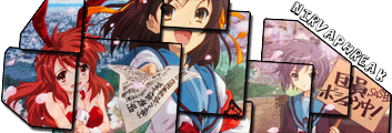
__________________
Last edited by Nirvaphreak; 2006-06-12 at 19:59. |
|
|
|
 |
| Tags |
| rate, signature |
|
|