2009-10-21, 01:28
|
Link #261 |
|
books-eater youkai
Join Date: Dec 2007
Location: Betweem wisdom and insanity
|
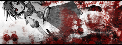
Esp; the animatio n is great but the spooky factor is quite missing; I know than she is a vampire bit it's isn"t showing much o this picture. I am not sur e than it would be enought but adding some blood on the ground might help.
__________________
|

|
|
2009-10-21, 05:12
|
Link #262 |
|
Busy busy busy
 Graphic Designer Graphic DesignerJoin Date: Mar 2008
Location: Slovenia
Age: 36
|
Taken the suggestions into reality:
   v2 - Fixed colour, levels - Added glowing red vampire eyes, some blood - Added blur to the non light area - Made it darker to give it a true night feeling Spoiler for comparison to v1:
Thoughts?
__________________
|
|
|
|
2009-10-21, 07:28
|
Link #263 |
|
books-eater youkai
Join Date: Dec 2007
Location: Betweem wisdom and insanity
|
Esp I prefer version2 but it's much scary. I did saw the glowing eyes on the dark only because I was searching for the glow. For the darkening of the the non-illuminated area, is it possible than you did it too much? something betweem v1 and v2 would look more natural.
__________________
|
|
|
|
2009-10-21, 09:06
|
Link #265 | |
|
Busy busy busy
Graphic DesignerJoin Date: Mar 2008
Location: Slovenia
Age: 36
|
Quote:
 Also, version 1.5!    - Balanced the brightness - Removed some unnecessary blur - Slighty fixed colours Spoiler for comparison:
Should be something between v1 and v2. *stares at ganbaru* Well, anything else? 
__________________
|
|
|
|
|
2009-10-22, 00:45
|
Link #268 | |
|
ISML Technical Staff
Graphic DesignerJoin Date: Dec 2006
Location: Phoenix, AZ
Age: 35
  |
Quote:
__________________
|
|
|
|
|
2009-10-22, 10:28
|
Link #270 |
|
Busy busy busy
Graphic DesignerJoin Date: Mar 2008
Location: Slovenia
Age: 36
|
Since it's getting close to the final date, I might as well submit it as my final entry.
Final entry:    - Made adjustments from v1.5 to look more like v2 - You might call it v1.75 - Darker setting and the eyes are glowing fiercer - I'm getting seasick from looking at the swinging lamp Spoiler for comparison:
__________________
|
|
|
|
2009-10-23, 01:07
|
Link #271 |
|
Strangely dependable...
Join Date: Nov 2006
Location: some random place out there...
|
Applied the suggestions for the light, so here's version...3?
            Spoiler for previous versions for comparison:
I know I'm calling it close to the deadline but which one looks good? C&C?
__________________
Last edited by PreSage; 2009-10-23 at 06:46. |
|
|
|
2009-10-23, 03:15
|
Link #272 | |
|
♪ ~ ♫
ArtistJoin Date: May 2008
Location: Europe
Age: 35
 |
Quote:

__________________
|
|
|
|
|
2009-10-23, 03:39
|
Link #273 | |
|
ISML Technical Staff
Graphic DesignerJoin Date: Dec 2006
Location: Phoenix, AZ
Age: 35
|
Quote:
__________________
|
|
|
|
|
2009-10-23, 06:48
|
Link #275 |
|
Strangely dependable...
Join Date: Nov 2006
Location: some random place out there...
|
I was afraid the flashing light would divert too much attention.
 Well, I toned the intensity of the lights down a bit and slowed the flashing down. This is it. No more tweaking. >_<; Thanks for all the help everyone! And good luck to all! Well, I toned the intensity of the lights down a bit and slowed the flashing down. This is it. No more tweaking. >_<; Thanks for all the help everyone! And good luck to all!FINAL ENTRY v4      Spoiler for previous versions for comparison:
__________________
|
|
|
|
2009-10-23, 22:45
|
Link #277 |
|
Kira_Naruto, the ecchi
Graphic DesignerJoin Date: Dec 2005
Location: http://www.exciting-tits.com/
|
Final Entry list.
Entry phase closed. Wait for Solace for voting thread. Have fun guys and good job ^^ .. Check out the last 7 for horror animation battles
__________________
|
|
|
 |
| Tags |
| contest, sotm |
|
|


 :|::|
:|::|