2006-11-28, 15:14
|
Link #2162 |
|
"Show it to me"
Join Date: Dec 2005
Location: In solitude, where we are least alone
|
Azrael_Azure: the pic is a little bright and I don't see the main theme for it. Plus, it doesn't seem to have an border around it. 6/10
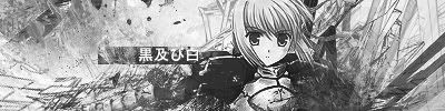
--> New sig. This was cropped and edited by KiNa. I know blonde is Arceuid but I don't know who the blue-haired one is.
__________________
|

|

|
|
2006-11-28, 19:32
|
Link #2163 |
|
Mia 'cova
Join Date: Nov 2006
|
Cyz - the composition is very nice. The blue complements the orange tones creating a pleasing color selection. The eye movement from Arceuid to the text beneath the image really boosts the entire effect of the sig also. only negative is that to my eyes the rendering of the box doesn't quite match the style of the characters, thus theres a little tension between to two parts of the image. other than that, very cute and effective. 9/10
finnaly got around to making a touka sig after finishing uta 2-3 weeks ago :X |
|
|
|
|
2006-11-28, 23:27
|
Link #2166 |
|
"Show it to me"
Join Date: Dec 2005
Location: In solitude, where we are least alone
|
leofish: mmhmm, Touka looks really good in there. The bg designs are nice too. You could put the pic a little down so we can see her whole face
 9/10 9/10Ai Suzuki: Too crowded IMO and it's a little dark too. But points for having Dark Magician Girl on it 7/10shinobiknight0: I think it's better if the img is a little close. The dark made the img even harder to see. 7/10
__________________
|
|
|
|
|
2006-11-28, 23:37
|
Link #2167 |
|
Kira_Naruto, the ecchi
 Graphic Designer Graphic DesignerJoin Date: Dec 2005
Location: http://www.exciting-tits.com/
|
@ Azrael .. Can I call you that? Anyway crop sig .. would be better if you include full eyes =/
@ leofish .. the eyes getting cut was your failure.. half eye is bad >.< .. lower her a bit please  .. BG is lovely .. get a smaller border .. BG is lovely .. get a smaller border  .. or at least a bit transparent =/ .. or at least a bit transparent =/@ shinobiknight ... I post my analysis (sort of) in that other thread =/ @ Ai .. Too crowded @_@ @ Cyz .. finally, how do it feel to use your own creation  .. btw, blue haired girl = ren .. btw, blue haired girl = ren  ... I've put their name in the filename, didnt I ^^ ... I've put their name in the filename, didnt I ^^Anyway .. >.< Promoting my sig analysis/discussion thread again >.< Dont rate my sig =/ in the 1st incarnation .. better one (sort of) in my thread
__________________
|
|
|
|
|
2006-11-29, 00:07
|
Link #2168 | |
|
"Show it to me"
Join Date: Dec 2005
Location: In solitude, where we are least alone
|
Quote:
Tsukuyomi:  That's one scary sig. A little late for Halloween no? That's one scary sig. A little late for Halloween no?  7/10 7/10
__________________
|
|
|
|
|
|
2006-11-29, 00:58
|
Link #2170 |
|
阿賀野型3番艦、矢矧 Lv180
Graphic Designer Moderator ModeratorJoin Date: Mar 2006
Location: Belgium, Brussels
Age: 37
|
*is refraining himself, avoiding some too deep comments ~~*
@Azrael_Azure : the signature lacks of some mood/subject, while the zoom isn't bad (though like kina said, full eyes would be a plus). 6/10 @Cyz : very cute, though it's too bad that the top hair is cut. also, the arcueid right ear isn't really smooth : are there cut leftover? 8,5/10 @leofish : either way, you should shrink touka picture, or displace it a little bit to the bottom (like already said, it should be better if touka's face isn't cropped.) also, i dunno, but i feel something wrong, despite the sig quality. probably the font. 8/10 @AI suzuki : No comment... @shinobiknight0 : something... funny is left on the bottom of the sig. i will agree with cyz : the picture is a bit small, and with the dark, it is rather hard to determine what's happening etc. the signature could be slightly cut at the edges, and the font isn't really suiting it. 7.5/10 @phelddagrif : the image quality is a bit low (aliasing and graininess around). also, the BG are a bit contradictory, and don't fits Ed :s. last note : edward elric is really hard to read, especially the "elric" 7.5/10
__________________
|
|
|
|
|
2006-11-29, 10:57
|
Link #2171 | |
|
"Show it to me"
Join Date: Dec 2005
Location: In solitude, where we are least alone
|
Quote:
Phelddagrif: I agree with Klashikari. The bg doesn't seem to fit Ed. 7/10
__________________
|
|
|
|
|
|
2006-11-29, 11:06
|
Link #2172 | |
|
阿賀野型3番艦、矢矧 Lv180
Graphic DesignerModeratorJoin Date: Mar 2006
Location: Belgium, Brussels
Age: 37
|
Quote:
as for the right ear, i wasn't talking about the hair between the ear and the top hair, but the very ear itself : just like the top ear, the ear wasn't really cut smoothly, so the line was slightly cropped. XD but this is really minor, of course ^^
__________________
|
|
|
|
|
|
2006-11-29, 14:10
|
Link #2174 |
|
Senior Member
Join Date: May 2004
|
@ Cyz: That's pretty fun sig to watch and the transparency fits in too.
@ Klashikari: Slightly too big and slightly too messy to my taste. You could remove some of the text inside and outside the pic. @ Azrael_Azure: You need to sharpen the pic, add borders, and use less compression. The artifacts are a bit too obvious. |
|
|
|
|
2006-11-29, 15:30
|
Link #2177 | |
|
I'm a Senior Member!
Graphic DesignerJoin Date: Oct 2006
Location: The Bronx
Age: 31
|
Quote:
__________________
|
|
|
|
|
|
2006-11-29, 16:59
|
Link #2178 |
|
LOVELY☆COMPLEX
Join Date: Dec 2005
Location: Ontario, Canada
|
shinobiknight0 - yeah I can't really make out what's happening, but i guess thats just the way it is, with the dark theme, which is nice. Th bottom doesn't seem to fit =/ I like the font though =)
CXC - I can't see the one you posted so I'll just comment the one you have now. I like the left side, but the right side doesnt really blend and it's pretty bare. Again I do really like the left though, pink is cool =) Cyz - quality is great! and can you say cute xD? love it (yay to KiNa) |
|
|
|
|
2006-11-30, 01:04
|
Link #2180 |
|
Kira_Naruto, the ecchi
Graphic DesignerJoin Date: Dec 2005
Location: http://www.exciting-tits.com/
|
@ Cyz .. If only I have the time to do a vector on the original >.<
@ Wordplay.. You and Manti never change sig  Kudos ^^ Kudos ^^@ KiNA .. Please refrain from long ass winded bashing in here *looks at Klashikari* ... save it for the other thread
__________________
|
|
|
|
 |
| Tags |
| rate, signature |
| Thread Tools | |
|
|