2009-08-12, 15:44
|
Link #62 | |
|
勇者
Join Date: Dec 2006
Location: Tesla Leicht Institute
Age: 34
|
Quote:

__________________
|
|

|
|
2009-08-12, 17:14
|
Link #64 |
|
time waits for no one <3
 Graphic Designer Graphic DesignerJoin Date: Aug 2008
Location: Portugal, Lisbon
Age: 32
|
ok now that I've criticized a bunch of you people it's time for you to get it off your backs and criticize me all you want - please do
 so here's my first official try *and yes I'm aware it's almost the same as my current sig but I just love them both and that scene was heartwrenching* 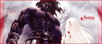
__________________
|
|
|
|
2009-08-12, 17:42
|
Link #65 | |||||
|
Black Dragon
Graphic DesignerJoin Date: Dec 2007
Location: In the Netherrealm, thinking who to betray next...
|
Quote:
Quote:
 Quote:
Quote:
__________________
|
|||||
|
|
|
2009-08-12, 17:44
|
Link #66 | |
|
~Rock ☆~
Graphic DesignerJoin Date: Apr 2007
Location: In The Farplane
|
Quote:
__________________
|
|
|
|
|
2009-08-12, 17:49
|
Link #67 | ||
|
time waits for no one <3
Graphic DesignerJoin Date: Aug 2008
Location: Portugal, Lisbon
Age: 32
|
Quote:
Quote:

__________________
|
||
|
|
|
2009-08-12, 18:17
|
Link #68 | |
|
Senior Member
Join Date: Nov 2006
Location: Virginia, USA
Age: 62
|
Quote:
 ) )
__________________
|
|
|
|
|
2009-08-12, 18:31
|
Link #69 | |
|
time waits for no one <3
Graphic DesignerJoin Date: Aug 2008
Location: Portugal, Lisbon
Age: 32
|
Quote:
hmm well for those who're familiar with the scene it has a meaning.. for those who don't, imagine it as a sarcastic remark and thanks for the positive feedback :3
__________________
|
|
|
|
|
2009-08-12, 22:14
|
Link #71 |
|
books-eater youkai
Join Date: Dec 2007
Location: Betweem wisdom and insanity
|
@Terrestrial Dream I agree with Evil Rick, the signal lost in not really helping
@vandakiara a good one, but the ''smile'' in his current form... I would keep the word but change the font or make it bigger. @Katocchi, I am not too hot for the secondary text.
__________________
|
|
|
|
2009-08-12, 22:47
|
Link #72 |
|
Constellation
Graphic DesignerJoin Date: Jan 2008
Location: Pearl of the Orient Seas
Age: 31
|
@Evil Rick, ganbaru &vandakiara
yeah thanks for the tips I feel like something's missing to aside border and text I'm still thinking of what kind of border to use and how the text will look like I'm not good with those things so it'll probably be a while @Terrestrial Dream animation before the "Signal Lost" text seems fast? dunno, maybe it's just me 
__________________
|
|
|
|
2009-08-12, 23:07
|
Link #73 | |||
|
勇者
Join Date: Dec 2006
Location: Tesla Leicht Institute
Age: 34
|
Quote:
Quote:
Quote:
Would this be bit better?  Anyhow still need to fix this a lot.
__________________
|
|||
|
|
|
2009-08-13, 00:02
|
Link #74 | |
|
Constellation
Graphic DesignerJoin Date: Jan 2008
Location: Pearl of the Orient Seas
Age: 31
|
Quote:
then you can put the "Signal Lost" thing oh one more thing, if you can... try to make the animation of the gundam to make it look like crash-landing by making it faster then make the animation at the end slower (the one that looks like there's no signal in tv) but maybe it's still just me
__________________
|
|
|
|
|
2009-08-13, 09:03
|
Link #77 |
|
Fuwaaa~~~
IT SupportJoin Date: Apr 2007
Location: Indonesia
Age: 34
 |
@KholdStare :
Whoa that's some very good animation! But I guess you might need to improve the readability of the text, maybe some glow/stroke effect? @ganbaru : Pretty nice "out of the box" idea. But I think it'll be better if exclude your name from the fading effect. Question : Is this eligible for entry? If it's OK then this will my be entry until I've updated it. "Perspective" is just kinda confusing... 
__________________
|
|
|
|
2009-08-13, 09:42
|
Link #78 |
|
Watcher
Join Date: Oct 2008
Location: who knows.. where you're thinking
|
  C&C anyone Furunno : I'm not sure , but i think it can be. Even if i think the sky is too plane to add a perspective. Ganbaru: I really like it, the render is well done, it's just the Cut of the sig on the corners. I think you should add the same effect to all the sig, or leave it simple
__________________
Last edited by Risa chan; 2009-08-13 at 10:08. |
|
|
|
2009-08-13, 10:33
|
Link #80 |
|
books-eater youkai
Join Date: Dec 2007
Location: Betweem wisdom and insanity
|
@Furoro Solace will have the last word about who it the theme or not but I don't think it fit.
@Risa chan, I also prefer the first one , more colorful. But you shouldn't forget the limitation about the file(s) size. I am not really sure what Risa chan mean by '' Cut of the sig on the corners'' ... Another version, C&C would be welcome.   
__________________
|
|
|
 |
| Tags |
| contest, sotm |
|
|