2006-11-27, 23:02
|
Link #1 |
|
Kira_Naruto, the ecchi
 Graphic Designer Graphic DesignerJoin Date: Dec 2005
Location: http://www.exciting-tits.com/
|
Signature Creation, Discussion and Improvement thread
Seeing how the rating signature thread have becoming a place where we no longer rates signature but turning it to a sig dismemberment
 I thought I'd made one where we free to bash comment on the style preferences without the fear of RoD (Rate or Die) post deletion. I thought I'd made one where we free to bash comment on the style preferences without the fear of RoD (Rate or Die) post deletion. ITT (it means In this thread -- in case you were wondering ) I'm not looking for peoples coming and tell how they love a certain sig .. OK, that would be nice  rather, comment on what they feels could be improve on, and also given the chance to defend their creations (which is a pain in RoS thread since we need to rate another sig as well. rather, comment on what they feels could be improve on, and also given the chance to defend their creations (which is a pain in RoS thread since we need to rate another sig as well. I'm on holiday so I could probably spam some sigs to brush up my skills. I'm not very good at PS honestly, just started last year after getting it as birthday present ... hell, I go to the banner thread and wonder how the hell you guys churns out those beautiful banners .. I'm a bit random in sig making .. going by what I feel nice at the moment of creation, I usually have a particular image chosen.. and work myself up from there. I love experimenting in my own sig, going by the approved technique for request sig.. Thats why you can see the generic sig style when I've done for request, but for my sig myself, havoc, low ratings in RoS etc etc Also, I prefer echi (within AS rule) theme in particular, and as stated by BC13, I pour a bit more effort in them .. That cant be help since as you guys/gals probably know, I collect echi pic .. a lot .. thus having an abundance of sig source to begin with. I do hope this thread would be allowed by the mods (particularly CG since he was the FC mod ) .. That being stated, I'll started this thread with my sig remodified from the current one I'm using .. based on the criticsms in the RoS thread  BG is created with fractal brushes .. Both Temari have sorta powerup glow oozing out from behind her >.< (or sort of) And instead of windy element, I opted for more generic DBZ power glow BG .. BG is created with fractal brushes .. Both Temari have sorta powerup glow oozing out from behind her >.< (or sort of) And instead of windy element, I opted for more generic DBZ power glow BG .. I still wanted to have my name in my sig .. for a reason =x , Font selection was a pain .. As I couldn't use girlish font .. and going too gothicly dont go too well with the overall feel. In the end, still gothic type.. but more subtle IMOAnd please, this is not a place for my sig alone.. please post your work as well and improve each other as time grows as well. Bash away
__________________
|

|

|
|
2006-11-28, 05:07
|
Link #2 |
|
sleepyhead
AuthorJoin Date: Dec 2005
Location: event horizon
|
Hmm.. I think it's better then v1.. especially since you cleaned up some elements.. :) ok that's the would be the good..
Time for the bad.. :P 1. I think you cropped it BAD.. to be honest I'm not that thrilled when people start cropping the characters hair off.. I mean it's anime the hair is a major focus point.. (the point you chose to crop for the bottom part doesn't look that great either) 2. IMO you sacrificed way too much detail for the left-character.. I mean she's look how many pixels got turned to white.. just a little more and her face would have disappeared.. :( (remember the histogram is your friend ;)) Well I'll give you points for trying to place her in the foreground ;) (but, to be honest I had to think a little to get that she was suppose to be in the foreground) 3. The background I think is good.. I'm personally not very enthusiastic about that kind of random style, but it's kool :D IMO it would look better if it was organized-randomness instead of just randomness (I'm not suggesting you use some more geometrical brushes.. just make some creative patter..). Right now (as I see it) it's was too chaotic.. not saying that's bad thing, just that I think you loose all perspective and focus... Compared to the v1 I think v2 is a definite improvement although maybe you toned it down a little too much -_^ 4. Now, I personally don't like things that don't fit in any way with their surroundings.. (either blending in or blending out) But IMO people that haven't touched a gfx progy in their life, generally don't notice/care for things like that. BTW feel free to flame critique any of my work.. I'm always thing to improve what little skills I have.. ^^ Ok.. so it's a little hard because I generally don't like to make complex sigs.. maybe I'll make a more eye-sore-style sigy later.. ^__^ (if I ever finish processing all the feedback in the software thread ^^')
__________________
|
|
|
|
|
2006-11-28, 20:41
|
Link #3 |
|
I'm a Senior Member!
Graphic DesignerJoin Date: Oct 2006
Location: The Bronx
Age: 31
|
I think your sig is okay.
The image quality is so-so and I don't like the fractals that much, but the color is pretty good. Although I think it's better to have 1 focus image, you could've left out the image on the left. I like the placement of the text, but it's a little too big. Add a border and it'll be pretty good. And now for me, I'll put up a recent sig made today. 
__________________
|
|
|
|
|
2006-11-28, 23:26
|
Link #4 |
|
Kira_Naruto, the ecchi
Graphic DesignerJoin Date: Dec 2005
Location: http://www.exciting-tits.com/
|
@ BC13
... liberty at its best .. Thank you so very much for the critics .. btw, I'm trying to defend it (1) & (2).. Intentionally done... because all I want is the pose .. If you look at ur comments, you can see that the face was not the main focus .. rather her body pose .. @_@, I think its sexy , and I kinda like the half face effect in Riker's Yuki banner  (3) Admittedly, I still trying to developed my style in brushing Randomness at its fullest (4) That its personal preferences IMO .. I'm on the opposing side =/ Now yours, I like your work, obviously, you more talented than I am in PS I could never get that smooth transparent effect there @_@ .. yet . A question, why that style? blocky edge on the right and gradient tranparent on the left .. randomness? Also, that little yellow thingie on the bottom right really look out of place; her knee?... BG is nice, no comments there. @ shinobiknight0 .. correct the bottom part plz  , you got a layer moving out of place there O_O, Other then that ... the light part behind necrolooks a bit weird, because somehow he got an extra horn there =/ . I like the text placement .. , you got a layer moving out of place there O_O, Other then that ... the light part behind necrolooks a bit weird, because somehow he got an extra horn there =/ . I like the text placement ..OK OK.. I'll try to removed the left Temari next .. have to redo the BG on the left >.<
__________________
|
|
|
|
|
2006-11-29, 06:38
|
Link #5 |
|
阿賀野型3番艦、矢矧 Lv180
Graphic Designer Moderator ModeratorJoin Date: Mar 2006
Location: Belgium, Brussels
Age: 37
|
@KiNa : akh... too late, so BCXIII almost said everything i had in my mind (dang, you are a sibling?
)in some extent, the increased brightness just doesn't give any impact. you can barely see the curve and the depth of the body. in fact, it does only give a good effects on the legs, which is less than the third surface of the left temari. the right side still suffers from persisting aliasing. (i'm really wondering why though) the red fan was partially erased, but the right piece is really useless. either you should put back the whole fan, but with more transparency, or you should erase it completely. the complete wind removal wasn't really necessary. i think you could simply replace it with larger curved wind, with an increased transparency (about 10%) for this, i think you can change the balance, enlarging the length by 50/75 pixels anyway, the second signature is better, but not it does resolve every issues that the first version had, but i brings some more with it. @Shinobiknight0 : like i said in the RTS thead, the problem is most likely the dark, and the picture size, wich is a bit too small. also, the signature could be shortened a bit. finally, the text font don't really fit the impression of dark light.
__________________
|
|
|
|
|
2006-11-29, 06:46
|
Link #6 |
|
Kira_Naruto, the ecchi
Graphic DesignerJoin Date: Dec 2005
Location: http://www.exciting-tits.com/
|
 Keh keh keh ... Everybody couldnt wait the chance to bash mine Here's another chance =x .. And no, me and BC is not related ^^ I would explain the thought .. but I guess you still can bash it .. But yea.. I've learnt something from BC comments
__________________
|
|
|
|
|
2006-11-29, 11:20
|
Link #7 | ||
|
阿賀野型3番艦、矢矧 Lv180
Graphic DesignerModeratorJoin Date: Mar 2006
Location: Belgium, Brussels
Age: 37
|
Quote:
Quote:
bashing? dude, you will be ill with this  so let's see... 1) you corrected the right side, this is now good (except the arm, but you cannot really do something about it) 2) the fan is now well blended : it doesn't add some silly red and shape around. 3) i dunno if you did it on purpose, but the center picture lost a lot of its impact because of the gradiant. in fact, the picture is almost part of the BG. 4) i think the propotions of the left image is a bit too big, it almost cut the signature in 2 parts : left part with 1 third, the right with the 2 third left. also, the left picture suffers a bit of irragular cut : the edge line is sometimes thick, sometimes almost erased. (but again, this is easier to say than to do) 5) it's too bad that you removed almost every wind effect, now the impression isn't really the same. 6) you really should give up this text . joke aside, it's really hard to read, and even harder to consider it suitable for the signature mood.overal, i would say you have improved in the structure, but you lost some points for removing some parts. it would be equal to me ^^;
__________________
|
||
|
|
|
|
2006-11-29, 19:45
|
Link #8 |
|
sleepyhead
AuthorJoin Date: Dec 2005
Location: event horizon
|
Ok.. for wathever reason I remember you being more tallented o_OQuote - Are you sure you're KiNa.. ?????? Well anyway.. here's one.. flame away  Just so people can bash better here's a lil bigger (unresized) version..http://xs109.xs.to/xs109/06484/BigVersion.jpg Oh yeah I like to make 'em in sets.. so here's coresponding avy..  Spoiler for Zoomed:
__________________
|
|
|
|
|
2006-11-30, 00:49
|
Link #9 | ||
|
Kira_Naruto, the ecchi
Graphic DesignerJoin Date: Dec 2005
Location: http://www.exciting-tits.com/
|
Quote:
.. and lets our sig do the talking ^^Quote:
) .... Number two, the middle Saber .. her hand was kinda make me o_O, feels a bit weird since the hand is too unattached to her .. I feel no synergy in ur BG to any of the Saber pic ... No Fate is Eternal is too jagged >.< .. especially on the capital letters ... What actually is the rotating Saber text around her on the left supposed to convey? Not very fond of your name being cropped out like that either .. especially when it wasnt part of BG ... Font on BG = ok if crop, Font on top = not OK  Fake transparent is just >.< By any chance, are you trying to do a vector sig? (I think thats what they call the technique is >.< ) Looks like I'm taking my revenge here ==============================  I feel that I cant get a good brushing work for her BG. >.< .. I dont know what would work too .. .. still wanted to add my name somewhere in my sig .. habits
__________________
|
||
|
|
|
|
2006-11-30, 09:53
|
Link #10 |
|
sleepyhead
AuthorJoin Date: Dec 2005
Location: event horizon
|
HehQuote - KiNa  You're still not smart-ass enough for me to accept you as the old KiNa.. Never intended for that...Quote - KiNa But anyway, if you feel emptiness then I guess it's a good mistake :D :heh: I wanted the forus on the middle saber.. so I deemphasized the left one.. the idea was of solitude.. mmm.. maybe that wasn't such a good idea..Quote - KiNa Hmm.. I didn't want the name to be at the same level as the left Saber.. (definitely didn't want it to be outside) I also didn't want it to be close to the level of the middle Saber.. well it's clipped so it looks like its somewhere in a middle ground..Quote - KiNa Yes I know :'(.. but .png would be too big and a .gif would start chopping off little pieces of her head..Quote - KiNa It's either bad or worse.. not much of a choice. And I really really want transparency there... >.< Ok.. I'll import it to PS.. I can solve the problem there.. give it that alpha channel and make it AS friendly.. ;) Yes.. but I don't know if you can call it a technique..Quote - KiNa That sig was made 100% in a pure-vector-based progy (everything is vector except for the 2 Sabers who I imported in).. I never made a sig using only vector based tools before, actually even with bitmap progs, PS (or IR) was the only one I used for this stuff. Well I always luv experimenting with stuff.. xD Why the " :( " o_O ??Quote - KiNa I have no problem accepting the opinions of others.. please take as much as you like ^_^ Thanks for the feedback btw.. :) 1. Next to her hand (on the left side) There's a little spot of black.. shouldn't that one be blue? (btw there's also one in back of her neck and one in the top left corner... and a black one in the bottom of the image for the middle character, it's suppose to be a shadow for her neck but's way too black..)Quote - KiNa 2. The text.. mm.. it's a little to invisible on the left, can't distinguish Black that well.. on the right the "N" and "L" are a little too close to the edge.. (the "N" actually seems to be missing the right part, because of this)... the text seems to have little white spots all over.. witch I presume are gun shots but they definitely don't look like gunshots as they are there.. Also I see you tried making the Black a slightly different color then Lagoon.. (well even if you didn't and it's just blending it's a nice effect ^^) but at that size its a little too unnoticeable for the average viewer (IMO) 3. The lines that separate the 3 images are a lil messy (I'm specifically referring to the way they seem to meet in the corners.. the ones for the right character don't seem to want to completely meet.. ) also the line separating the black empty space is a lil too intense) 4. The middle and right characters aren't highlighted enough.. needs a little work on the shadows and highlights on them IMO.. the edges could use some softening, maybe :/ 5. The Blank Rectangle Spot on the left (as well as the characters, as mentioned above) makes the sig bg look a lil' empty.. how about adding another bg layer behind your current one.. ? it seems way too simple (because there are only pics there) 6. The characters on the "LAGOON" type could use some highlighting.. maybe an other glow or anything to make them stand out more.. they're very confusing at first look 7. The right side seems ok.. the left part of the extreme top and bottom margins as well as the left margin don't.. the basic problem is that your name (which is nicely done btw ^^) her hand holding the cigarette, her shoulder, and her hair are major focus points and the margins kill focus (oh and don't go for anything like a 1px black border that would probably be worse) 8. The sig could be a little wider.. looks a lil too square.. and some clipping (like for the hand of the character on the right) are a little inappropriate.. -_^ 9. The A in your nick is a lil' eaten away at the end makes it look like a P ^___^ 10. If you look closely on the right of the hand of the right character there's a white glow where her hand meets the border.. 11. The red in the cigarette could use some enhancement.. there's also the possibility of adding smoke ;) Well don't take my comments too seriously.. the sig is top notch..  ------- Ok I'll just go now to work on version 2 for the one I posted earlier.. 
__________________
|
|
|
|
|
2006-11-30, 23:12
|
Link #11 | |||||||||
|
Kira_Naruto, the ecchi
Graphic DesignerJoin Date: Dec 2005
Location: http://www.exciting-tits.com/
|
Quote:
.. somehow, I did have a layer behind them .. it just kinda turned off visibility Quote:
.. it just that they on different contrasting BG that produced the effect. I've resived the 3 main image BG there now .. dou? Quote:
Quote:
.. Maybe that was the reason .. change to normal blending white border this time Quote:
Quote:
.. size reduced  Quote:
... Quote:
==============  .. Added animated smokes and makes changes based on BC comments.. Hows the smoke look? .. Added animated smokes and makes changes based on BC comments.. Hows the smoke look?
__________________
|
|||||||||
|
|
|
|
2006-12-01, 03:06
|
Link #12 | ||
|
阿賀野型3番艦、矢矧 Lv180
Graphic DesignerModeratorJoin Date: Mar 2006
Location: Belgium, Brussels
Age: 37
|
Quote:
1) the space between saber in the center and the right side is a bit big (like kina said, you can feel some emptyness) 2) is the text intentionaly that small on the right? it's hardly possible to read it. 3) the black... "stain" around the saber in the center has 3... weird block below her. 4) No fate is eternal font seems really awkward here... both for saber or the signature style. 5) like KiNa said, your name shouldn't be cropped. 6)...but unlike KiNa, i feel a certain synergy between the 2 saber and the colour and style of the signature. however, the center saber expression might be the problem. Quote:
[/joke] well well, my comment will be probably a bit biased, since i'm really not used with black lagoon universe. 1) the lines around the the right square aren't linked properly 2) the contrast with the BG and the main picture is maybe... a bit too strong. i think the hair lack of something to prevent some weird mix between bright colour and the dark blue of the BG (not really important though) 3) the hair at the top right is weird... is it because of the cut or something? 4) again, black is not really obvious to read. but i don't have no suggestion but shrinking a bit both black and lagoon, so you can fit black more accordingly. 5) the smoke should be lengthened a bit. since KiNa asked in the RTS thread, here is my lastest sig...   i have a bad feeling about this...
__________________
Last edited by Klashikari; 2006-12-01 at 06:52. |
||
|
|
|
|
2006-12-01, 08:11
|
Link #13 | ||||||
|
Kira_Naruto, the ecchi
Graphic DesignerJoin Date: Dec 2005
Location: http://www.exciting-tits.com/
|
Quote:
Quote:
.. I really dont want them to compete .. but maybe I overdid it .. I'll see if I can increase the opac some more without letting them clash too much^^Quote:
Quote:
Quote:
Quote:
But, if theres 1 casualty, its probably be me ============== hmmm, let see .... 1) While the sig didnt look/feel outstretched(how the hell you spell this word anyway? ), you are bound to the length of that staff in the BG IMO .. thus making the BG resolves around the staff itself .. not the girl.2) You are using too much font .. some are even hard to read Reduced the number of font used maybe?..) 3) The girl is too bright.. Unlike my Temari sig, she is the main attraction of the sig .. so I felt that her face is very important IMO. Right now.. the attention is shifted to the staff she's carrying 4) Lastly, it wasnt noticeable on a single work .. but when I view your signatures (your latest Nanoha set) and a few more previous latest sig by you (to be sure), it became apparent (at least) to me .. I dont know if you've noticed it as well, but it seem that you have a bit of problem when it came to placing text as a standalone piece (ie like when placing names). You have no problem when the text was meant to blend with BG. One of the reason, IMO, is that you love busy BG. You fill the BG with too much detail, and when you wanted to put the text, you have not much of a choice left =/ Thats how I see your work currently. Look at your current Rena sig.. I so freaking love it despite not being fond of higurashi.. but tell me where, can you put your name without interupting the flow of the sig =/ Try using one of the other font for yagami hayate name .. and place it either on top of the staff (above the stand by text) -OR- top right spot. That way, it doesnt have to compete with the left side.. its kinda busy there. -OR- the bottom left .. but that you have to relocate the Set up text. push the set up a little bit up and to the left ..so the "S" is near the end bottom of "y" in Ready Top right is just going in the way of the BG .. thus, out of place. ---- 3rd version 
__________________
|
||||||
|
|
|
|
2006-12-01, 08:51
|
Link #14 |
|
sleepyhead
AuthorJoin Date: Dec 2005
Location: event horizon
|
Suggestion: Medium to Slow Shape Tween tweaked with lots of hints ;)Quote - (hope this isn't alien to you ^_^) Oo Huh?! so?... oh I see your trying to say mine's square too ^^ lolz.. (<- a 4real lol)Quote - Mine doesn't stretch all the way vertically.. :P Simply put when you look at those parts it's hard to keep focus since they contrast too much with the forum bg.. that wouldn't be a problem if it were just a color fill (like on the right but) but on the left it really makes the cutting of the edges stand out..Quote - BTW.. the 3d version is the best so far.. the character in the middle is showing very nicely.. One thing.. the character on the right.. ummm.. not looking so good.. the overall img quality is ok now.. but she's way too cut.. really looks like some image you copy/pasted in.. maybe moving her down to show more and fading to the text.. just a little.. -_^ ------------ I'm currently on another computer.. heh.. it's so interesting how things can look so different on different monitors :)
__________________
|
|
|
|
|
2006-12-01, 10:08
|
Link #15 | ||||||||
|
阿賀野型3番艦、矢矧 Lv180
Graphic DesignerModeratorJoin Date: Mar 2006
Location: Belgium, Brussels
Age: 37
|
Quote:
well, just see below :  Quote:
in fact, i edited my post a while back, and the brightness has changed ^^ well, here you can compare, and i feel the updated version is fine (maybe...)  Quote:
in fact, i think the BG is as important as the main subject (since it is a part of the character representation for me ^^; ). it's not like i love especially cluttered/busy BG, but i try to put the highest number of details according to the character, under a certain limit and appreciation. and since the fonts are tools to describe and gives a message with the pictures (at least, to me), i tend to blend and use them as a detail but also as a part of a BG, like you guessed very well. as for your question, there is an easy answer to me : nowhere in fact, you will probably never see a signature from me with a name on it (except the character(s) name), except if asked in requests. but if i really had to do this, i would remove rena's name and put mine. (but i agree, it would be hard as hell XD) Quote:
Quote:
Quote:
so i invert their place, and since the "stand by" group isn't really that important, i can decrease its opacity. let's see in action (version 2) :  Quote:
now, the top right hair still bother me somehow
__________________
Last edited by Klashikari; 2006-12-01 at 10:39. |
||||||||
|
|
|
|
2006-12-01, 10:12
|
Link #16 | |
|
Ha ha ha ha ha...
Graphic DesignerJoin Date: Apr 2006
Location: Right behind you.
Age: 35
|
Quote:
__________________
|
|
|
|
|
|
2006-12-01, 10:56
|
Link #17 | |
|
Kira_Naruto, the ecchi
Graphic DesignerJoin Date: Dec 2005
Location: http://www.exciting-tits.com/
|
Quote:
Dont kill me yet ^__^ And as McGyver once said.. I cant die yet.. I havent pay my tax She's Temari .. I'm KiNA btw, thanks for the comment .. ^^ appreciate it. I love to hear somebody who is natural viewer too ... fresh comments from them, and they provide view from a non technical point ^^ btw @ Klashikari .. Yea.. I was writing the reply this evening when the storm started .. Turned off the computer ... and written the comment on my palm pc ^^ .. then transfer it up and post it back here .. didnt check on ur changes lol .. sorry =x
__________________
|
|
|
|
|
|
2006-12-02, 09:38
|
Link #18 | |
|
~ You're dead ^__^* ~
Graphic DesignerJoin Date: Apr 2006
Location: uk, England
Age: 34
 |
whoo didnt even know there was such a thread
Quote:
there are too many different themes for the fonts and parts stick out too much where they shouldnt... it would be better to blend the "set up" part imo and extrude hayate's name outwards instead... being so concerntrated near the middle details near the edges are lacking...i just cant stop noticing that the bottom left and right are too empty even with the effects... left side : nothing really stands out...maybe move the words "yagami" left to fill in the gap? right side : even with the writing there it seems all too flat...the BG is just black with a few lines and it cuts off from theme above it...where the bloc ends the BG does so too...this makes it seem inconsistant
__________________
|
|
|
|
|
|
2006-12-02, 10:04
|
Link #19 | ||
|
阿賀野型3番艦、矢矧 Lv180
Graphic DesignerModeratorJoin Date: Mar 2006
Location: Belgium, Brussels
Age: 37
|
Quote:
i think it would be convenient to have the "set up" parts as a mere information into the bg, rather in the front (it would probably blend just like in nanoha sig) as for hayate name, this is plain hard because of the shimmering grid behind XD i'm still toying with the blending and colour but... ~~ Quote:
for the left side, it would probably be ok if i extend the name space, while moving the "set up" part... *argh* i really need to improve my vocabulary XD
__________________
|
||
|
|
|
|
2006-12-03, 04:13
|
Link #20 |
|
Kira_Naruto, the ecchi
Graphic DesignerJoin Date: Dec 2005
Location: http://www.exciting-tits.com/
|
I dont feel like giving out analysis today =3
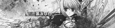
Probably, the final version ..  And my next one.. I feel a bit artsy today .. so 
__________________
|
|
|
|
 |
| Tags |
| discussion, signature |
| Thread Tools | |
|
|