2011-05-27, 18:10
|
Link #1621 | |||
|
「Darkly Charismatic 」
 Artist ArtistJoin Date: May 2008
Location: The Lounge
|
Quote:
Quote:
Quote:
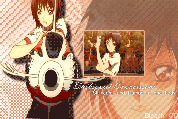
I read the 1st line of text and I just wanted to tell you guys that the original image is 1920x1200 (My monitor size) I re-sized it for these boards  *Edit* After reading the comments, Haha sorry for posting the re-sized image in that case, if you wanted to use it in full resolution, I'd be happy to provide  And Dist, no offence taken at all! Why would I be offended by a friend of mine?  (even though I'm absent a lot) (even though I'm absent a lot)
__________________
|
|||

|

|
|
2011-05-27, 18:45
|
Link #1622 |
|
sleepyhead
AuthorJoin Date: Dec 2005
Location: event horizon
|
Just post it to a site like post http://postimage.org/ then you won't need to waste time manually resizing.

__________________
|
|
|
|
|
2011-08-17, 11:39
|
Link #1623 | |
|
Junior Member
Join Date: Aug 2011
|
Quote:
Thank you |
|
|
|
|
|
2011-09-24, 18:58
|
Link #1624 |
|
sleepyhead
AuthorJoin Date: Dec 2005
Location: event horizon
|
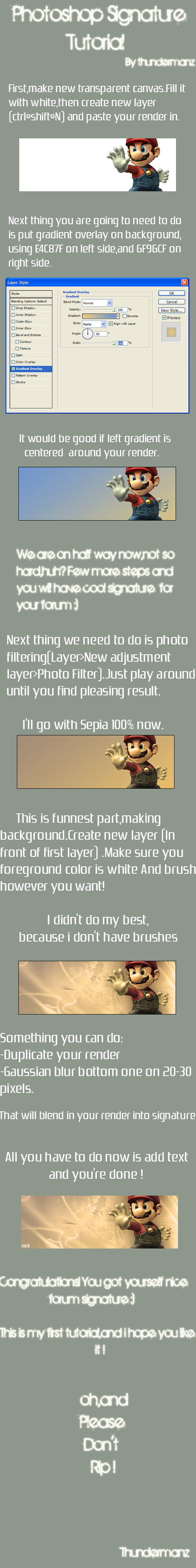
(by request)
Creating an Avatar First start off by finding a post of yours. Found it? Take a screenshot. On windows press PrintScrn, on other system you will either have access to this same functionality or will have to install a separate program to do it; I'll let you google it. Open Photoshop or Elements, select File / New..., you should see the dimentions of your screen already dialed in (on windows) otherwise just dial them in; make sure you're set to pixels. After everything is sorted, just hit Ok to accept and create a new photoshop document. Now press Ctrl+V or select Edit / Paste. IF you used a specialized program to take the screenshot, please just open the file created by that program by going though the File / Open dialog. (sometimes Photoshop can have hicups, just paste into pain save and open the file) Ok so now we have this big screenshot. We really don't need all of it. What we're interesting is really only our post, so we just crop that out, along with part of the signature to get a good view of how things look. Should now look something like this... Ok now that's setup, we need to find us something to make the avatar out of. Normally you want something like 20-30 images on which you apply the process bellow, but for simplicity I'll just show it for one. Namely this one http://www.zerochan.net/388417 What you want to look out for...
Ok so now that you got the image, just open it, via File / Open, and repeat the following over and over, until you feel you've exhausted all the possible angles at which you it would work as an avatar.
__________________
|
|
|
|
|
2011-10-06, 09:09
|
Link #1627 | |
|
Manga Addict
Join Date: Sep 2009
Location: England, UK
Age: 32
 |
Quote:
We have alot of talented animation designers. Here's a tutorial of KiNA's if you're too lazy to look in the index. |
|
|
|
|
|
2011-10-06, 10:20
|
Link #1629 |
|
Senior Member
Join Date: Oct 2008
Location: Finland
Age: 33
 |
Maybe you should go back to the index and learn how to make animated avatars. When you got that covered, you will know how to make a signature such as above. And why avatars? Because those squares in your signatures are avatars, just inside a signature this time.
__________________
|
|
|
|
|
2011-10-06, 10:51
|
Link #1630 |
|
Senior Member
Join Date: Sep 2010
|
but the problem is, some of the tutorial who has pic (easier to follow for me I guess) dont show the images. You see I had a little problem with language coz English is not really my main. If only I can be redirectetd to an easier tutorial with pics, I could go.
|
|
|
|
|
2011-10-06, 10:54
|
Link #1631 |
|
sleepyhead
AuthorJoin Date: Dec 2005
Location: event horizon
|
Yeah a lot of tutorials have "expired" because images were hosted outside the forums and not on galleries here. I might just have to remake the entire thing to contain only the tutorials that still have images, but chances are those will inevitably expire as well...
Not really sure what's best course of action to be honest.
__________________
|
|
|
|
|
2011-10-06, 16:07
|
Link #1632 | |
|
~ fabulous ~
Join Date: Mar 2011
Location: Serbia
|
Someone should save all the tutorials and archive them just in case.
Here are all of my tutorials thus far since I'm not sure which ones I posted here before: Quote:
__________________
|
|
|
|
|
|
2011-10-06, 22:33
|
Link #1633 | |
|
Sleeping
Join Date: Sep 2011
Location: psn
Age: 12
|
Quote:
http://www.photoscape.org/ps/main/index.php this is free. i learned basic animation using this one before. here's some samples i made when i was still apprentice in animating using photoscape,   edited: if you are interested, i'll try to instruct you in shortest way i can plus screen shots",
__________________
|
|
|
|
|
|
2011-11-18, 01:35
|
Link #1634 |
|
Koomi-kun~
Graphic DesignerJoin Date: Oct 2011
Location: In the distortion of space and time..
|
Help! Signature Problem!
Hi I have several pop-up signatures. I saved them as a gif. Even if I saved it as a gif. Once I upload them to AnimeSuki forums they white transparency background is still there. It wasn't like that before... Help!
__________________
|
|
|
|
|
2011-11-18, 03:24
|
Link #1635 |
|
Senior Member
Join Date: Oct 2008
Location: Finland
Age: 33
|
Don't save as gif. JPG and PNG support transparency too.. Can't offer more detailed instructions as I am not home but it should be easy enough to toggle when you use '' Save for web and devices '' on Photoshop.
Anyway, always save as JPG/PNG. GIF sucks for it's quality.
__________________
|
|
|
|
|
2011-11-18, 03:57
|
Link #1636 |
|
sleepyhead
AuthorJoin Date: Dec 2005
Location: event horizon
|
Don't use the animesuki upload feature. It is also possible your entire signature is above 50,000 bytes (ie. 48~ kb) and is optimized by the forum.
Upload it to a imagehost and post it here.
__________________
|
|
|
|
|
2012-03-23, 09:50
|
Link #1638 |
|
Junior Member
Join Date: Mar 2012
|
I posted a guide on making anime GIFs, no optimization or anything. I guess I can contribute that.
It's a video. http://www.youtube.com/watch?v=aEfkeI_jfQA
__________________
|
|
|
|
|
2012-03-31, 14:29
|
Link #1639 |
|
Koomi-kun~
Graphic DesignerJoin Date: Oct 2011
Location: In the distortion of space and time..
|
I would like the make a signature similar to this.
This is one of the signatures escimo made. Pardon me for posting this! I just really wanted to know.  Is there a specific tutorial on how to make those cybernetic lines and effects?
__________________
|
|
|
|
|
2012-03-31, 17:35
|
Link #1640 | |
|
Manga Addict
Join Date: Sep 2009
Location: England, UK
Age: 32
|
Quote:
|
|
|
|
|
 |
| Tags |
| avatar, graphic, photoshop, signature |
| Thread Tools | |
|
|