2007-07-25, 01:53
|
Link #222 |
|
Falling for Ginsama ^3^
 Graphic Designer Graphic DesignerJoin Date: Feb 2007
Location: Airantou
 |
hmmmmm who is this? .................................O___________O
Kimmie-chan!!!!??!?!?  when did u join A-suki? xD(looks under avy) REALLY? in april  Man it seems I have drawn everyone from a-source here or something cuz alot of them are now a part of A-suki now o__O well anyways I have tried again and still don't know T___T 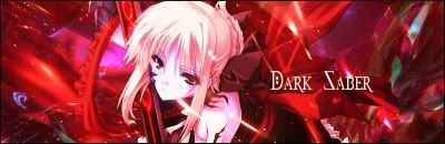 and here are my banners as it stands now #1   #2  #3 
__________________
|

|

|
|
2007-07-25, 02:24
|
Link #223 |
|
Kira_Naruto, the ecchi
Graphic DesignerJoin Date: Dec 2005
Location: http://www.exciting-tits.com/
|
@ Sig .. better .. but the text now look hanging without some sort of anchor..
I like your font choice and placement for the AMG banner.. the Kira banner need more .. erm clouds? +1 for using my anime avatar btw  .. He is me *shameless* ... Well, the Kira part from my name is tribute to him btw .. 2nd part was a word play .. since Kira_Shikamaru dont sound so nice .. He is me *shameless* ... Well, the Kira part from my name is tribute to him btw .. 2nd part was a word play .. since Kira_Shikamaru dont sound so nice
__________________
|
|
|
|
|
2007-07-25, 08:33
|
Link #224 |
|
C.C. belongs to me
Join Date: Aug 2006
|
very nice, u've improved alot since the last time i saw ur work
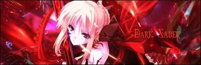
I really love the dark saber 1 cept the font, other than that its probably my fav 1 from u as 4 the banners, they r nice 2 cept they r kind boring 2 look @. Try 2 play around with color adjustments and add some effects 2 the sides, and font needs work 2 =] hope that helps 
|
|
|
|
|
2007-07-25, 08:37
|
Link #225 |
|
~ You're dead ^__^* ~
Graphic DesignerJoin Date: Apr 2006
Location: uk, England
Age: 34
 |
owh i love the saber font
though the placement is kinda dodgy O.O i think it would look better if you add an outer glow as well ^.^but overall i love the siggy ^.^
__________________
|
|
|
|
|
2007-07-25, 18:33
|
Link #227 |
|
Hail pork!
Graphic DesignerJoin Date: May 2007
Location: Silicon Valley
|
lol, I beat you to the T-Elos sig! Well anyways, your dark saber sig is coming along through out all your revisions. Try not to overpower her body with the c4d. Thought it's a bit busy in the bg, you kept it consistant which is good. Keep up the great work... BTW, check out my T-Elos sig. You'll like it better than my Kos-Mos sig.
__________________
|
|
|
|
|
2007-07-26, 11:40
|
Link #230 |
|
Retired
Graphic DesignerJoin Date: Mar 2007
Location: Princeton University
|
Wow Dave your Dark Saber sig is really cool now, I like its new feel now =3
As for your banners, banner #2 really stands out to me for some reason, good work ^ ^b Keep those banners coming =3
__________________
|
|
|
|
|
2007-07-26, 23:07
|
Link #232 | ||
|
Falling for Ginsama ^3^
Graphic DesignerJoin Date: Feb 2007
Location: Airantou
|
Quote:
Quote:
thx for the comments Shana ^^ NEW SIG:  for all the ppl who are xenosaga fans should know that mech. >,> and for all those who aren't a xenosaga fan its a mech from the game. xD edit: <,< okay since I seriously dislike doing mutliple posts here is my dawn banner. I didn't know what to put so yea...  
__________________
Last edited by bigdave; 2007-07-27 at 02:52. |
||
|
|
|
|
2007-07-27, 16:15
|
Link #234 |
|
Falling for Ginsama ^3^
Graphic DesignerJoin Date: Feb 2007
Location: Airantou
|
Toxic>> Thx Toxic ^^
I hope I garner some votes for my banners xD well seeing as the contest is winding down I made another Sig. =D  its another claymore sig XD Man I hope that that claymore IS miria cuz if it isn't im going to be pissed >,<
__________________
|
|
|
|
|
2007-07-27, 16:53
|
Link #235 |
|
Retired
Graphic DesignerJoin Date: Mar 2007
Location: Princeton University
|
I dont watch the show so I dont know if that is really her so gomen
but otherwise, a very nicely done siggy =3 Good work Dave ^ ^b And your dawn banner is pretty cool too =] glad you decided to join the extension
__________________
|
|
|
|
|
2007-07-28, 02:25
|
Link #238 |
|
noLife
ArtistJoin Date: Jul 2007
Age: 35
|
It's pretty much okay but the render needs some more blending =P some edges of it are a bit rough (like the right part of his face n stuff). Also, I know it's hard, I keep having font problems as well, the font is not the best choice, nor it's is positioning, play around with fonts some more :O
Don't be afraid of the blending hehe~ |
|
|
|
|
2007-07-28, 08:16
|
Link #240 |
|
Hail pork!
Graphic DesignerJoin Date: May 2007
Location: Silicon Valley
|
Oh man BD you're being like me and just spitting out sigs left and right. It's a little bit past 6am and I'm already working on a sig in gimp. If I can figure out the gradient maps, I'll let you know.
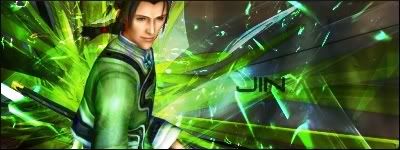
Your first E.S. Sig: I say swap the text and render and remove the arcing c4d and keep the radial looking c4d. Apply a light drop shadow on the render and then post results if you want. Clamore sig: Ah this one is a nice soft piece. Colors are very balanced and text is excellent. Render is a tad too bright but in all reality, it's still blended nice so you don't have to touch it at all. Nice addition to your portfolio. Jin Uzuki sig: I see you're getting into creating a Xenosaga set. Have you seen the animated series for part 1 yet? Well anyways, nice c4d explosion view. I would say watch your direction of c4d especially by the name text. See below it the c4d is striking downward and the c4d on the bg is going is an upward directions? Try to keep them consistant. Colors are complimenting is gear which is great. You're getting a lot better with every sig you make. Don't forget to make a T-Elos sig... and Nephelim too.
__________________
|
|
|
|
 |
| Tags |
| signature |
|
|