 2009-12-18, 19:07
|
Link #161 | |
|
Impostor Cutie
Join Date: Oct 2009
|
Quote:

__________________
|
|

|
|
2009-12-19, 04:11
|
Link #162 | |
|
time waits for no one <3
 Graphic Designer Graphic DesignerJoin Date: Aug 2008
Location: Portugal, Lisbon
Age: 32
|
Quote:
__________________
|
|
|
|
|
2009-12-19, 11:29
|
Link #163 | |
|
Strangely dependable...
Join Date: Nov 2006
Location: some random place out there...
|
Quote:

__________________
|
|
|
|
|
2009-12-19, 13:57
|
Link #164 | ||
|
Black Dragon
Graphic DesignerJoin Date: Dec 2007
Location: In the Netherrealm, thinking who to betray next...
|
Quote:
Quote:
__________________
|
||
|
|
|
2009-12-20, 00:12
|
Link #166 | |
|
Impostor Cutie
Join Date: Oct 2009
|
Quote:

__________________
Last edited by Cyrus17; 2009-12-20 at 00:13. Reason: spelling |
|
|
|
|
2009-12-20, 00:24
|
Link #167 | |
|
(ノಠ益ಠ)ノ彡┻━┻
 Moderator ModeratorJoin Date: Mar 2006
|
Text is tricky though. It's not always about what it says but where you place it, or the size of it, or even just the font. It's (in a way) like having another brush or piece of the puzzle that is a signature. Unfortunately text is a mixed thing...sometimes it works, sometimes it doesn't, and of course there's always going to be someone who feels distracted by it.
Ninja edit: Quote:

__________________
|
|
|
|
|
2009-12-20, 11:20
|
Link #168 | |
|
Senior Member
Join Date: Nov 2006
Location: Virginia, USA
Age: 62
|
Quote:

__________________
|
|
|
|
|
2009-12-20, 12:38
|
Link #169 |
|
time waits for no one <3
Graphic DesignerJoin Date: Aug 2008
Location: Portugal, Lisbon
Age: 32
|
ok so I tried to mess with fonts and stuff but I can't downsize 'in your sweet insanity' or else it'll look really bad and you can't even read it where it is...
I did downsize the first part though... but I'm not sure if it looks better... and I redid the border too, so... C&C? v2 
__________________
|
|
|
|
2009-12-20, 18:30
|
Link #170 | |
|
Impostor Cutie
Join Date: Oct 2009
|
Quote:
Black border is okay, but I'm not sure about the second "light" border under the black one.
__________________
|
|
|
|
|
2009-12-20, 21:57
|
Link #171 | ||
|
Strangely dependable...
Join Date: Nov 2006
Location: some random place out there...
|
Quote:
Quote:
__________________
Last edited by PreSage; 2009-12-24 at 12:53. Reason: was brain dead T_T |
||
|
|
|
2009-12-24, 19:21
|
Link #179 |
|
is not amused
Graphic DesignerJoin Date: Jul 2007
Location: Naval Base
|
Here are Final Entries so far.
1. katiemirmo  2. sayinterry 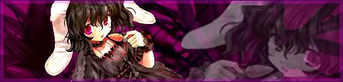 3. Evil Rick  4. ganbaru      5. JRendell  6. Beruko08 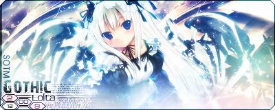 7. Mr.Kurosaki  8. White Manju Bun  9. Cierra  10. Moonie   11. AtomicoX  12. escimo  13. Ichigo-Sora  14. CrowKenobi  15. Drake  16. LKK     17. capture  18. Furude Rika  19. Endrance  20. ayu-smepai  21. Frailty  22. Miko Miko  23. Ice Climbers  24. vandakiara  25. PreSage  26. Eps~  27. xxBANGitsaly  In case I missed someone's entry again. Please do tell.  EDIT: bumped katiemirmo's entry. bumped sayinterry's entry. added xxBANGitsaly's entry.
__________________
Last edited by Kana Futayo; 2009-12-25 at 21:02. |
|
|
 |
| Tags |
| contest, sotm |
|
|


 :|::|
:|::|


