2010-04-26, 12:05
|
Link #22 |
|
♪ ~ ♫
 Artist ArtistJoin Date: May 2008
Location: Europe
Age: 35
  |
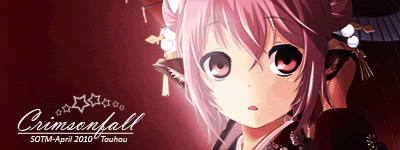
2. Furude Rika
 A very nice idea here. Splitting the sig by text like that. The borders look great as well. Though it's a bit funny to see Flandre look like the innocent one here.  18. Naoto  Aww, Momiji looks cute here. Bright, optimistic sig coupled with good font selection and a non-intrusive border. It has a very autumn-like feeling to it. 28. Ice Climbers  Ridiculous ammount of brightness here. But hey, it kinda works in this case! Making it all celestial-like. Longer periods of closer study not recommended though. ×_×
__________________
|

|
|
2010-04-28, 23:49
|
Link #35 |
|
Member
Join Date: Oct 2009
|
Wow so many entries this month, maybe because of the theme or bec. it's already vacation.
My votes and reasons (it's better to vote with a reason right? ) 25. Marina  ----> Awesome effects, magical and alluring, though the pic is kinda blurry it resulted in a nice way. Also a plus on the text because of the good typo and style you have used. 7. capture  ----> It feels really random but resulted in a good way, color scheming is nice, really refreshing in the eyes, maybe because it's green? lol some textures are kinda random, and also a plus for the font specially the name. 18. Naoto ----> The really eye candy in this work was the texts, good job on that part. The sig itself has no depth but the use of scanlines on the pic turn to be positive and nice. Color scheming isn't also bad, plus points for the broken-line border.
__________________
|
|
|
|
2010-04-30, 01:12
|
Link #39 | |
|
~La-la Land~
Graphic DesignerJoin Date: Jul 2007
Location: Seattle
Age: 37
|
Quote:
__________________
|
|
|
|
 |
| Tags |
| contest, signature of the month, sotm |
|
|


 Administrator
 :|::|
:|::|